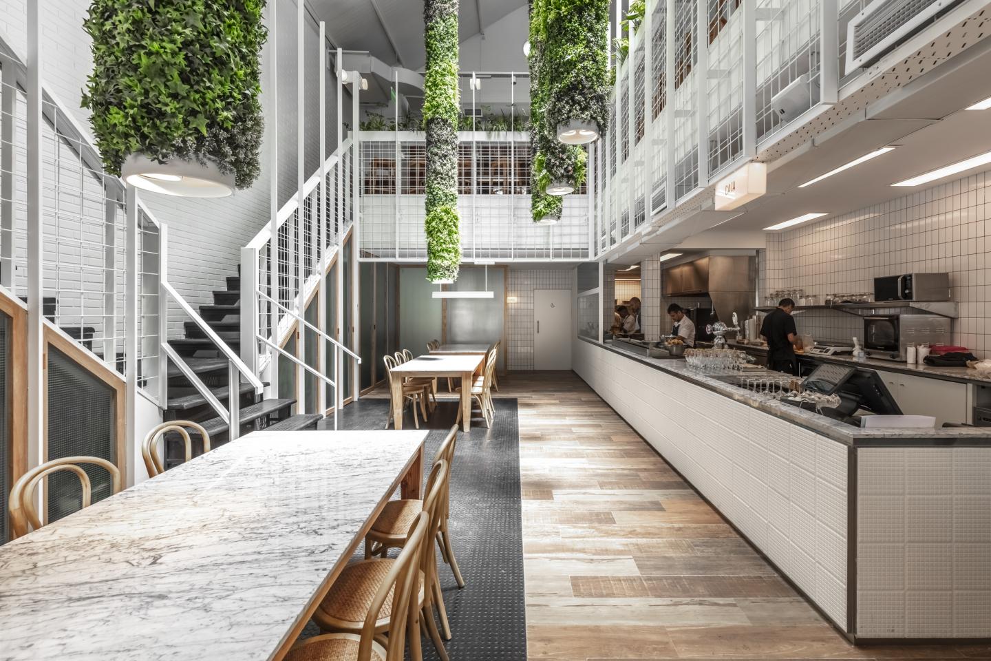
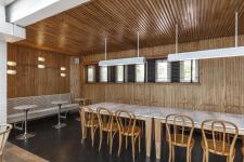
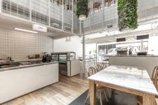
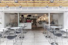
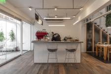
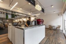
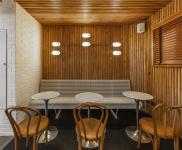
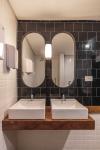
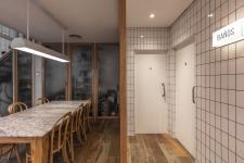
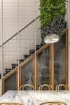
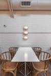
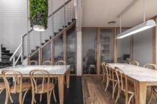
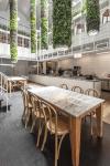
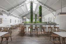
The project has been influenced by modern, neutral and industrial details. The neutrality is given by the balance of its materials and its shades of white. All its materials have been used in a bitonal balance of black and white, except for details in corrugated aluminium and the black rubber floor.
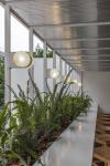
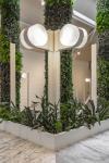
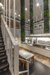
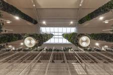
From the beginning we understood that the brand is, as its name indicates ( Fresco means Fresh in spanish ), a place whose identity is marked by the nature of its simple materials, its fresh and natural products as well. From this reflection we have suggested to implement a nature of alive presence and prominent avoiding to fall in the use of static nature. This nature is form and function in all its interventions, they work as a light system and as an active landscape in several of its bars.
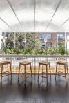
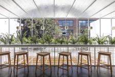
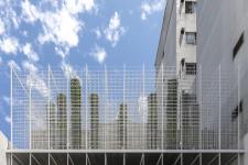
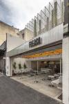
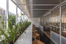
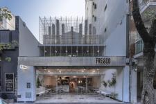
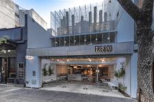
Its materials of direct reference with the fifties, have suggested an identification with the compositional system of modern lines from its modular organization in the facade. The wire mesh that is a fundamental part of the project is composed of a simple 15×15 wire mesh, which generates different depths like a veil that allows the old original facade of the building to be seen between its meshes.
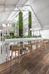
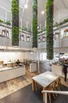
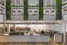
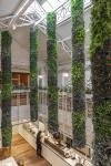
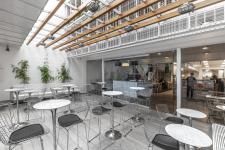
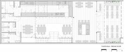
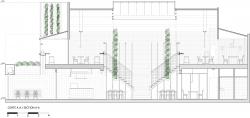
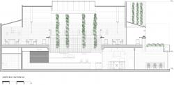
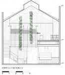
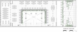
We applied the same system of mesh in different depths, in the first floor "balconing" to the central space, made of a bar that looks at this core, which is crowned by six large lighting supports surrounded by vegetation. The species of vegetation used are ferns, various philodendrons, various ferns, Potus lemon or green, Calatheas, Dracenas, Zamioculcas, Crotones, Spatyfilium and so on.
We have extended the upper floor by building and connecting, as a bridge, between two previously unconnected areas on the first floor. This unified the entire upper floor crowned by a large perimeter bar.
In the facade we used metallic meshes located in different depths for the incorporation of vegetation designed through cylinders. This strategy allows us to visualize the old façade suggesting an interest in preserving the history of the old building. Through this operation we have managed to unify the line of the balcony facade and the front, achieving a semi-covered space of use.
The repetition and modulation has allowed us to establish order from where we have proposed a specially designed lighting, with a reminiscence of the fifties. In the same way, the wooden cladding represents an aesthetic linked to this period.
We propose a eco- perceived experience, in which most visitors feel as if they were in an old greenhouse or garden with elements that simulate magical vegetation.
2019
2019
LOCATION
Honduras 5656, Caba- Buenos Aires, Argentina
Concept_/ Project_/ Construction Documents / Construction management / Interior Design
Hitzig Militello Architects
General Contractor
E-7 construcciones
Suppliers
E27- Lighting fixtures - [email protected]
Huup lighting fixtures - [email protected]
Just green - artificial vegetation- [email protected]
Werloztech – Blacksmith - [email protected]
Kikely furniture- [email protected]
Gago- marble and granite- [email protected]
Alvy - Glass and glazing- [email protected]
Jardineira el Ceibo– Gardener [email protected]
Ingenieria Gastronomica- Gastronomic equipment - [email protected]
Oficios asociados - Smithing firniture - [email protected]
Renders
Arch. Eliana Gonzalez
Photographs:
Federico Kulekdjian
Surface
Ground Floor 190 m2
First Floor 120 m2
Project Team
Construction Documents:
Arch. Jeanette Zotta
Construction Manager:
Arch. Jeanette Zotta
Branding
Crista Bernasconi
