“We always imagine ourselves as kid who wants to have fun and explore. I would like to have a space with safe and gentle feeling, a corner for myself, to hide, read and imagine. We've been trying to make this happen, and then we got the answer we wanted from the smile of the kids.”
— Principal Designer Vinci Chan & Team —
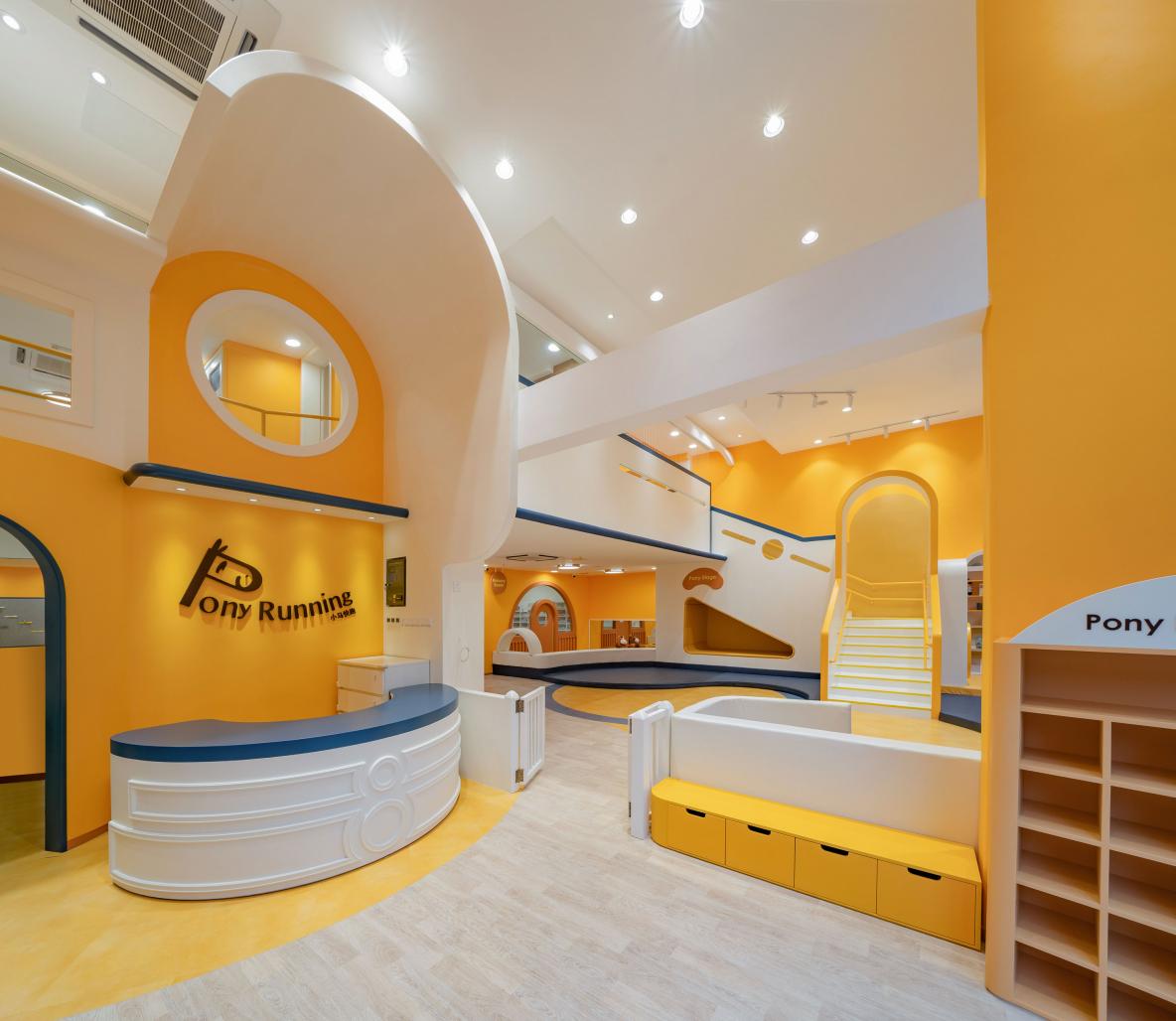
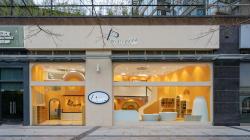
Transparent glass separates a shiny and bright yellow world of joy from the sober grayness of the city outside. Despite being surrounded by a forest of reinforced concrete, its warm atmosphere flows through time and space, favoring the spiritual growth of children. Pony Running, as the name of the brand implies, goes beyond the boundaries of traditional thinking, granting children invisible wings of freedom to move at will, explore and grow in an inspiring mini universe full of possibilities.
An Oriental Approach to the “Earth Building”
As an early childhood education institution, Pony Running is widely cherished for its rich teaching system. A small class structure stands at the core of its educational concept, focusing on the personality needs and potential of every child. To perform the brand upgrade, VMPDE Design was inspired by the emerging approach of an “Earth Building” found in the Western Architectural “School of Natural Life”. Based on the natural disposition of children, the use of adult “decoration” techniques was completely abandoned, highlighting the beauty and fun of the building itself, letting children be children in a free environment.
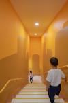
In terms of material selection, a large number of environmentally friendly materials were integrated into the design language, demonstrating the sustainability philosophy of the designers and educators, and creating an “oasis” for children among the concrete jungle. In terms of color selection, colorful schemes were rejected in favor of a unique main tone that enhances the appeal of the environment, letting people feel the moment, in a comfortable, happy, classic and pure manner, rather than focusing on materialistic attributes. Such positive psychological and emotional suggestions are transmitted to the outside world through the floor-to-ceiling glass façade, arousing strong resonance among the local people.
Regarding the relationship between decoration and practicality, VMDPE Design firmly believes that function is the core of the modern educational space. Thus, the designer parts away with redundant ornaments, shapes are reduced to their minimum expression, there are no meaningless decorations and only essentials for a healthy life are nourished, focusing architectural content on didactic functions and activities for children. On this basis, both spatial integration and color matching use the “simplest” techniques to highlight a natural and essential temperament, eventually devoting all the space to the children.
Unrestricted Social Life
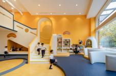
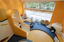
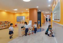
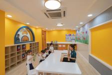
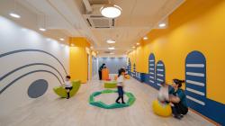
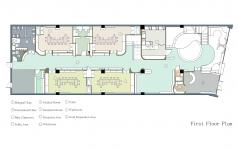
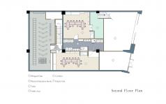
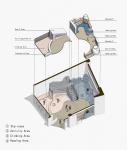
“Use the space itself to create purpose and beauty, revitalize spatial use and put it at the service of the user.” VMDPE firmly believes that children in the age group of 0 to 3 years old need socializing opportunities without restrictions, as they are eager to contact and communicate with children of the same age. Therefore, the spatial design of the project goes against that of most nurseries in China, reserving one third of the site as a dynamic integration of the social area, the reading area, the science area and the role-playing area. Together, they form the stage where children first try to establish community relations. In such a huge space, children are the main characters, while functions destined to adults or logistics remain cleverly hidden beyond children’s reach.
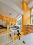
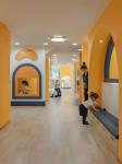
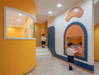
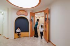
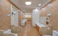
The entire social area adopts an open design that arranges several corners called “nests”, where children are free to choose their favorite location at any given time. The scale of the space has been carefully balanced, designing all corners in a way that allows teachers to observe, while transmitting children a comfortable feeling of privacy. Furthermore, everything from materials to the design style has been carefully thought to provide a high degree of safety in the area. This allows children to move freely, while teachers participate and guide activities on the side, stimulating children to learn to think during play and develop their own personalities. This is the place where children chase and play, they can play leisurely in a corner, they can be accompanied by teachers, or they can explore freely, in other words; empower children to choose for themselves, stimulating their personalities to grow in a natural way.
Reshaping Learning and Teaching
To design classrooms with small class structures proves to be a clear and concise approach based on the education concept of the brand. As such, the designer parts away with any cumbersome furnishings and complex color matching techniques, creating a positive learning environment for children to study, a place less susceptible to outside interference. Even more, children psychology is considered to design every corner on the right scale, allowing children to feel safe and relaxed, encouraging them to take part in group activities at ease.
Delving into the didactic features of Pony Running, VMDPE Design was inspired by the brand’s “Didactic Warehouse” to design a system that combines abundant teaching aids and courseware with environmental design into a unique “teaching tool input system” for every classroom. Thus, the warehouse strengthens the brand’s core concept by providing fresh and abundant content on a daily basis, making it easier for teachers to prepare and present effective educational materials that greatly stimulate the children’s potential.
When pondering about the status of early childhood education institutions in urban development, people realize that the rapid expansion of the industry demands growth spaces that truly belong to the children. In this regard, Pony does not advocate the “design” of the space, but the beautiful picture of the children and the space in natural harmony. Just like standing outside a shop window, the interior showcases a breathtaking world of pure innocence.
2019
2019
Project location: Junhui Xintiandi, Nanshan District, Shenzhen, China
Project type: Façade renovation and interior design, lighting design, prop design
Design period: July 2019 – September 2019
Construction time: September 2019 – December 2019
Site area: 626m²
Lead designer: Vinci Chan
Design team: Sean Ve, Dio Chang
Design development: Dio Chang, Nancy Lu
