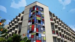
Architectural density whenever created is to benefit interaction and climatic conditions, and, above all to take maximum advantage of natural topography and vegetation which the campus has got as nature’s gift, that can be instrumental in the making of the campus a memorable experience.
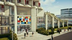
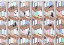
The newly constructed boy’s hostel sits very cozily in a corner of the institutional campus. It was the straight roads and strong straight lines that dictated the form of the building that is to be curvilinear and rounded in general handling of the flux. The form was divided into two blocks that were separated by a mess and kitchen block. The subtle shift in the axis from the symmetry has given a new dimension in the geometry of the form. The “seemingly symmetrical” plan is accentuated by the angular balconies that protrude out and shift access on every floor.
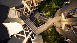
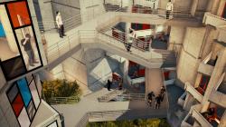
Abiding by the strict norms of the existing zone, the parameters brought out the creativity in the forefront. Four hundred rooms adorn in two wings of this hostel. A central court along with the linking bridge is the lifeline of this project. It is breather, a space provider divider, and a reminder of Mother Nature’s bounty which is all surrounding.
The bridge is a unique design with a direct link and one arm that becomes the staircase connecting the lower floor. In its design and formation, this linking bridge transports students innovatively, never losing interest in the movement and visibility.
There is an abundant privacy and sunlight. Small ventilators for natural air have been provided on top of the almirahs. There is no provision for air conditioning in these hostels and therefore is necessary that natural ventilation is adequately provided. The shifting balcony’s effect is so dramatic that it calls for repetition, and that is what the architect has tried to do. Both in physical effect and implied, the interiors have an effect of calmness and possess both the austerity and serenity of a zen garden.
We are accustomed to thinking of nature as a backdrop for architecture, but here I had seen architecture function as a backdrop for nature and how pleasing that is.
The natural parameters and design achievements.
• To harness the natural surroundings.
• To orient the building in such a way that all rooms have ample light and ventilation.
• The central court concept has been used for a free flow of ventilation and to use this court as a buffer between the rooms.
• All rooms are with the balcony and orientation being in the most positive direction.
• Toilet blocks are at the ends as separate identifiable blocks.
• The open planning, the ambient green environment, the orientation of balconies or the best-harnessed design elements in this project.
• The treatment of the corridors is immersed in light and at no point, there is a dark patch.
• The central court provides avenues for interaction and encourages constant participation.
2019
0000
SITE AREA: 21000 SQM
BUILT-UP AREA: 19000 SQM
NO. OF ROOMS: 400
CLIENT: IIT ROORKEE, INDIA
COST: 8.4M USD
Major design achievements and architectural features
• Effectively designed windows and ventilators and interconnected courtyards aid in cross ventilation.
• Window design encourages the use of daylight in an efficient manner reducing glare.
• All rooms are adequately daylit and skylights are provided in the corridors which create an interesting transition with shafts of daylight illuminating the long corridors.
• Formation of light shafts with the help of skylights over the corridors to increase light penetration into the corridors and into the rooms.
• Interlinked courtyards help in increase of heat loss by ventilation, which also for, functional spaces.
• The design maximizes the use of locally available materials.
• Innovative treatment of corners in the corridors by providing skylights to minimize dust collection and cobwebs.
• Daylight integration has been used for reducing energy usage.
• Natural lighting is extensively used by providing courtyards which become permanent sources of light and ventilation.
• The building design and form evolved to maximize daylight utilization and induction of natural ventilation.
• The typical vernacular design did as much as terraces. Natural brick facades, the use of brick toile construction techniques, the bright colours used in the corridors, the central central court, the curved balcony, the use of green coloured tile on the parapet are all implied local design elements, which are all an architect’s delight.
Planning success in achieving energy-saving and sustainable design
In rooms layout
• Cutouts in the corridors are specific at places which would be underutilized are now providing cross ventilation, view and light. By this the corners which are neglected and accumulates dust is now non existent and infact got to use.
• Specially designed aerators facilitate natural ventilation. The vertical slit fenestration enhances the flow of air through velocity.
• High-level window on top of the cup board is for cross ventilation as the rooms are non-air-conditioned. This area otherwise remains redundant and under utilized. This small innovation in planning enhances natural flow of air and increases light.
• Crazy pattern flooring out of broken terrazzo tiles and unfinished kota stone. This application is skill-oriented and involves as well as promotes craftman ship and traditional heritage.
• The balconies act as a protection in front of the rooms to break the direct sunlight and to provide shade on the windows below it. The design is such that most of the building takes the “shade” as its companion for providing cool vertical and horizontal surfaces throughout the building.
• Natural brick walls are primary load-bearing structures. This is not only cost-reducing but also ecologically rich in this region. The red brick finish brings the whole ambience to a domestic scale which is rich to habitat.
• The corridors are well lit through skylights. Cutouts are provided in the slabs for natural light. Kota stone is the basic material used for major circulation. The monotony of the movement is constantly broken by punctures of cutouts and through diffused blue light coming from the sky light.
• The interior planning comprises of primarily one bed. A study table and a chair, placement of each unit effectively using minimum circulation and taking advantage of the windows for best orientation. Terrazzo tiles are used for flooring.
• The placement of the bed is such that the view of the court is constantly appreciated. The study table is placed against the wall minimal disturbance yet get the best light while studying.
• Unhindered circulation through planning is achieved.
PRINCIPAL ARCHITECT: SANGEET SHARMA
TEAM:
ASSOCIATE ARCHITECT: PURNIMA SHARMA
TEAM SDSA
Favorited 2 times


