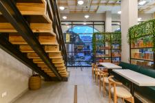
Located in the commercial capital of Madhya Pradesh, Indore, Bake-n-Shake, is the very first choice of the city when it comes to bakery which has now been an established name for a decade. It reflects contemporary style through its design. The aesthetics are minimalist and it is a blend of comfortable, liveable elements that create a sophisticated, elegant and fresh look.
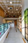
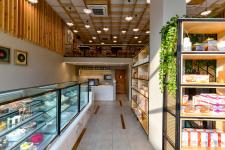
As we enter, we have the double height entrance foyer which further divided into two separate areas, with the purpose of segregating activities. On the left hand side is the retail display of all the bakery items and café bar whereas, the right hand side has been utilized for seating purpose. Cool white light for the confectionery display with and sparkling satvario marble base complements the overall warm atmosphere. The vertical wooden strips are placed in such a way with grey tiles, giving it a subtle yet distinctive look. The rectilinear layout of the whole space and easy accessibility to the mezzanine floor makes the circulation of the place very comfortable.
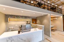
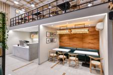
The billing counter is made of satvario marble with a grey tiles which provides a storage space beneath. Behind the billing counter is the service counter on which a series of bottles are composed, with bigger bottles at the top and small glasses at the bottom for the purpose of preparing mock-tails and shakes. It also connects with the kitchen through a small service window on the wall beside the shelves. This area is accessible from the adjoining functions, the bakery counter as well as the seating. The seating beneath the mezzanine has been treated like a corner of privacy which consists of a wall finished with brown veneer. This is purposefully done to form a little cozy nook. It includes a linear couch, two tables and low back rest chairs providing variance to the seating with a unique hanging light above.
The entrance arched façade with the pitch black mullions creates attractive frames with the glazing of glass offering full visibility and glint of sunlight diffusing in the seating area that binds us to the exterior environment producing a lively and soothing ambience. The prominent and eye catching feature of the space is its industrial look railing made of pine wood and MF frame which continuously flows to become the mezzanine railing giving a seamless look. Keeping harmony with the theme, storage shelves with wire mesh has been designed in a way meeting the requirement of partition as well as confectionery display, highlighting the trailing plants atop. The berch ply grid emerging from the ceiling accommodating the air conditioning system and electrical wires avoiding the chaos of wires giving it a clean and uncluttered look. To enhance the effect of double height in the area, upper part of the walls is treated with wooden rafters in a subtle way illustrating minimalism through its design.
Uniformity has been maintained in the ceiling design throughout. Hanging lights suspended from the ceiling enhances the grid pattern of the ceiling. Primarily, the seating is at the mezzanine floor visible from below. A rather simple seating is provided in the whole space. It includes a linear couch, tables and low back rest chairs. The chairs are a blend of comfort cushioning with a round backrest which depicts minimalism through its design. Suspended lighting produces a surreal effect especially when viewed from the mezzanine floor.
The collage of frames has been used to create a drama in the space. These include portraits, graphics, still life, abstracts and modern abstract paintings. They follow a uniform pattern throughout the walls with colour scheme of vivid red and black which are adding a splash of colour to the lighter tones. Adding red colour induces appetite and also symbolises adventure reflecting a fun and homely place for food lovers.
The choice of materials has emerged keeping in mind the latest trends and comfort of all types of user groups, which has, in turn, justified the intend of the project. Overall the exterior façade shows how a simple entrance can be transformed into a classic design by adding a few elements like white brackets, mouldings and beautifully carved statues highlighted with vintage lanterns. The use of wood is standing out in the interior, and its amalgamation with beautiful lights makes it a perfect place to have long talks with some snack or even just a cup of coffee.
2017
2019


