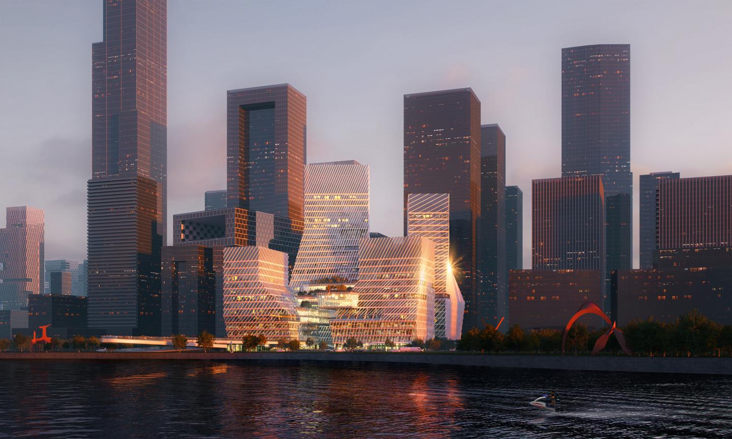
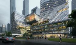
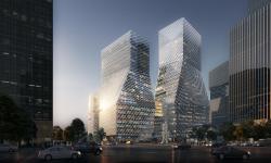
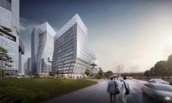
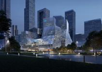
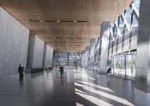
With locational advantage of super headquarters area and planning framework, CEC Shenzhen Bay Headquarter is designed based on an in-depth research of urban structure, which is meant to provide innovative urban design strategy for Shenzhen’s CBD. The design starts with the concept of “city layer” from Chinese historical cities again and comes up with more effective urban complex design strategy according to current policies: remove the boundary between commercial podiums, high-rise tower and public space, create multi-dimensional city layer.
Located in the coastal section of Shenzhen Bay Headquarters Base area, CEC Shenzhen Bay Headquarter is consisted of office, commercial, culture and supporting facilities, covering 160,000 square meters. It’s surrounded by Baishi No.4 Road, Shenzhen No.4 Road and Shenzhen 2nd Street. Abundant bay resources will make it the most valuable land around Shenzhen Bay area in the future.
We hope to use urban design to uncover the relationship between individual buildings and city texture under the super-block grid system by analyzing urban forms of Shenzhen. We seek to find out methods of designing forms and optimizing spatial configuration from existing combination modes, make quantitative analysis of current environment through city’s height and verticality, then develop approaches that can meet needs of urban extension and have close connections with existing urban system.
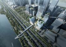
Basic building volume is generated according to the current construction condition and urban planning requirement of Shenzhen. The east-west city texture remains unchanged to make a cluster of buildings extend towards the heart of Shenzhen Bay Headquarter. The building block unfolds in the south-north direction to create a south-north visual corridor. We incorporate urban pedestrian system into coastal park area, enhance the connection between the base and coastal park, offering a sightseeing and ecological corridor to urban space in northern parcel of land.
The plot ratio is adjusted between the two parts of the site by means of area replacement, making the four towers look like an upward spiral and complement with the city skyline of Shenzhen Bay Headquarter. Meanwhile, it offers scenic views and improves the openness of office towers in the northern part. An overhead corridor is established between the four towers along with spaces provided for communication, relaxation and greening to strengthen the connection among the four buildings. The structure of overhead corridor is simplified to reduce the impact on the buildings beneath it according to the daylighting requirement.
Considering the location, environment, ecology and image of the four towers, T1 main building is a self-owned property of CEC and its maximum height is 120 meters. Connecting with the main building, T4 is a hotel that serves CEC staff, and it is an iconic building with the best city image. The top part of T2 and T3 tower are for sale or rent, owning excellent landscape views and urban identity.
The façade is designed depending on daylighting requirements. The slanted aluminum curtain wall uses electronic components and slanted appearance to enhance a flowing form of the building. Horizontal floor and slanted curtain wall show a “connected” façade to mitigate “massy” image and visual discomfort of tall structures standing around. A few hollow sunshade parts and viewing balcony are combined to increase openness of the curtain wall and urban publicness.
Apart from Asian existing vertical urban forms, we make coastal environment closer to nature. As for buildings, their connecting parts with various functions are intended to serve different purposes of life and work in each building; when it comes to traffic, the multi-layer first floor of buildings is connected to urban public transport system, rapid transit system and basic transport system as well as multi-layer pedestrian system for different purposes.
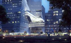
Unlike public space of traditional offices that are mostly in a fixed height and position, we make public space interwoven horizontally and vertically to create a “penetrative” atmosphere, allowing colleagues to have more chances to interact and communicate. In addition, green environment also extends in different directions and daylighting angles, which becomes more natural and versatile than before.
Three-stage tower design is a “concession” for the bottom part and top part. The “concession” in the bottom part offers the tower a relatively wide entrance, which increases a sense of ceremony; the “concession” in the top part of southern tower makes the building look more “friendly”; the “concession” in the top part of northern tower increases daylighting for its bottom part and delivers a more open building cluster and broader south-north visual corridor.
The ladder-shaped underground commercial space and tall office towers make up a series of independent yet connected viewing platforms. Three-dimensional gardens differ from each other to bring unique experience space for lessees and owners. Viewing balcony and central viewing platform constitute vertical greening system, and multi-layer greening system and public platform are put together to form open urban public space.
2018
0000
Gross floor area:160,000 square meters
Total area: 12,500 square meters
Landscape ratio: 21.3%
Building density: 53.9%
Plot ratio: 8.58
Building storey: 28
Building height: 120 meters
Design principal: Jun Gong, Hui Sha
Design director: Haitao Hu, Wang Lin
Design team: Wang Lin, Hu Yongheng, Lu Da, Liu Yange, Ziwar Al Nouri Andrea Carniti, Jiani Chen, Chenwan Qin
Co-designer: T22 Architects
