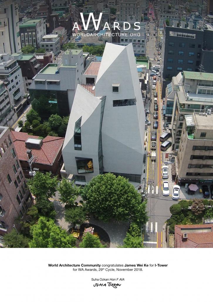
This is a special building which doesn't avoid the contradictory nature of its site and its program, but instead transforms them into the futile ground from which a unique creation was grown.
Nature vs. City
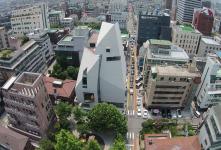
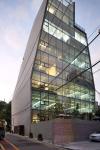
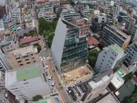
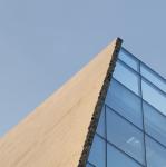
Just a few blocks from Gangnam's dense business district, the project sits on the border between a small park to the north and mid-rise buildings to the south. Across this micro-boundary between city and nature, we gave the project two contrasting face: to the park side, it presents a solid concrete facade, akin to a massive rock mountain in nature; to the urban context on the south side, it opens up with full panoramic curtain walls, like a lantern. Not unlike "Despina" in Calvino's "Invisible Cities", the building's two opposite faces answers to the desire of nature and of the city.
Sunlight + Facade
Most building in this area adhere to the daylight set-back regulations by stepping back each floor as it ascends. We linked the critical set back points to create a sloping facade, both satisfying the regulation and achieving a building massing of sculptural quality. The solid facades are broken into three large main pieces, their juxtaposition and overlapping creates narrow chasms, to allow for indirect sun-lighting and glimpses of the surrounding to the east and west.
In the evening, seen from the park, the building presents a mysterious massing with narrow slots of lighting, leaving the calmness of the nature undisturbed. From the south side, the curtain wall lights up like full-blaze during the night; and soaks up direct sunlight during the day.
Most of the computer workstations are positioned behind solid facades, eliminating direct sunlight.
Sculptural Quality vs. Interior Function
The sculptural quality of the massing is carefully calibrated so that the resulting floor plans are entirely rectangular and efficient at each floor. Furthermore, the sloped facade is made of structural concrete that acts like a curved beam. Together with the concrete core, the structural facade enables each floor plan to be completely open, with only a single column. As a commercial building without common corridors, the efficiency of usable floor area is well above 90%.
Sectional Quality vs. Volumetric Efficiency
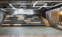
Sectional-wise, the building houses a parking lot at the first basement level and a 300 seat, multipurpose theater at the second basement level with a separate entry. The main floor is a public restaurant and the 6 floors above contain open spaces that are 4.5 meters in height.
The core volume contains rest areas, elevators, staircase, bathrooms, and storage and computer server rooms. Since the smaller spaces in the core do not require tall ceilings, the floor height was reduced to 3 meters. Thus, two levels of office floor equal three levels of core space, maximizing volumetric efficiency.
(Office fl. to fl. height) 4.5 m x 2 = (Core fl. to fl. height) 3.0 m x 3
The entire working floors contain 200 workstations, 8 conference rooms and 6 executive offices, with no wasted corridor areas or hidden volume above false ceilings.
More is Less
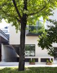
The strong concrete form on the exterior is an iconic image, structural shell, and finished exterior material all in one, with no need for extra cladding facade materials or paint.
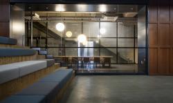
The richness of forms, fenestration, sectional composition, all combine to create an interior that is full of spatial complexity, eliminating the need for additional interior cladding or decorative surfaces. All ceilings are exposed; floors are mainly made of polished concrete, walls are a simple layer of gypsum board over thermal insulation materials.
Unlike a standard office building with typical floor plans, this building offers a wide array of views, potential space configurations, direct and indirect lighting, open floor plans and walls at interesting angles. The spatial complexity has greatly reduced the desire and need to "decorate". In all these instances, the more intricate the architectural form, the less one has to “dress up” the interior space.
Form Follows Time
As a headquarter for a digital marketing agency, the client desires a special icon with a sense of timelessness, all the while equipped with the flexibility that adapts to the fluid nature of the trade. The solidity and massing of the building, with its contrasting facades, is an artistic answer to the demand. On the interior, the open space, efficient core, open ceiling and a minimum of interior cladding materials makes re-arrangement and wiring as easy as possible.
In this building, functional efficiency, programmatic flexibility and symbolic form can be complementary rather than contradictions. The outward image of the building responds to a timeless duration while the interior readily adapts to rapid changing spatial demands. Instead of “form follows function”, here is a case of "form follows time"
2017
2017
Architecture Design: Chiasmus Partners
Interior Design: Chiasmus partners
Lighting Design: Chiasmus partners
Design Principals: Hyunho Lee, James Wei Ke
Design Team: Narae Yang, Noumura Chika, Yeseul Huh
Construction Company: Coremsys
I-TOWER by James Wei Ke in Korea, South won the WA Award Cycle 29. Please find below the WA Award poster for this project.

Downloaded 25 times.

