Submitted by
Multi-Brand Boutique Reflects Audrey Hepburn's Impeccable Fashion Sense With Rounded Shelves
teaser2-1--2-.jpg Architecture News - Aug 18, 2021 - 09:53 2569 views
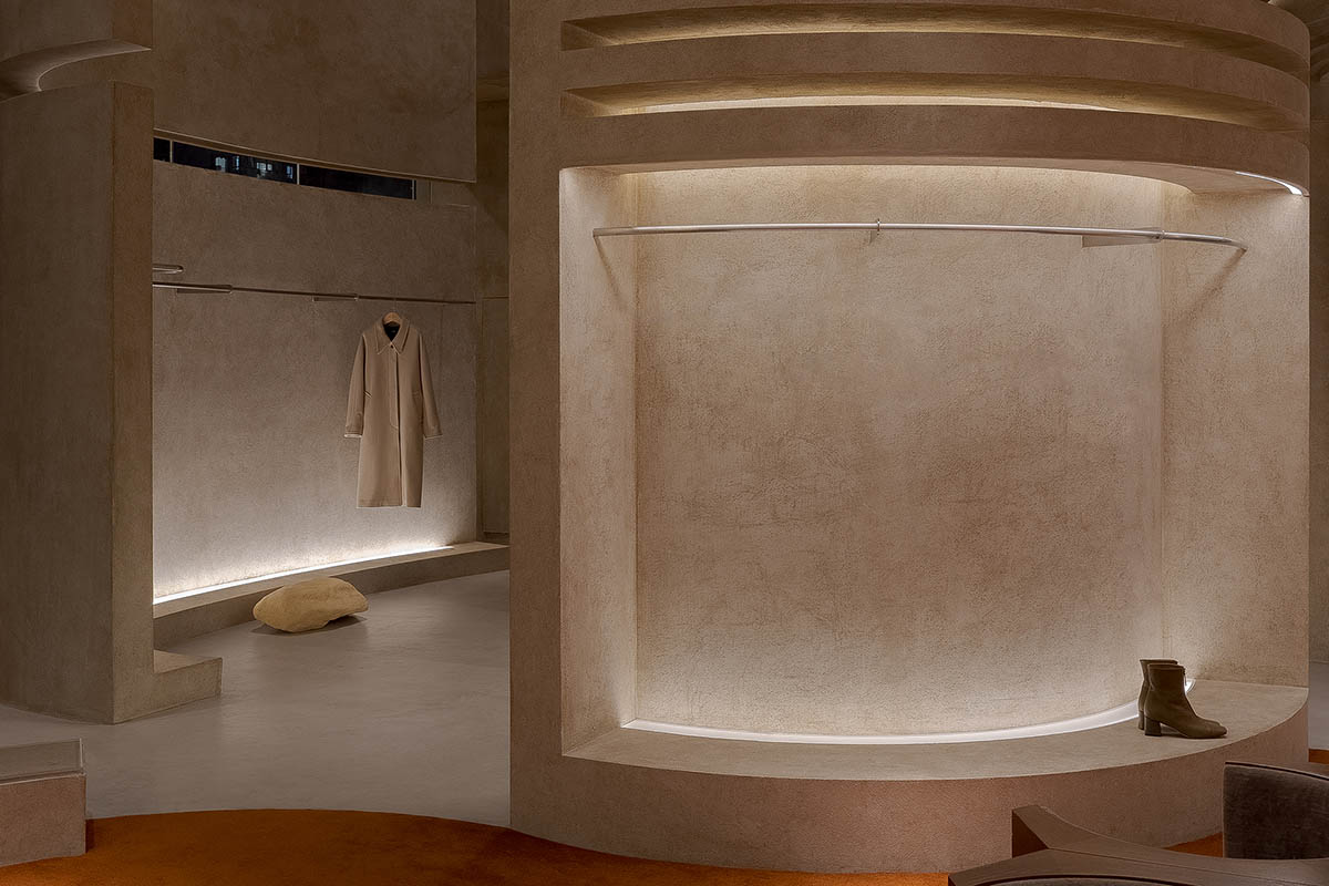
Chinese architecture and interior design firm Liang Architecture Studio has designed a multi-brand boutique that evokes the character of British humanitarian actress Audrey Hepburn, who is known for her impeccable fashion sense, graciousness and beauty.
The boutique, named AUDREY Boutique, was named after the death of Audrey Hepburn in 1993 based on the boutique owner's requirements and brands introduced into the store, the design team explored the attitude that the space was intended to convey.
Clothing display area
Based on these references, the architects aimed to explore "retro-futuristic" concept, combining both retro and futurist elements to create a dramatic space where past, present and future merge in the interiors.
Located in Shanyin Road, Xiaoshan District, Hangzhou, Zhejiang, China, the 300-square-metre store features soft fabrics, retro wood textures that weaken the coolness and rigidness brought by concrete and metal.
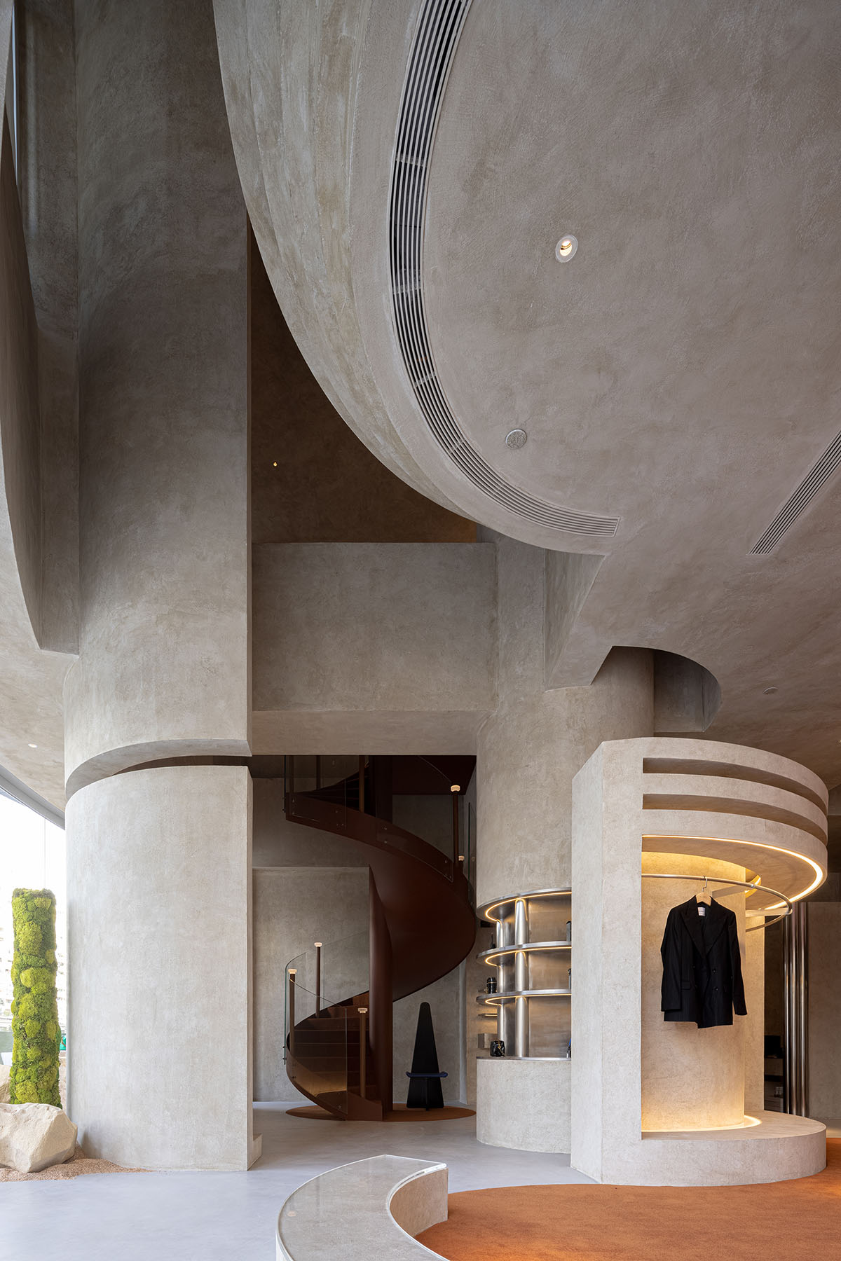
Entrance
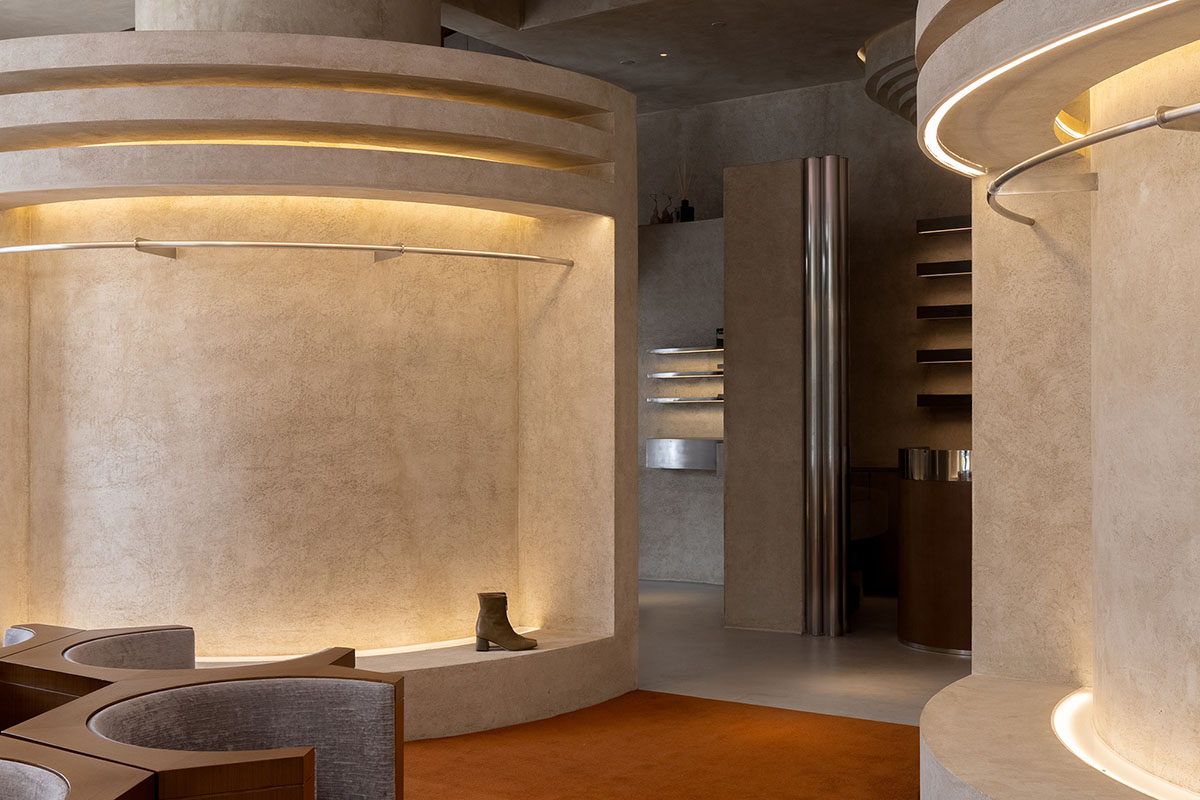
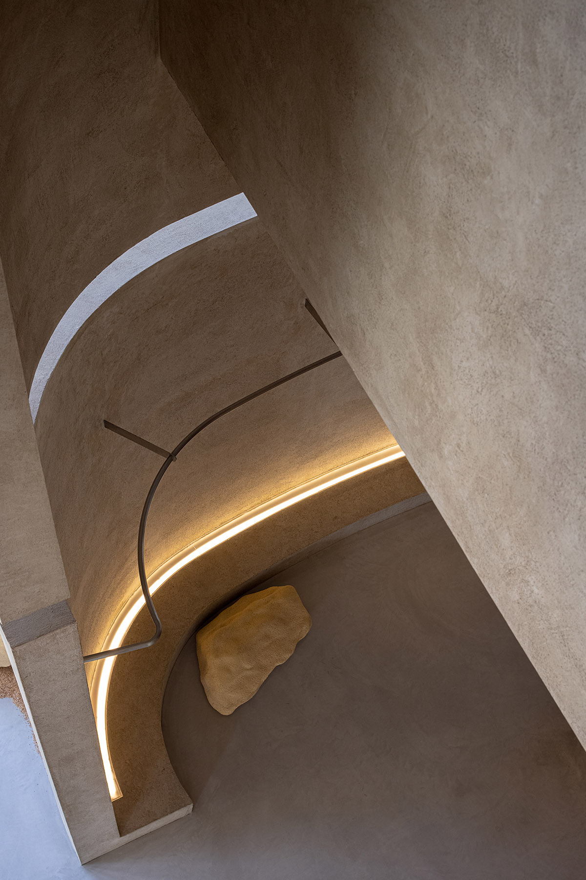
Soft curves, rounded edges, earth-toned display areas become the main elements that are the basis of functions and layering of space. The interior space presents a continuous flow while customers moving inside.
As the studio explains, this determined a design approach that not merely started from forms or visual effects. Like Audrey Hepburn, the founder of AUDREY has a graceful appearance and a strong will, which shows an attitude.
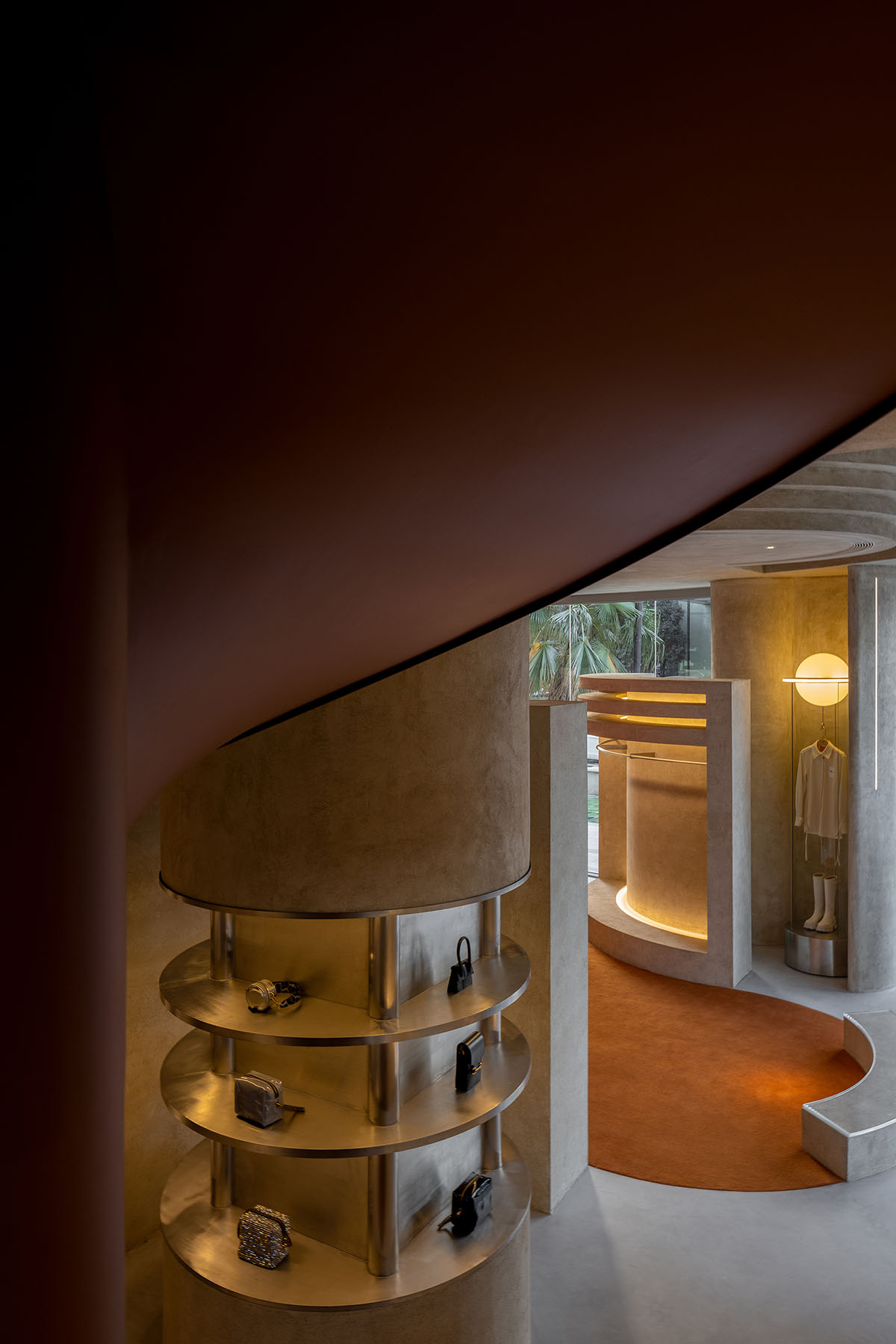
Jewelry display area
The design team hoped to express such an attitude in the store, where consumers can explore the spatial structure defined by softness and hardness.
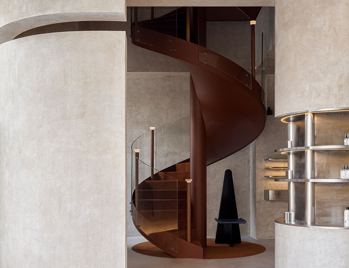
Jewelry display area
The classic, eternal and confident attitude expressed by this fashion boutique defines the brand's positioning and target customers. The design team didn't pursue trendy design for this store, but intended to build connection between eternity and balance, and dialogue between past and future.
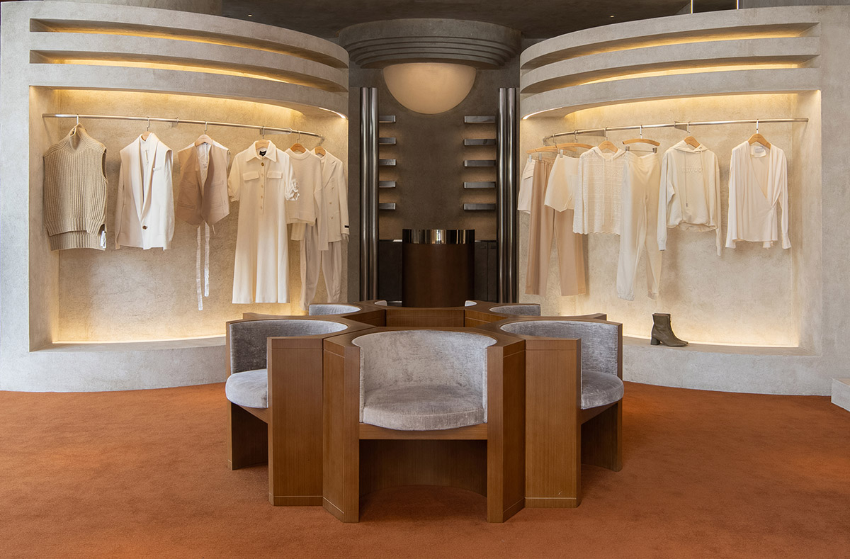
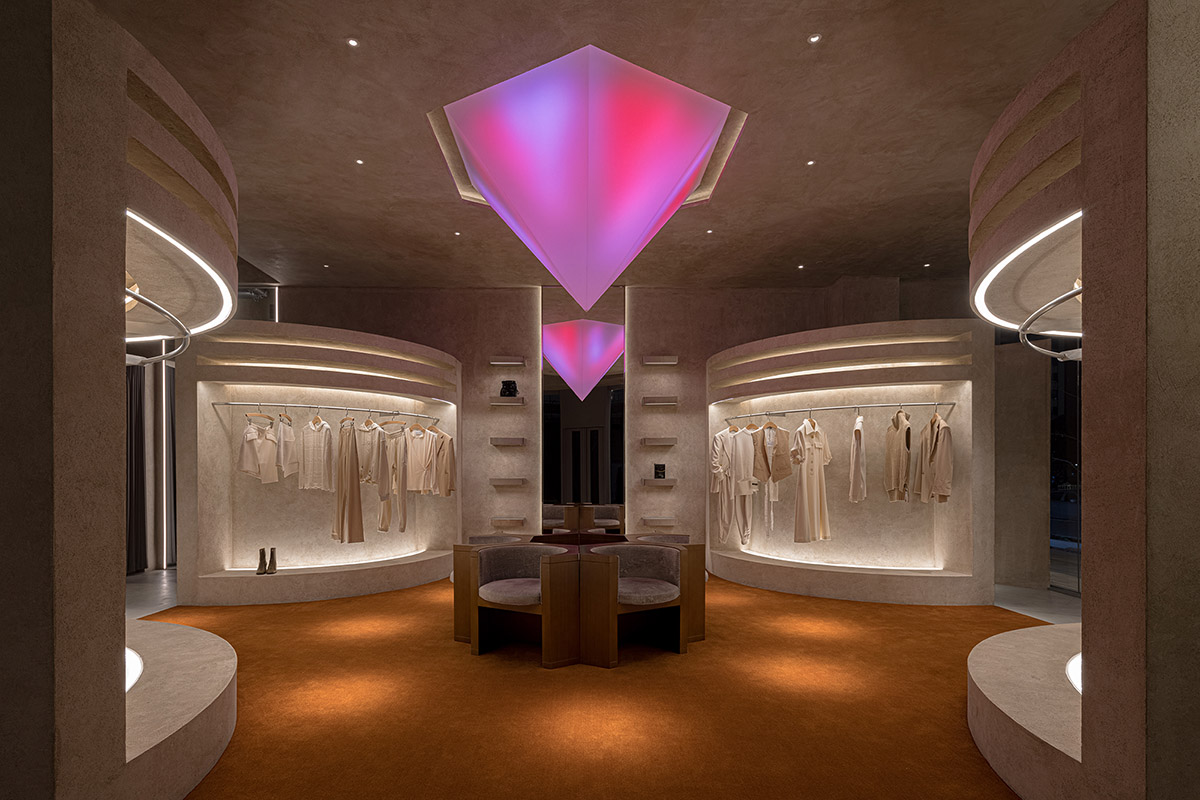
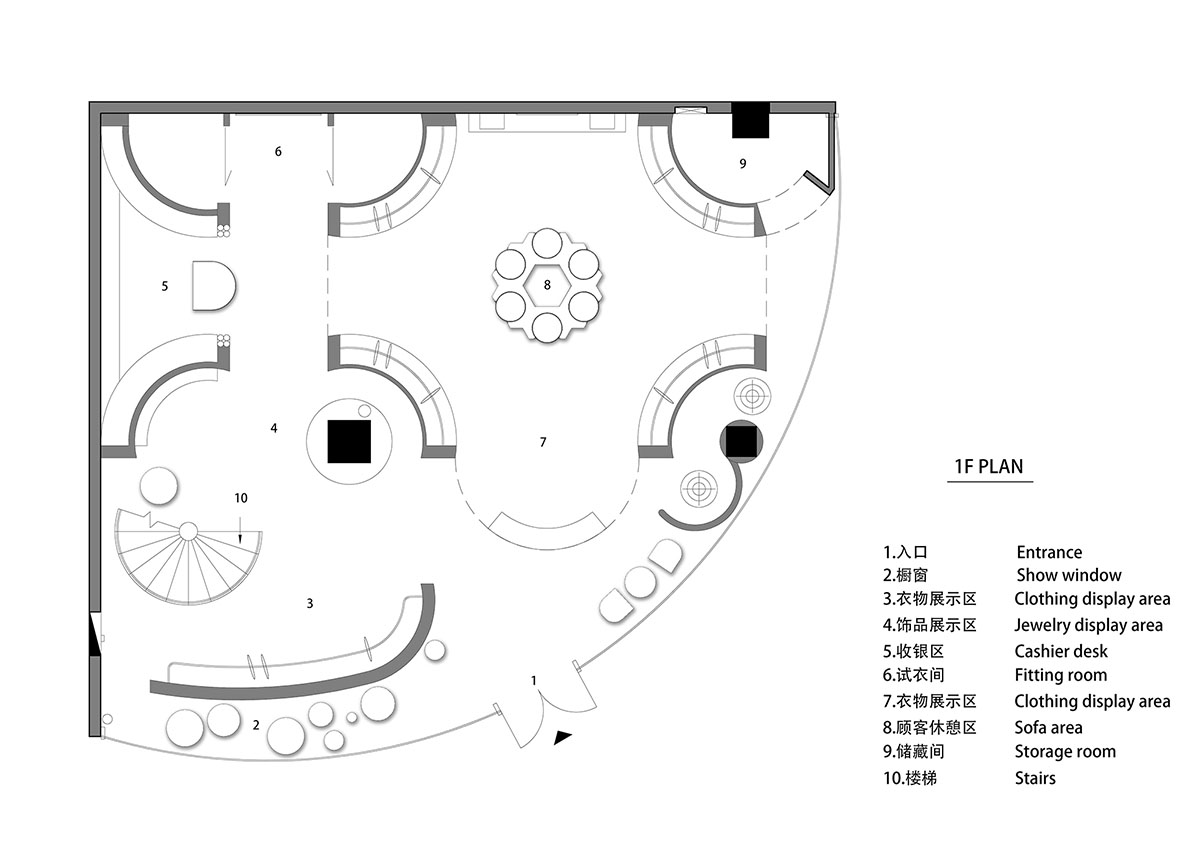
Stepping into the entrance, customers will arrive at a semi-enclosed symmetric display area. The seating area at the middle is composed of five chairs, which form an enclosure. It shows a sense of ritual and welcomes customers in a low profile.
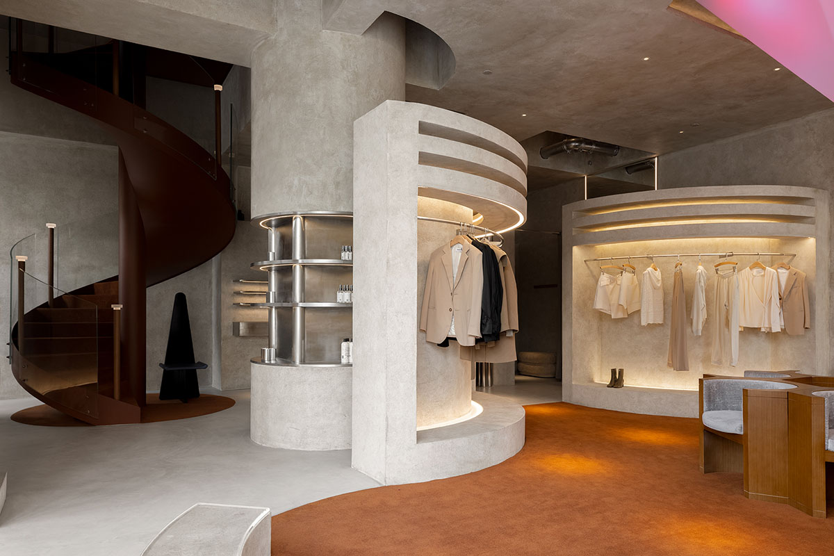
Clothing display area
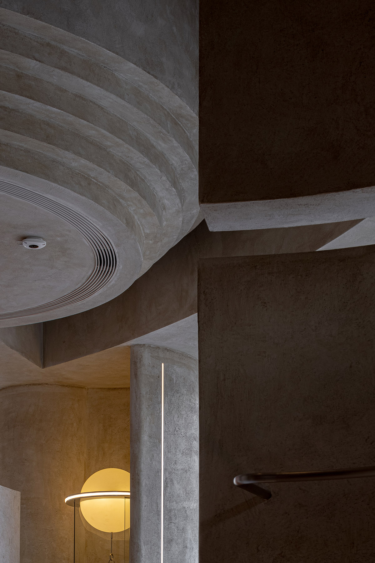
The architects utilized graceful curves and sharp geometric elements to shape the forms of structures and display props in the store, and meanwhile adopted symmetric languages to construct the overall space.
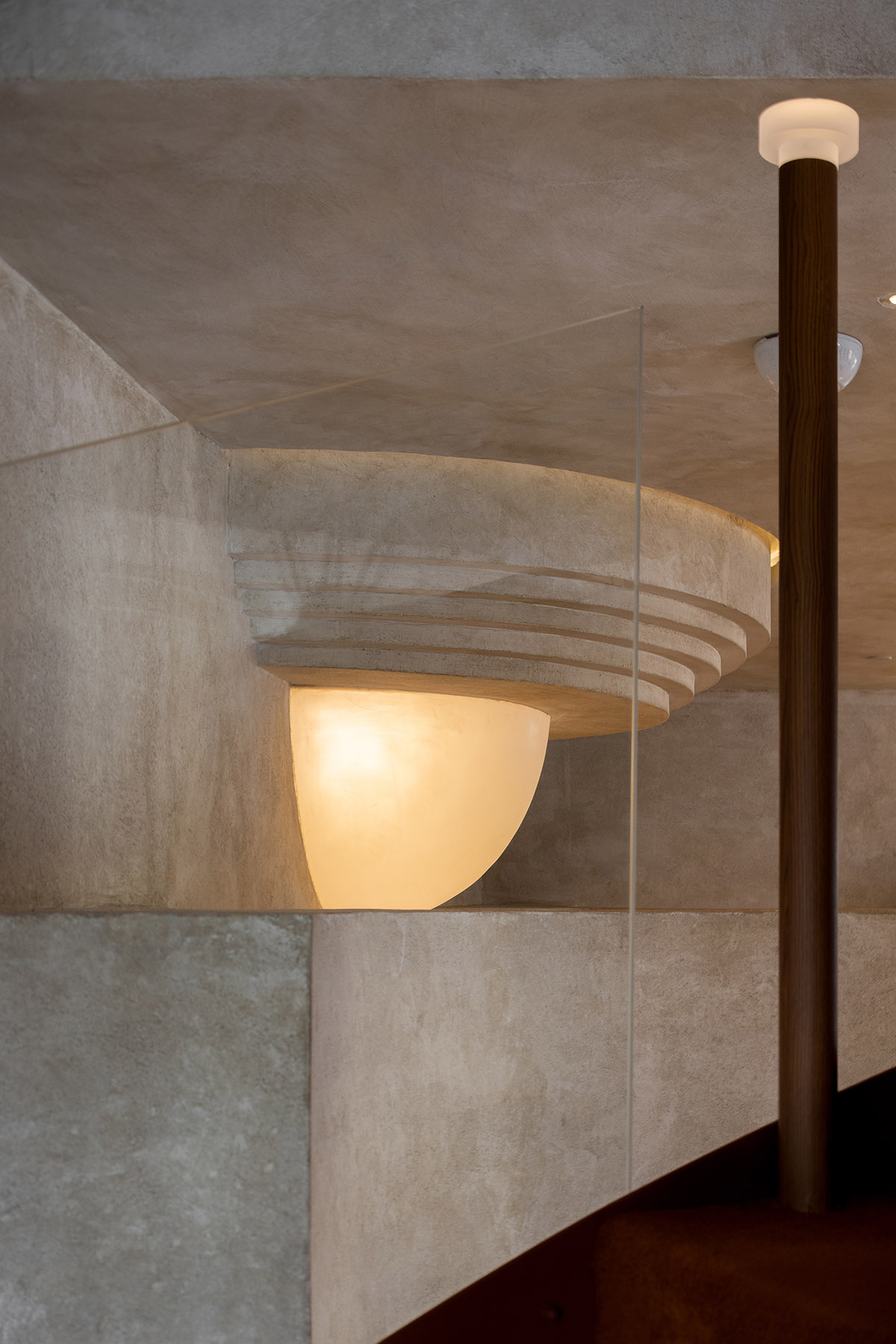
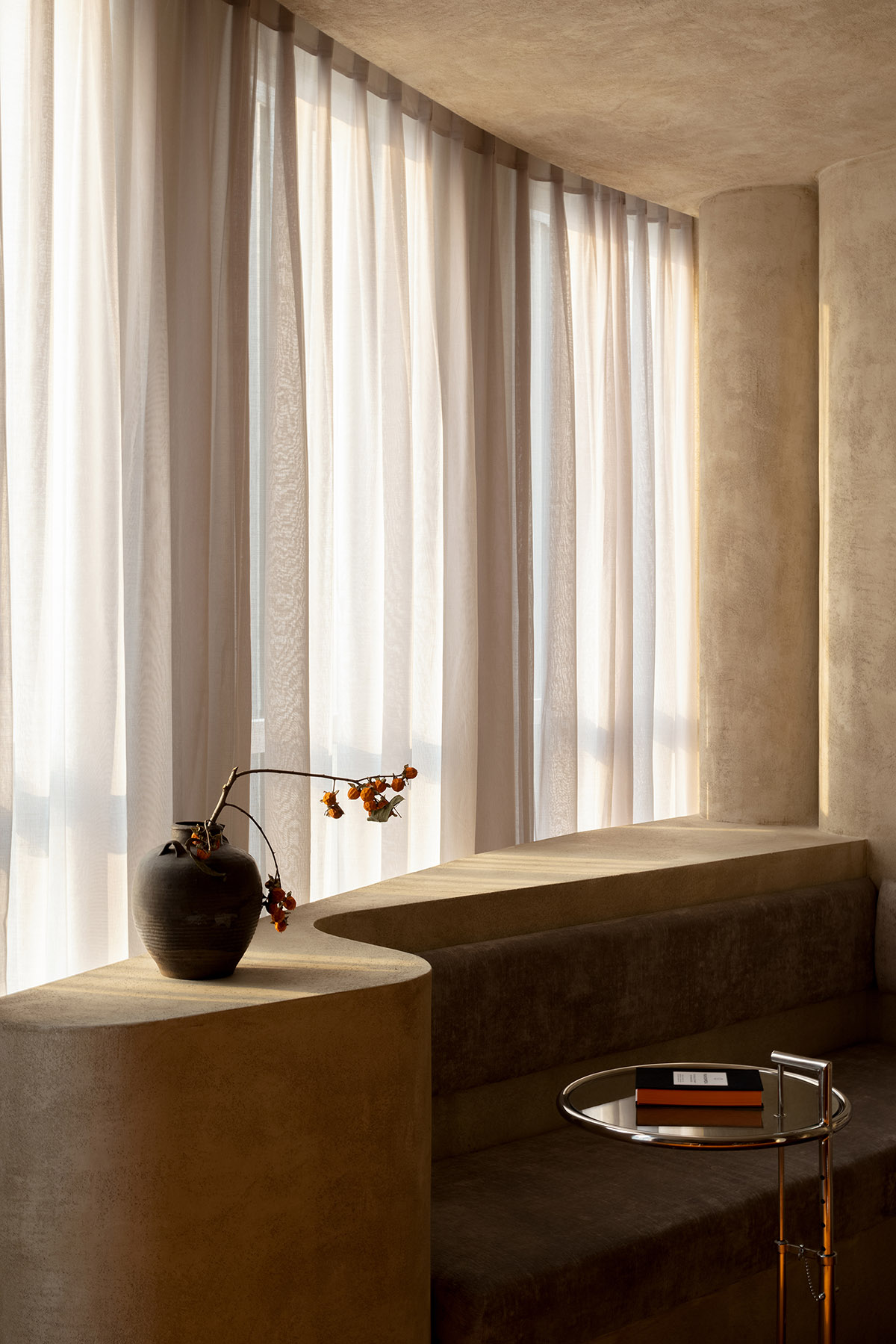
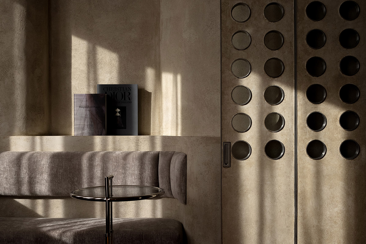
The meticulous material selection defines the spatial form and layout to some extent. The soft fabrics and retro wood textures weaken the coolness and rigidness brought by concrete and metal.
The material textures and structural forms help blur the boundaries between different areas, and endow the space with changes and greater value. This is a space that dialogues with the brand, establishes an attitude, gives a voice to the market and pursues eternal beauty.
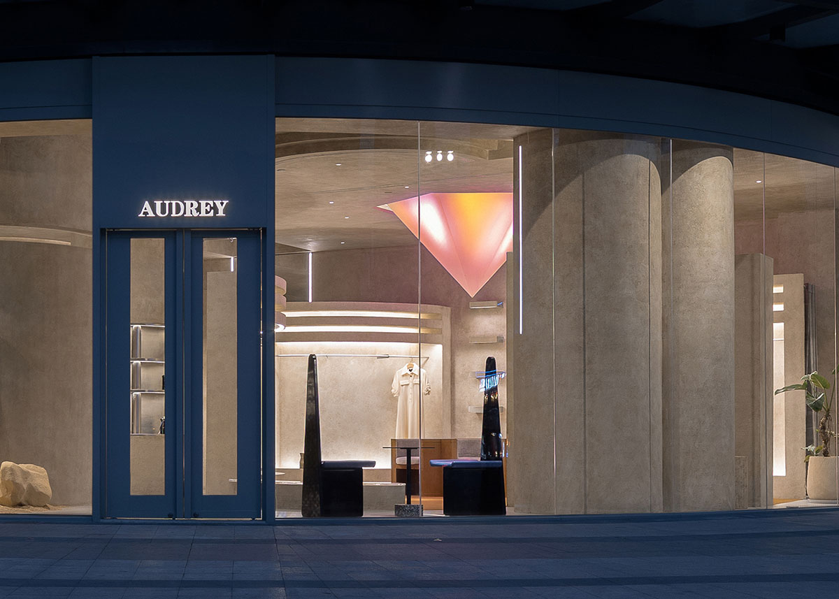
Façade
Graceful curves outline plain concrete display structures, which generate a comfortable, artistic and free spatial atmosphere along with the hanging clothes.
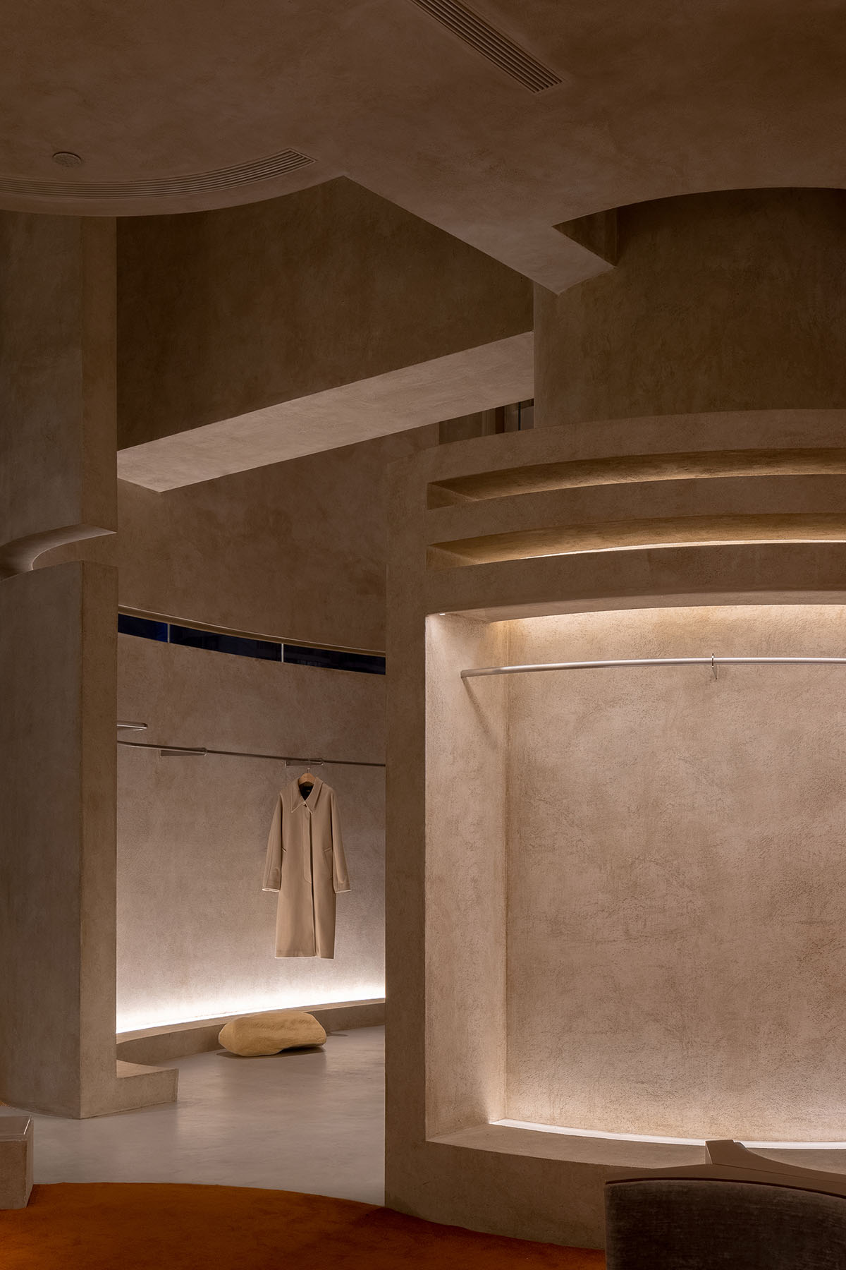
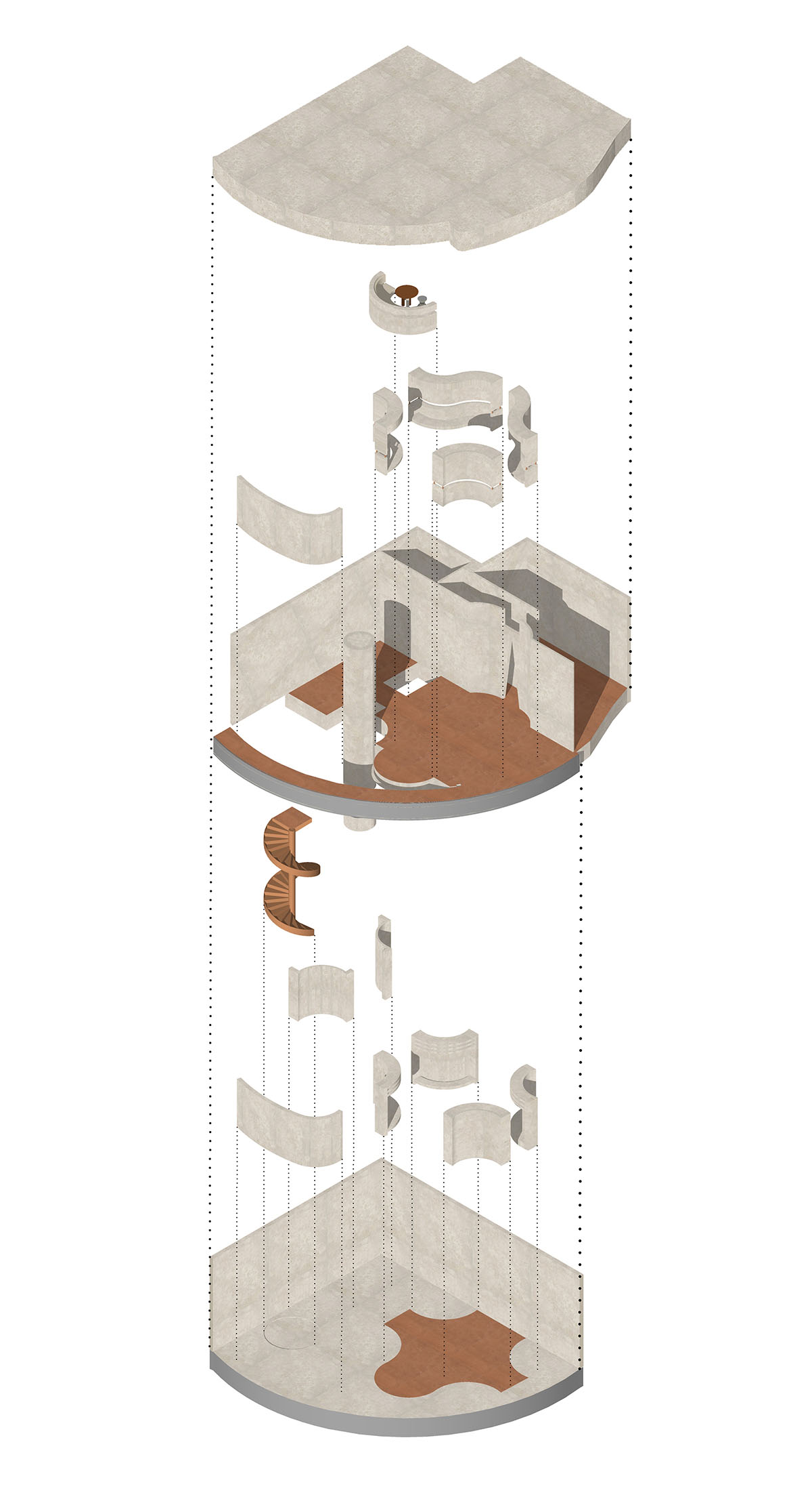
The designers reshaped the architectural space through interior structures. With similar or varying forms, those structures are given different functions and attributes. The textures of the space and structures are simple, but expressive.
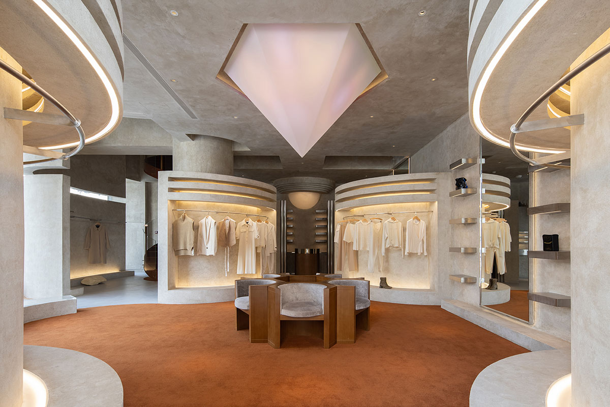
Clothing display area
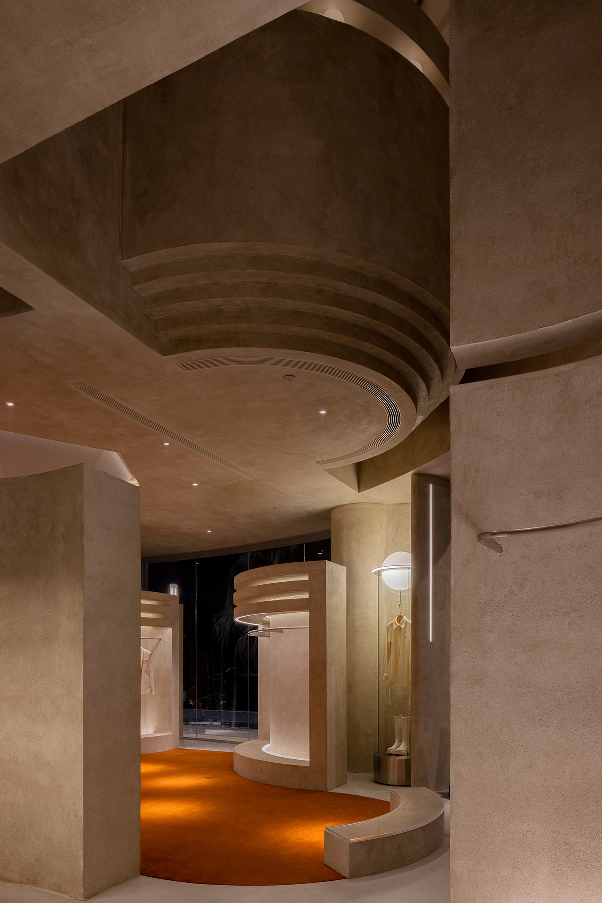
The space has two levels. A grand, bold spiral staircase connects the two floors of the store, and creates a visual highlight with its strong hue and spiral shape. In addition, the soft textile cladding the steps adds a romantic and dynamic ambience to the space.
The second floor functions as a VIP display area. In order to give the consumption experience with a sense of ritual, the designers introduced church-like structures into the space.
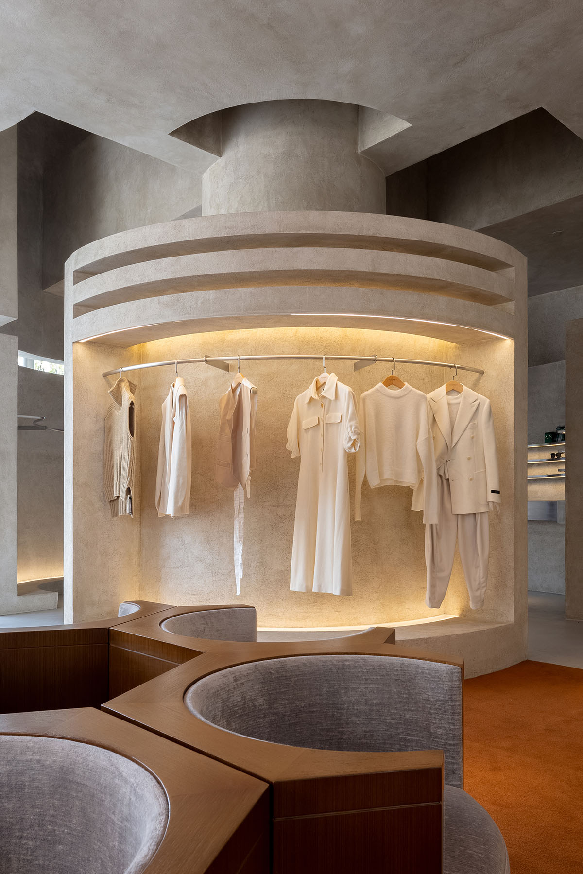
Clothing display area
This floor continues the central-axis-based composition and symmetric languages of the first floor, and features a sense of ritual and holiness. It's free, yet sedate to some degree.
Clothing display area
"The freedom of this space is not about visual effects but emotional expressions. Customers will be attracted by its atmosphere and be guided to perceive its attitude," said Liang Architecture Studio.
"Spatial design is a medium of communication," the studio added.
Clothing display area
For this project, the design team combined colors, structures and lights to create an ambience that resonates with people, hoping to provide diversified spatial experiences. Simplistic, clear structures and pure textures together express the spatial aesthetics.
Cashier area
Clothing display area
Clothing display area
Clothing display area
Clothing display area
Clothing display area
Jewelry display area
Stairway
Stairway
Clothing display area
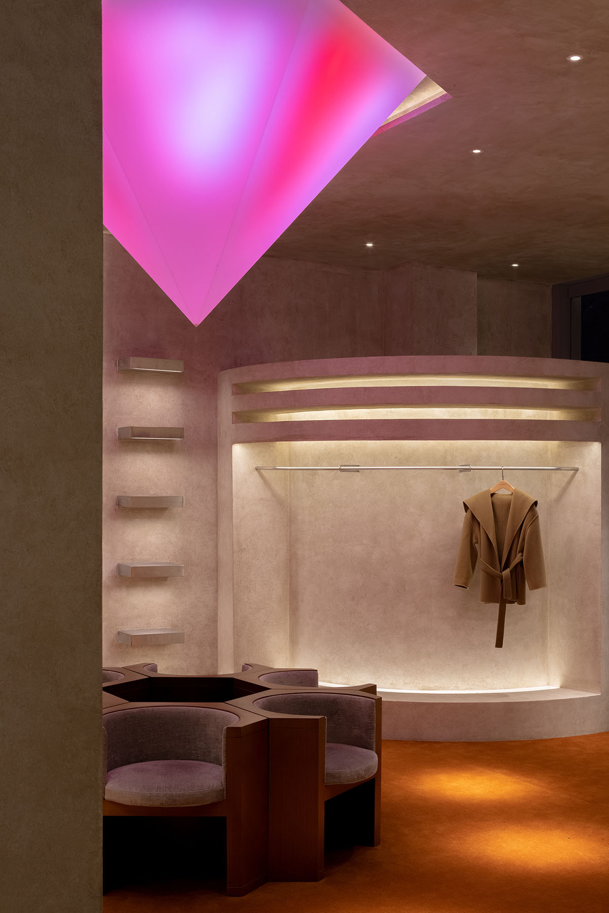
Clothing display area
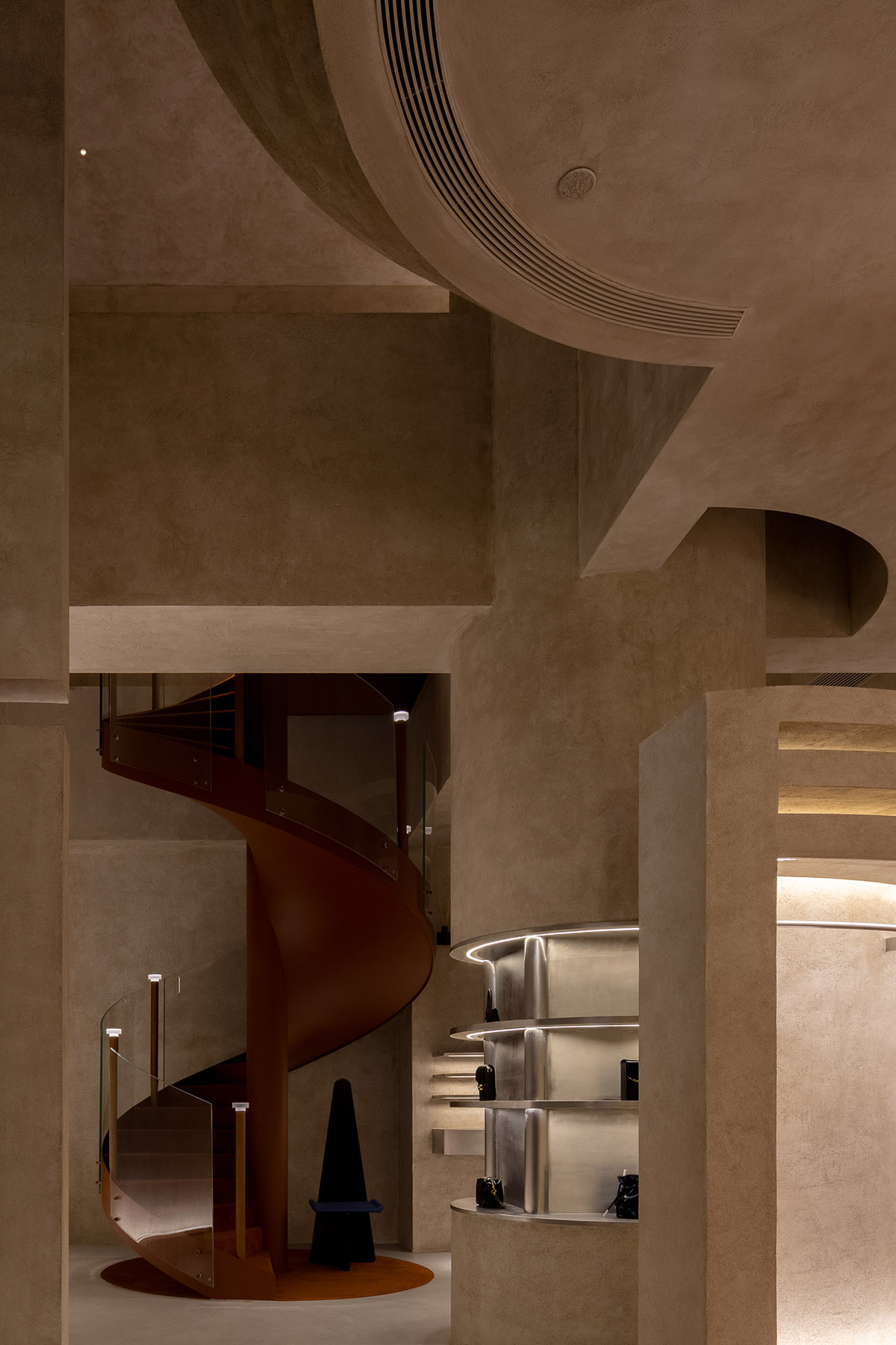
Staircase
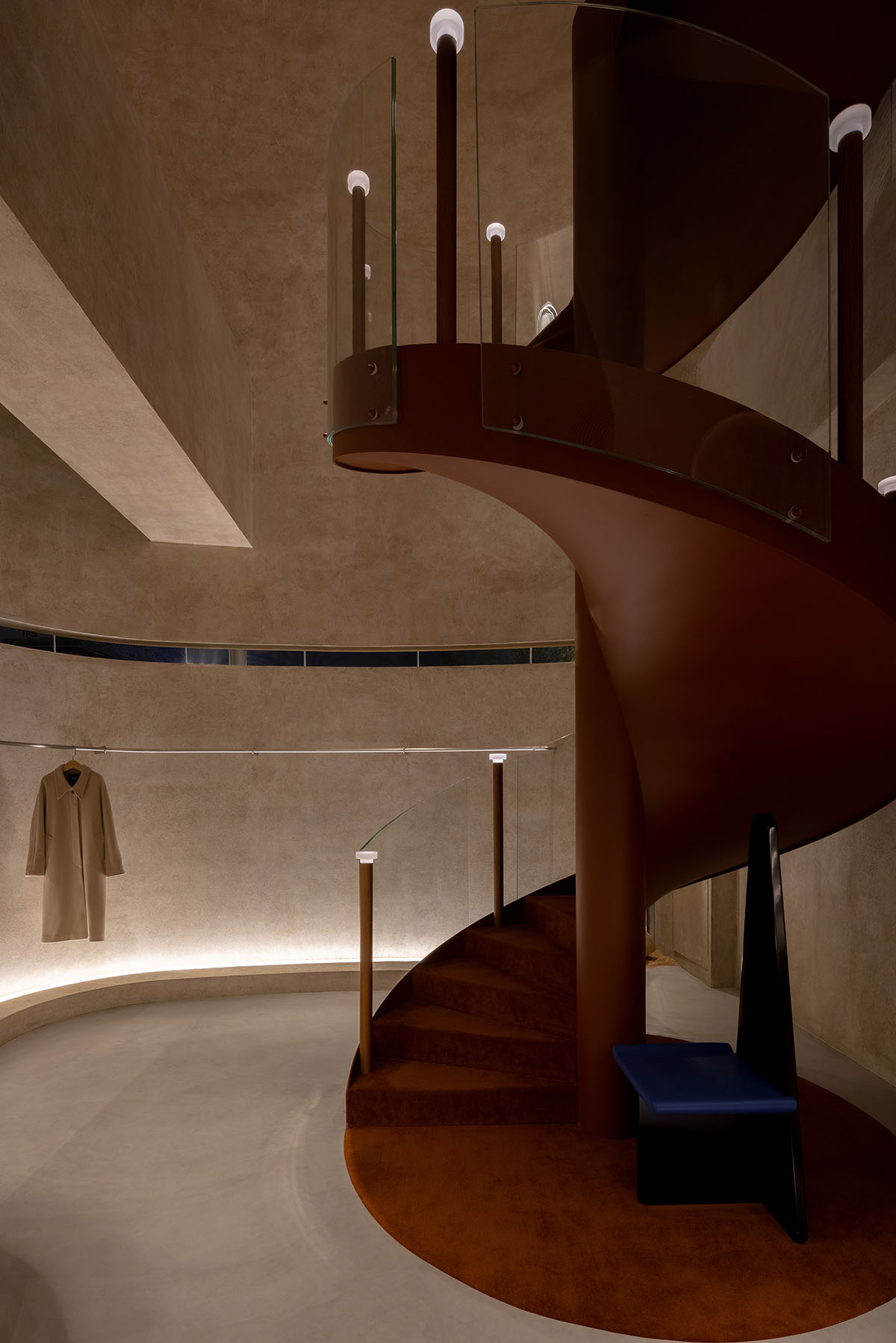
Stairway
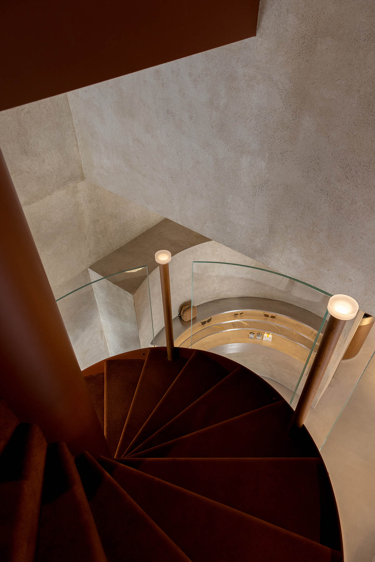
Stairway
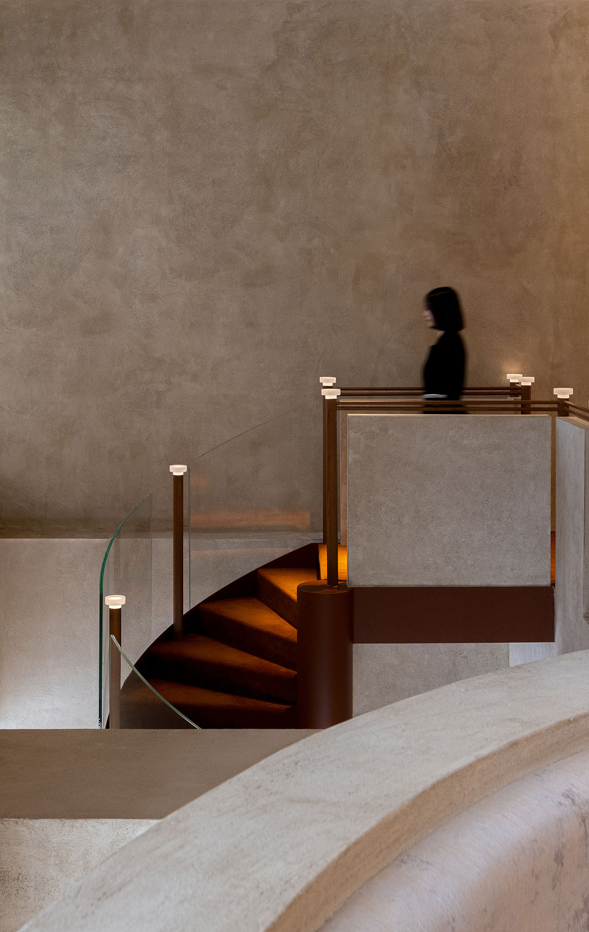
Stairway on 2F
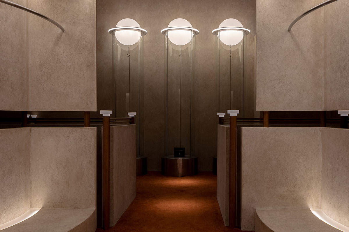
Corridor on 2F

Clothing display area
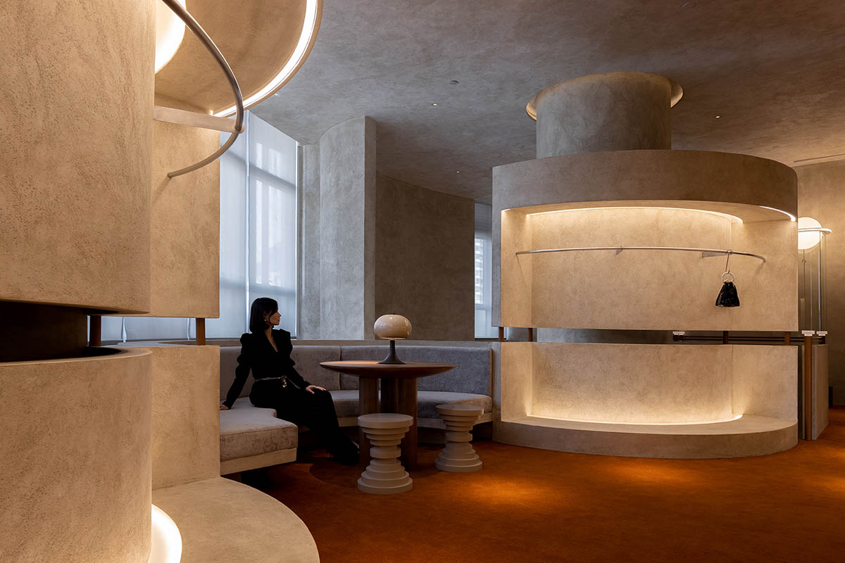
Reception area on 2F
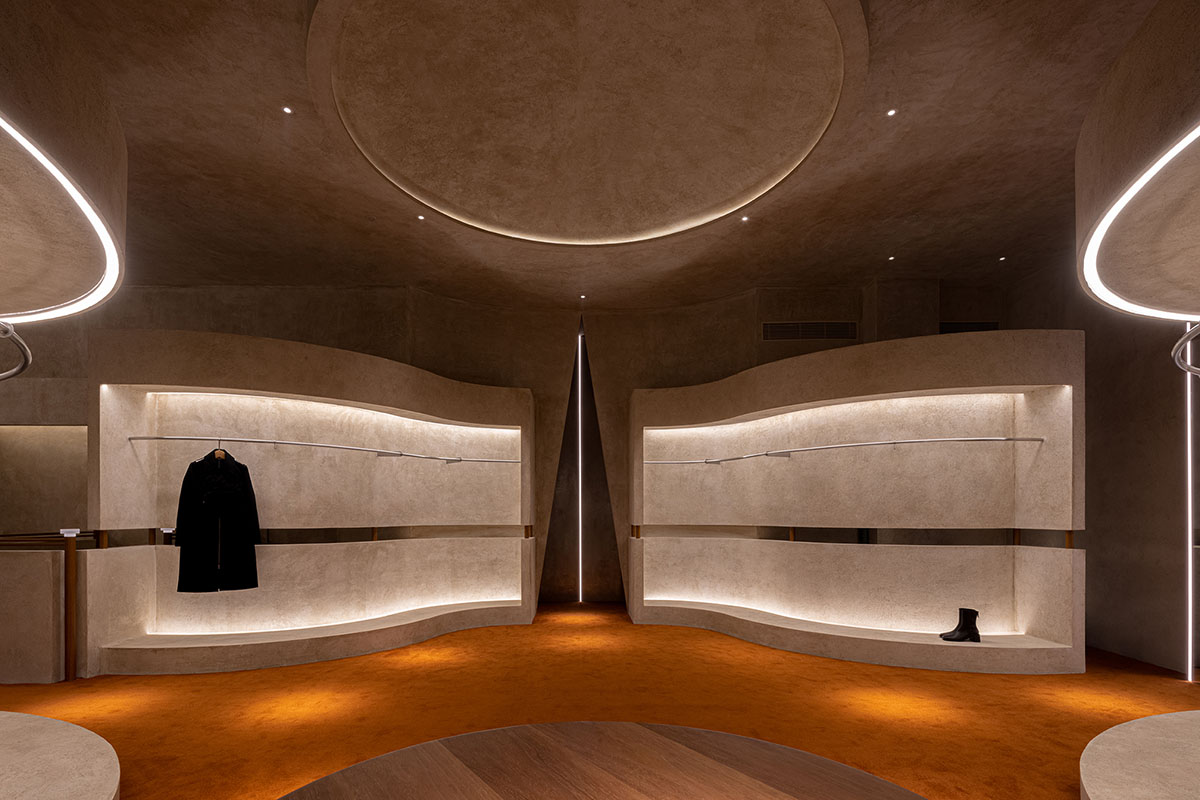
Clothing display area
Studio
Studio
Structure diagram
First floor plan
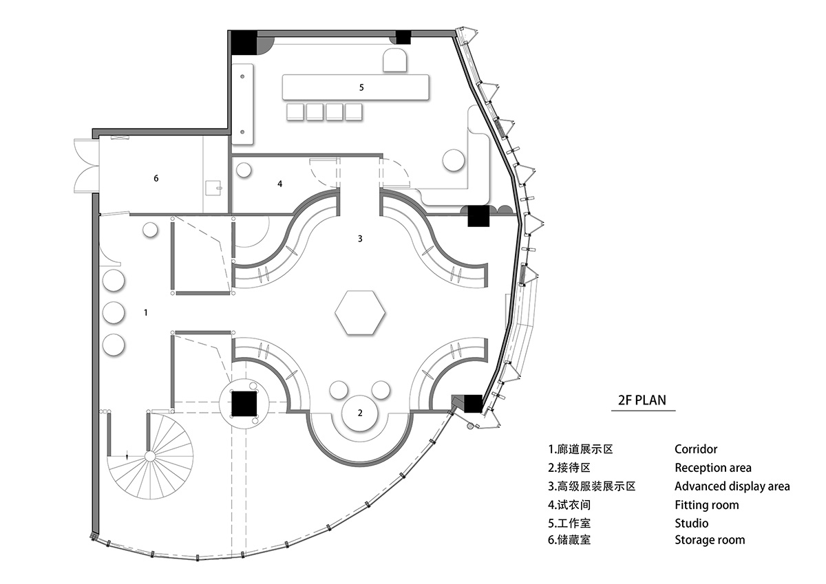
Second floor plan
Project facts
Project name: AUDREY Boutique
Location: Shanyin Road, Xiaoshan District, Hangzhou, Zhejiang, China
Category: retail
Area: 300m2;
Completion time: March 2021
Design scope: interior, decoration, architecture
Design firm: Liang Architecture Studio
Creative director: Xu Liang
Chief designer: Sun Yongfang
Decoration design: Wang Xinyan
Design team: Sun Yongfang, Zhou Zesi, Wang Xinyan, Cheng Pingping, Li Qing, Lu Xin, Xu Liang
Lighting designers: Liang Wei, Yang Ke
Lighting design firm: Yaank
Construction firm: Zhima Decoration Engineering Co., Ltd.
Main materials: NEAYEA micro cement, brushed stainless steel, KD wood veneer
All images © Shao Feng
All drawings © Liang Architecture Studio
