Submitted by WA Contents
DOMANI completes TIC Art Center with red ceramic brick in Foshan
China Architecture News - Feb 21, 2022 - 09:56 3690 views
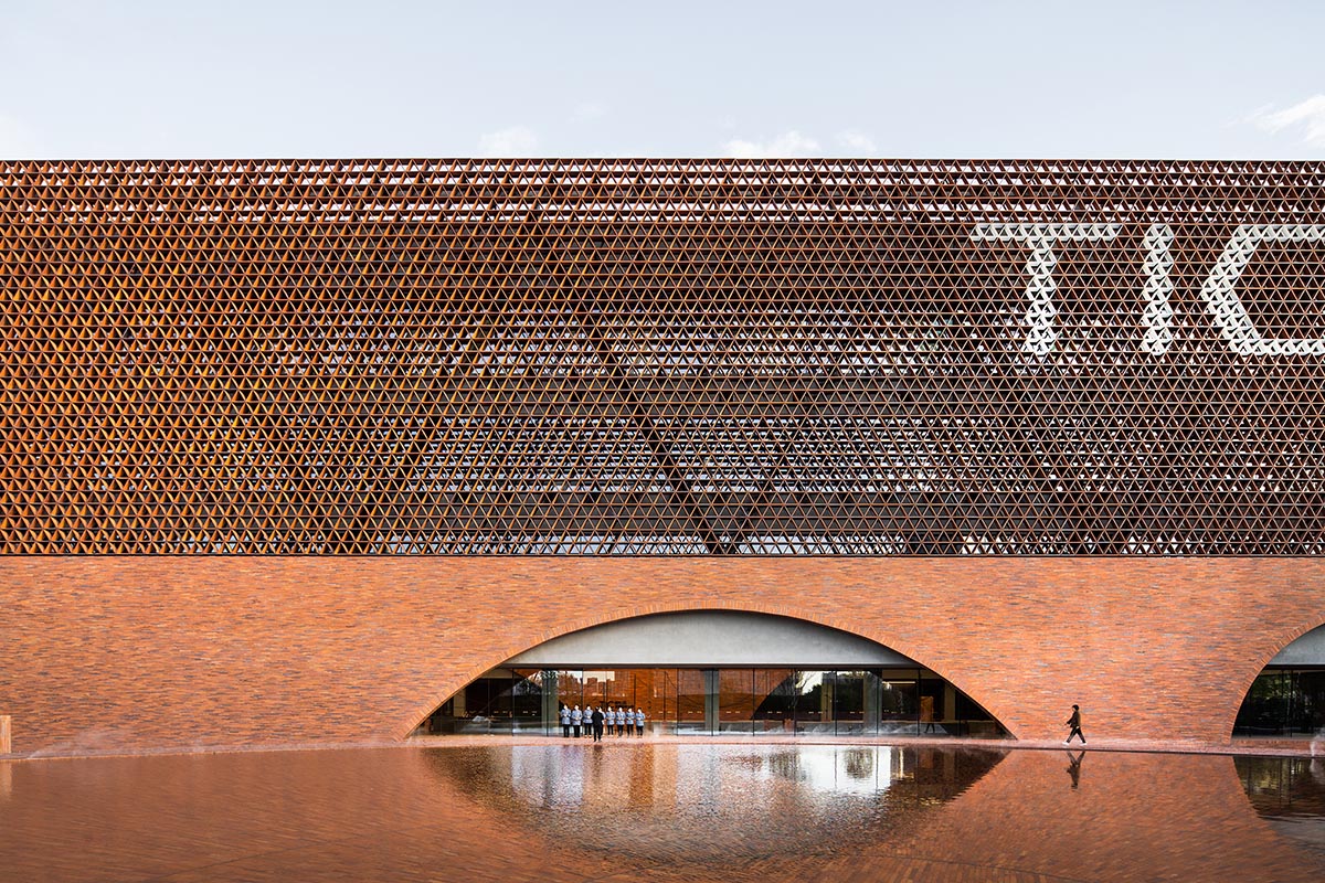
Chinese architecture firm DOMANI has completed an arts center with red ceramic bricks in Foshan, Guangdong, China.
Named TIC Art Center, the 18,000-square-metre building offers different discovery with circulation routes in both the building itself and the landscape itself.
DOMANI was responsible for the design of architectural project, interior design project and landscape project of the complex.
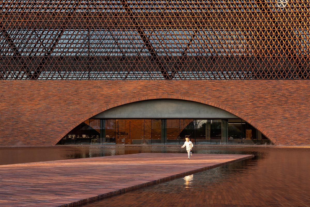
The project was narrated by the firm's own words. TIC Art Center, as an iconic symbol that represents the image of the maker town, received a total investment of around 180 million yuan.
DOMANI was invited to carry out the overall design of the project, with the design scope covering landscape, architecture, interior, products, and more.
Meanwhile, top-tier resources in the sector are joined together to create a top-class work with high integrity, high standards, high academic and commercial value and high urbanity, which is rarely seen in the real estate industry in recent years. The project becomes a hit, indicating that Times China is embarking on a new journey of refined product-oriented long-term development.

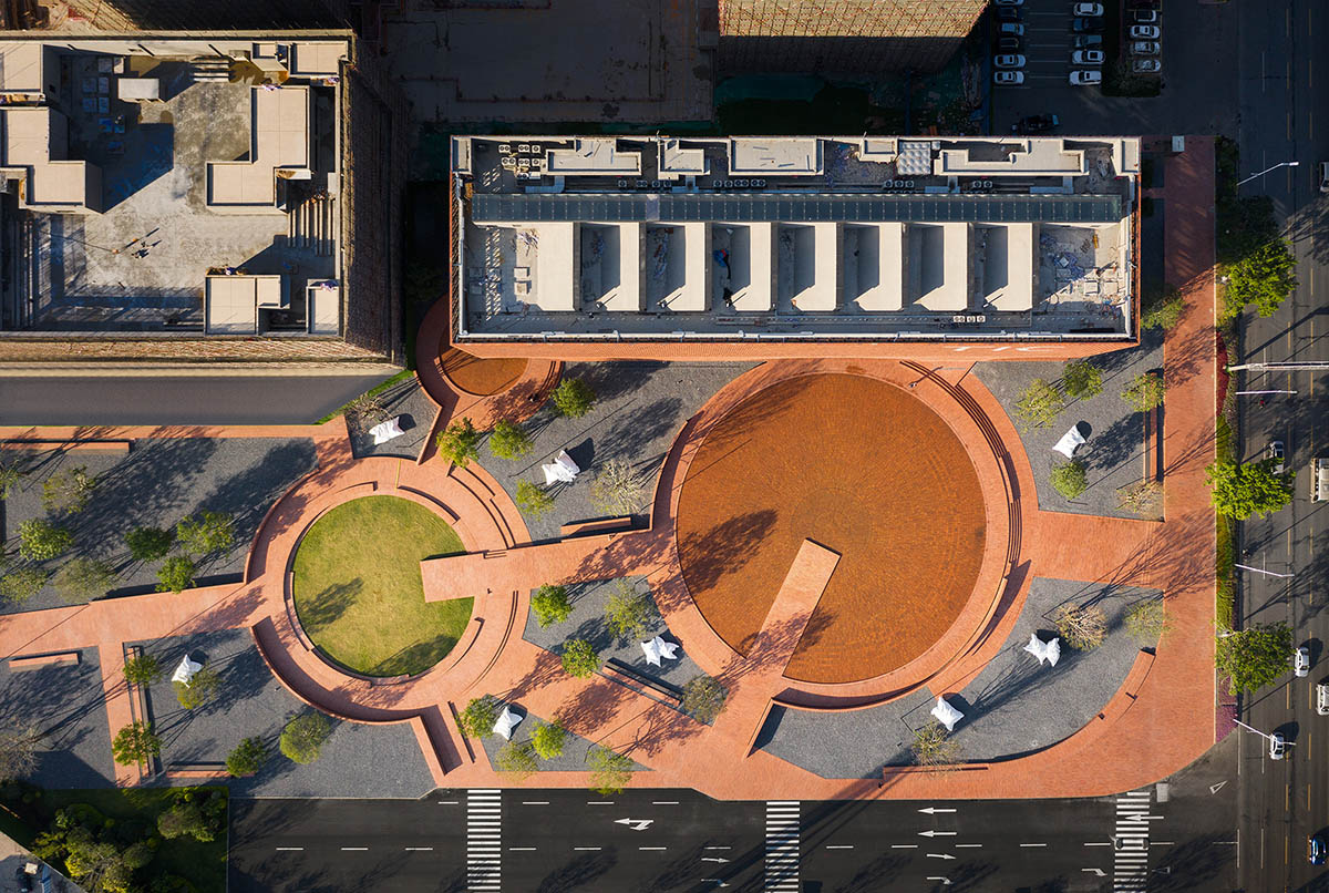
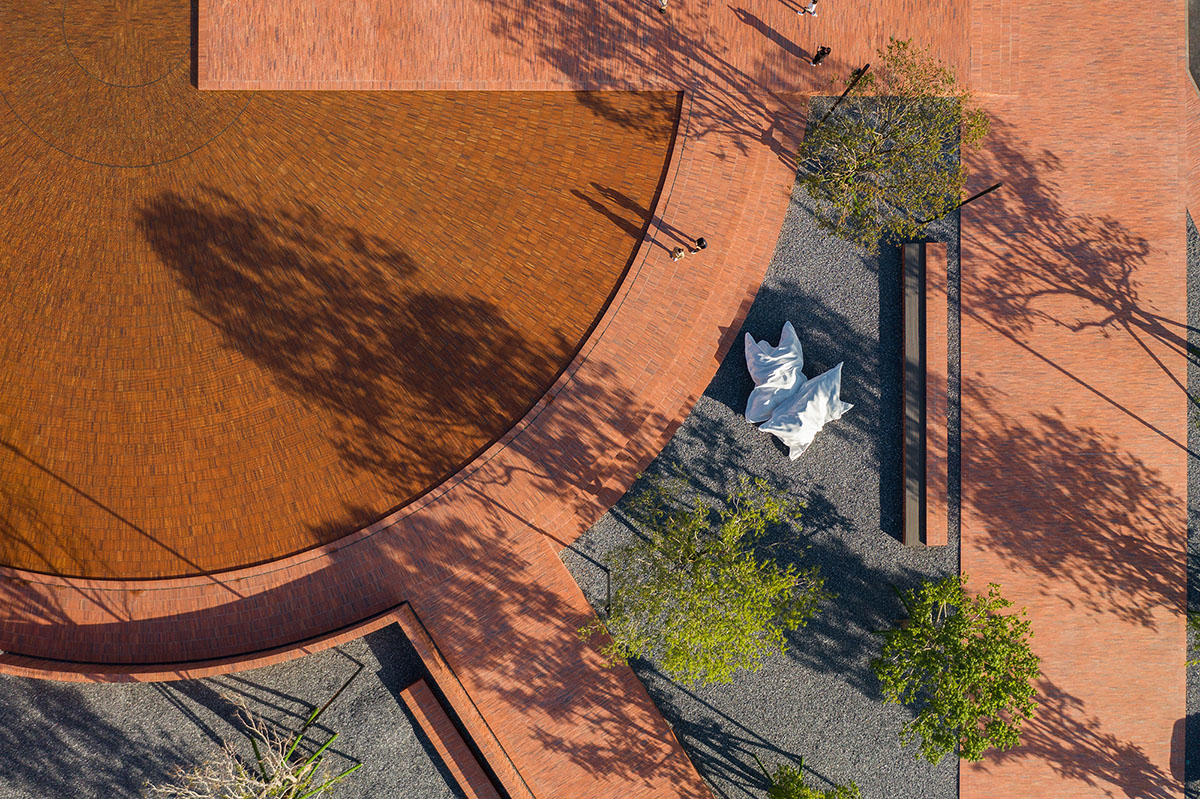
The landscape, a prelude to the building, emits a magnificent atmosphere. The design team divided the landscape circulation route into upper and lower levels. Red ceramic bricks were utilized to create a sense of ceremony and provide a clear guide towards the building for people entering the space from different directions.
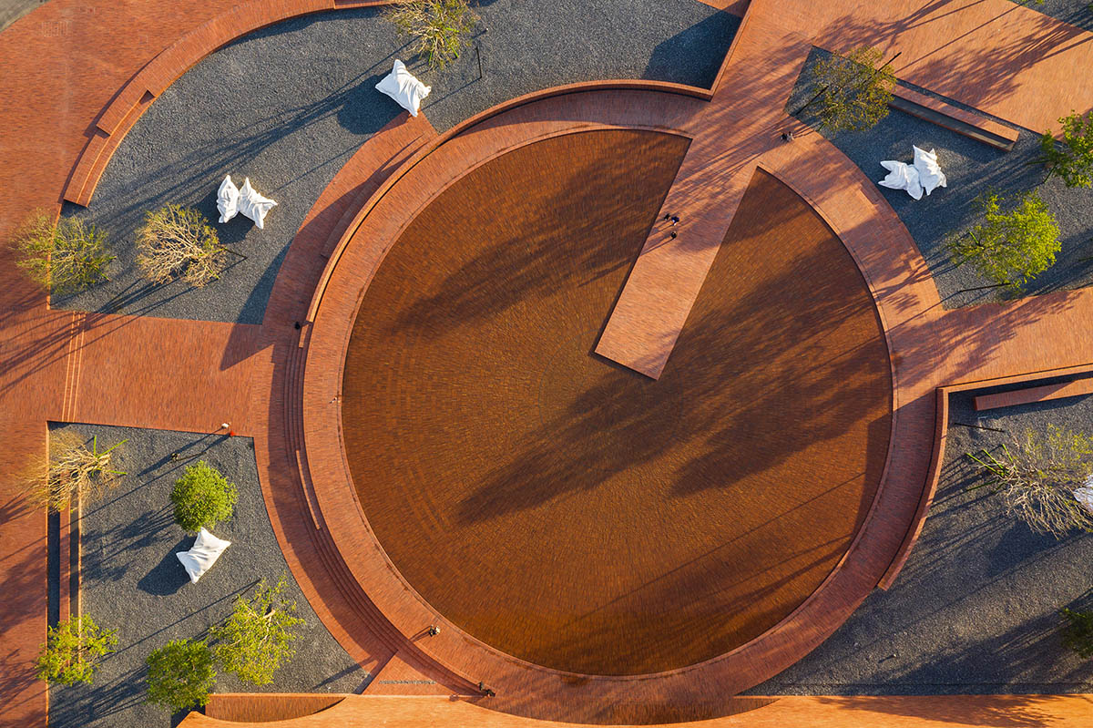
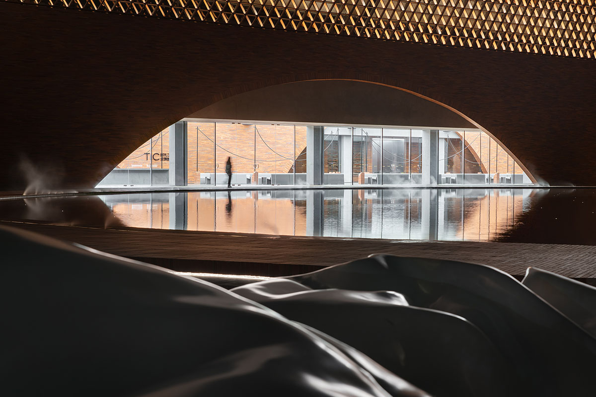
Meanwhile, the black gravels-paved garden provides a more open and freer area to stop and rest, giving visitors another option for diverse experiences. The upper and lower levels are intertwined to create a rich, multi-directional, and intuitive experiential route. On the other hand, the iconic round pool, which is one of the largest artificial waterscapes in Guangzhou and Foshan, has become the destination for numerous visitors.
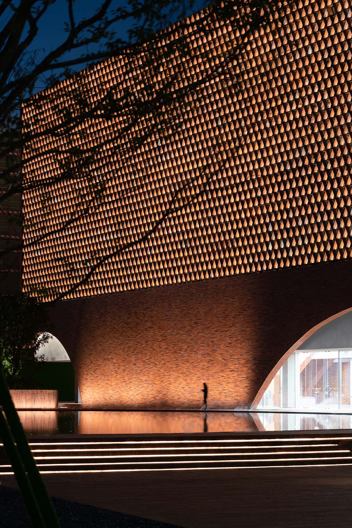
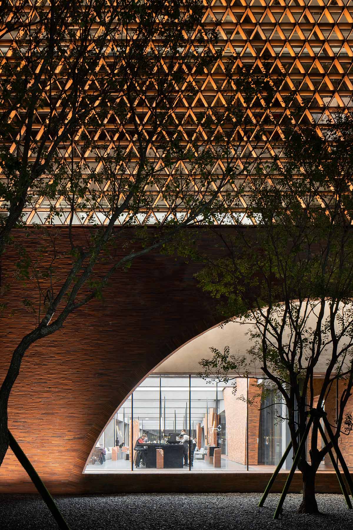
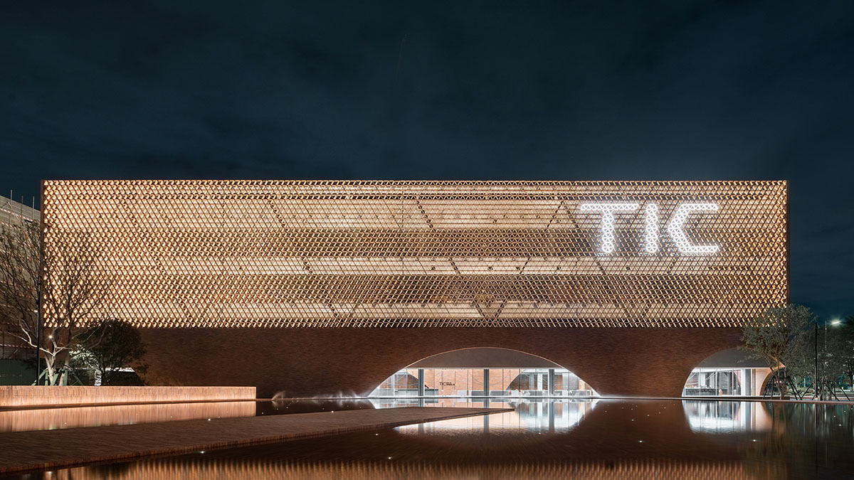
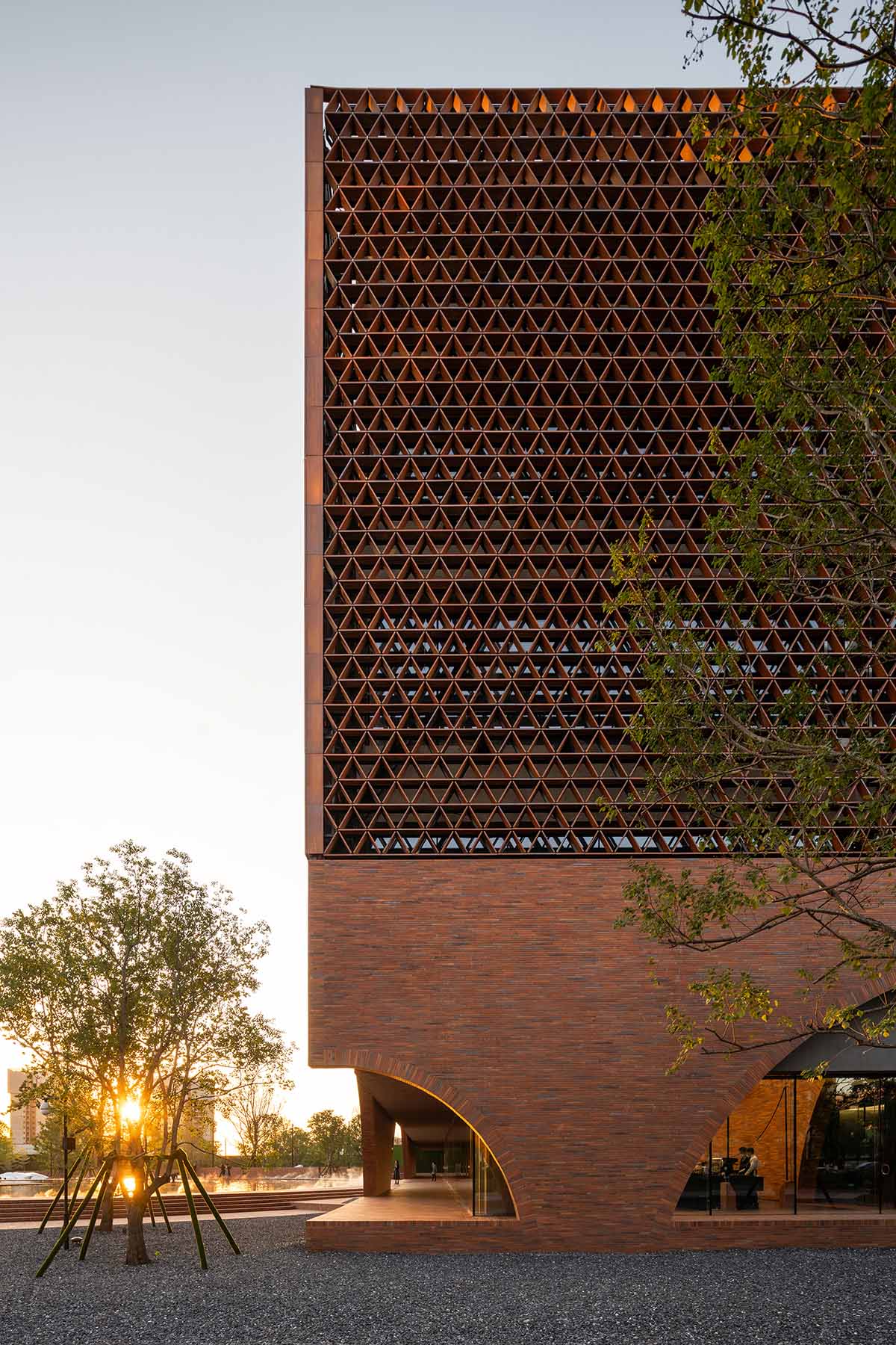
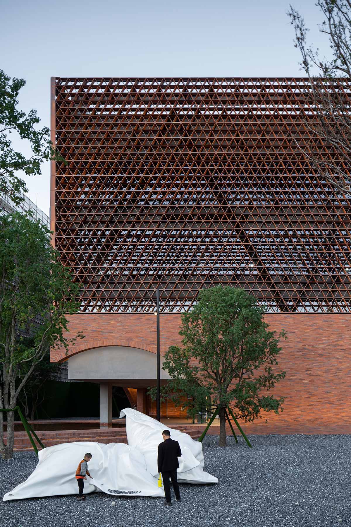
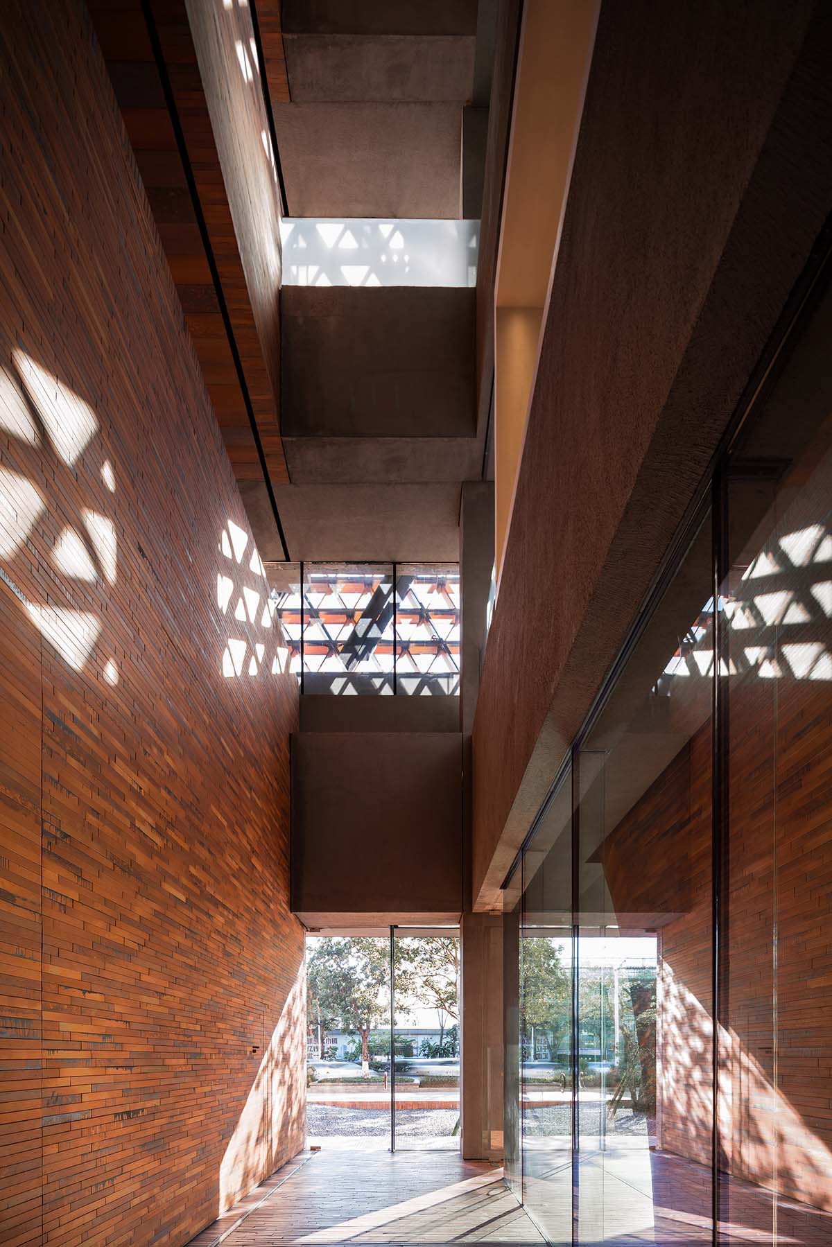
The viewing platform stretching to the middle of the pool provides a panorama of the main facade of the building. The mesh-like double-layer curtain wall system is both the visual highlight and the technical focus of the project. A unique grid masonry effect is achieved by combining traditional "ceramic bricks" with modern curtain wall structural design. Equilateral triangular modules are assembled to form the mesh-pattern facade.
Thanks to the concealed anti-dropping nodes of the curtain wall, the unique aesthetics of the openwork masonry is ensured, and meanwhile, damage and falling of the ceramic panels are avoided. Through industrialized production, precision of the concealed aluminum alloy unit adopted for the ceramic mesh curtain wall is effectively ensured, whilst significantly improving the efficiency of its installation.
The inner-layer curtain wall adopts ultra-clear glass in its conventional economical size. Single glass pieces with a length of 2,200mm enlarge the view from indoors and ensure fast installation. Thickened and laminated glass ribs avoid exposed frames, and the reduced width of glass ribs increases the utilization of interior space. This structure emphasizes the transparency and invisibility of the glass curtain wall, creating a clearer background for the outer mesh curtain wall formed by triangular ceramic bricks.
The overall "passive design" of the building minimizes energy consumption through the double-layer curtain wall system, including clay brick grid, cavity, insulated and low-e tempered glass on the east, south and west facades.
Compared with conventional curtain walls, the system reduces the heat conduction of the building by about 30 per cent and estimated cooling energy consumption by 30 per cent, effectively improving its insulation performance.
At the same time, the 240mm-thick side openwork brick curtain wall system forms a sunlight filter, preventing glares caused by direct sunlight while enhancing the softness of the light through refraction.

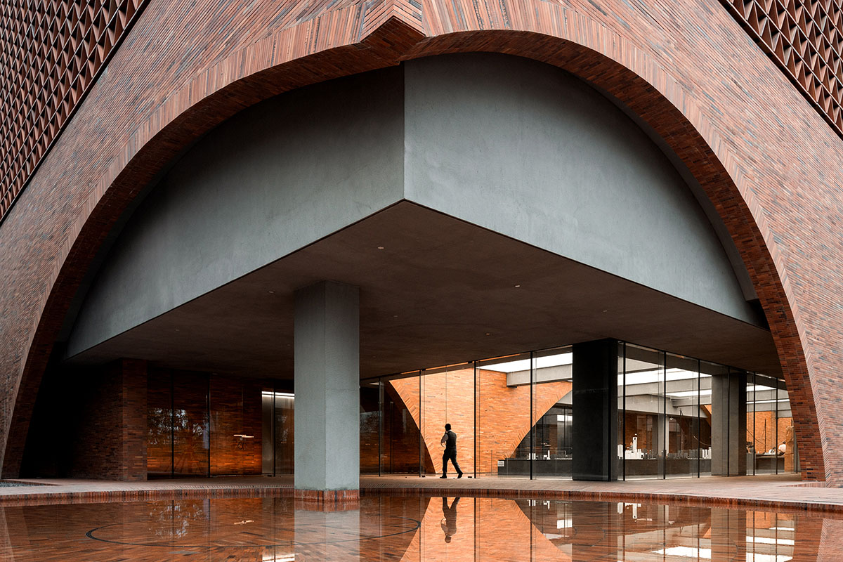
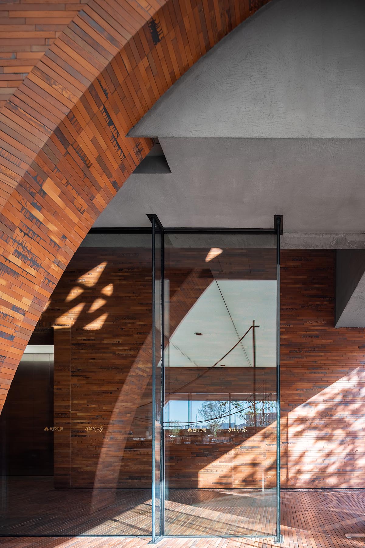
An arch with a maximum span of 29 meters is created on the facade wall. The top of the arch is composed of cantilever beams and upturned overhanging folding slabs so that it's higher than the beams between floors. The middle of the arch features cantilever beams and hanging columns and beams to achieve a wide scale. Finally, the non-arch section is build by cantilever beams and brick walls.
The Big Dream is a set of independent large outdoor installations designed by A&V. Its design is inspired by Earth Art and BDO fantasy, telling the metaphor of an invisible big giant or his vast loose dreams.
The installations, which are especially loved by children, contrast with the huge circular square as to highlight the conflict of ultimate rationality and pure artistic sensibility. The design intentionally reinforced its structure and material in addition to formal control, in order to provide a safe climbable miniature structure for kids.

The interior functional planning focuses on the vertical organization of spaces in the main building, and the integration of concealed engineering within the architectural structure provide more possibilities for flexible mixed-use during future operation.

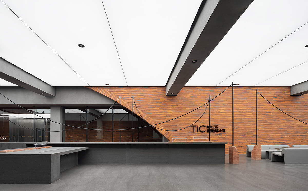
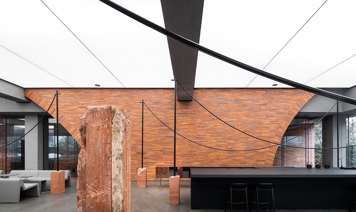
The reception area on the first floor emphasizes a transparent boundary between architecture and landscape. The interior design is based on the idea of de-interiorization. Firstly, in contrast to the traditional interior lighting solutions, a large intelligent preset light film ceiling is adopted to obtain a balance between indoor lighting and outdoor daylight.
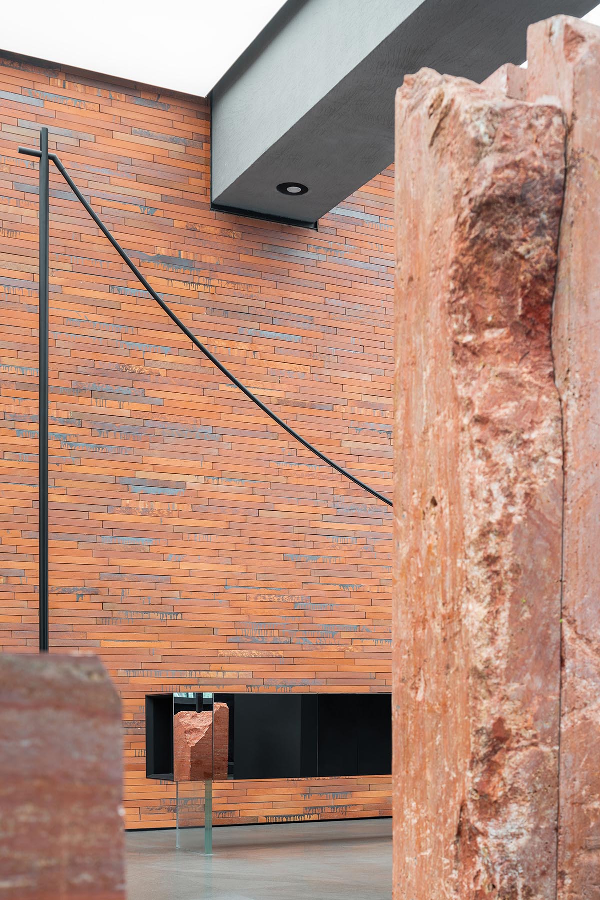
This lighting strategy is similar to the control of top lighting in photography, helping create a strong sense of vastness in the space. Secondly, the emphasis on architectural structure. The electromechanical and fire systems strictly follow the extension of its beam and column system. Thirdly, the interior materials are directly derived from the architectural elements, bonding between interior and exterior while greatly reducing the construction costs and risks.
The original articles and furnishings reveal an artistic charm.
After the harmonious integration of interior space and architecture is realized, a visual focus is to create rich spatial and sensory experiences for visitors.
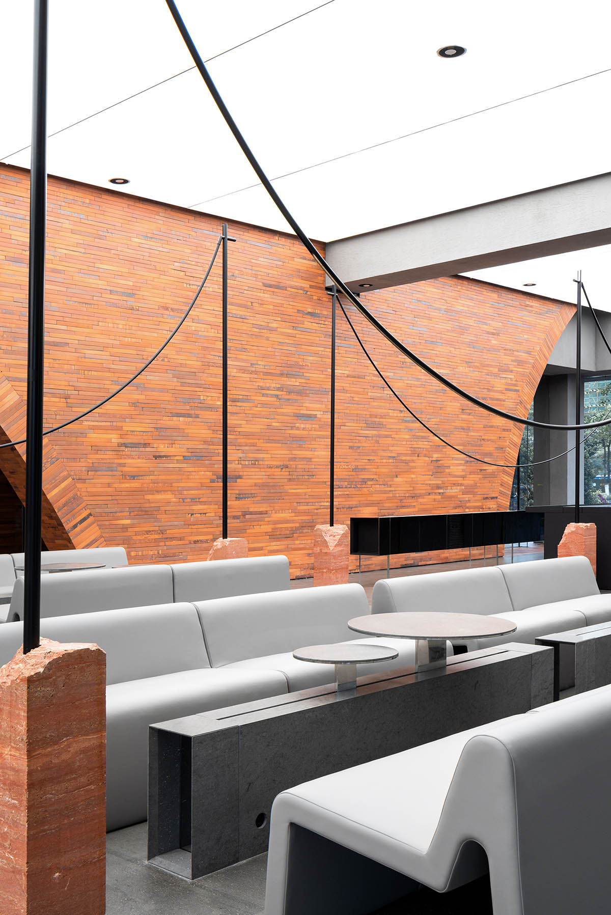
Therefore, the original lighting product series inspired by clothesline, commonly found in traditional dwellings, act as art installations in the interior.
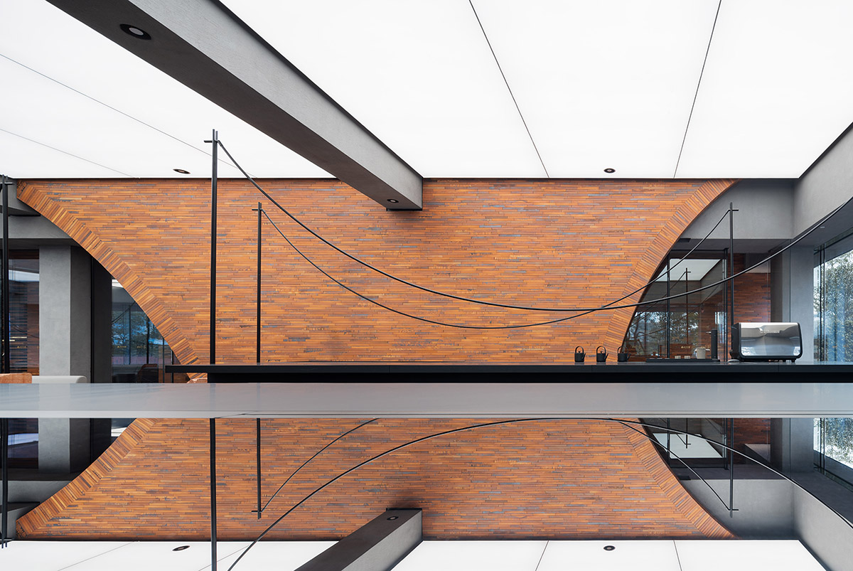
It provides supplementary lighting for different areas and is widely used on the first floor. The visually intertwining curves soften the space and respond to the circles and arcs of the building and landscape.
Furniture in the lounge area explores the middle ground between traditional "table" and "side table". The platforms of different heights with pre-embedded track cater to various dialogue scenes. The refined stone workmanship is manifested in the details.
The large bar counter breaks the boundary between waiters and customers, creating an open working area through the integration of functions. The furniture design subtly showcases a sense of flexibility and order in the space that enjoys the diversity of users.
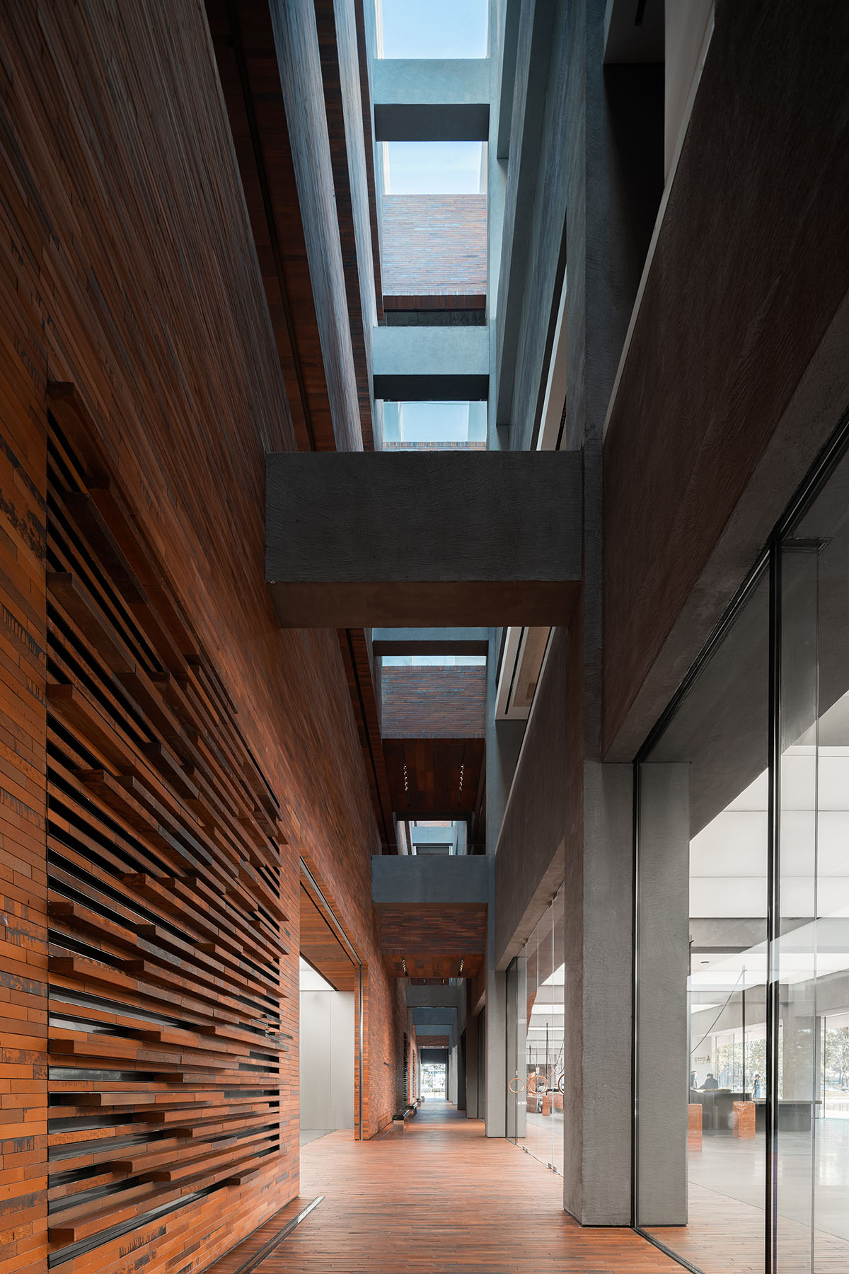
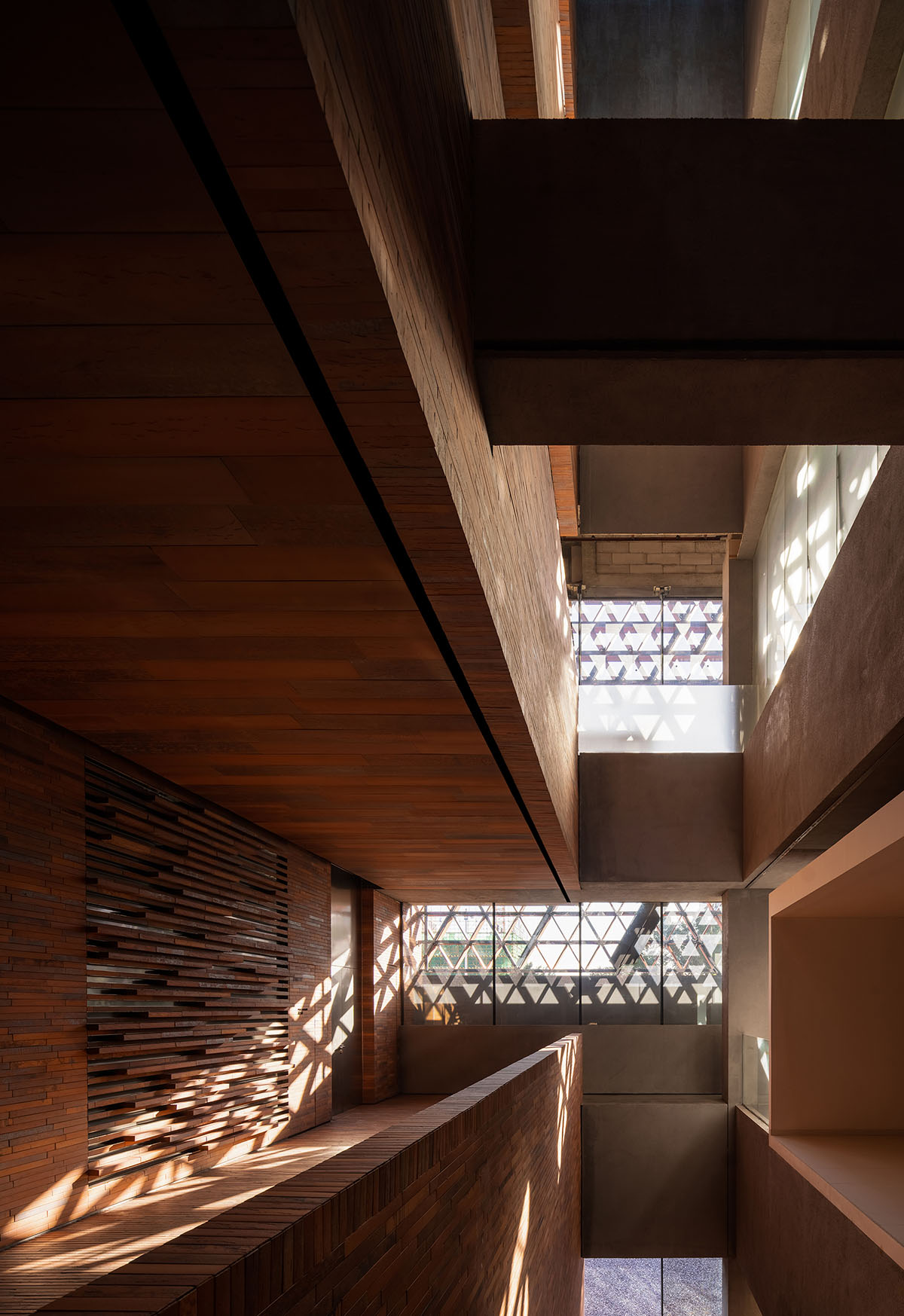
Based on the technical fire planning that separated into the front part and the back, a "valley" passageway is constructed in the middle of the architecture. It creates a highly through and interactive cavity within the building. While separating the main displaying building volume from the operational annexe, it releases an uninterrupted touring experience within the main building.
Therefore, multiple functions and flexible alteration of the building would be possible through its life cycle. The main and annexed building volumes are connected horizontally by beam bridges, providing visitors an unexpected overlooking view amongst the interplay of space, light and shadows.
From north to south in China, the color of clay bricks used in folk houses generally changes from dark to light. From the traditional use of humus to make clay bricks, which resulted in great losses of arable land and woods, to today's large-scale industrialized production of clay and terracotta bricks, the genes of "brick" and "masonry" in Chinese folk architecture continue to be passed on. Of these, red bricks are particularly widely used in folk buildings for their low cost.
With the development of urban construction criteria, however, traditional bricks and masonry techniques no longer meet the requirements of large-scale public buildings. To hold back the vanishing of traditional craftsmanship, we need to look deeper at it and redesign an adaptable method.
The red bricks used in TIC Art Center were created by 25 sets of molds, resulting in rich specifications and trimming systems. The scale and proportion of the bricks were modernized in relation to the specifications of "hand-holdablebricks", through iterative research on the six indicators, i.e. controllable furnace condition, material performance, applicable structure, process stability, production cost. Thus, the bricks were eventually refined.
All the interior furnishings and the art installations are original works, the copyrights of which are owned by A&V. In the event that plagiarism is discovered, A&V reserves the right to take legal actions.

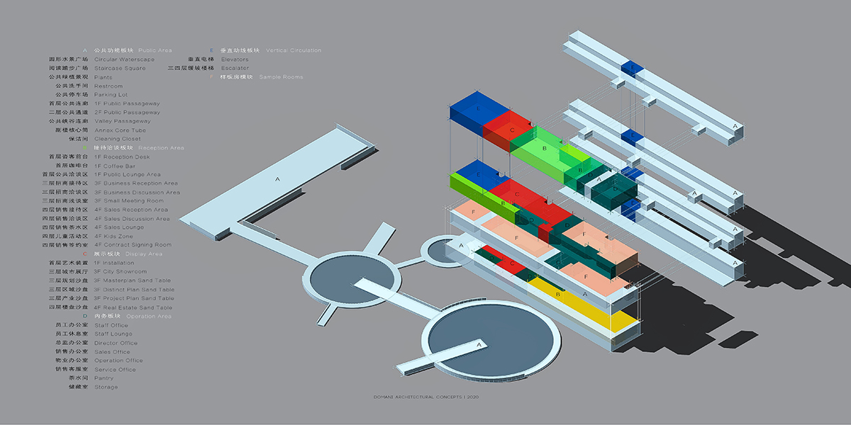
Functional analysis
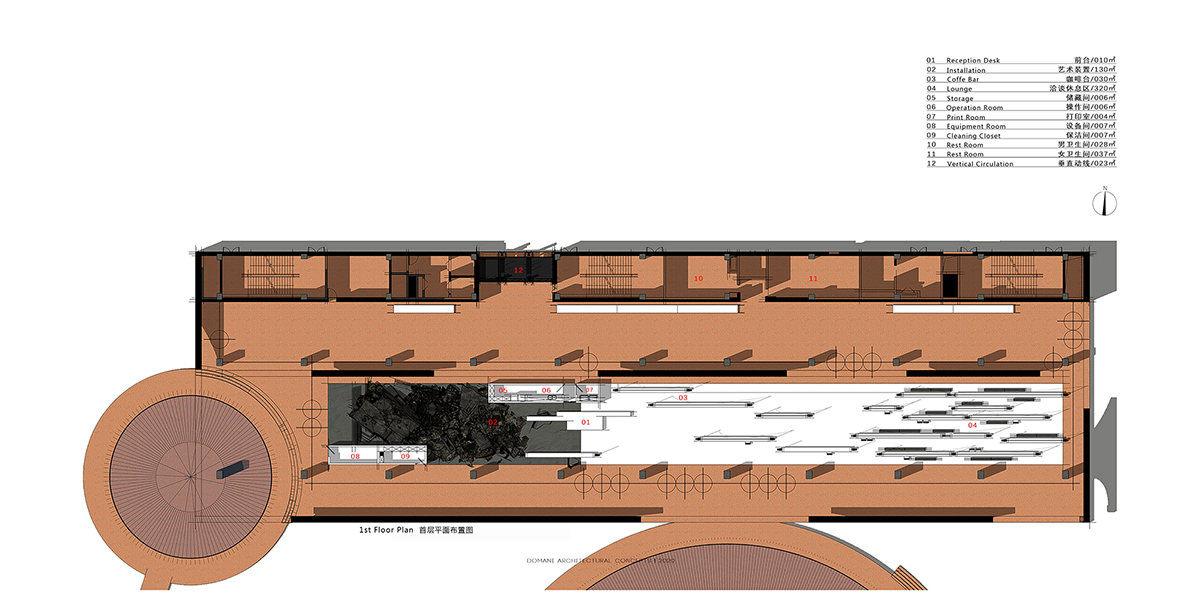
First floor plan

Second floor plan
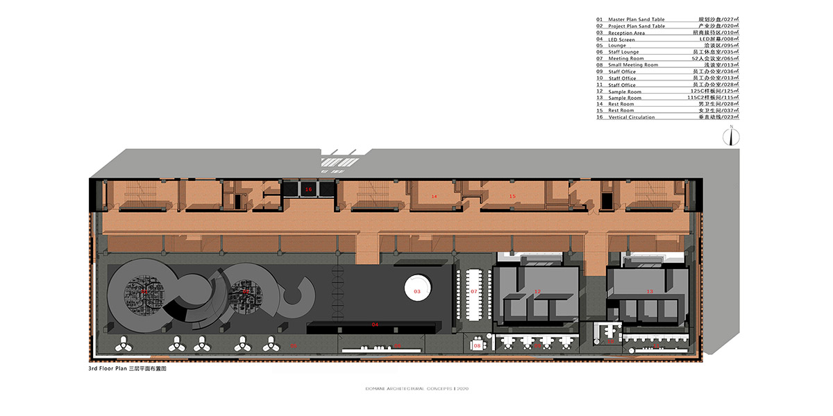
Third floor plan
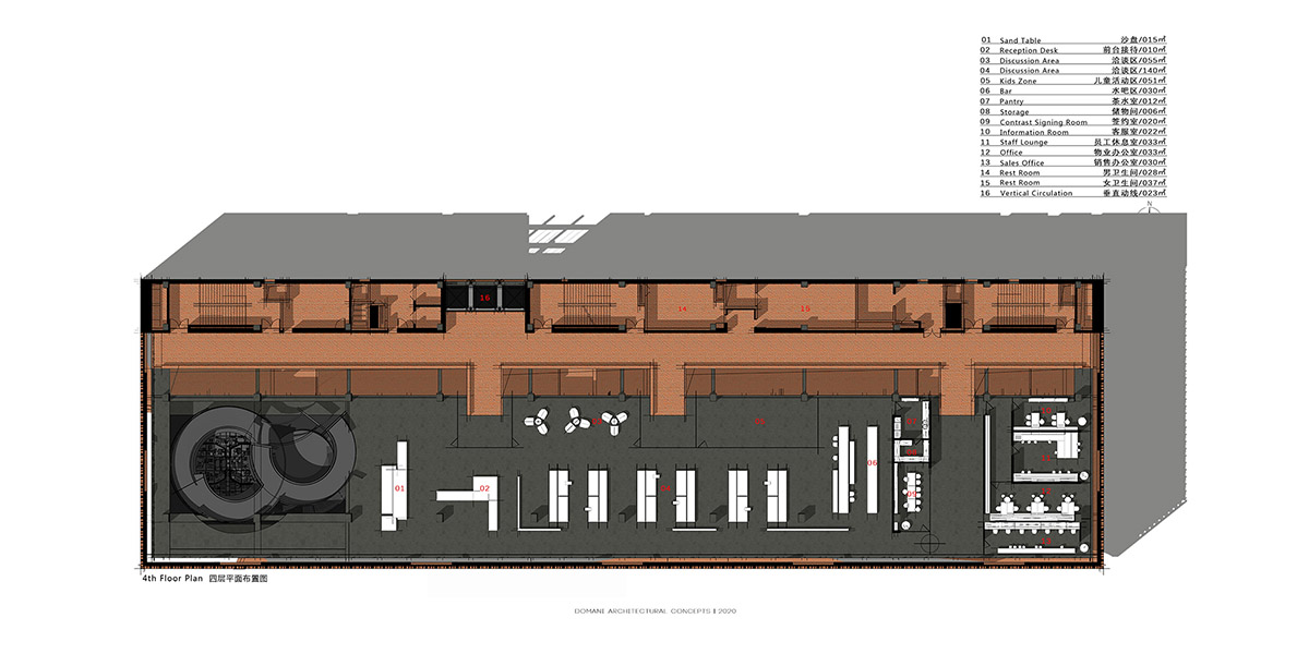
Fourth floor plan

East section
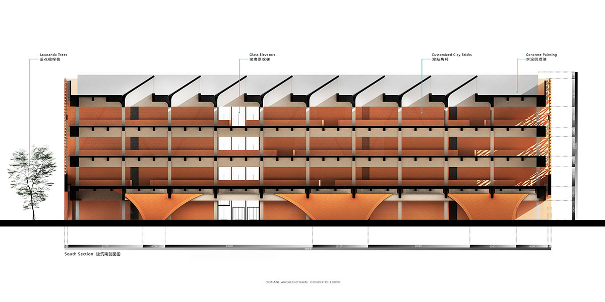
South section
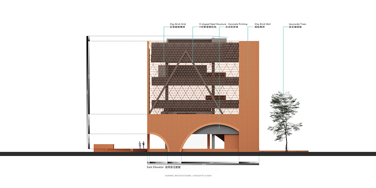
East elevation

West elevation
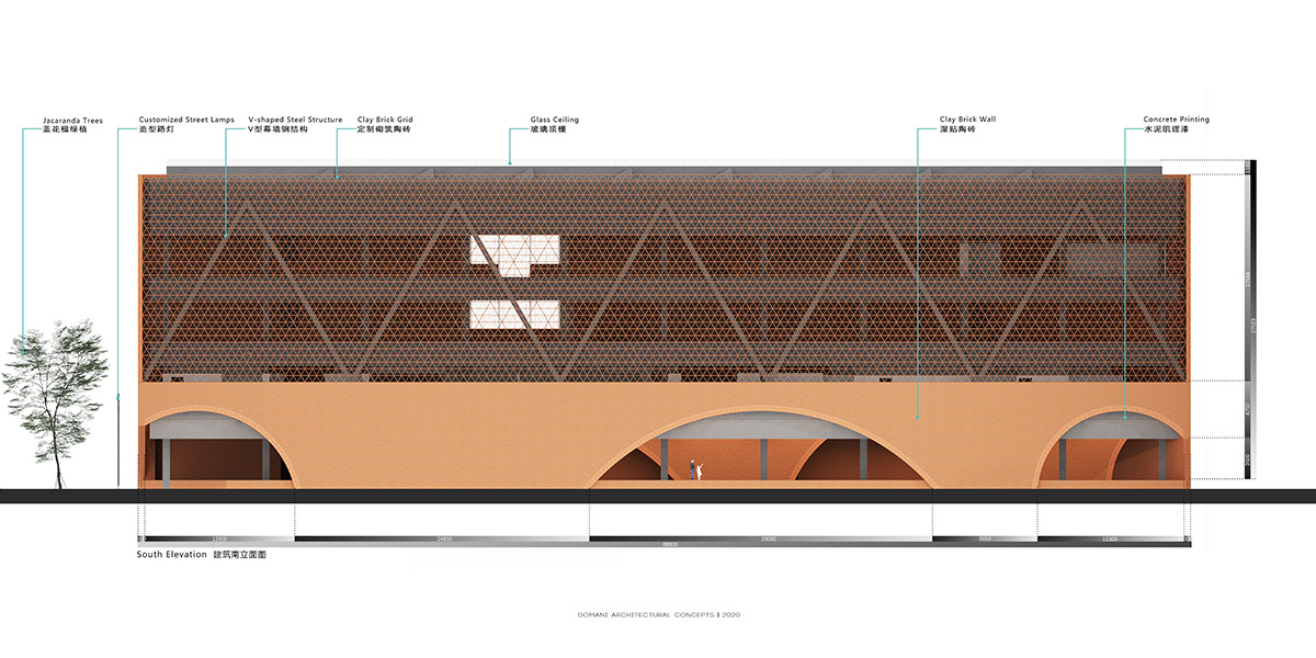
South elevation
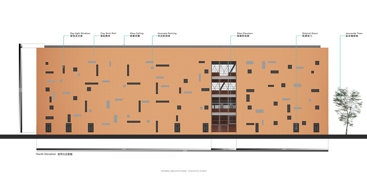
North elevation
DOMANI previously designed a bold red staircase to the interior of a Shenzhen store brand. The firm also designed a Club House with light-filled and pure structure in China.
Project facts
Project Name: TIC Art Center
Location: Foshan, Guangdong, China
Area: 18,000 Square Meters
Client: Times China
Architecture Design / Interior Design / Landscape Design: DOMANI Architectural Concepts
Principal Architect: Ann Yu / DOMANI
Design Team: Ruiquan Ye, Xiaojun Wang, Yinyi Huang, Zhiquan Tang, Wenxi Tang, Qiannan Ye / DOMANI
Architecture Construction Design: GDAD (Guang Dong Architectural Design & Research Institute Co., Ltd.)
Curtain Wall Design: Wuhan LING YUN Curain Wall Design and Research Institute
Landscape Construction Design: BOX Studio
Installation & Product: A&V
Architecture Lighting: Drean Design
Interior Lighting: HE GUANG Lighting Design
Curtain Wall Construction: JIANG HE Curtain Wall
Architecture Construction: YI DE XING Construction
Interior Construction: Maxima Decoration
Landscape Construction: NONG FANG Landscape Construction, YUAN YU Landscape
Lighting Construction: TIAN JIANG Lighting Construction
Material: LOPO China, KE DIAN Constructional Material
Construction Management: Shaowei Yang / Times China
Media Management: Karo Hong / DOMANI
All images © Vincent Wu
All drawings © DOMANI
> via DOMANI