Submitted by WA Contents
AD ARCHITECTURE creates dark interiors for showroom playing with light and sharp geometries in Foshan
China Architecture News - Jan 19, 2022 - 14:43 4818 views

AD ARCHITECTURE has created dark interiors for ceramic tile brand Overland's headquarters and showroom playing with light and sharp geometries in Foshan, China.
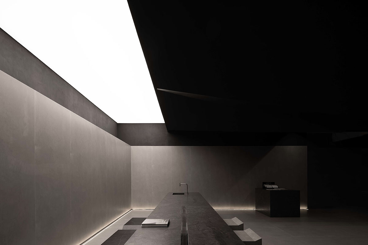
Named Chasing Light · Overland Headquarters & Showroom, the 890-square-metre space features a play of light and shadows to help create geometric forms in the space.
"Architecture is the masterly, correct and magnificent play of masses brought together in light. Our eyes are made to see forms in light; light and shade reveal these forms; cubes, cones, spheres, cylinders or pyramids are the great primary forms which light reveals to advantage; the image of these is distinct and tangible within us and without ambiguity. It is for that reason that these are beautiful forms, the most beautiful forms" - Towards a New Architecture (1923).

Architecture is a relationship, bringing a pure spiritual experience and creating an abstract, tranquil, pure and geometric space. The interior space is awash with natural daylight and artificial lighting, allowing people to feel the spatial power and resonate with its spirit.
The building integrates the functions of reception, exhibition and experience, and aims to upgrade the brand's image. Subtle subjective feeling is turned into technical parameters. The boundary between products and people is explored with a critical eye.

Brand positioning
Overland innovatively turns people's subtle subjective feeling about ceramic tile products into technical parameters, and combines a plain aesthetic with modern manufacturing technology. Based on natural texture, modern elements and artificial grain, the brand designs and develops ceramic tile products through tactile, visual and functional innovations. Its ceramic tile products are mainly dominated by grey hue, featuring a classy yet plain touch.
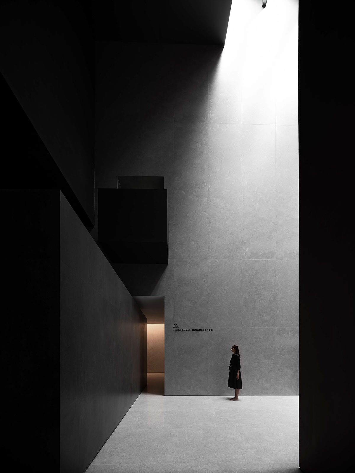
The product grains embody the fusion of naturalness and modern, humanistic aesthetics, and highlight the mix of natural and fashionable elements. The brand's product portfolio mainly includes large-sized sintered stone panels. Overland targets at consumer groups with a unique taste, and advocates a modern, comfortable, simple and pure style.
Through the combination of architecture, space, geometry and light, the design creates a textured scene to unfold narratives about products, and interprets a guiding art and aesthetic system.
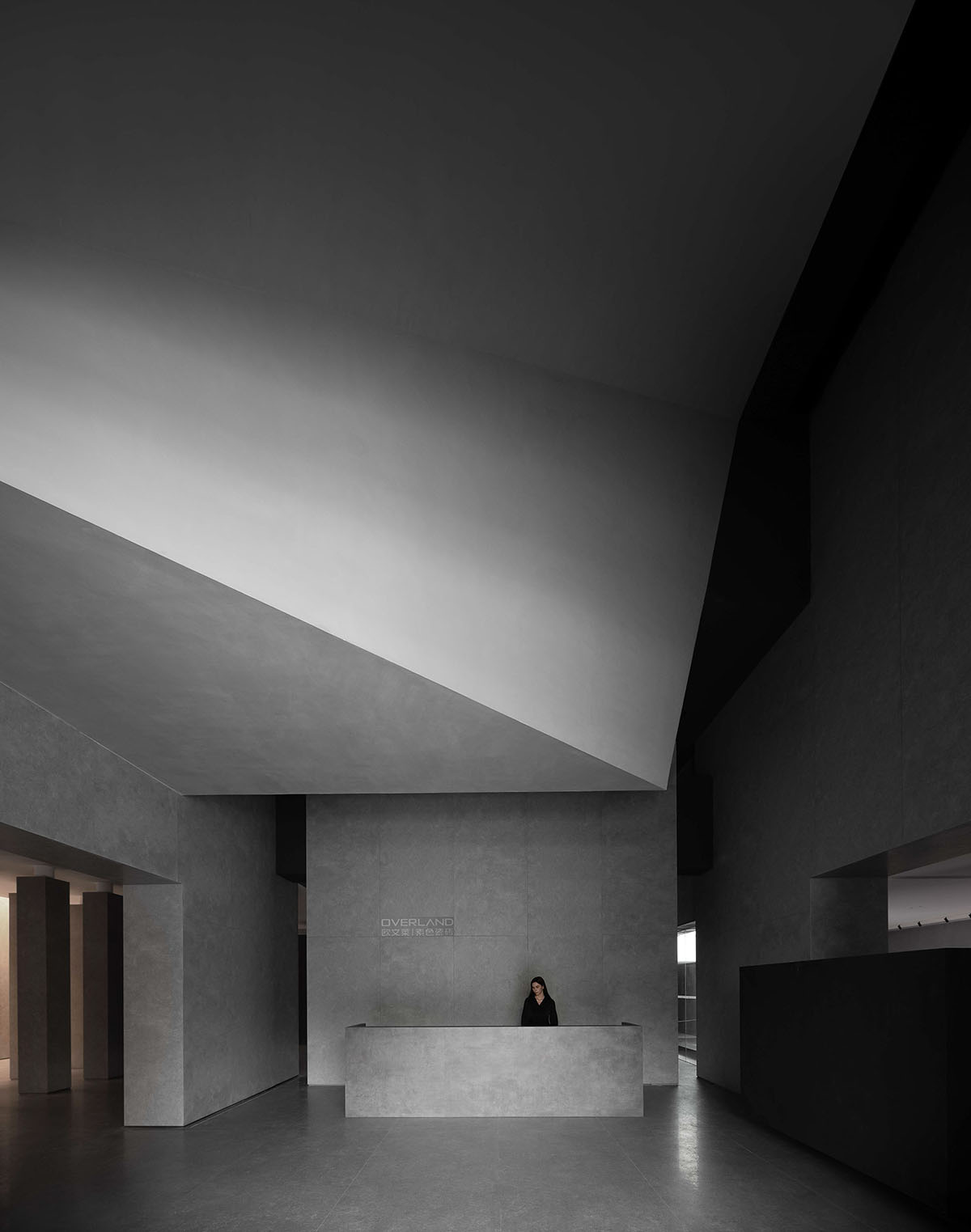
Brand exploration
Based on the core values of the ceramic tile brand that represents the creative power of China and has a history of 23 years, the project adopts a design logic that meets the demands of contemporary and future exploration, and shows respect to the brand's culture and core. The design team dug into the brand's philosophy that respects nature and values a plain aesthetic. Through architectural space and light, the designers expressed their understanding of ceramic tile products with a confident attitude. The overall design well harmonizes with nature.
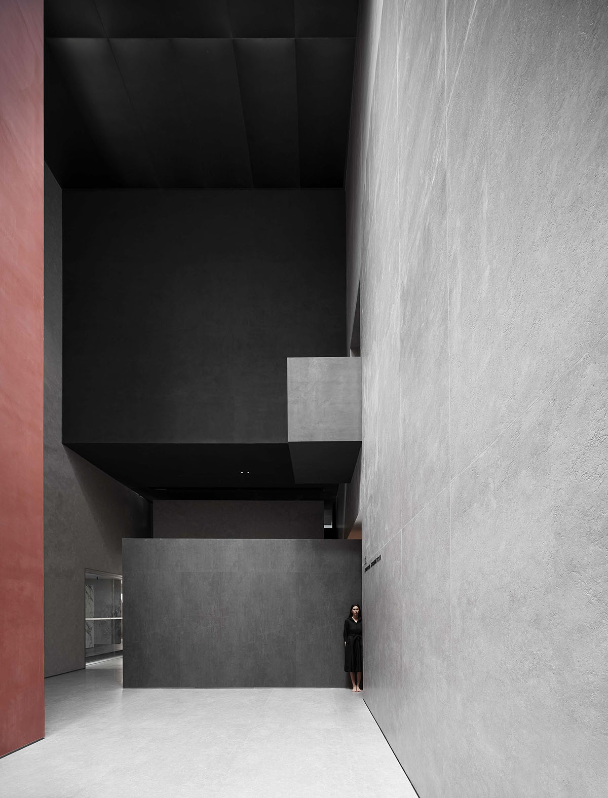
Innovative logic
The design is an experimental thinking on how to present a future showroom, how to leverage an innovative logic to break the homogeneous image of conventional showrooms in China's ceramic tiles sector.
Conventional showrooms face two common problems. First, the traditional spatial pattern restricts products to express themselves. Second, the classification of products is trapped in the conventional thinking of selling goods, thus easily causing disorder in the space, making displayed products less expressive and directly lowering customers' purchasing desire.
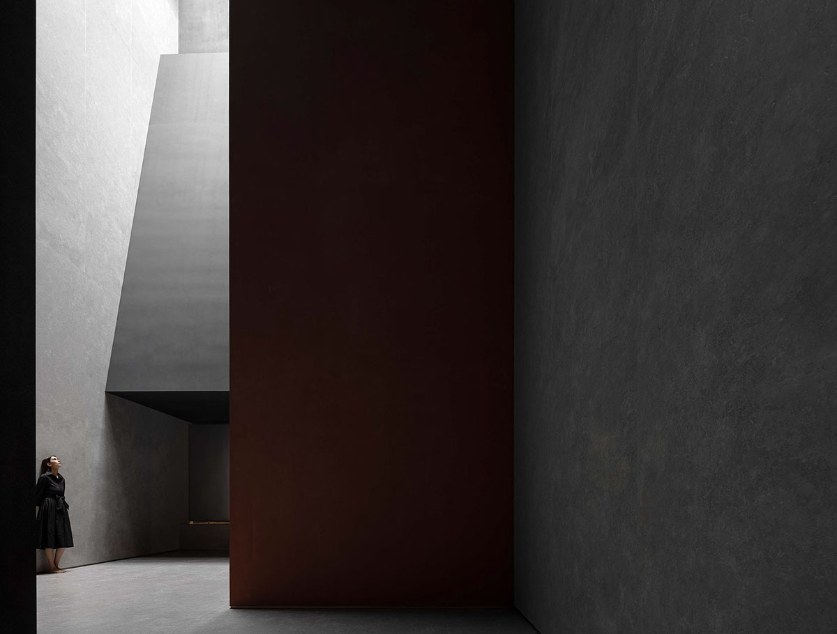
Design exploration
Starting from the thinking of commercial value, AD ARCHITECTURE is creating a "positive case" for the industry.
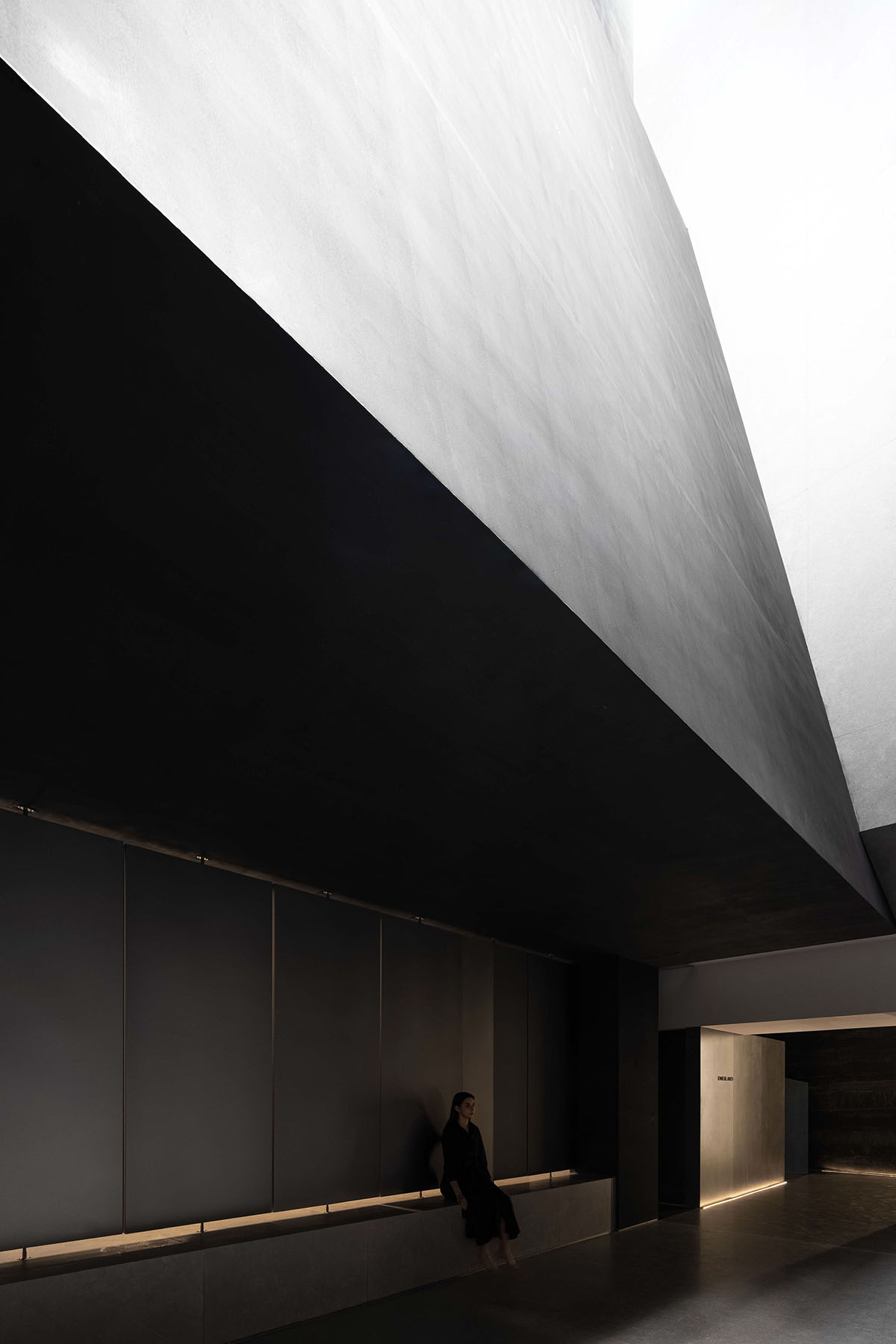
An exploration with both grasp and risk
The design breaks the homogeneous design of conventional showrooms and ways of product display, hence enabling products to resonate with the space, nature, people and time. For this project, AD ARCHITECTURE conducted a bold exploration of showroom design in China's ceramic tiles sector.
The free interior surfaces make room for diversified material textures, to show the inherent character of products. By releasing the column network of the space, the project creates a free, relaxing spatial atmosphere and a well-organized circulation route, allowing visitors to feel all products and participate in every spatial node by following the set circulation. Rich layers and multi-faceted design techniques create a breathing space for highlighting product textures.
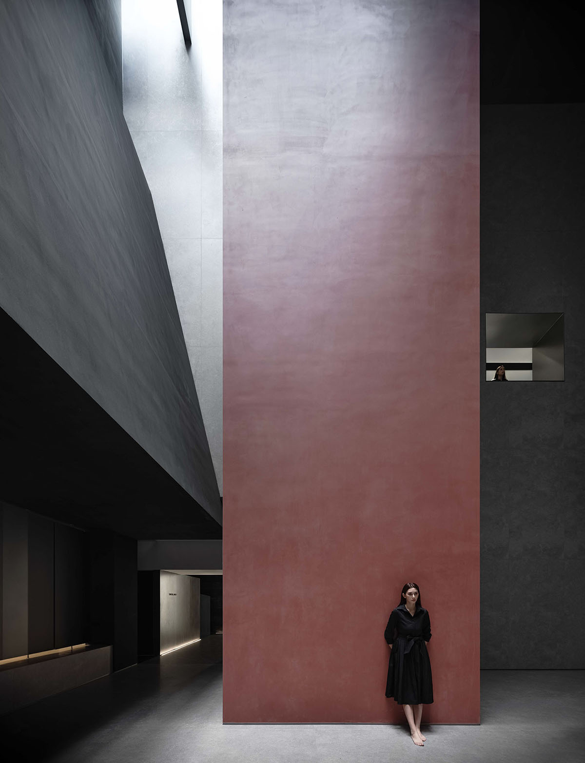
Stimulate dialogue between products and events in the space
For this project, the design team reflected on how to break restrictions and create more possibilities through design approaches, and tried to explore diverse uses of materials.
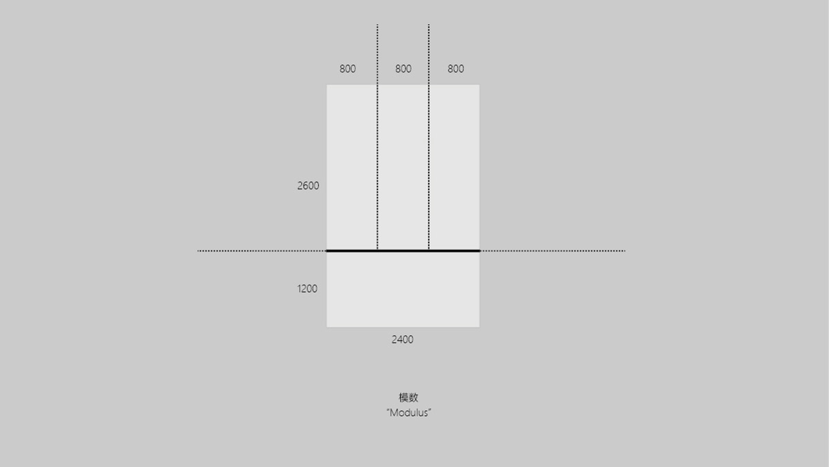
There are 38 types of sintered stone panels, which can be used in 54 different ways in various spaces. To efficiently display the diversified uses of such a variety of products was the client's request, and was also a challenge as the large quantity of displayed products was likely to cause disorder in the space. To solve this, the design team matched and combined products through rigorous calculation, thus unifying the overall space.
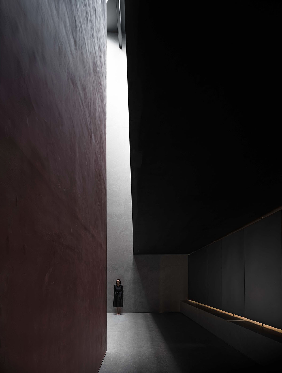
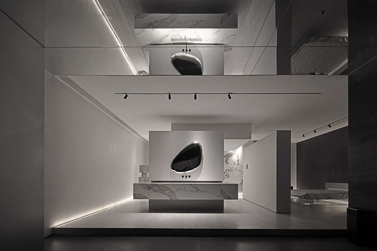
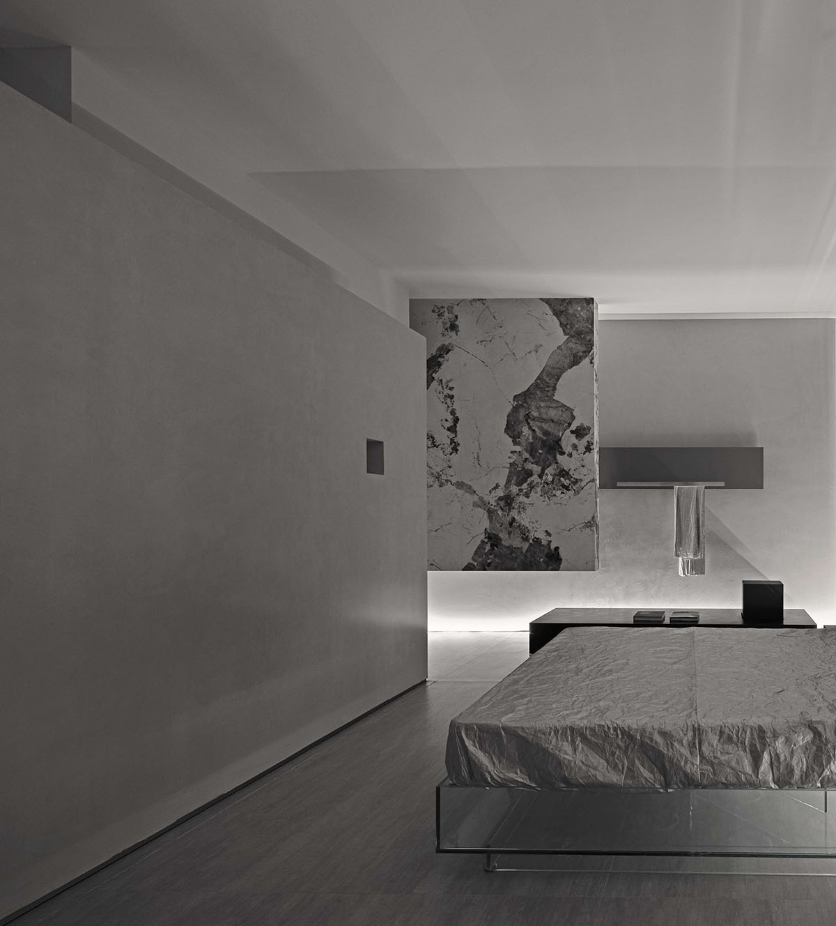
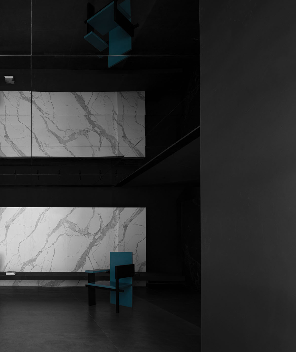
Displayed sintered stone panels are presented in the space in combination with other materials such as metal and glass, and are applied to cabinet, furniture and bar counter, etc., with a view to highlighting the value of those products and establishing a dialogue between products and the space. The design team believed that such design could help effectively showcase the application of the brand's products.
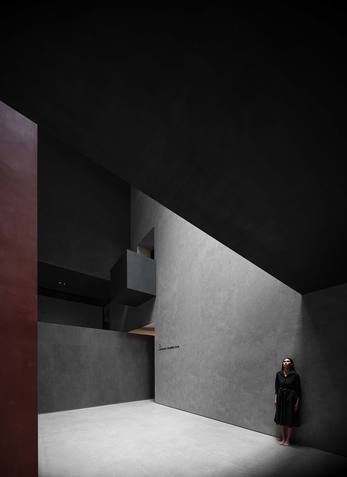
Spatial narratives
The ceiling of the lofty space is lowered, to create playful, powerful scenes.
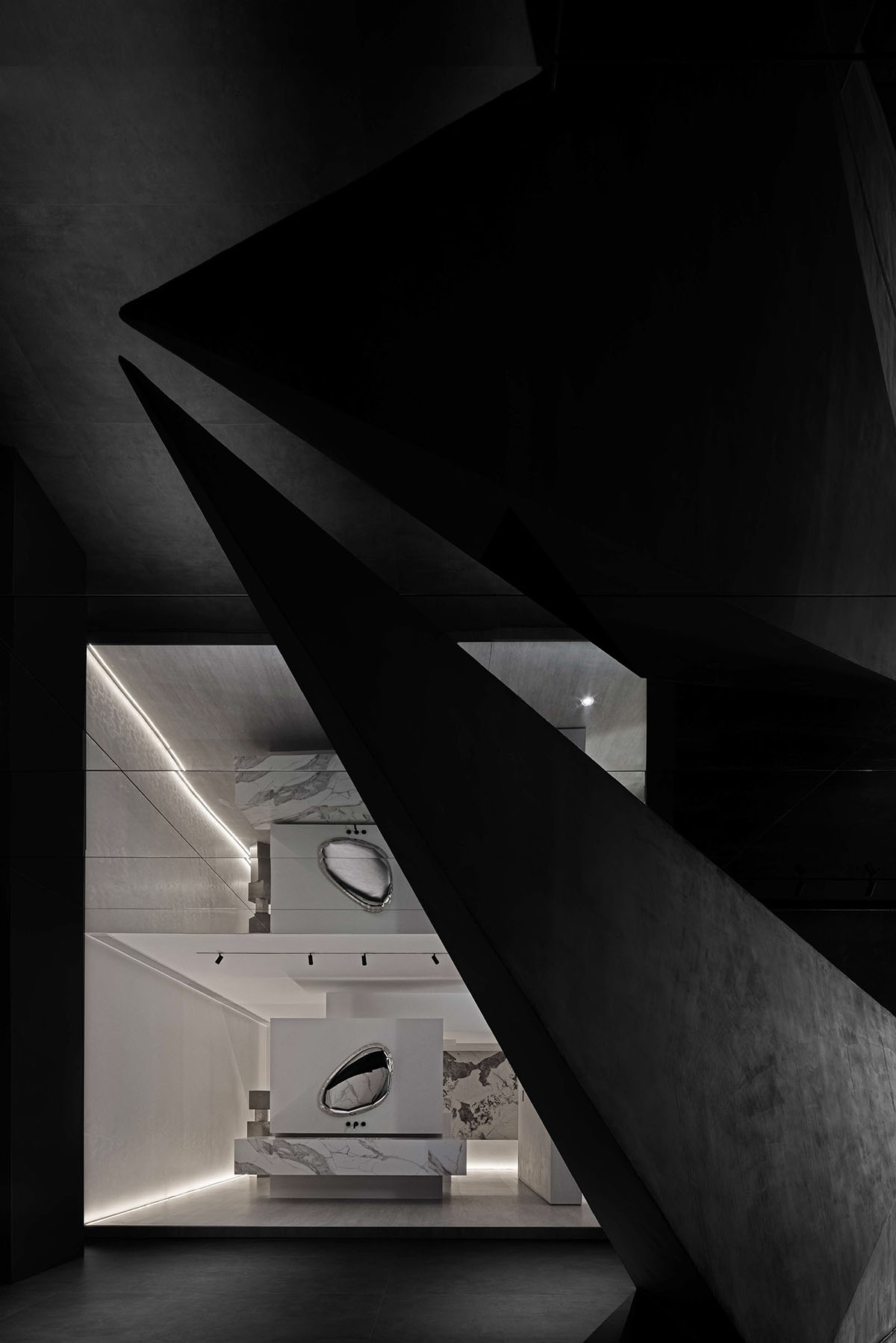
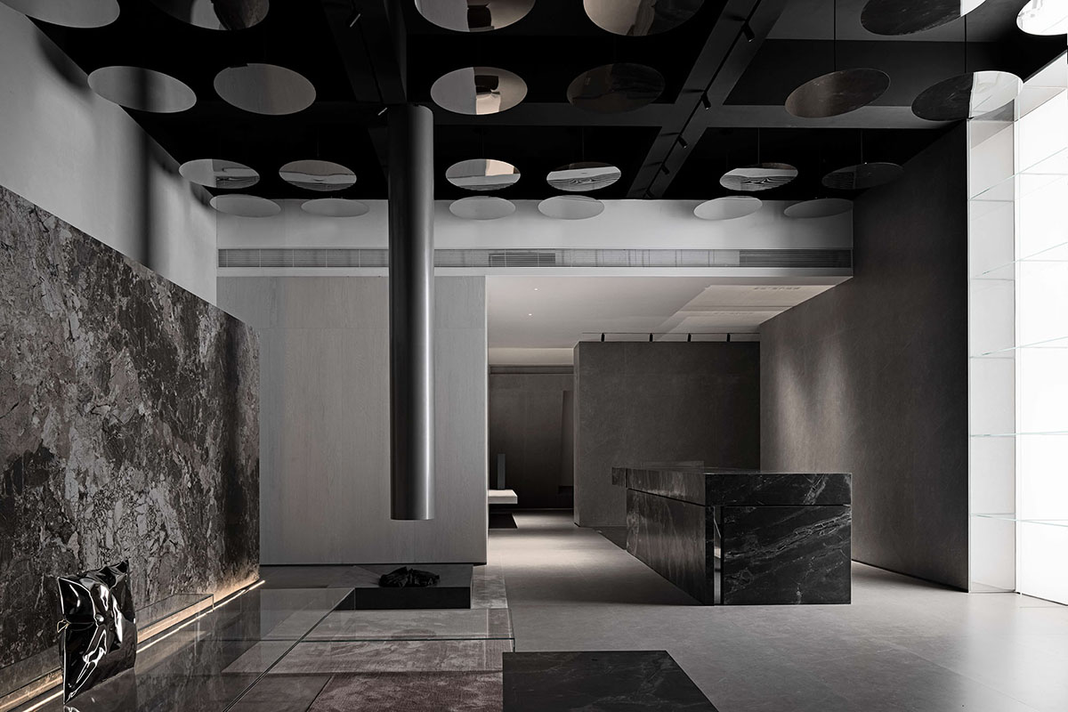
The reception lobby breaks the original high and closed space, lowers the height of the ceiling, and incorporates interesting forms and a sense of strength, which visually extends the interior surfaces, enriches the spatial layers and effectively removes the oppressive feeling brought by closed space.
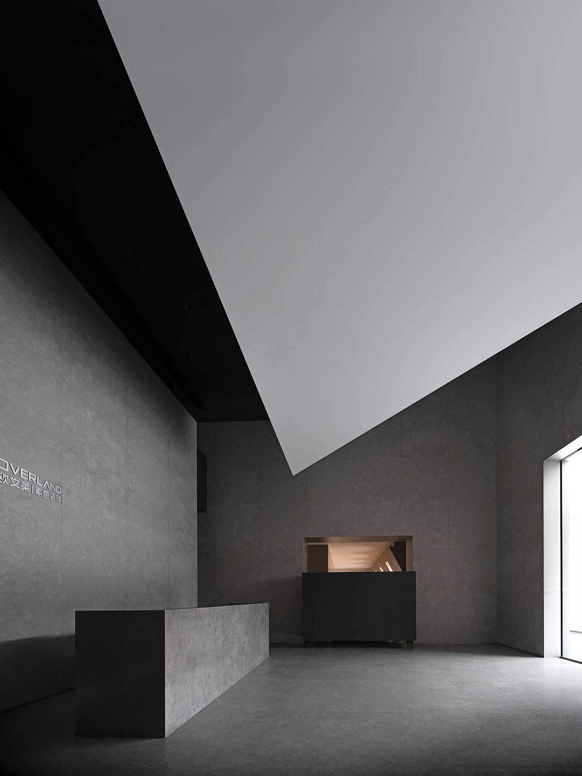
The design encourages touch behaviors in the space, and the carefully-organized circulation route is intended to stimulate interaction, perception and a sense of participation, hence creating memorable experience.
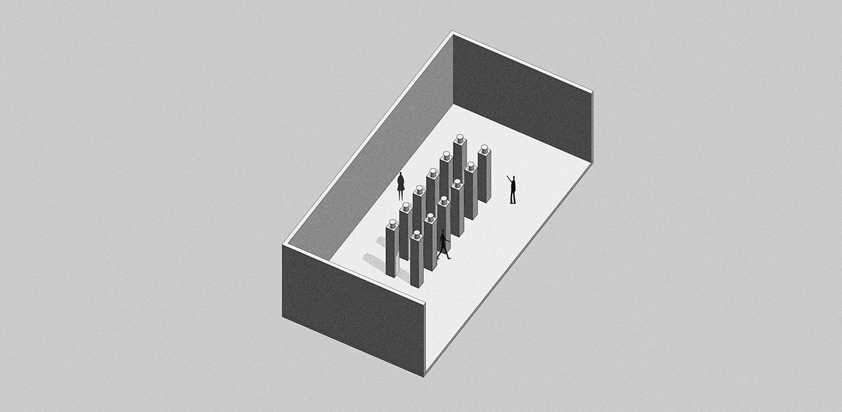
The design presents the brand's image in an interactive manner, and creates connection between 12 square columns and the brand. Brand display is realized based on multimedia that provides a tactile experience, encouraging visitors to perceive the products by touching them. The integration of products display and space makes the process of perceiving the brand more interesting, interactive, participatory and memorable.
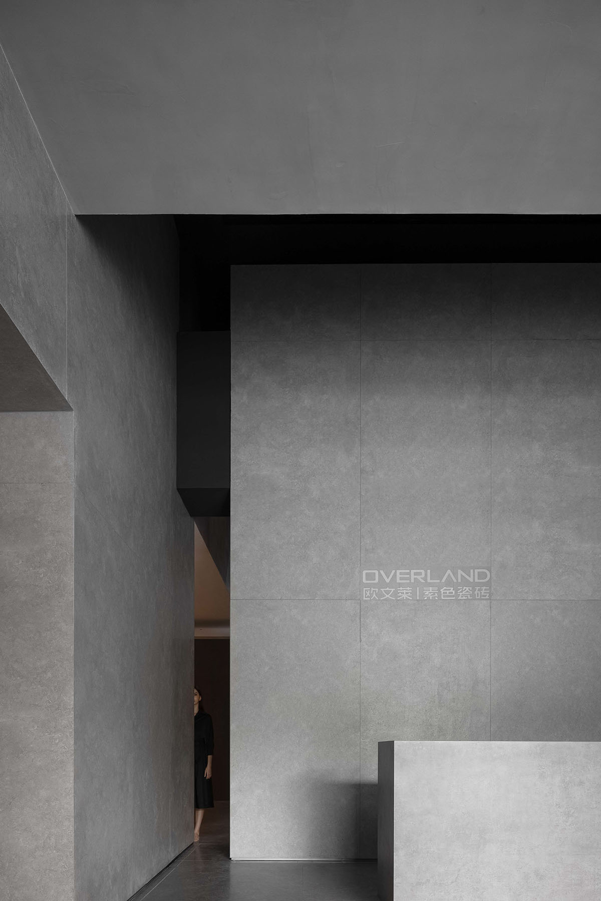
The design well matches spatial functions, and deliberately creates contrasts to amplify emotional experience.
Several transitional spaces are inserted to link spatial nodes, which produces a calm atmosphere before visitors enter the spatial climax, so as to generate a strong sense of shock and surprise and intensify visitors' emotions and feelings.
The design creates powerful forms, and makes use of light to highlight product textures in a natural manner.
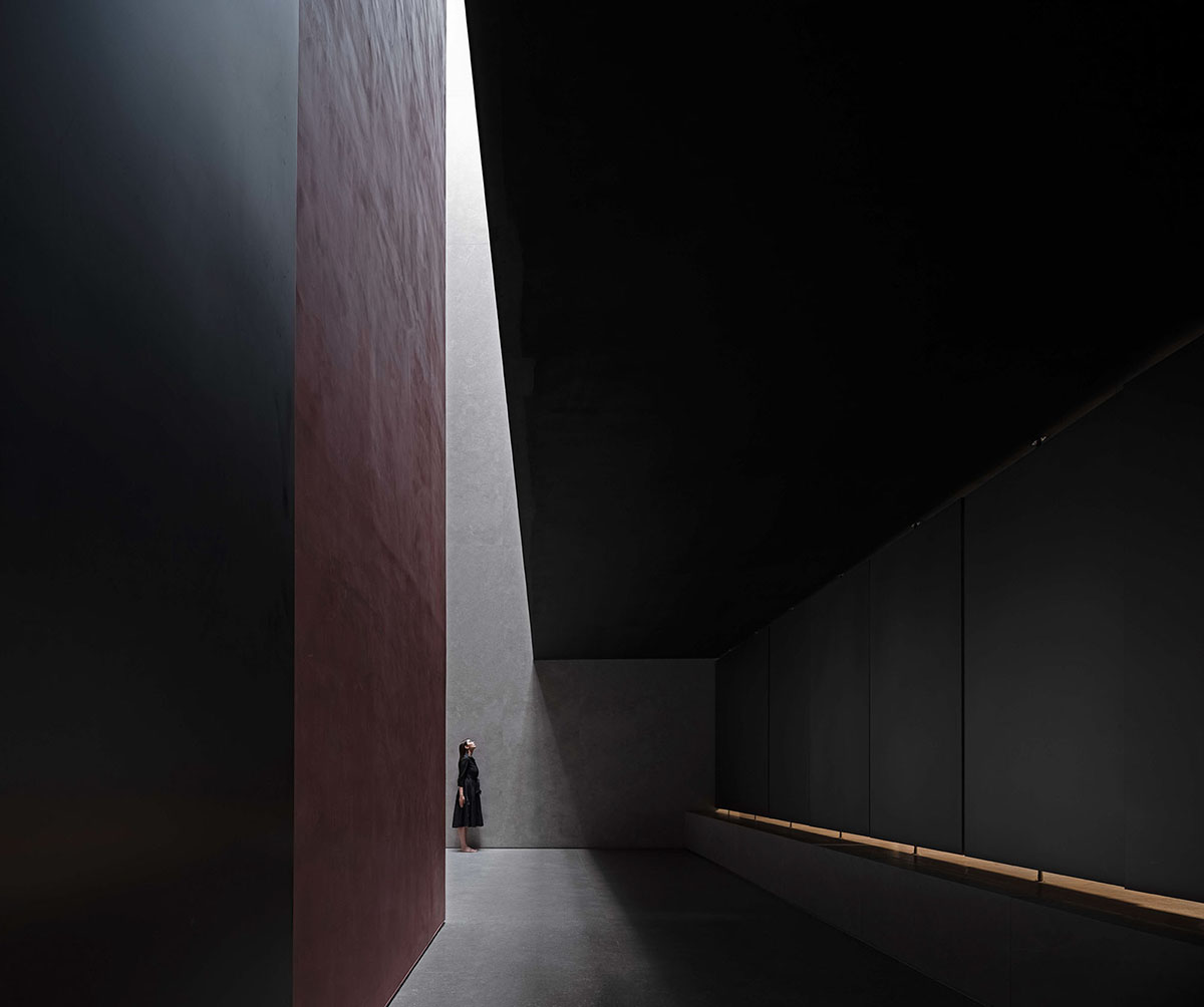
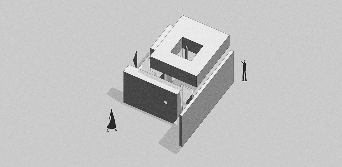
The column network leads to the 20m-high hollow space, where visitors feel released from the oppressive feeling. Daylight penetrates the glass and geometric steel structures, enters the space and interacts with sintered stone panels. It varies with time, bringing visitors a joyful experience and taking them to the spatial climax.
The geometric form and scale of the space highlight the large size of sintered stone panels. Complemented by light, the textures of natural sintered stones are strengthened. The tranquil light, powerful forms and natural tactile experience are intriguing, evoking various emotions and thinking.
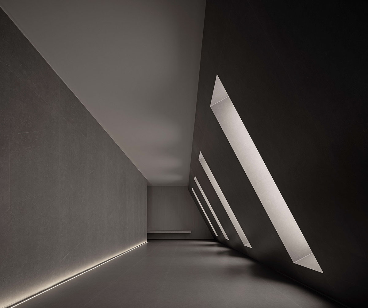
Light and geometric forms interact with each other, and the quality of displayed products is accentuated through architectural aesthetics.
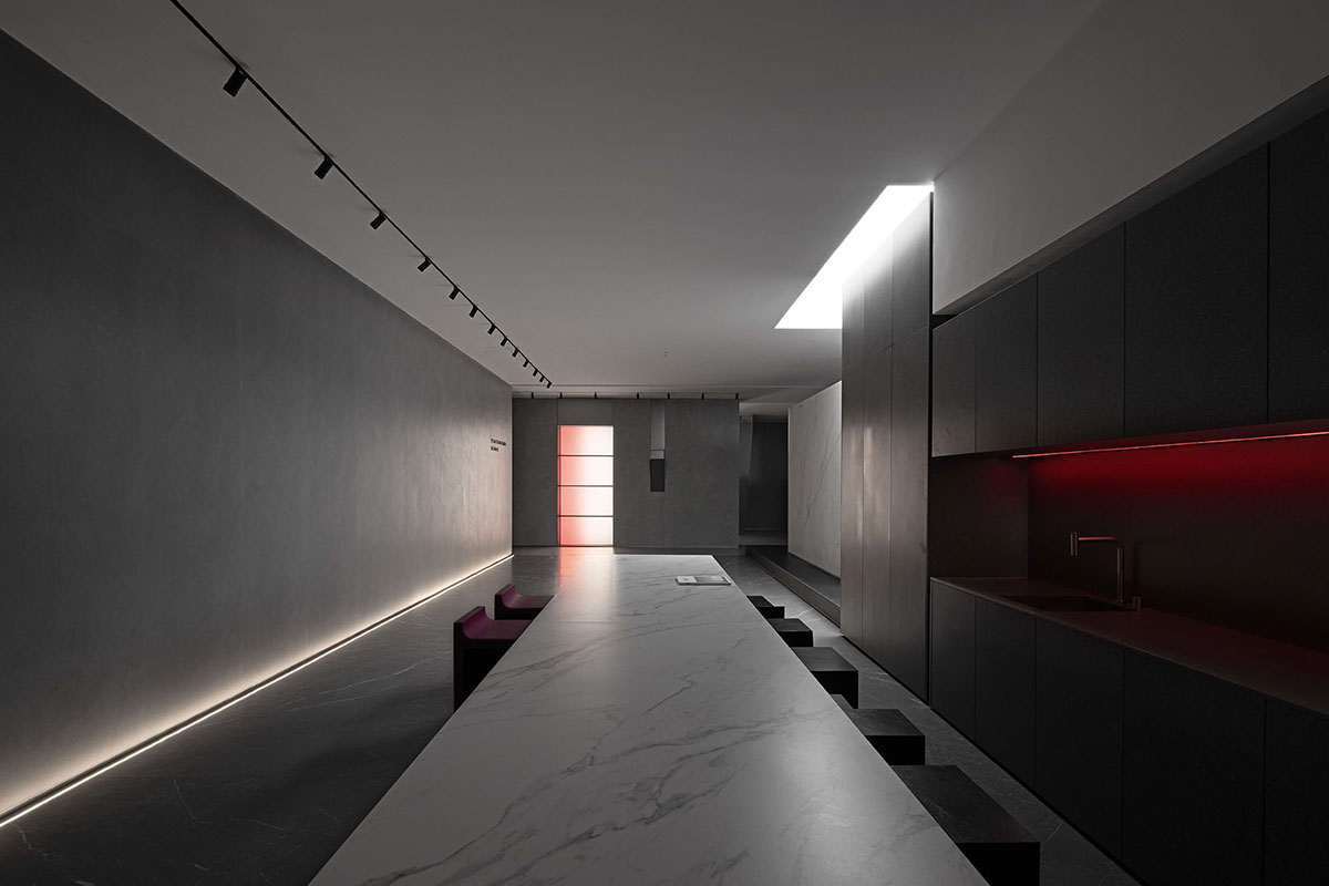
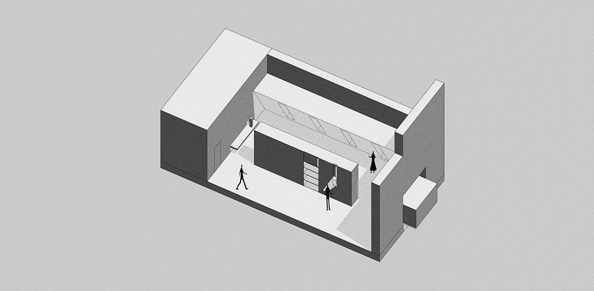
The products display space continues the overall design logic. To solve the problem of exhibition, products are divided into four categories, and are showcased in a pure manner on the horizontal and vertical surfaces within the space. With the interaction of light and geometric forms, and based on architectural aesthetics, the design expresses the confidence of the space and highlights the high-end products.
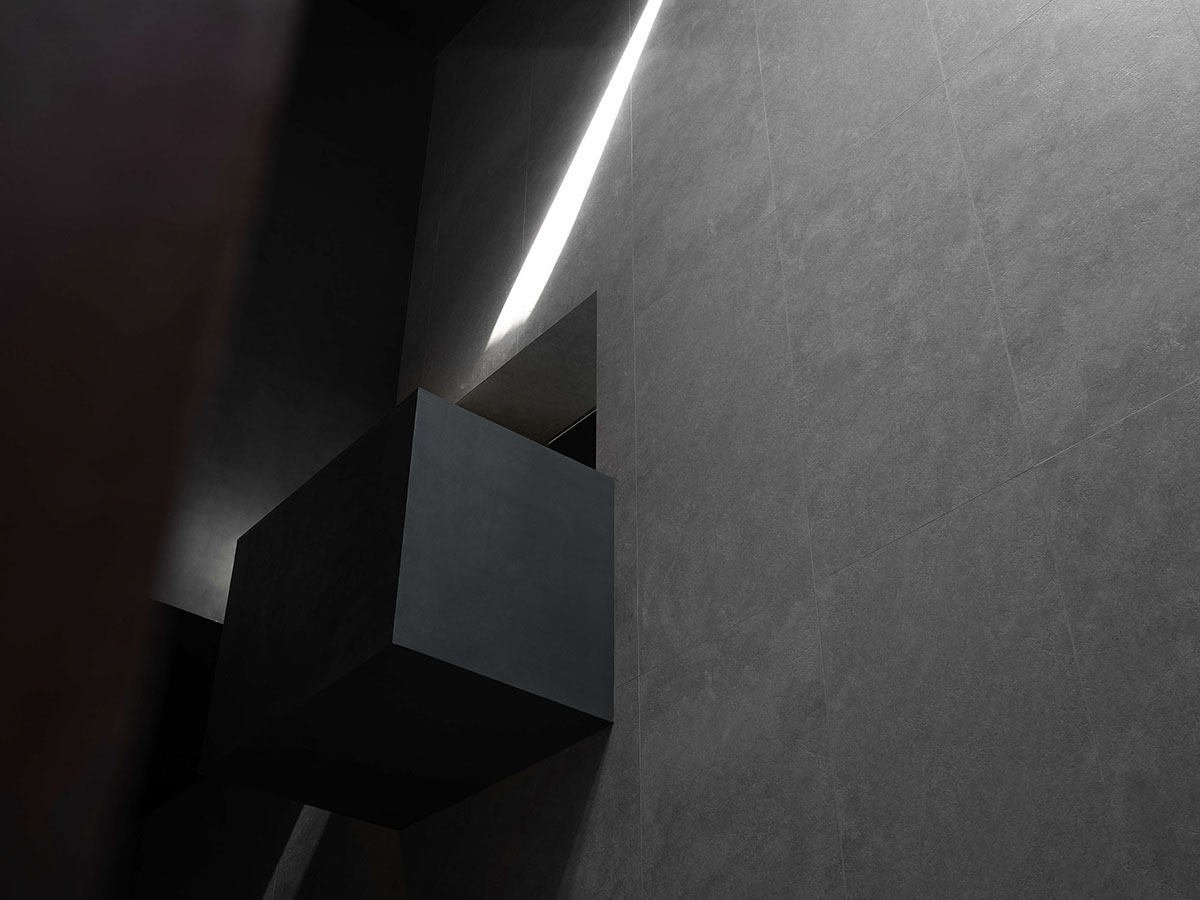
The design shows the application of products from multiple dimensions, and aims to guide visitors to perceive the space and the unique features of products.
The space accommodates a diversified product system in a selling scenario, and reveals artistic aesthetics unique to the brand. The space as well as light and shadows evoke visitors' imagination and sensory perception of products. Such artistic aesthetics feeds back the product system. Space empowers products, while products form the space, generating a stable brand system.
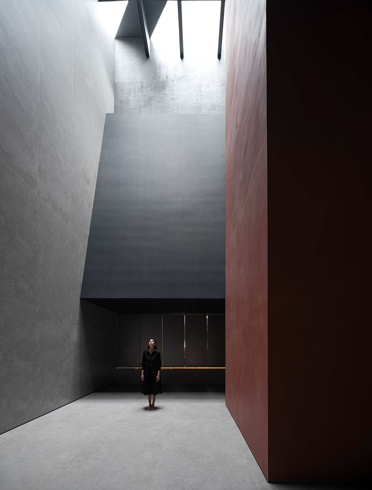
Freely flowing light and shadows integrate the rich layers of boundaries of products. The subtle subjective perception of material textures is converted into the impression of the spatial state.
The design activates the character of material textures. Instead of centering or focusing on certain aspects, it integrates products, space and visitors' sensory experience in a free and fluid manner. It critically reflects on the boundary between people and products, and let great things and surprises happen spontaneously.
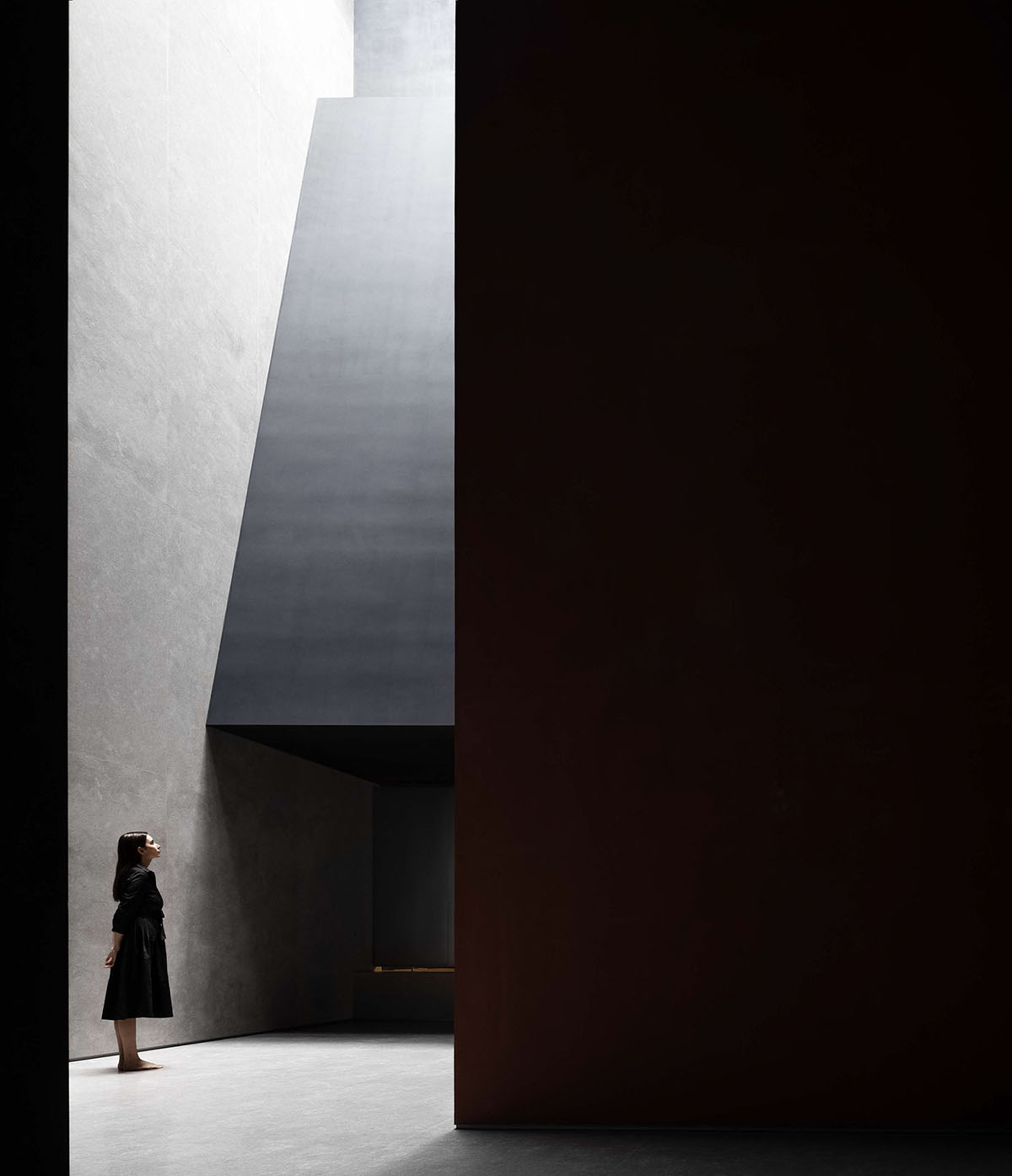
The circulation route creates a radical yet slow journey, intended to trigger dramatic emotional experience.
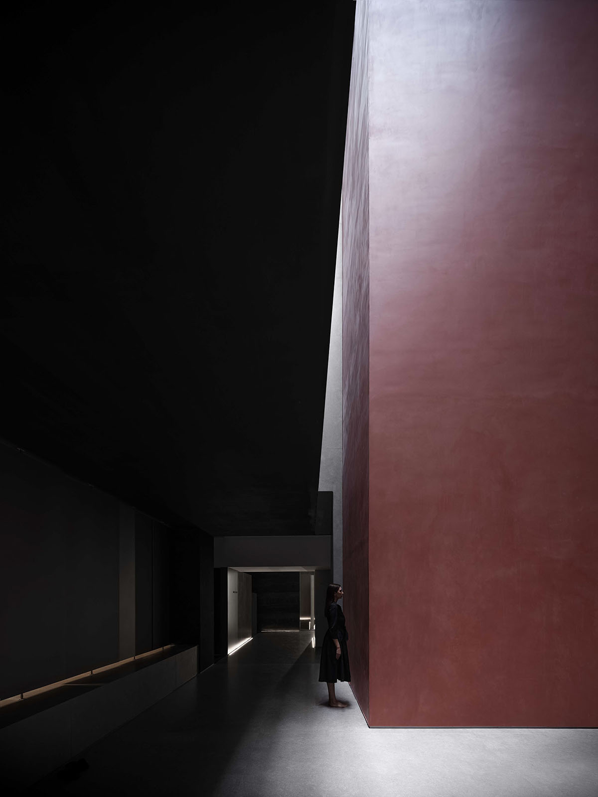
AD ARCHITECTURE created a radical yet slow journey in the space, and built the relationship between displayed products and people, space, nature and time. The interaction between spaces, the control of rhythm and the thinking of light are fully considered to optimize the circulation and the scale of human behaviors. In this way, the design softens the originally cool, rigid space, and effectively showcases products and the brand's temperament while reshaping the spatial spirit.
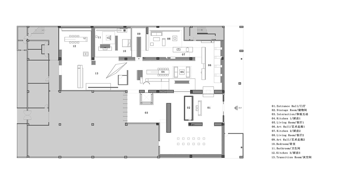
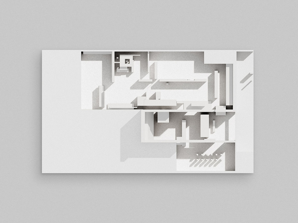
Floor plan
Section
Project facts
Project name: Chasing Light · Overland Headquarters & Showroom
Design firm: AD ARCHITECTURE
Chief designer: Xie Peihe
Furnishings: AD ARCHITECTURE
Location: Foshan, Guangdong
Floor area: 890 square meters
Main materials: sintered stone panel, paint, stainless steel, acrylic
Start time: August 2021
Completion time: November 2021
All images © Ouyang Yun
All drawings © AD ARCHITECTURE
> via AD ARCHITECTURE
