Submitted by WA Contents
CCD completes Heytea Zao Flagship Store (Nantou) in Shenzhen
China Architecture News - Dec 06, 2021 - 12:12 4561 views
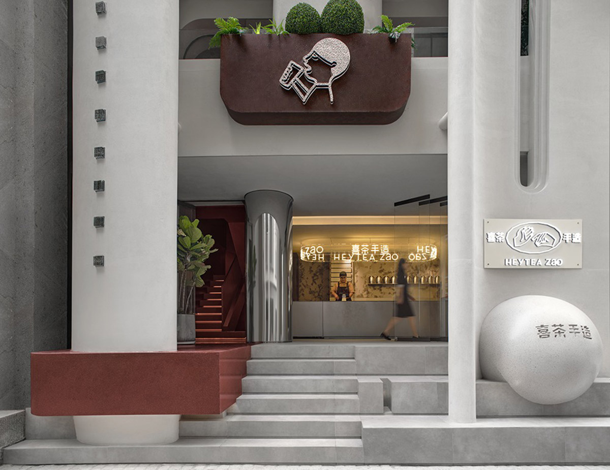
CCD / Cheng Chung Design has completed the new Heytea Zao Flagship Store (Nantou) in Nantou Ancient Town, Shenzhen, China.
Nantou Ancient Town is located in the central area of Shenzhen, with a history of more than 1,700 years. It is a cultural birthplace of Guangdong, Hong Kong and Macao. Through renovation, this urban historical and cultural neighborhood has been activated and renewed.
CCD conceived a Heytea store sited in Nantou. Through integrating the site's millennia-old cultural heritage and the city's modernization over the past three decades, CCD team created an example that represents the rebirth of Nantou.

Architectural appearance. Image © Boris
Based on modern approaches, CCD introduced classical architectural elements to inject timeless charm into the architecture and interior space. The most beautiful "sphere" strengthens the aesthetics of the space, which breaks conventional store design and creates an "undefined" inspiring space.
Undefined white castle
Deepened dimension
Considering that single experiential circulation is monotonous, CCD added screen walls to the existing building to change its horizontal form and highlight a sense of depth.
The building is enclosed by high, arc-shaped screen walls. The contrast of textures and colors not only differentiates distinct spaces, but also creates a striking visual effect.
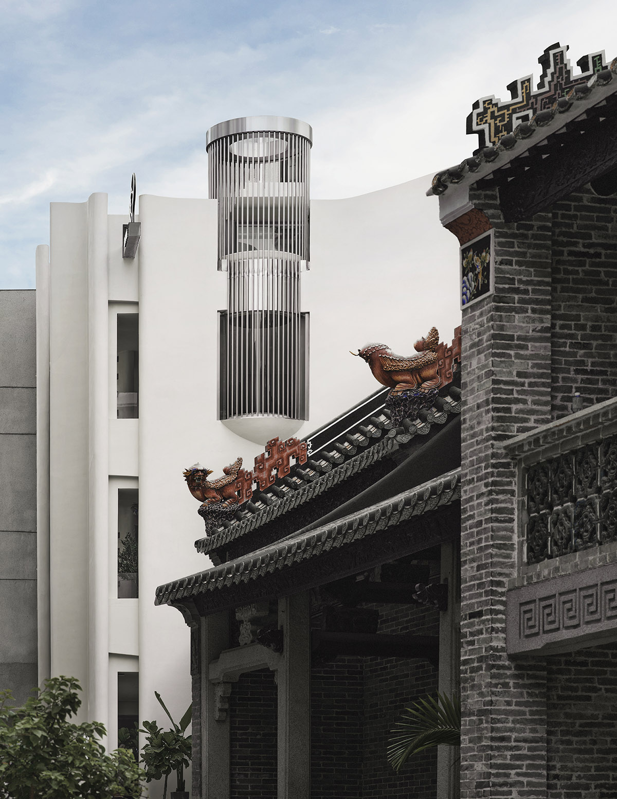
Architectural appearance. Image © Boris
Social architecture
The whole building reveals a simple, elegant image, with a large area of pure white facades. The facades mainly consist of 4 walls, 3 outside and 1 inside, which run from the first floor to the third floor. A roof garden is set on the fourth floor.
The inside screen wall passes through the balcony on 2F and 3F, allowing customers to take a close look at its material textures and form and providing an attractive setting for young people to take photos.

Architectural appearance. Image © Boris
Integration of architecture and interior space
At the entrance area on the ground floor, a floating "table" protrudes towards the street, which is as high as tables inside. The steps recall the style of lecture hall.
Customers can drink tea and chat around this "table", or sit on the stairs to enjoy tea and streetscape. In this way, they become a part of the street scene.
The interiors and outdoor space interpenetrate, which reflects CCD's consistent design concept of integrating architecture and interior space.
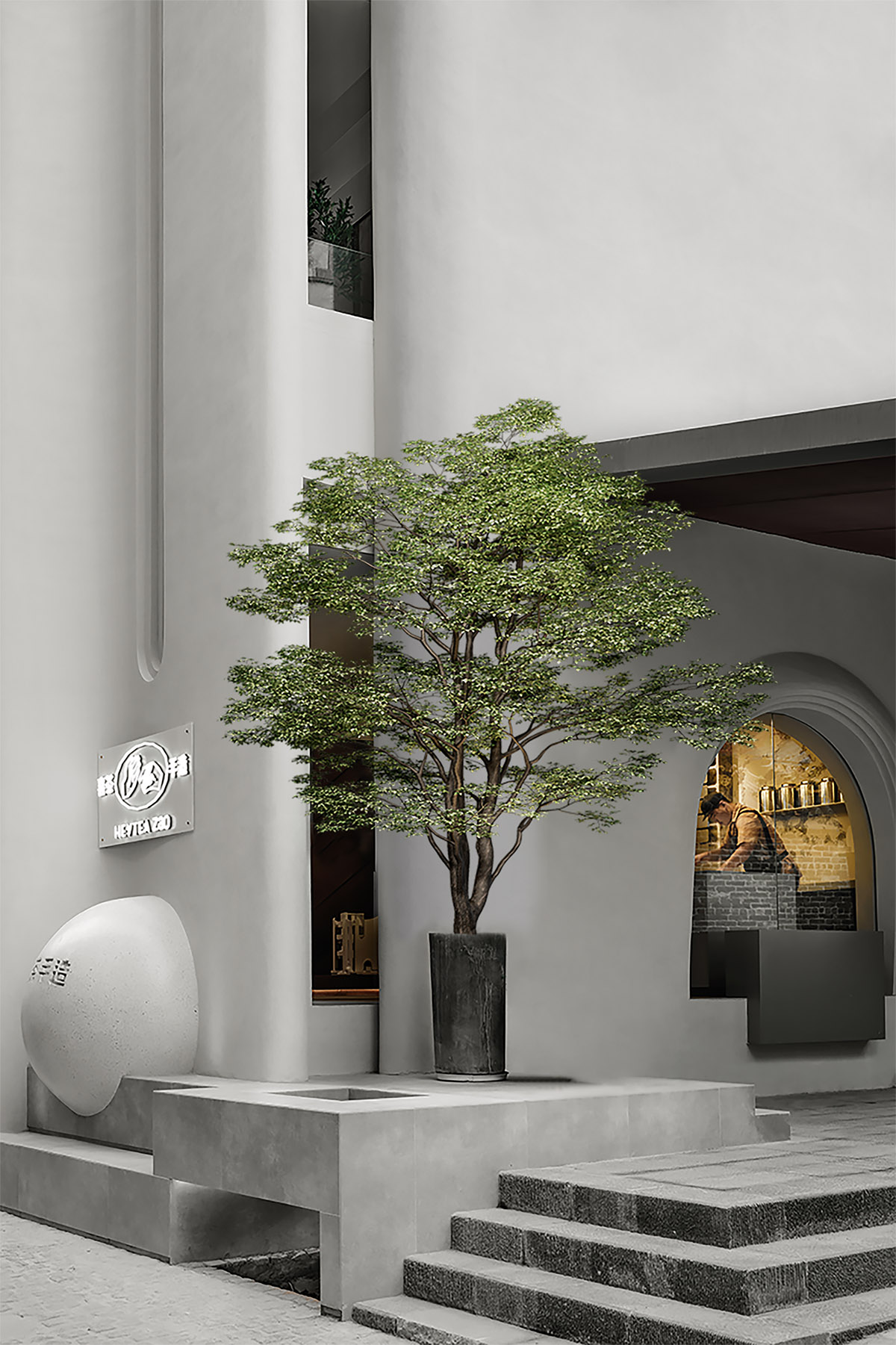
Architectural appearance. Image © Boris
The continuation of family warmth
CCD transformed and reinforced the exterior walls of the original building. Considering local people' attachment to their former residence, the design team retained the eaves, so as to let them feel that their "homeland" left by ancestor is still there and continues to provide a shelter for them. No completely closed window is designed for the store. Instead, transparent, open sliding glass doors are utilized. No matter when local residents return home or pass by, there is always a lamp waiting for them, calming and warming their heart.
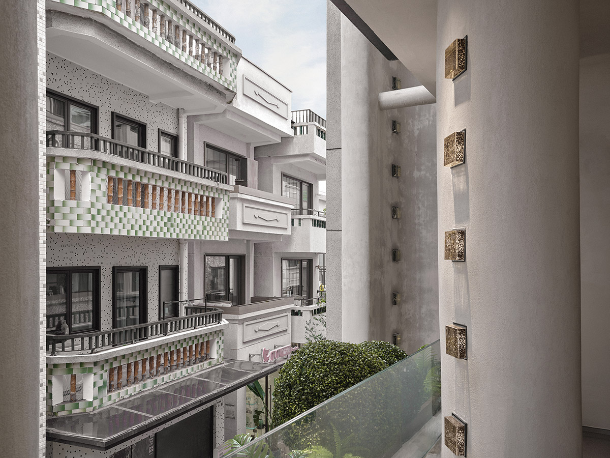
Interior. Image © Boris
Neighborly interaction on the balcony
Though occupying a limited area of about 60-square-meter, each floor of the store is equipped with a small balcony, where customers can see passers-by on the street and even greet and interact with "neighbors" in buildings across the street while enjoying drinks.
The design responds to traditional Chinese culture which stresses family life and the relationship with neighbors.
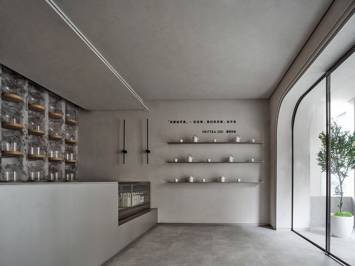
Interior. Image © Boris
Create a spatial relationship
Carlo Scarpa emphasized the necessity of creating certain relationships for architecture.
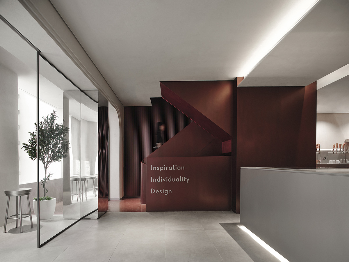
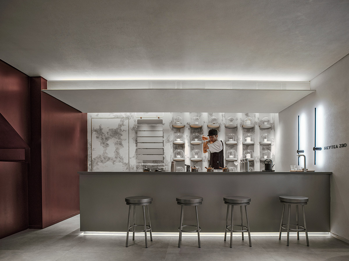
The interior space adopts a color palette mainly composed of dark red and white hues. The retro textured paint echo modern metal materials, which not only effectively differentiate functional areas, but also showcase the contrast and fusion of history and modernity.
Through extracting the tones and fabrics of Nantou Ancient Town, CCD built a vibrant red staircase to create a spatial relationship among floors. The "boundaries" of staggered staircase structures are combined with the space "in between" functional areas of each floor, which inserts a new spatial relationship into the existing spatial framework and thus enriches the spatial experience.
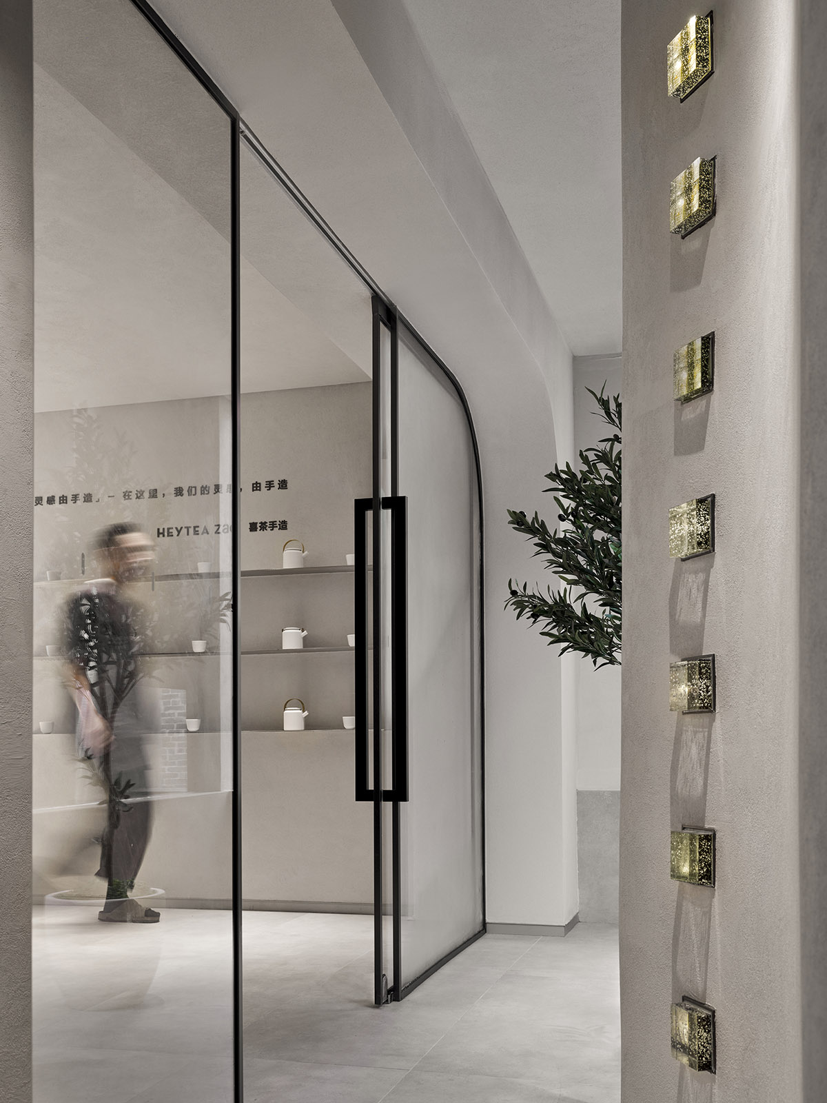
Interior. Image © Boris
The details of the space
"The detail is the adoration of Nature." — Louis Kahn
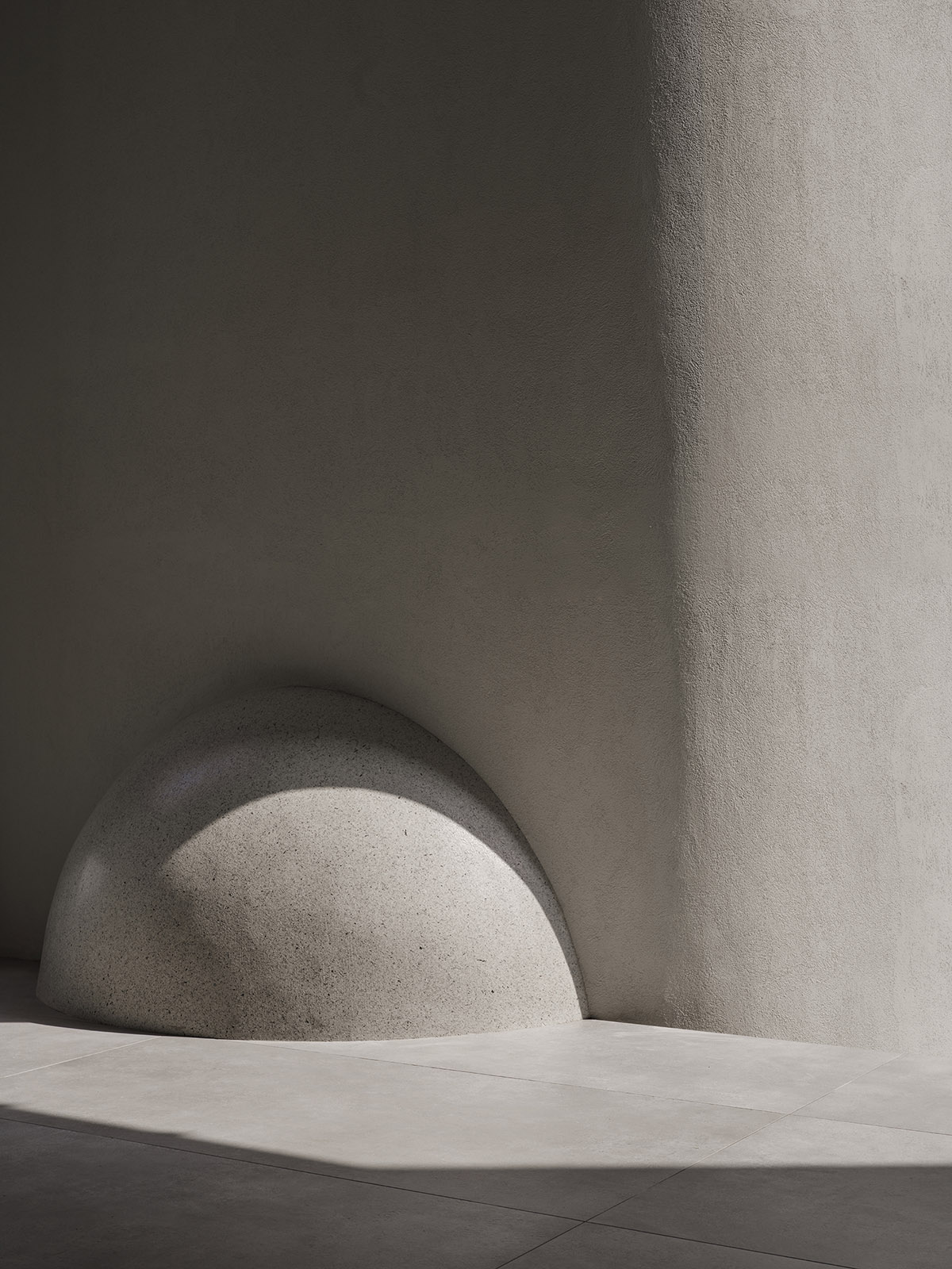
The sculptural sphere engraved with the characters "Heytea Zao" plays a guiding role and runs through the whole design. It is a witness that establishes interaction with viewers. In the space with a unified theme and diversified expressions, it helps tell a clear spatial narrative.
Half of the sphere is exposed outside and half is hidden inside, creating a multi-dimensional spatial effect. It's interactive, fun and surprising, attracting passers-by to step inside with joy.
The pure curved display wall visually expands the space.
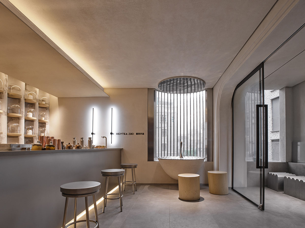
The art installation featuring "ripples" and "water droplet" produces rich visual effects, and staves off the boredom of the long space. It goes beyond rational forms, and immerses customers in an artistic, poetic ambience. The installation generates a scene that fuses the real and the virtual, and resonates with customers.
The "water droplet" is a design language that perfects the space. It is also a historic symbol and metaphor, creating a dreamy scene that incorporates memory and hope.

Interior. Image © Boris
Rooftop art life
We mankind actually live in two worlds, where we seek outward success and inward pleasure and satisfaction respectively. The project's pursuit of aesthetics goes beyond functions, which meets people's spiritual needs. People can drink tea, chat with friends, enjoy being lost in thought and bathe in the sun here.
The rooftop terrace on 4F enables customers to stay alone or gather with friends. The human scale-friendly design creates a natural, harmonious environment.
Red linear light strips render a variable, magical and dramatic effect in a modern manner. The design brings customers an immersive experience, and produces a distinctive, compelling atmosphere. The cool, stylish and classy spatial ambience interprets the "undefined and unrestricted" brand image of Heytea.

Interior. Image © Boris
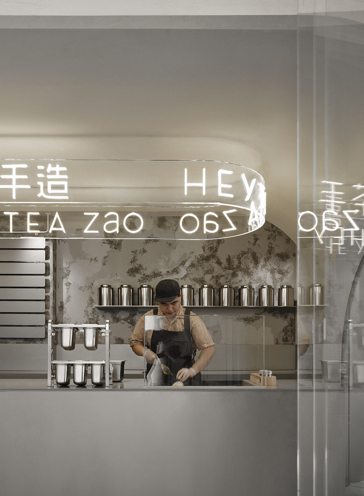
Interior. Image © Boris

Interior. Image © Boris
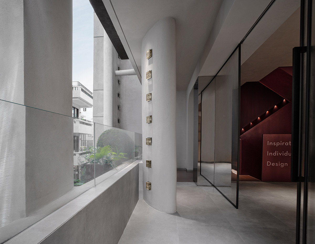
Interior. Image © Boris
Interior. Image © Boris
Interior. Image © Boris
Interior. Image © Boris

Interior. Image © Boris
Interior. Image © Boris

Interior. Image © Boris
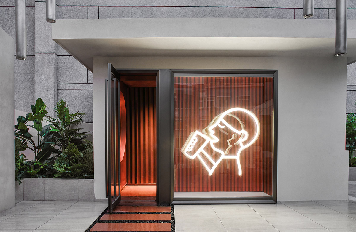
Interior. Image © Boris
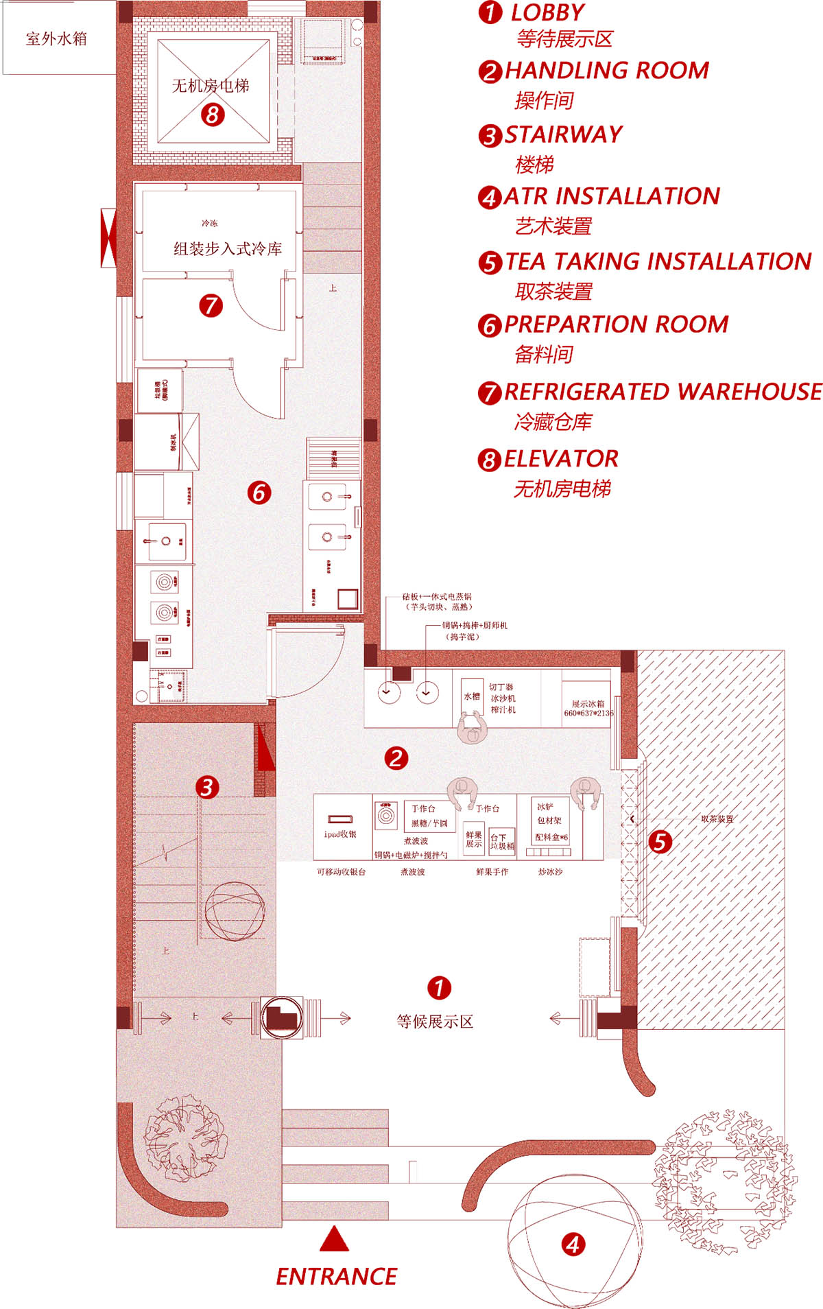
First floor plan
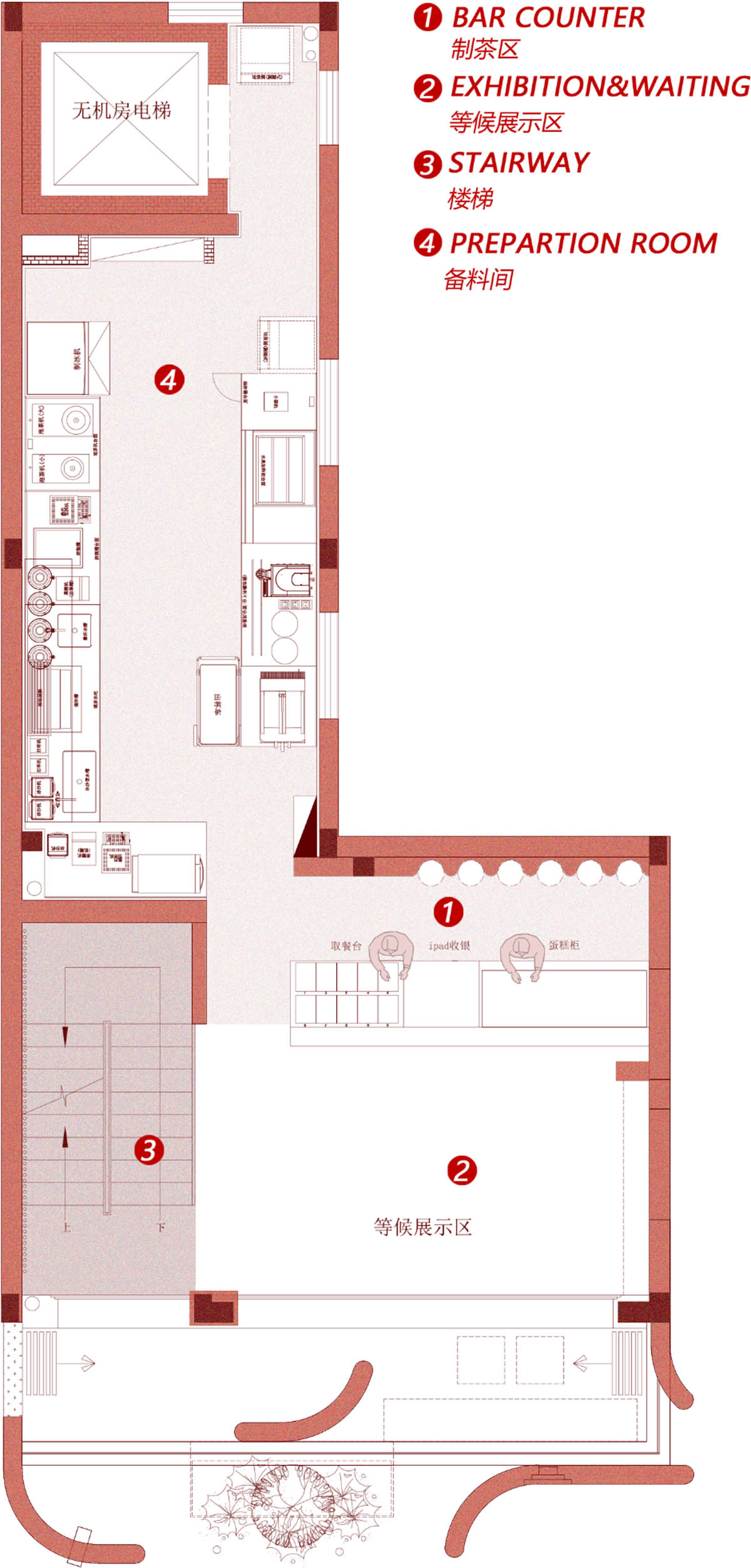
Second floor plan
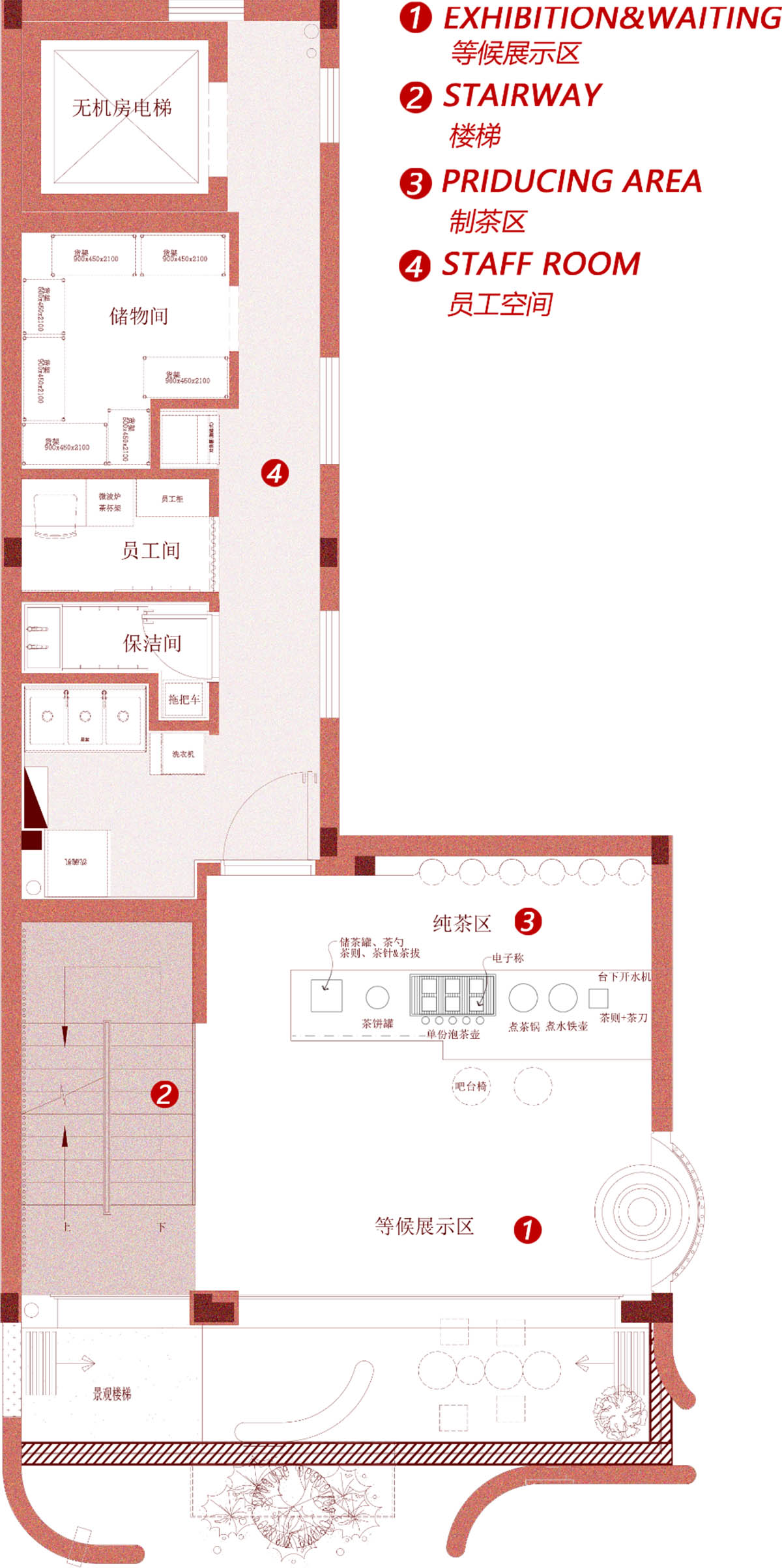
Third floor plan
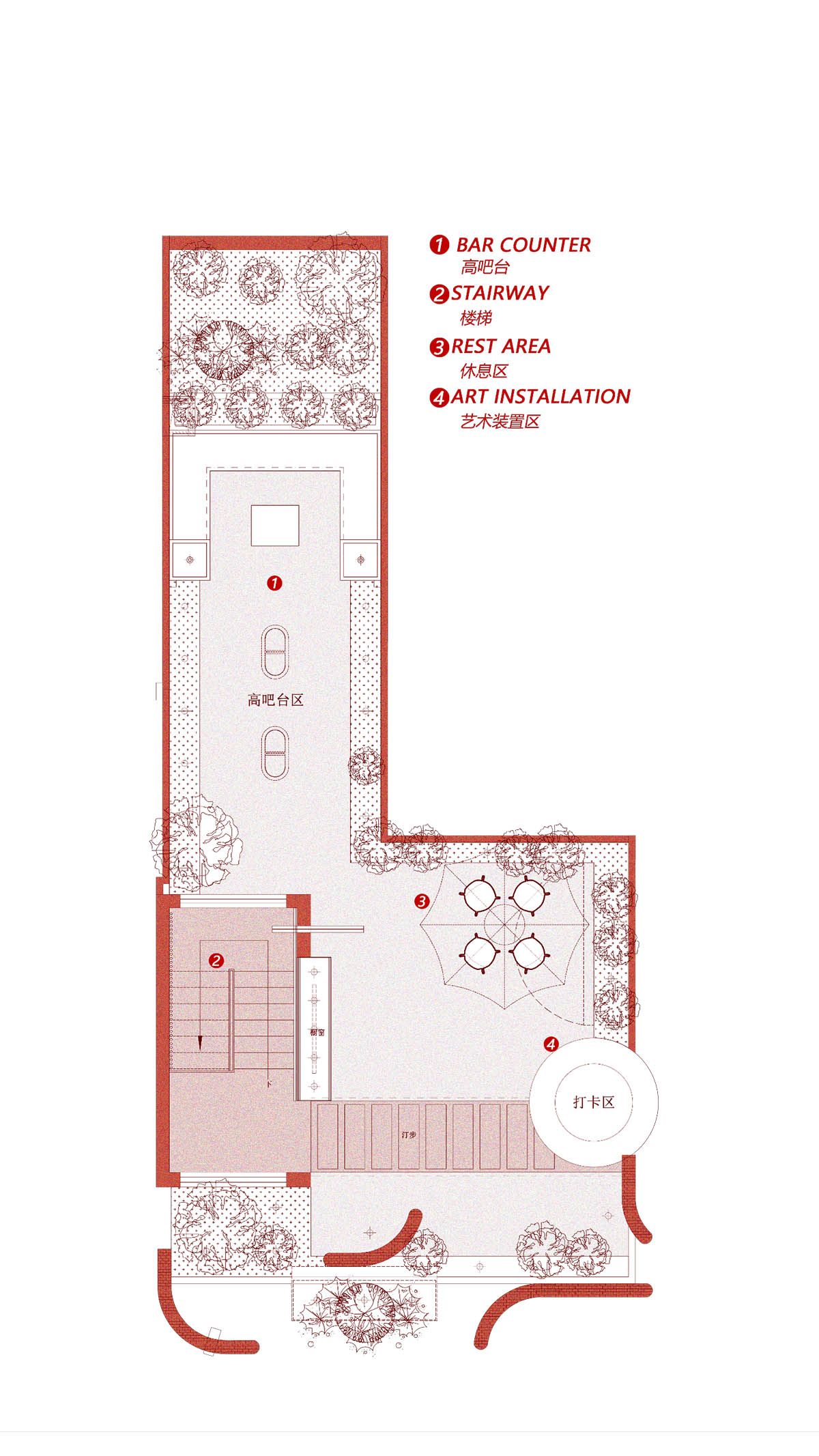
Fourth floor plan
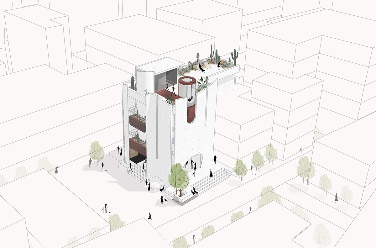
3D drawing
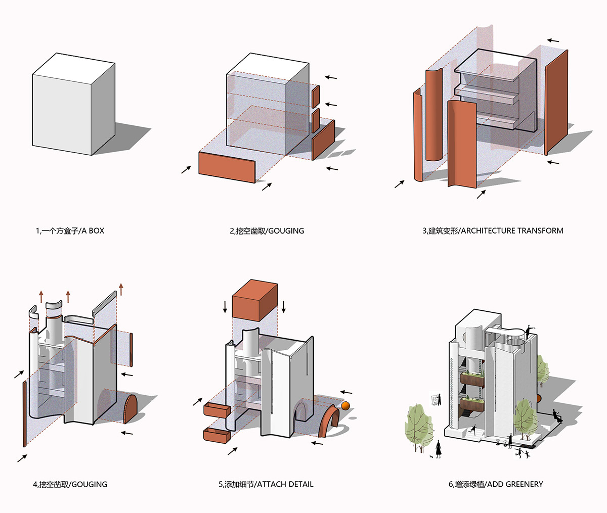
Architectural evolution

Diagram
Project facts
Project Name: Heytea Zao Flagship Store (Nantou)
Client: Heytea
Location: Nantou Ancient Town, Shenzhen
Architectural Design: CCD / Cheng Chung Design (HK)
Interior Design: CCD / Cheng Chung Design (HK)
Area: 300 Square Meters
Completion Time: September 18, 2021
All images © Boris
All drawings © CCD
> via CCD
