Submitted by WA Contents
Spring Design Office completes SigMann Showroom with bold and geometric elements in Guangzhou
China Architecture News - Nov 05, 2020 - 15:52 4055 views

Spring Design Office has completed a showroom in Guangzhou, China, featuring bold, geometric and cozy interiors.
Called SigMann Showroom, the 170-square-metre showroom was designed for SigMann, a cabinet and home furnishings brand, the name of which is derived from "Sig" and "Manna". "Sig" is the abbreviation of "special interest group", which represents cultivated, decent and tasteful elites, while "Manna" comes from Bible and implies food for thought.
Based on the development over the past years, SigMann has shaped profound brand values. It not only provides excellent home products to customers, but also inherits a unique lifestyle via classical designs and intends to bring it to numerous households.
Design Innovation
With consumption level and ideas improving, a kitchen revolution is happening, and more and more households are paying great attention to the design and quality of kitchen and bathroom furnishings. Under such context, SigMann attaches great importance to its offline showroom, where relevant experiential scenes can evoke visitors' imagination of future life.
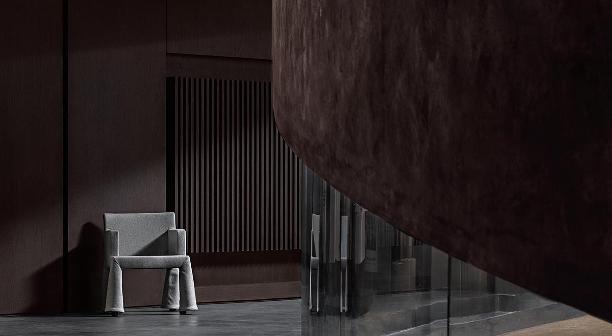
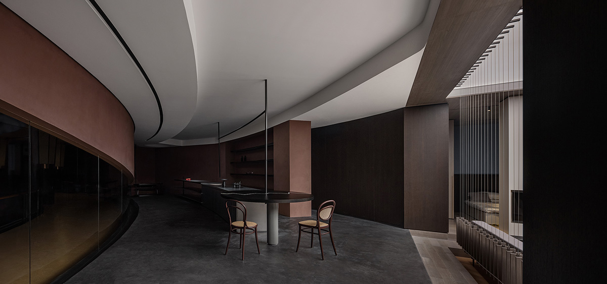
This showroom is situated within a large home products mall in Guangzhou, China. The designers broke the original spatial pattern, while endowed glass curtain wall at the atrium with rolling forms.
The view varies as visitors moving, and natural light filter in, together generating a storytelling space. The ceiling features curved lines, and looks like a slowly spreading curtain.
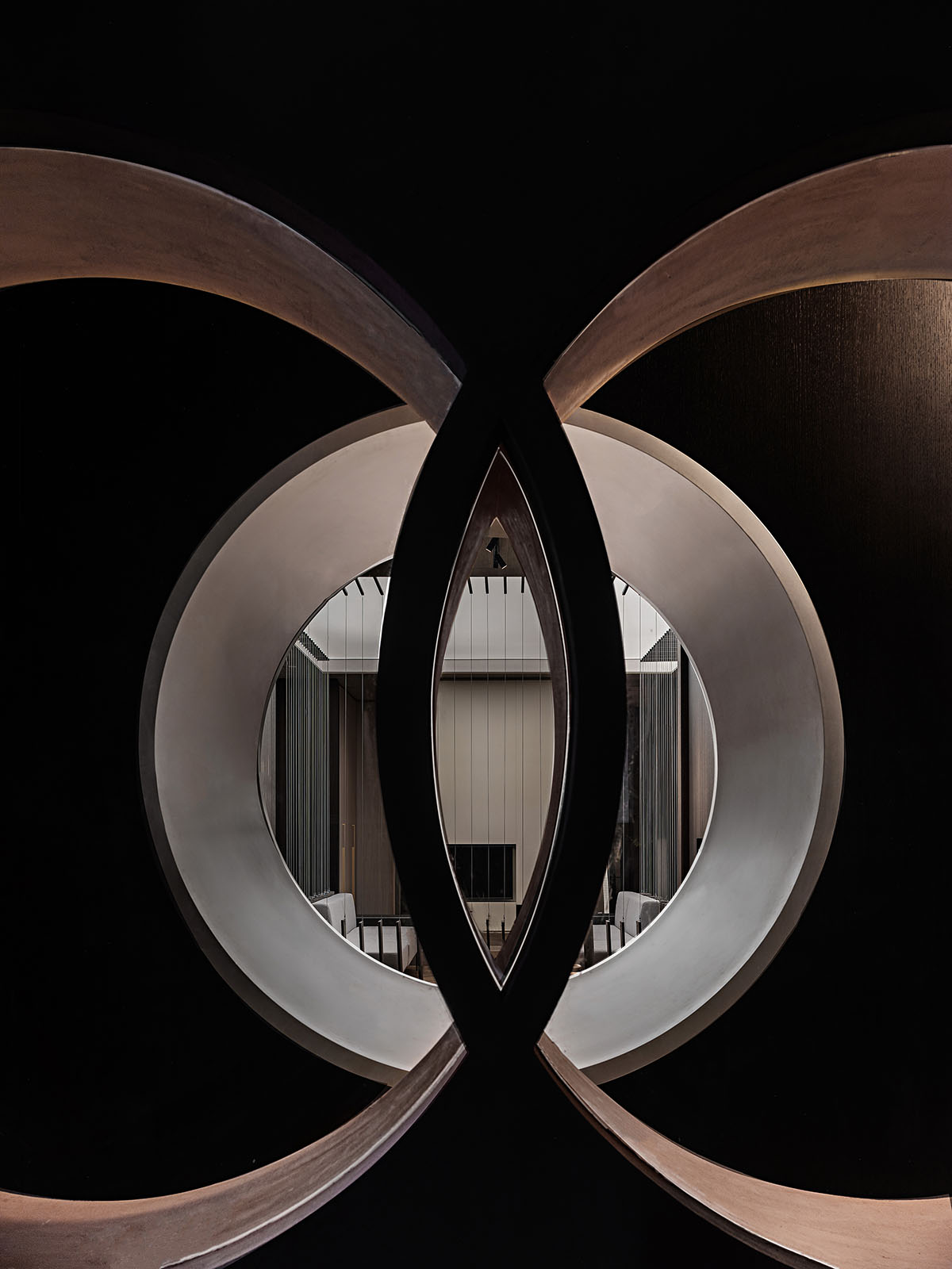
The design drew on "borrowed scenery" technique in classical Chinese garden design, to enhance the sense of depth of the space.
Nested, connected or mutually echoing round openings reveal partial scenes, and the light is full of changes. One of the design focuses was to create rhythm via the symmetric and balanced relationship of circles.

Creation
Maybe, in a sense, modern designs have been indulged in the stereotyped material palette of concrete. However, materiality and textures shouldn't be so monotonous.
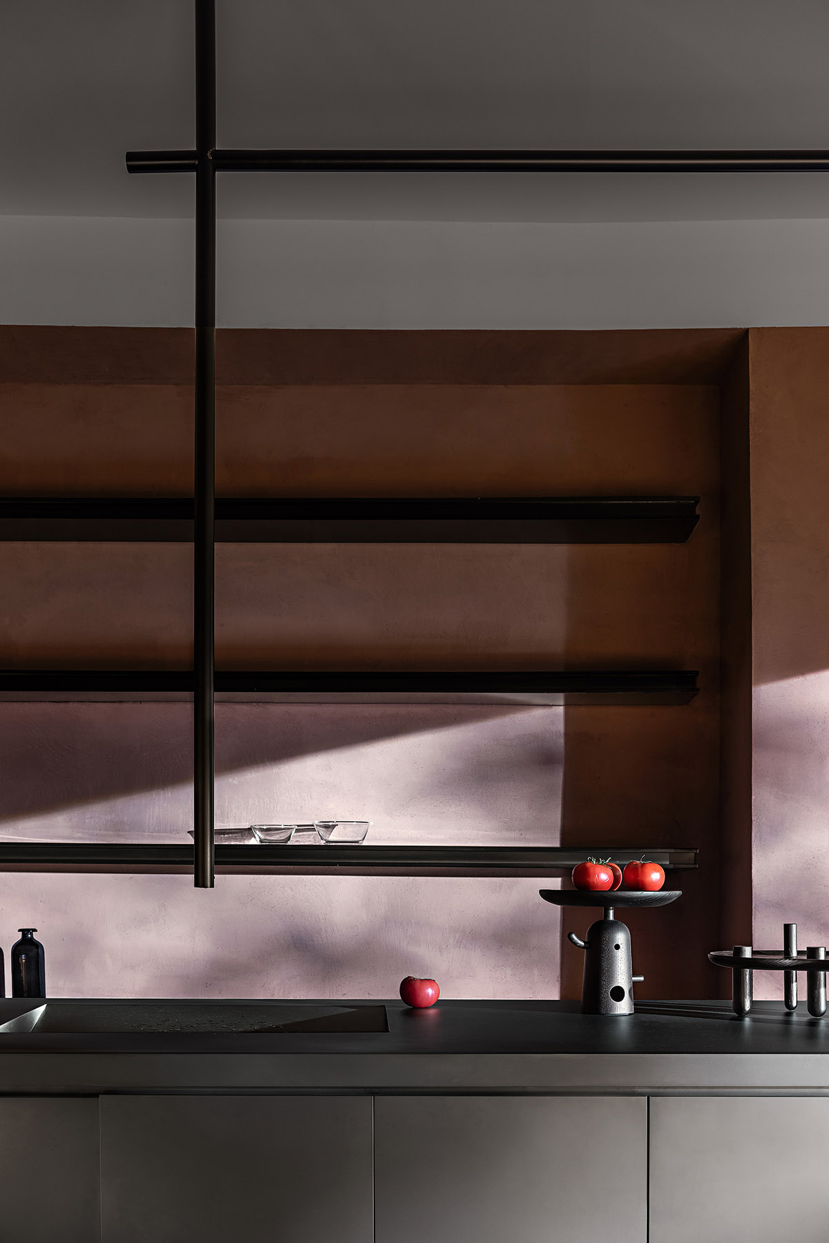
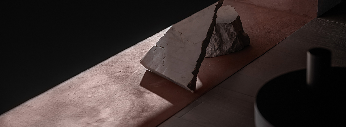
The large systematic island customized for the showroom is full of contrast and tension, and stainless steel releases a strong industrial atmosphere. Unique coating gives the cabinet wall a rough and plain texture, which looks like the red soil from plateau, embodying primitive inclusiveness.

The design team tried to "regain freedom of materiality and arouse its dignity and pride" as advocated by Kengo Kuma. The upper and lower parts of the systematic island respectively serve for kitchen and storage functions. The structure is very clear, whilst also incorporating a living atmosphere.
Tranquility
The passage is merely 80 centimeters, which generates serenity and a sense of formality. The two side walls show the contrast of the modern and primitive, with round window openings bringing in light.
In the tea room, a long tea table stretches above the sunken tatami area. The space features neat and concise lines. Its "emptiness" gives it an inclusive character.
One of the walls has an opening at the bottom, which reveals footsteps and the interplay of light and shadows. The fusion between the inside and outside of the tea room generates unpredictability.
Order
Set at the left side of the staircase, the living room area is at the turning point of the circulation and sight line. Featuring a rectangular plane, it endows the overall space with socializing languages.
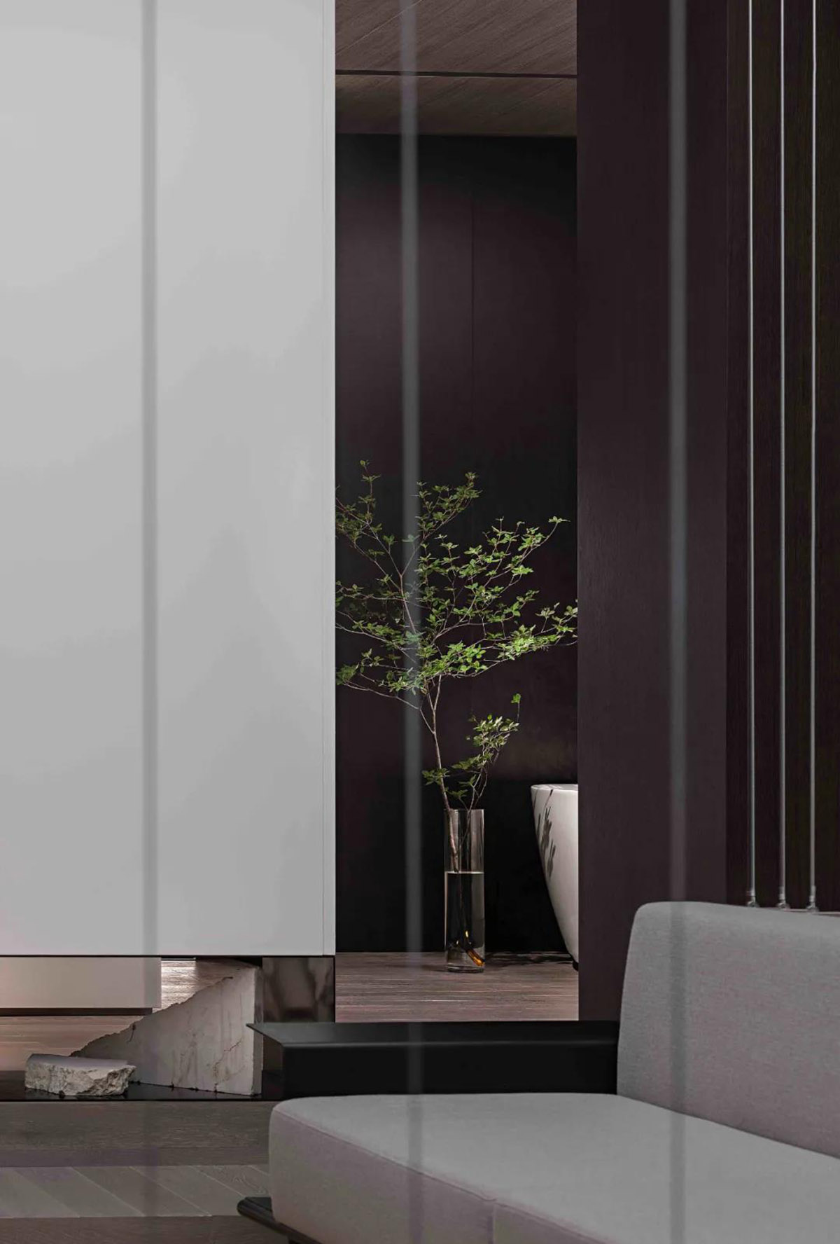
The sunken structure is independent, welcoming yet isolated. Vertical steel lines form several screens, which not only visually enclose the area but also identify boundaries of the mind.
People sitting in it feel like being wrapped and feel a sense of security, while those outside would consciously stop walking in. This shows the wisdom of spatial languages, and the sense of "order" between people.




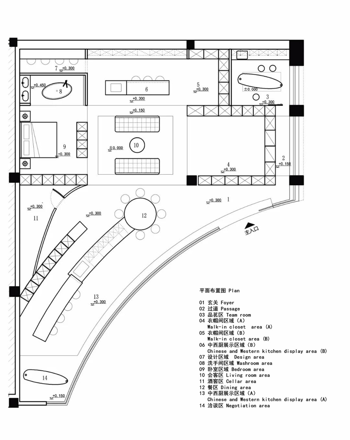
Plan
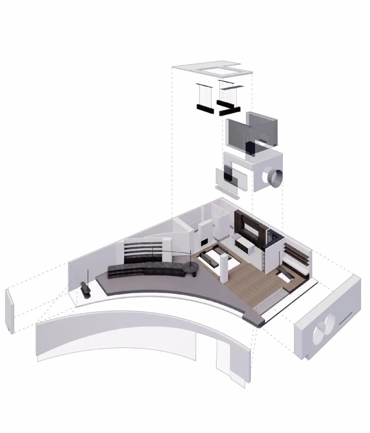
Exploded drawing
Project facts
Project name: SigMann Showroom
Location: Guangzhou, China
Design firm: Spring Design Office
Chief designer: Wu Jiachun
Area: 170m2
Start time: October 2019
Completion time: April 2020
Special thanks to: Guangzhou HORNET STEEL ART Co., Ltd., Yi's House
All images © b+m studio/ Kelvin
All drawings © Spring Design Office
> via Spring Design Office
