Submitted by Tarun Bhasin
Futuristic Workplace: Infosys Experience Centre, Chennai by Narsi & Associates
India Architecture News - Jul 16, 2020 - 13:02 13755 views
This article shall explore the Infosys Experience Centre, Chennai designed by Narsi & Associates. Founded by Mr. Narsi Kularia in 1986, the Narsi group is a interior turnkey fit-out service provider, PAN India. The company is an ISO-9001:2015 certified & rated SME 1 by ‘CRISIL’. The group comprises of ‘Narsi & Associates’ and ‘Narsi Interior Infrastructures Pvt. Ltd.’ The group’s client list includes key names in sectors like Banking, IT & BPO, Retail & Multiplexes, Pharmaceuticals, Hospitals, Airports and many more. Narsi Group has gained reputation for in providing a package of services ranging from concept to execution. The group also spearheads designing & manufacturing a wide range of high-quality contemporary furniture reflecting creativity, skill, style, finish, ergonomics and comfort in different colour combinations for different spaces. They also develop interiors and products to conform to LEEDS Green Building Certifications.
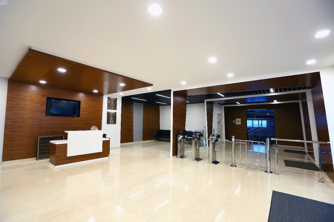
Reception Area, Infosys Experience Centre, Chennai.
An Experience Centre is usually a medium for any corporation to display its curation to its clients. It allows the clients to venture into a more personal understanding of the brand. Here, the space envisages and displays not just the functional qualities of the corporation’s work, but its philosophies and aspirations as well. From that point of view, an Experience Centre serves to introduce any client to the heart of the discussions that take place in an organization, and space-making is the centerfold to base that understanding upon.
While, the idea of an Experience Centre is rather obvious and straightforward for industries that deliver tactile objects, which in turn become a source of inspiration for the elements of design of space, or at times are used as prized displays to interested customers; crafting a definition for a company that is at the frontier of Information Technology (IT) is a challenge because their work serves the virtual domain and remains hidden, embedded in the depths of digital functions, processes and applications of the world. Here, not much can be put on display.
Narsi & Associates was confronted with a similar challenge when their returning client, Infosys Ltd. (an Indian IT multinational corporation), desired to create an Experience Centre in Mahindra World City in Paranur, Chennai. Since Narsi & Associates were well versed with Infosys Ltd.’s approach to their office spaces, having collaborated with them on many projects over the years, they understood the functional aspects of an office space demanded by the IT behemoth. However, the project in focus, would not be including the regular workplace aspects of their offices, but would serve to display the company’s vision to its clients.
A cliché approach to such a brief would be to fill up the space with digital mediums and overpower the visual environment and physiognomy of the interior spaces with bright and contrasting displays of forms of Silicon. But the interior design firm drew clarity of its knowledge owing to their previous projects, highlighting their contributions in advancing spatial design values in a contemporary and futuristic workplace environment.

Display Area, Perspective View.
Narsi & Associates noted the contribution of Infosys Ltd. and its need for a technologically friendly and driven work environment. They understood their role in influencing the office layouts over the years - having shaped the notion of workspace from clutter, cramped, object-oriented cubicles to minimal, fluid and adaptive landscapes that invite collaboration, are carbon-efficient, healthier and safer. Thus, from the inverse of a combinatorial explosion of digital applications and gadgets, the IT company had steered the design requirements to a more organized and agile workspace.
Understanding how technological innovation has served to be a relentless force in transforming modern workspace, that Narsi & Associates has worked into its own design philosophy, the firm explored the idea of a futuristic smart office to explore the limits of integrating workplace design with digital innovations. Thus, the Experience Centre was defined as a workplace that envisioned a lighter flexible workspace driven by user efficiency. Here each space would be segregated on the basis of the technology driving the functional use of that particular spatial segment. Therefore, rather than fighting for attention technology is used in complimenting the identity of interiors.
This concept provided Infosys Ltd. a unique opportunity to introduce its technologies and works by integrating them in the real-time use of spaces to help users understand how each space (in the future) would be driven by the underlying technology facilitating a particular typological function. Thus, the Experience Centre serves to portray not just how the IT company envisions the use of its own spaces, but how it seeks to transform the general understanding of interior design for everyone else.
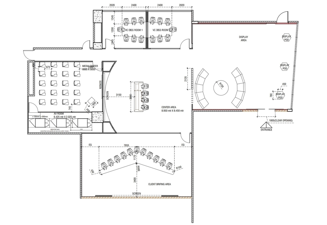
Layout Plan, Infosys Experience Centre, Chennai.
The layout is very simple. Beginning from the common entrance area from the building, that incorporates the functions of most modern lobby areas with enhanced security, communication and comfort, the user is taken to the Display Area that lies at the very front of the experience. Here, the contemporary furniture design shows how the interior design will evolve and change the adaptability of the space. The space is breathable and free to move around.
The semi-circular cushioned corner is the hearth of the narrative, which allows people to gather and remain focused on the discussion within themselves while the display in front serves as an extension to the conversations. The area is used primarily to introduce the visitors to the broader agendas of a meeting that will continue in the rooms placed ahead. Thus, the Display Area serves as a personal semi-formal extension to help the visitor transition between the agendas and develop interpersonal relationship with the company in the beginning.
The display pods add to that purpose by being aligned on one edge of the spacious room. Instead of displaying the company’s work in a formal marketing style, they remain silent and inviting, gently nudging the visitor to explore them at his/her own convenience and comfort. They allow the visitor to feel at ease but at the same time develop a curiosity to inquire more about the company.

Display Area, Client Briefing Centre.
While offices continue to evolve, the future workplace will see interesting advancements beyond modular meeting rooms, from personalized environments to furniture that is better for our health. The display area furthers a push towards workspace that value the well-being of staff on equal measure with their productivity.
The glass façade behind the display pods not only serves as a dynamic canvas. It adds a pop effect to the otherwise deep and meditative colour and material palette of the office for a necessary psychological upliftment. Placement of greens behind the glass façade, merge the static interior lighting and materials of the office to the dynamic weather and moods of the outside while plants promote both psychological and physical wellness.
The quirky lined graphics on walls and glass screens invoke the imagery of Silicon Motherboards and bring an intertextual reference to the identity of the industry which the Experience Centre seeks to promote. In contrast, the warm lighting, the black and woody tones add a Zen like effect, that keeps the employees and visitors calm yet active, tranquil yet aware.

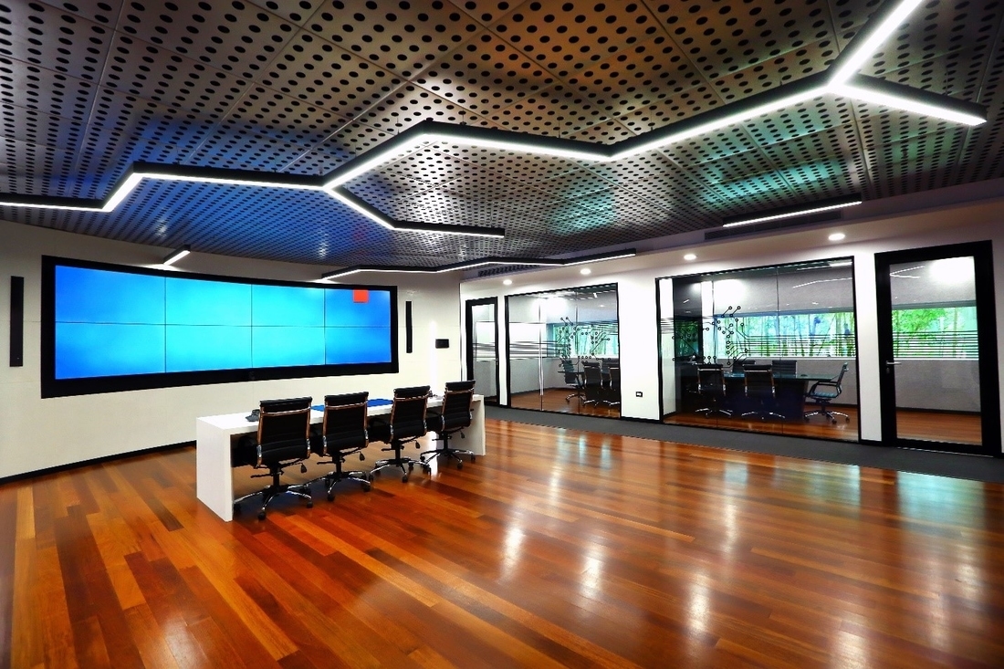
Center Area, Perspective View.
The Display Area advances to Center Area, which is the transition space between three functionally categorized spaces – The VC Discussion rooms to the right, The Media Room to the front and the Visitor Briefing Centre to the far left. The Center Area remains focused by aligning the table away from the Display Area, onto a wall with a TV screen. It is primarily used for online conference discussions that include a small number of people.
The larger focus of this space is for movement in between the rooms and for transition. Thus, the TV display is again used as an ancillary support. The discussions meant on the table are expected to be of a more open semi-formal nature. The distance between the table and the TV screen expresses a balanced reserved attitude. It does not keep the visual attention completely attuned to the TV but allows visual retention of the larger environment and the three formal rooms that accede it.
The curved display responds to the distance and width of placement. By doing so, the Experience Centre crafts a very fine line in the control of technology over human experience by placing an adequate distance between them. It allows the visitor to remain focused on the agendas through the use of technology but not be overwhelmed by the medium that they lose awareness of their immediate space. By doing so, it makes a statement on sensible use of technology in the workplace.
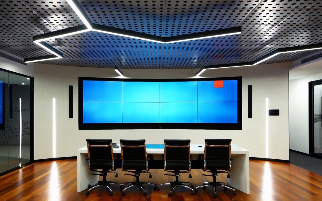
Center Area, Transition between other functional spaces.
The VC discussion rooms, can hold long, arduous and stressful discussions. The size of discussion teams also varies. Thus, two partitioned spaces can be combined to form a single bigger space. With a horizontally resting window peering into a view of greens, the VC Meeting room marks the idea of a flexible as well as healing space. It allows the participants to remain focused while enhancing their productivity and reducing their stress levels.
The soundproof glass façade retains openness with the rest of the office while maintaining confidentiality. The use of a narrow horizontal glass screen displaying the greens in the background ensures visual connectivity at a seating level that is accessible to the everyone across the linearity of the table.
From an ergonomic viewpoint, the effect is brilliant. It is be noted here that, while the landscape featured in the Display Area utilizes more leafy variety of plants for dense foliage that enhances energy. But, the choice of plants to craft the landscape view of the VC Discussion rooms is Yellow Bamboo, that is commonly used to create peaceful and meditative environments.
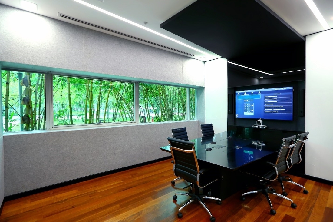
VC Meeting Room.
The Client Briefing room retains visual connectivity with the Center Area in the background but uses an obtuse angled table facing away from it and onto a wide screen for conference discussions. The obtuse angle creates two oblique sides that allow the participants to retain visual connectivity to each other thus facilitating discussions. But, unlike the semi-circular layout of display area, the wide angled layout here puts more focus on the screen, and thus the visual content.
Naturally, the space here focuses more on negotiations, agendas, driven by technological mediums, thereby, showcasing the space segregation based on technical use. The Client Briefing room takes this segregation a step further by completely detaching itself visually from the rest of the Experience Centre and crafting an enclosed audio-visual environment for an immersive experience.
Instead of the woody tones of the Experience Centre, the Client Briefing Room balances a tightly enclosed atmosphere by using white colour with black. It keeps the room visually light and accommodating but also serves to provide it a Sci-Fi look. It proves to be the last leg in the experience of the style of work of the corporation.
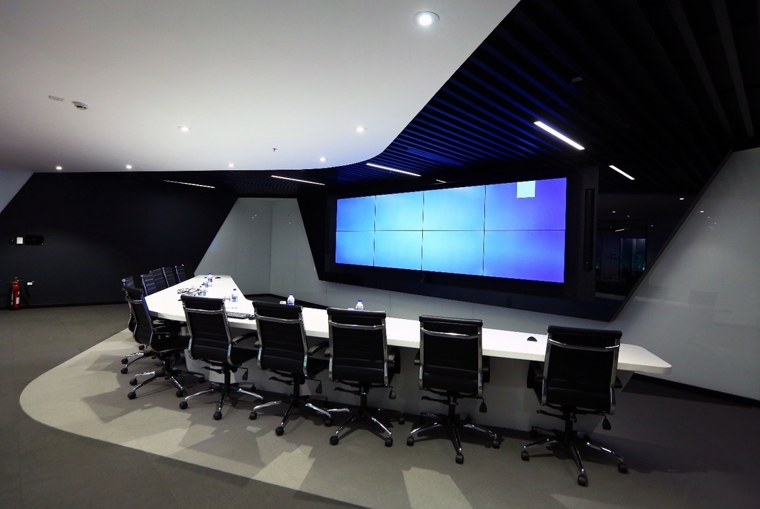
Client Briefing Room.
The Infosys Experience Centre by Narsi and Associates details the aspirations and visions of the IT giant while carefully displaying the principles of a well-planned interiors.
It retains the fundamentals of human experience and interaction that boost formation of relationships between clients and employees. At the same time, it works to guide them through the newer typologies of spatial functions augmented by use of technology in varied degrees - to facilitate the degree of comfort and control in each space according to its planned use.
Thus, it serves the purpose of an Experience Centre by merging the idea of an informed narrative with customer relationship management. Lastly, it allows Infosys Ltd. to deliver a lasting image to its clients, while projecting the defining aspects of Information Technology that will be pertinent in transforming the future of workspace, and in general, interior spatial design.
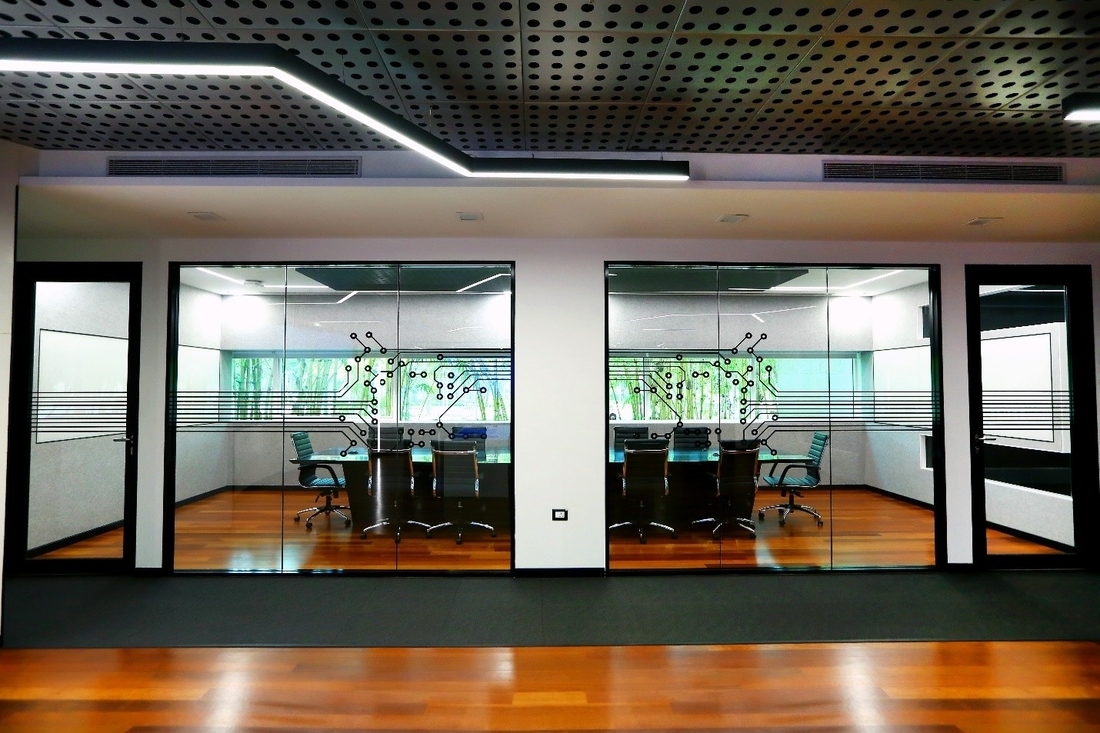
VC Meeting Room, View from the Passage.
Project Fact File:
Name of the Project: Client Briefing Centre
Location: Chennai
Client: Infosys
Architect: Narsi & Associates
Design Team: Narsi & Associates
Project Area: 4500 sq. ft.
Civil Contractors: Narsi and Associates
Estimate: INR 1.5 Cr/USD 200466
Initiation of Project: December 2016
Completion of Project: April 2017
Material and Supplier list:
Glass: Saint Gobain
Glass Partition System: Infrasys
Sofa: Chester
Carpet: Plaunshe Carpet
Cement: Aditya Birla Cement
Lighting: Havell
Flooring: Wooden flooring – Marbau natural wood floor, Living Element
Head Image: Central Area, Infosys Experience Centre, Chennai
All Images © Narsi & Associates.