Submitted by
Aquiles Jarrín Creates Tropical Interior In A Quito Apartment Featuring Various Layers Of Materials
teaserd-47-.jpg Architecture News - May 11, 2020 - 13:00 3663 views
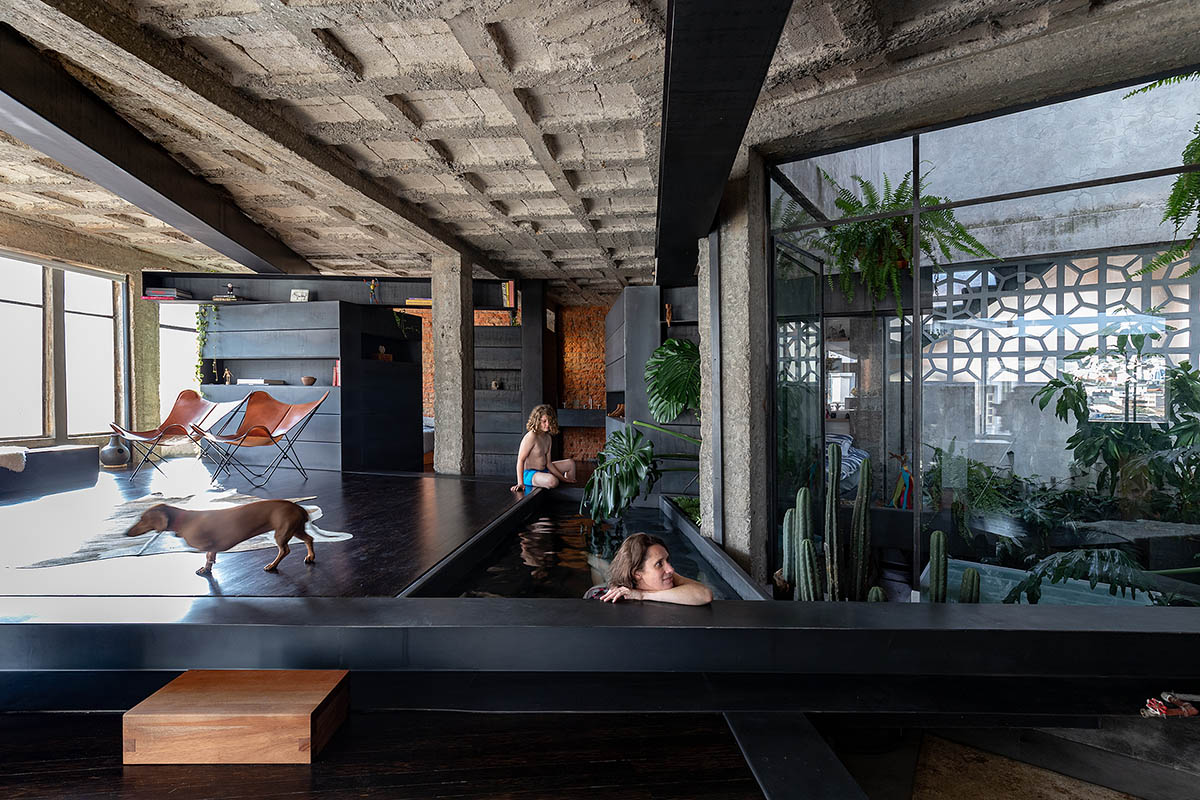
Quito-based architect and designer Aquiles Jarrín has designed a tropical-like interior in a Quito apartment in Ecuador by creating various layers of materials, textures, elements and alternative uses of fixtures that are spread throughout the apartment block.
Called A Forest, the architect transformed a 112-square-metre apartment from the 1970s, located in the historical center of Quito, by reflecting the strong presence of materials.
The apartment was designed for a family who acquires the property - they are a couple having a 10-year-old son and a small- breed dog.
The architect started the project by removing all the interior walls of the apartment to open up the space to light and flexible use.
According to Jarrín, the importance of generating less defined spaces, with multiple and subjective forms of use, and the need for a protagonical social area with no strong divisions between them and the private spaces were the key components of design.
Meanwhile, the architect wanted to reflect a strong presence of nature inside the apartment which was desired by the client. A tiny indoor pool looking at mini garden already proves the architect's intention on the project.
"Several properties built for housing are now becoming warehouses and commercial shops of all kind. Over the years the commercial vocation of this area has strongly risen to the detriment of a coexistence with housing for Quito’s population," said Aquiles Jarrín.
"At the beginning of the intervention, the 112 sqm apartment was in good condition with standard features: porcelain tile flooring, plastered and painted walls and ceilings, white lighting and spatial organization following “regular” housing standards."
"The apartment consisted in a social area, master bedroom with bathroom, single bedroom, social bathroom, a small storage and a kitchen."
The architect explained that a set of methodologies was applied to understand the needs and ways of inhabiting the space, calling on the imagination, the freedom to occupy the space and the aspirations of achieving a friendly and comfortable habitat for the whole family.
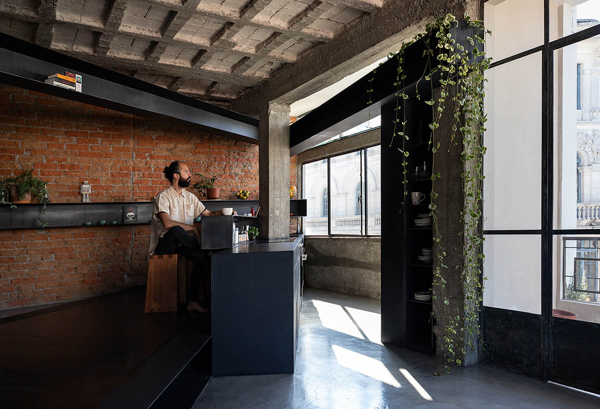
The clients were looking for a more dynamic space that would allow for a constant rediscovery and appropriation of the place. The son stated that he wanted to feel part of the house at all times.
The other source that fueled the conceptualization of the project was the investigation of the space, regarding the affectation of the existing, its potentialities, its limitations and the possibilities of experimentation.
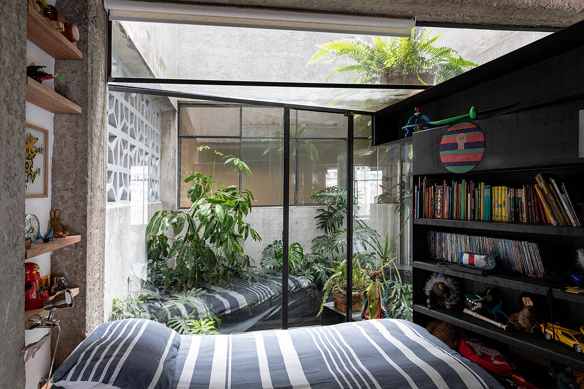
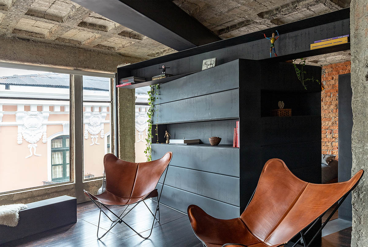
Three structuring elements were identified for the development of the project: Light: an existing air and light shaft; Materiality and composition: existing concrete structure with a free height of 3 m., Location: a very seductive urban landscape consisting of a view of the Panecillo hill (iconic place of the city with a protecting statue of the virgin), framed by republican facades.
These conditions together with the research results, allowed to define some goals that would be achieved with the intervention.
In the first place, building an exterior inside the apartment that allows the element of nature to be introduced with great strength, while generating a great amplitude in the social space, contributing to make this part of the house a green heart, which could be perceived and appreciated from anywhere in the unit. To achieve this target, one of the first decisions was to demolish all the existing walls, generating a new centrality of light.
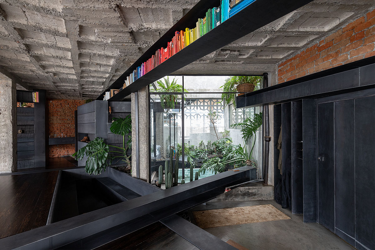
The 12-square-metre entrance of air and light was amplified by the absence of walls and allowed to introduce planters, in which climbing and large leaves plants were placed; the walls were replaced by glass openings with access to the patio, reconfiguring the space and transforming something that seemed like a non-place into a green space, releasing nature and light.
Without walls, the columns of the concrete structure acquired a strong presence, and promoted working with this element as a basic unit of the project.
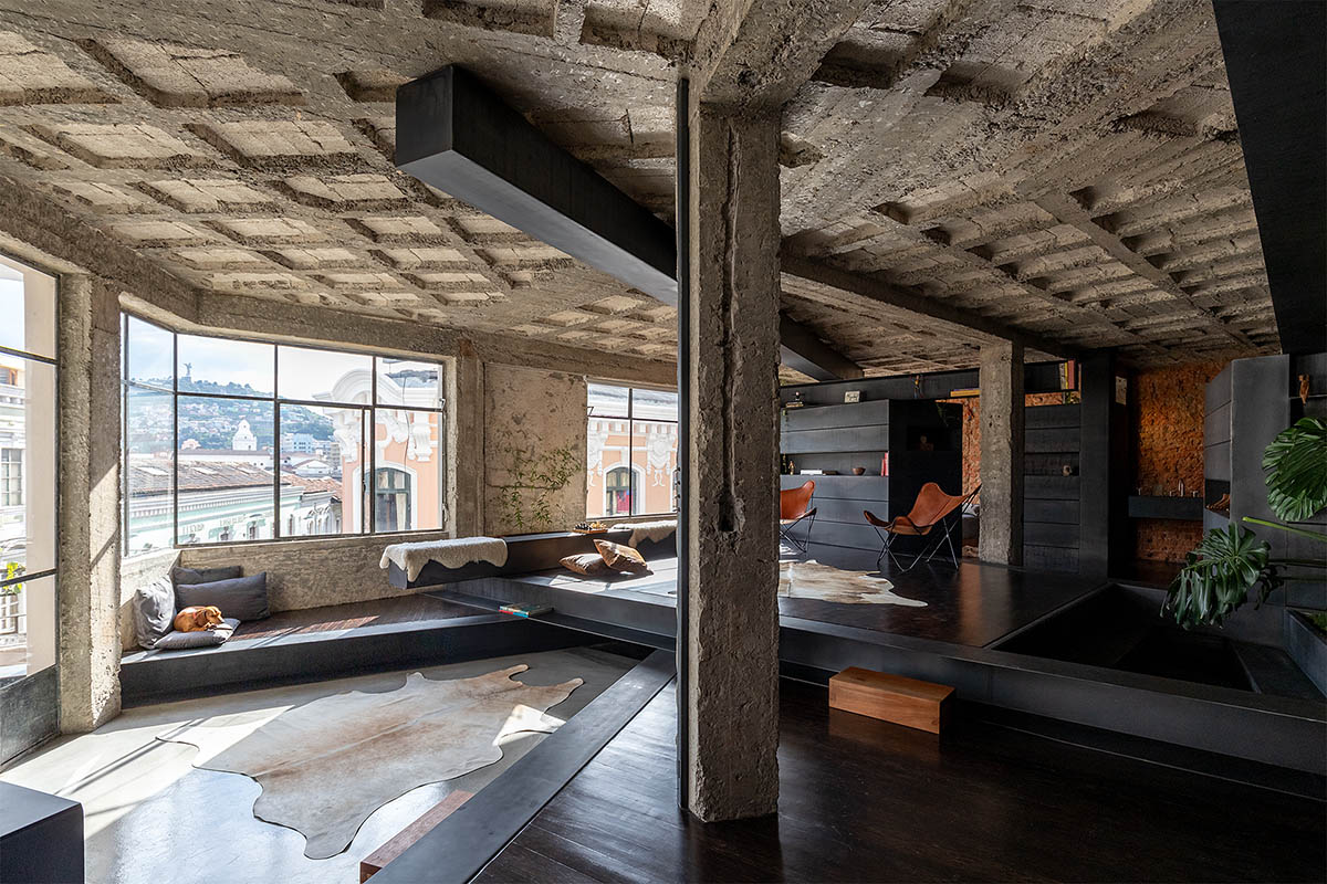
"The challenge consisted in finding out how to enhance this pre-existing element and make it coexist in a new logic of space," said the architect.
"The solution came about by introducing a more poetic dimension to the project: we stopped calling the columns as such, to start calling them tree trunks."
"This gesture of metaphorizing the space was defining for the entire design and understanding of the project, and thus, the idea arose that we were not in a domesticated space, as an apartment with the initially described characteristics, but were entering a wilder world, “a forest”, added the architect.
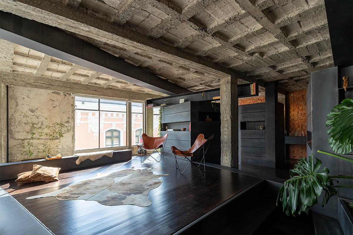
If the columns were trees and the space a forest, only other trees could appear in this scenario; some fallen or superposed, as it usually happens in nature.
The section of the existing concrete columns was 30 x 30 centimeters. With these dimensions new elements were generated to replicate these, and with them a kind of playful and experimental exercise begun.
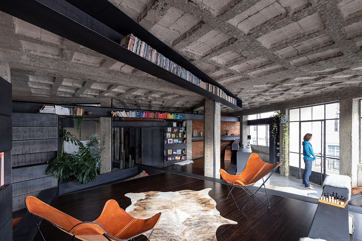
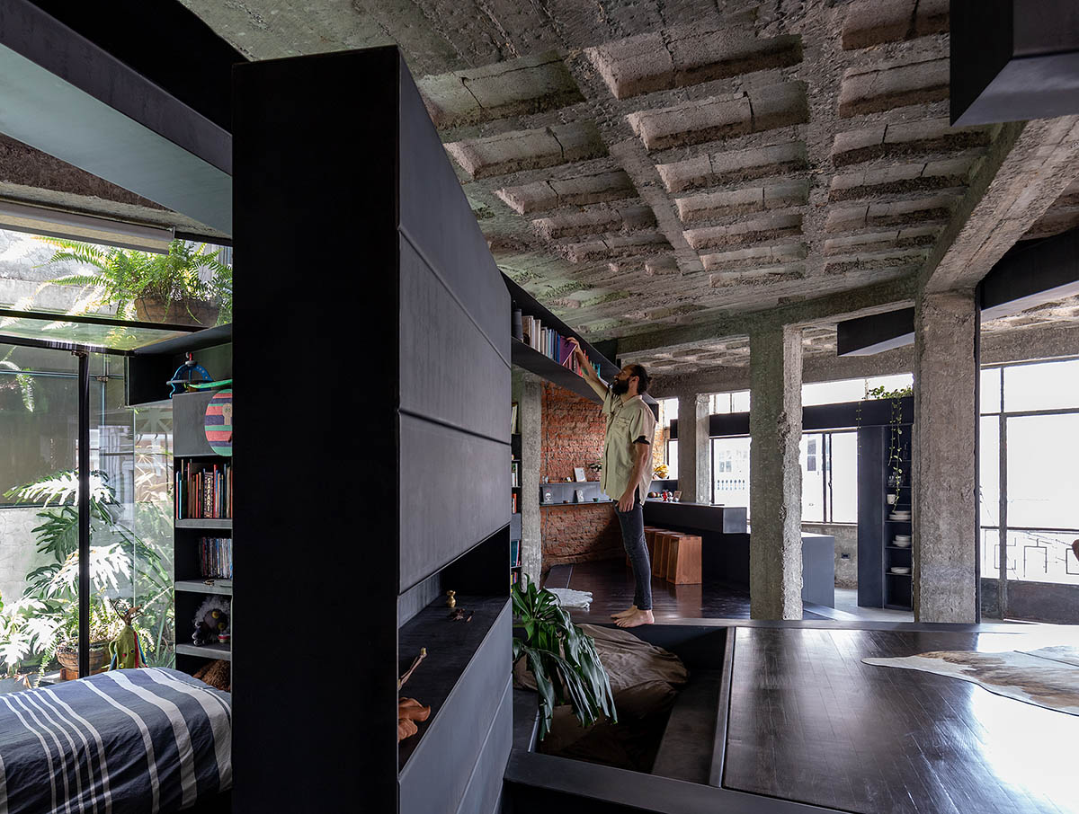
Many ways of crossing the space were tried out. With these new trunk-beams to play with, the design process was consolidated. Several models were made with different possibilities until a series of relationships were found to solve the needs of habitability, proposing a multiplication of spaces in the interior. By overlapping “the trunks” new floor levels were created, having heights of 30 and 60 centimeters. An interior topography occurred that was constantly redrawn.
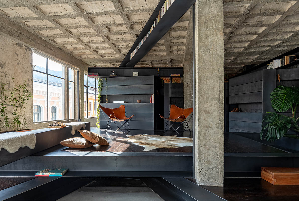
With this more defined pre-planning, the work on the design of this construction unit, which the architect has been calling tree trunks, began.
The aim was to ensure that these elements could provide a solution to all project needs, as the architect explains. The models evidenced a clear potential that would allow to (re) define the space, multiplying it. Thus, an enhancement for everyday use was necessary. The solution was to design these elements with three faces and an interior void, giving it a characteristic of furniture.
“In” a forest "we would not find chairs or shelves, so this element became a multifunctional piece, where a book, bread or shoes could be located."
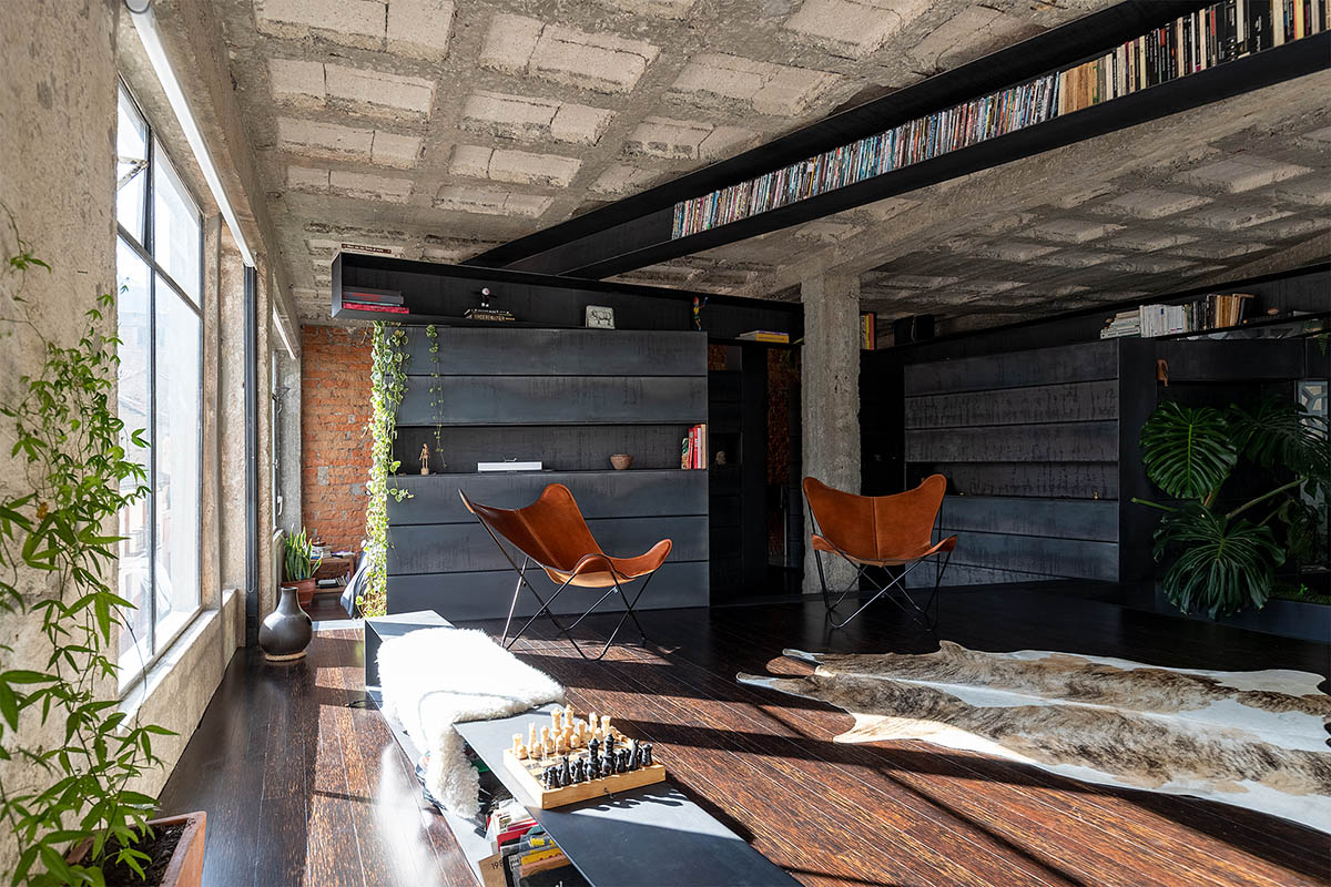
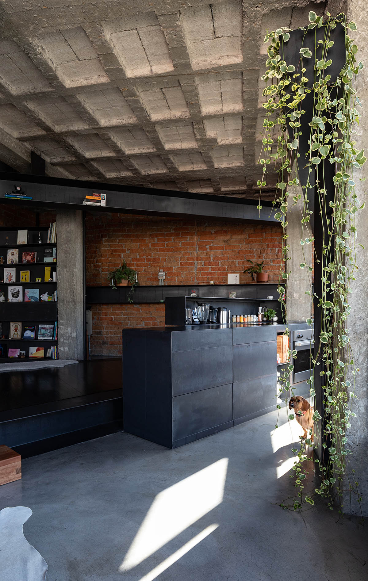
To build these trunks, 4 and 6mm thick metal plates were used. Metal was the most suitable material for this project because its characteristics allowed a more versatile use; the pieces could be structural and part of the furniture at the same time. Also, the apartment became a workshop, where all the elements of the project were manufactured. Metal is the main material of the project, its natural finish was preserved as soon as a protective layer was applied.
With these definitions, it was possible to develop practically all the elements of the project; intimate spaces, such as bedrooms and bathrooms, arise from the superposition of these elements that assemble closets, and that function at the same time as space differentiators. There are no doors, but curtains with magnets that visually close the spaces, inviting new logics of respect and intimacy among the inhabitants of the forest.
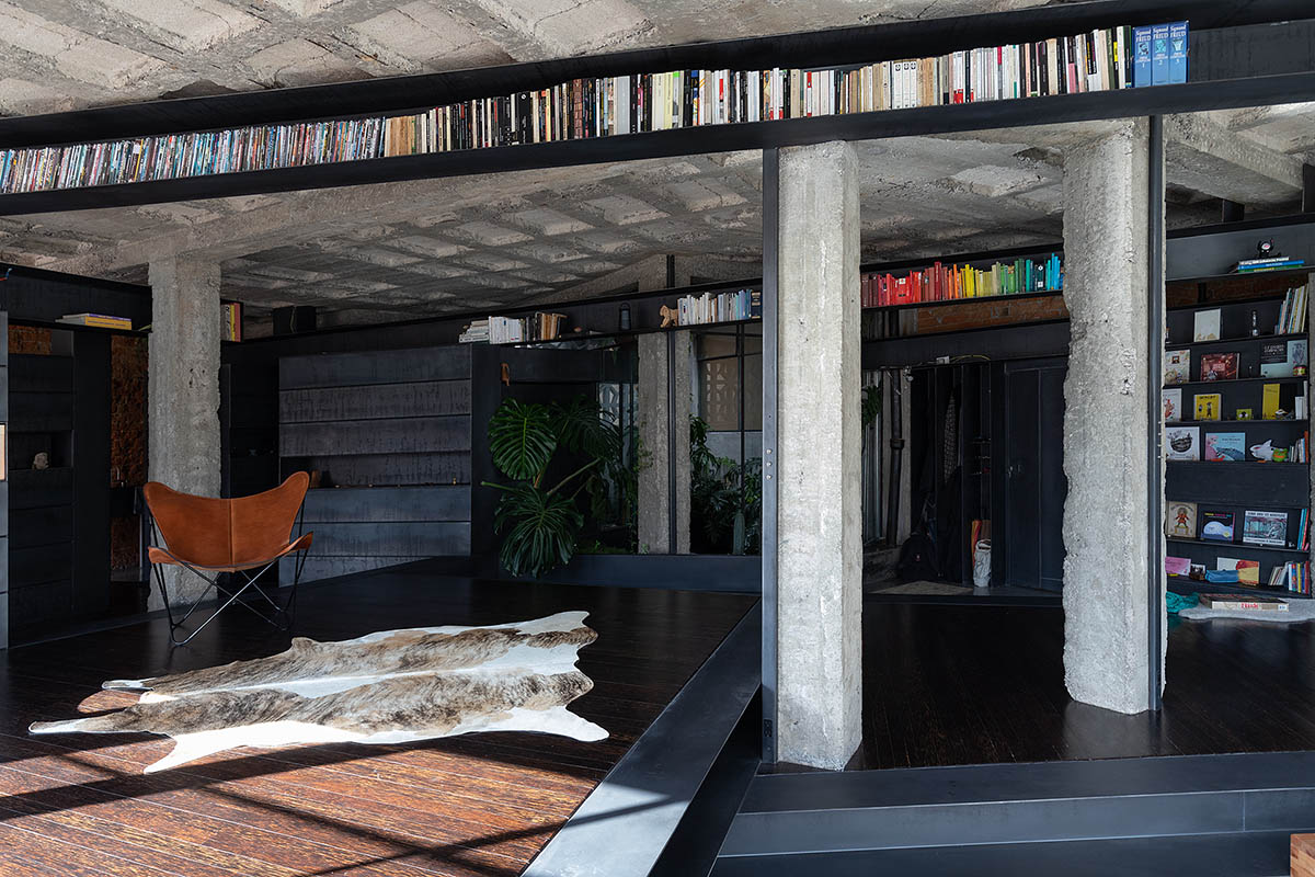
Another intervention strategy was to clean the place of any element that seeks to hide the nature of the materials: plastering of the ceiling, columns and walls were removed, the brick appeared and the paint was scraped off some walls, generating new and unique textures.
Aquiles Jarrín used Chonta wood for the new floor levels, which as a dark wood - almost black in color - was in tune with the tones of metal and concrete.
The brutality of the materials presents the intervention in an unfinished state of work or of modern ruin, in tension with purity of the lines and the finish of the metal elements crossing the space, and in conjunction with the plants.
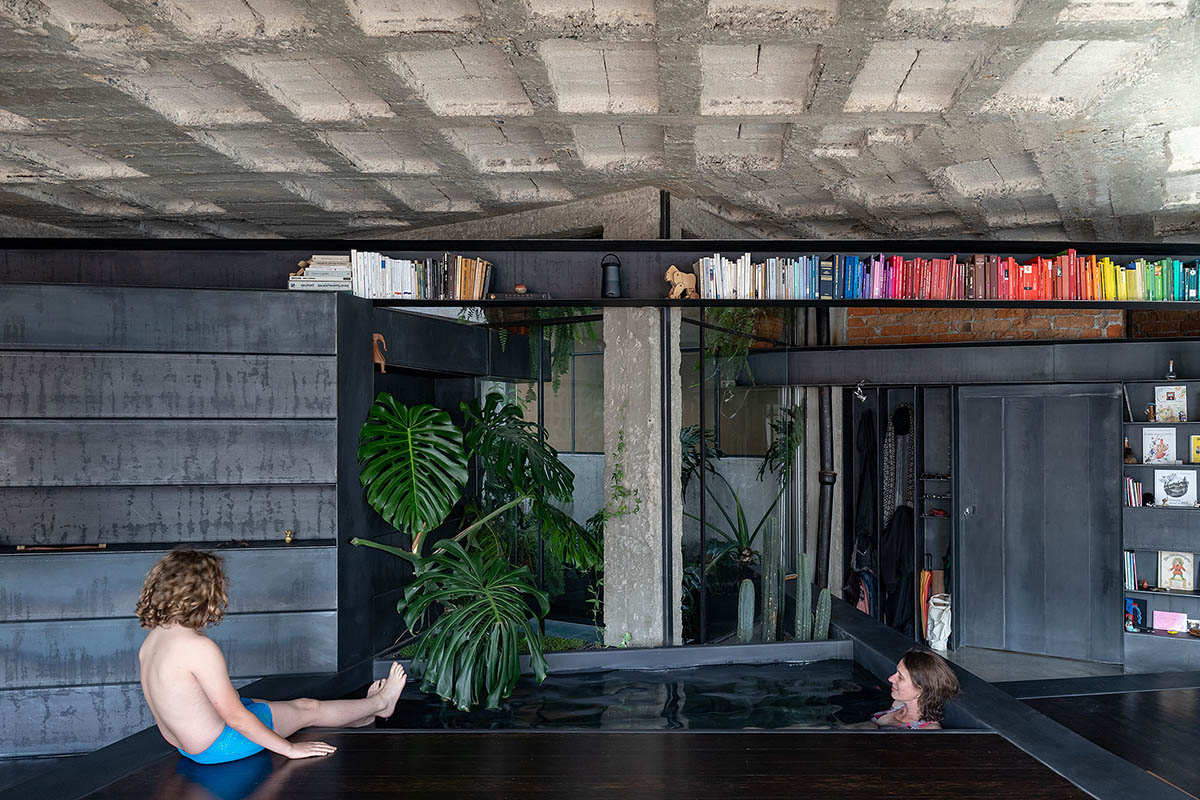
This composition gave so much strength to the interior of the project, that the beautiful colonial urban landscape that embraces the facade from the large windows, became something secondary to discover, and a new moment in the experience of touring the apartment.
The architect added that "the project “A forest” is a world in constant discovery. The textures, levels and elements that float and traverse invite to reinvent the forms of use and appropriation in space."
"Plants are not decorative, they are inhabitants of this shared and timeless place that offers a sensory and imaginative experience of living everyday-life."
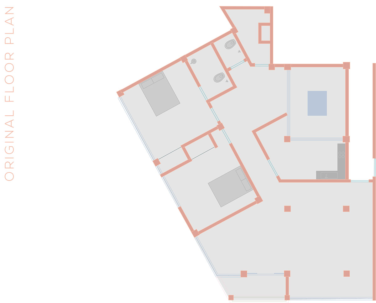
Original floor plan
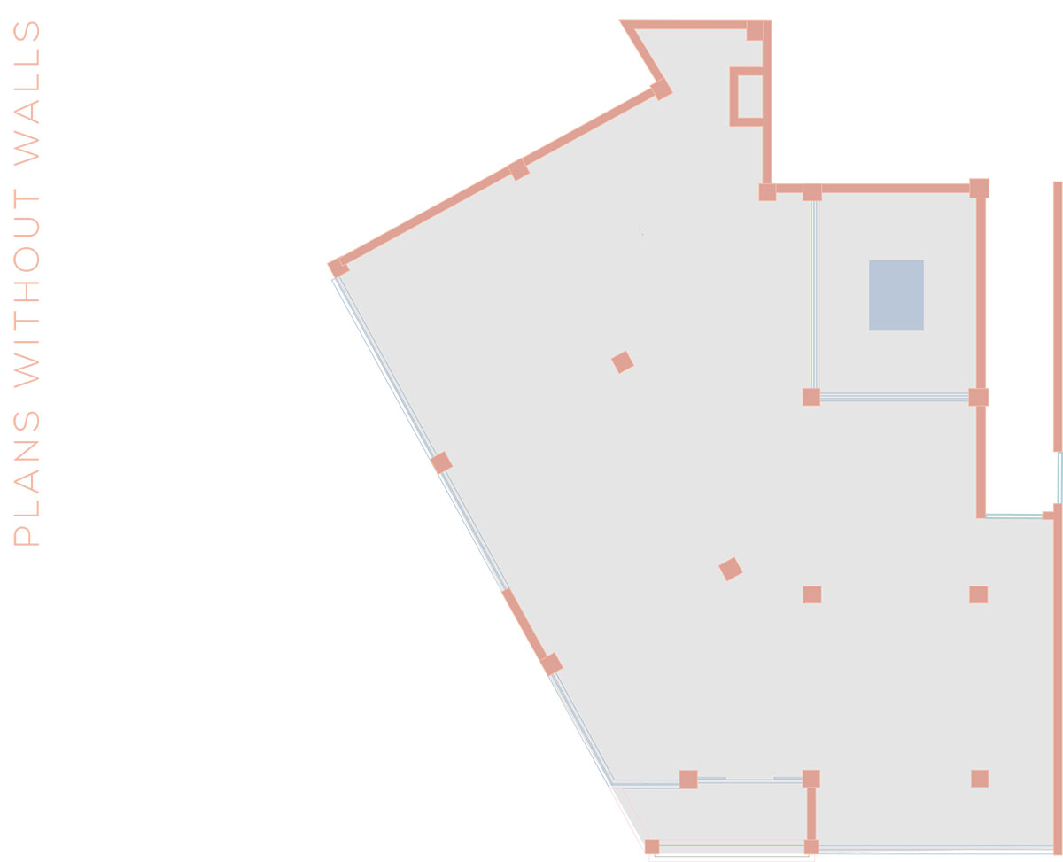
Plan without walls
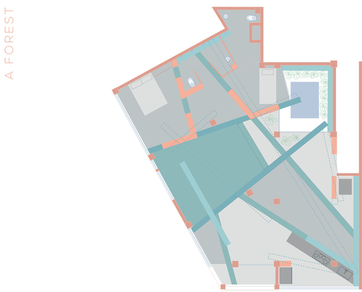
After renovation - A Forest plan
Project facts
Project name: A Forest
Project type: intervention
Surface: 120 m2
Location: Oriente Oe318 and Guayaquil. Quito’s Historic Center. Ecuador
Design: Aquiles Jarrín
Construction: Aquiles Jarrín
Project year: 2019
Year of construction: 2019 - 2020.
Suppliers: Acero Center - Fairis
Text: Aquiles Jarrín
All images © JAG studio
All drawings © Aquiles Jarrín
> via Aquiles Jarrín