Submitted by
Austin Maynard Architects extends existing post-war Canberra house with two shingle-clad pavilions
teaserb-37-.jpg Architecture News - Sep 30, 2019 - 20:24 4179 views
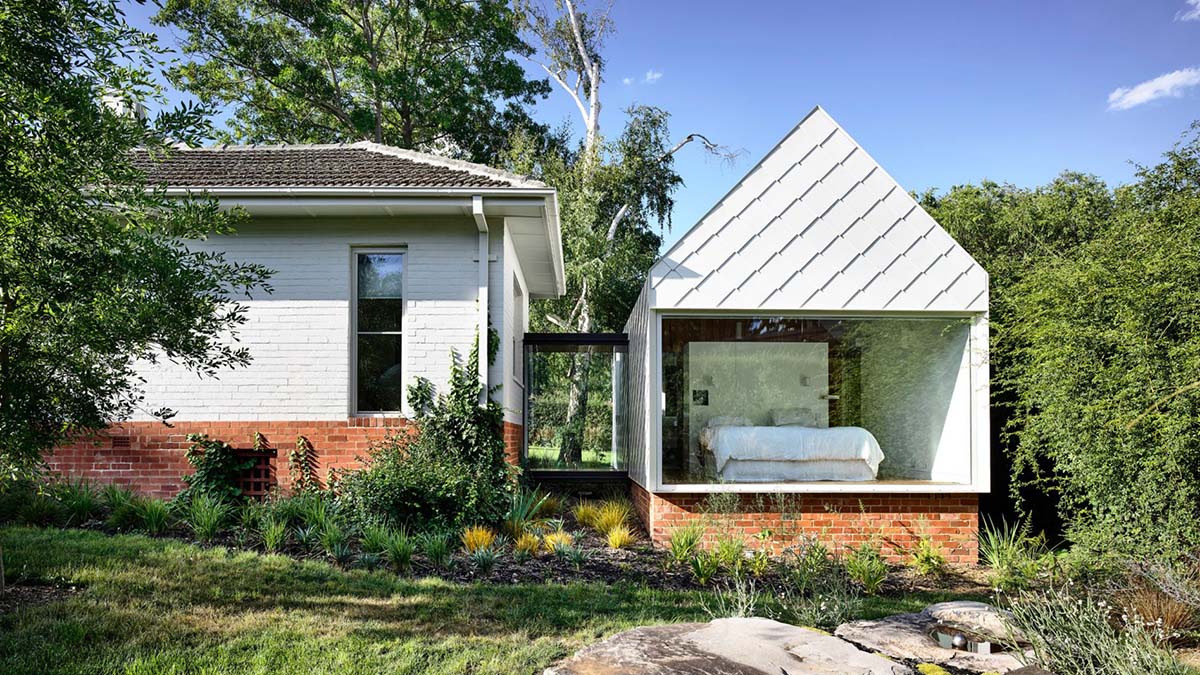
Victoria-based architecture practice Austin Maynard Architects has extended a post-war house by adding two new modest but contemporary pavilions in Canberra, Australia.
Named Empire House, the house is situated on Canberra's history ring roads where is home to some of the best examples of post-war and modernist architecture in Australia.
The client of the house, instead of completely demolishing and designing a new larger building, asked from the architects to renovate and extend the old bungalow house as "a longterm family home that catches the sun."

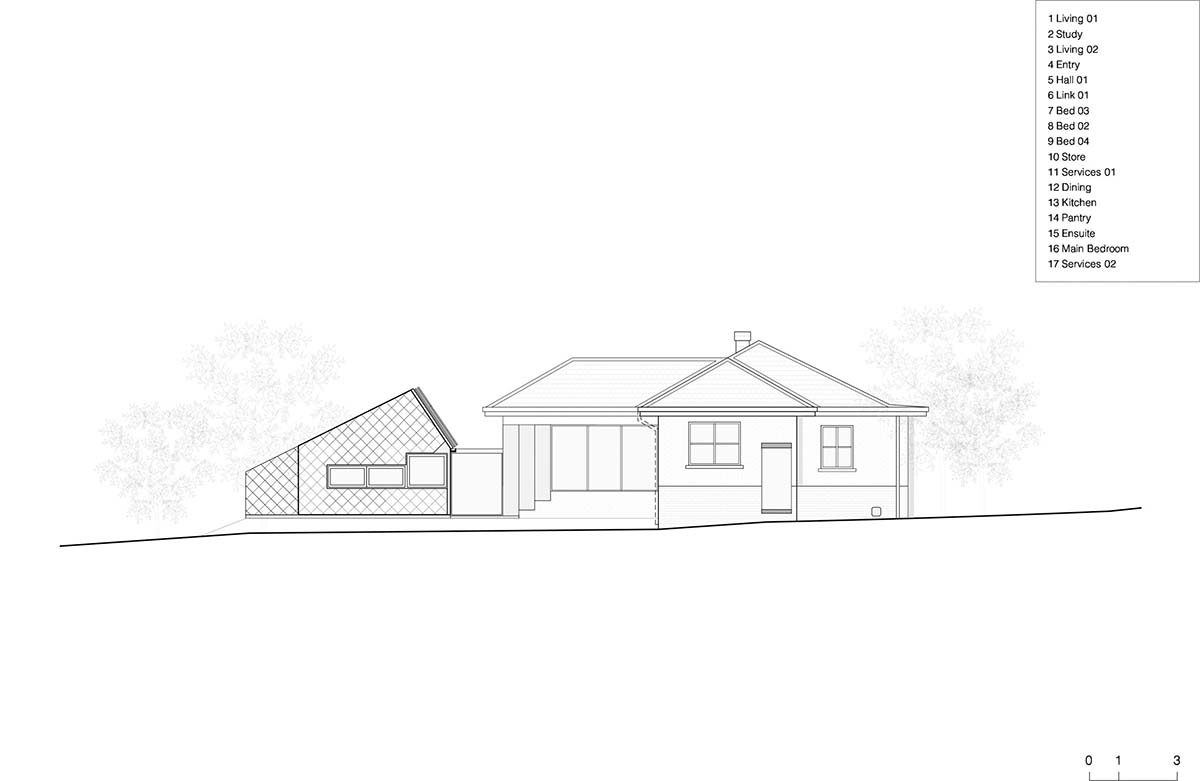
Austin Maynard Architects' response was to add two new pavilions which complement the existing post-war house, but distinctly contemporary in detail.

"Empire House is an exercise in considered intervention and restraint. It would have been easier, and a lot less fun, to knock down the existing cottage and start again," said the architects.
"The two new pavilions sit comfortably adjacent to the existing house and place the inhabitants in a beautiful, established garden that is characteristic of this Canberra suburb."

According to the architects, the aim of the project was to retain as much of the existing character of the site as possible and avoid the common trend of knocking down or adding a dominant and unsympathetic addition.
"The two biggest issues were - how do we have a conversation with the original building without attacking it or infecting it? And how do we create sunny spaces when the steep site levels and orientation of the house overshadows much of the garden," they added.
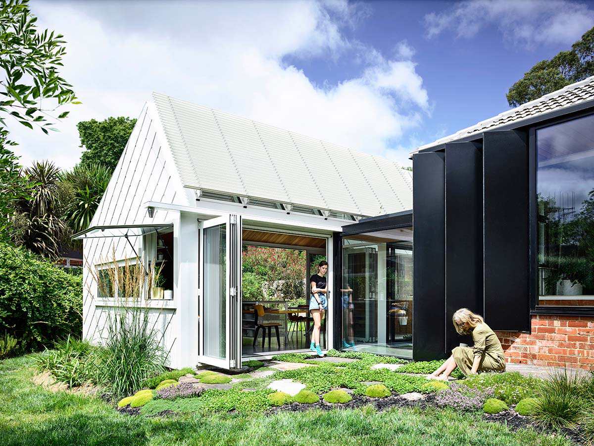
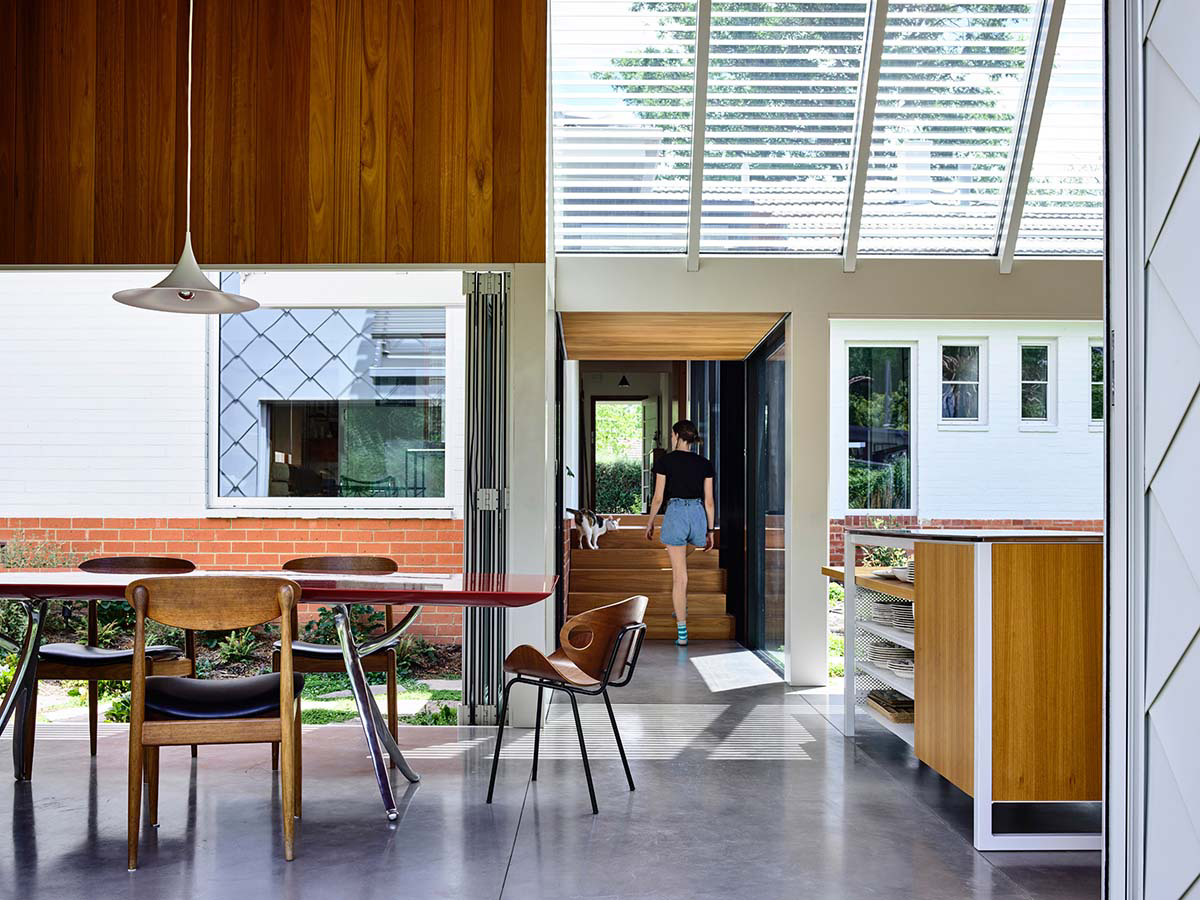
"The answer was to go in with a scalpel, making some big moves, without damaging too much. We cleared the site lines and created a corridor straight through the house, allowing still spaces and activity zones. We opened up to the outdoors and celebrated the exterior, giving clarity and creating a discussion between the old and the new."

The house was in fairly good condition overall, though the kitchen, laundry and bathrooms were oddly positioned and in poor state. The original hearth and fireplace in the living room had a great feel and were retained, along with the light fittings, windows, timber picture rail and skirting. The kitchen was relocated and separate living and sleeping zones, or pavilions, were constructed.
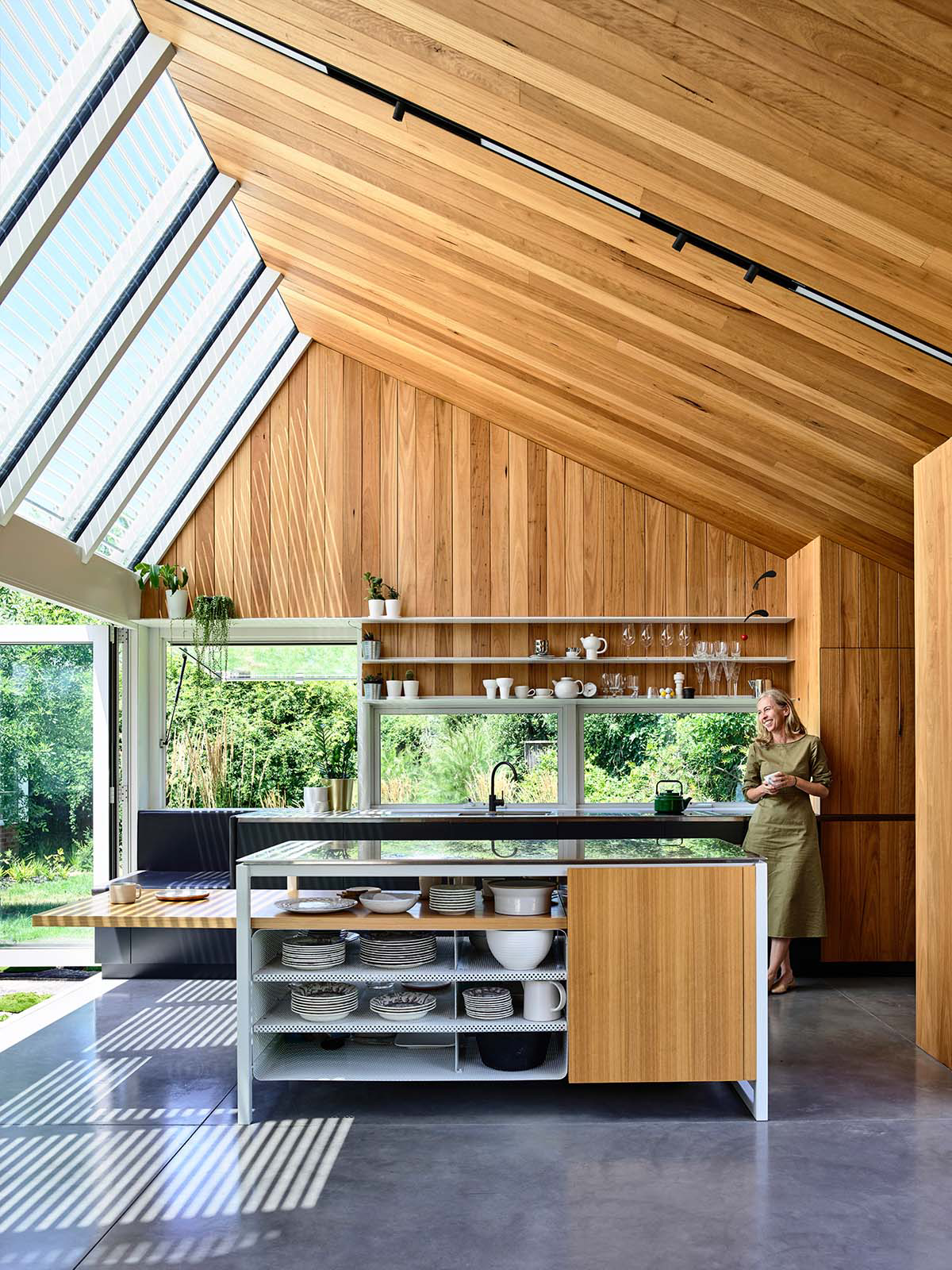
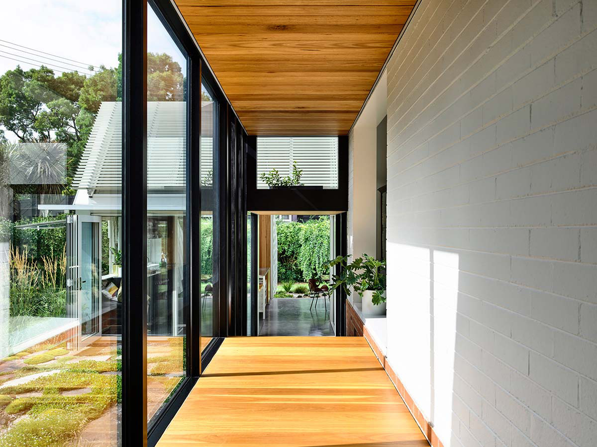
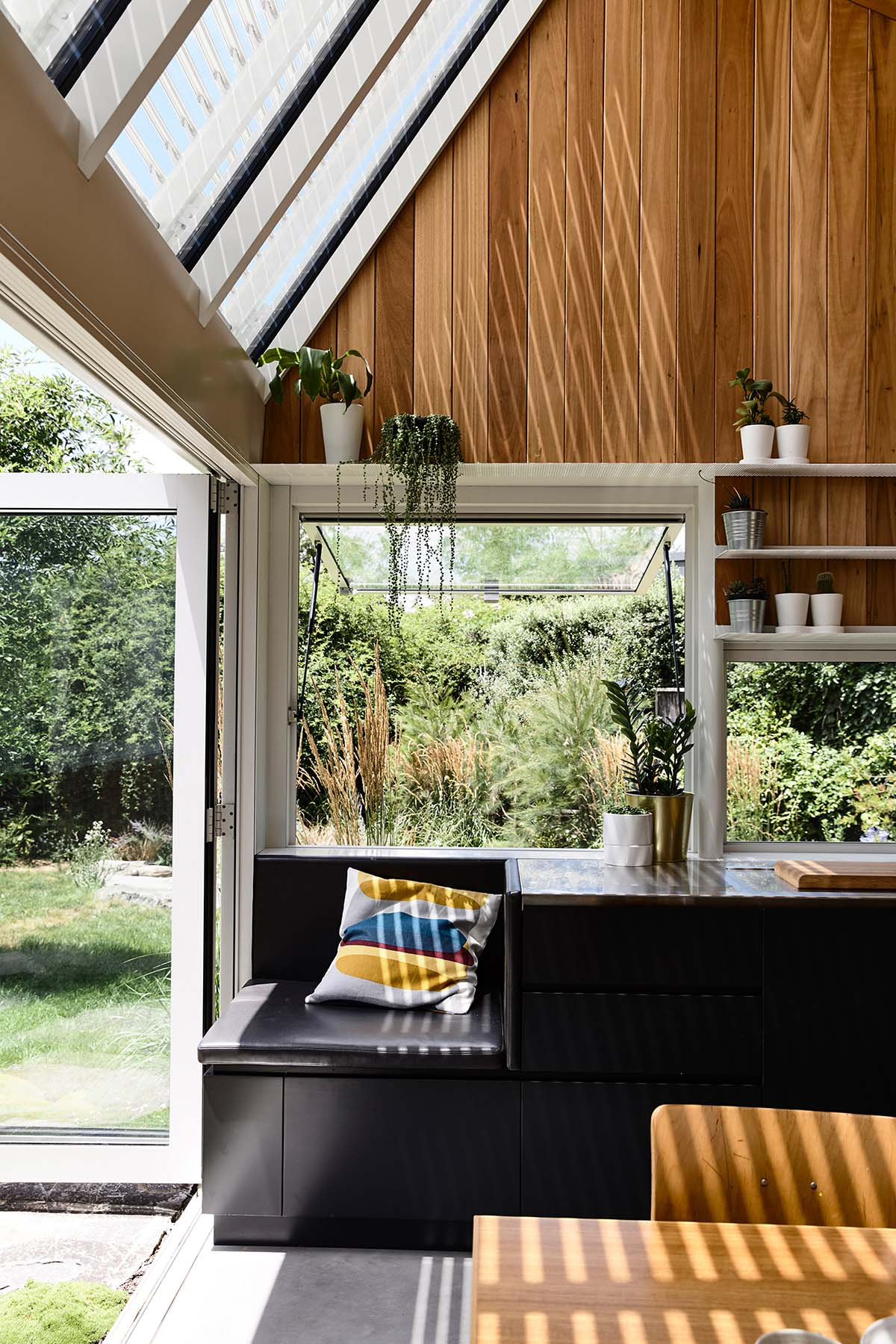
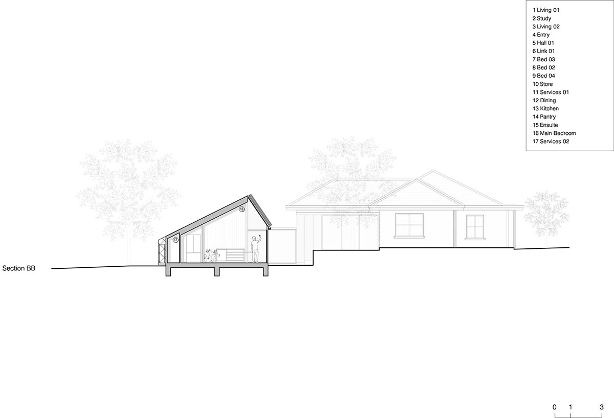
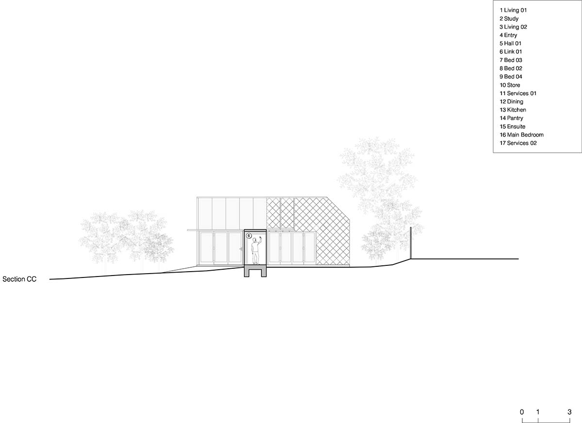
For the new pavilion, the architects added a new living pavilion in the garden that maximises passive solar gain, connected to the existing house via a corridor ‘link’.
A large north facing roof window spans across the pavilion, and is protected by operable louvres. The master bedroom pavilion is a similar approach of addition accessed via a link.
This new pavilion is visible from the street, so "it was important to respect the character of the existing house, but create a distinctly contemporary piece of architecture," emphasized the architects. The white shingle form rests on a datum of red brick, responding to the materiality of the existing house.
The craftsmanship of the white metal shingles, each one hand-finished and hand fixed with mathematical precision, is the distinguishing feature of Empire House.
"The material creates a relationship, a language and a discussion between the two eras, while making it incredibly transparent where the old and new elements meet."
Preferred Builders took great care in executing very refined details - particularly the concealed box gutter and the oversized shingle ridge capping. The detailing of materials externally are reflected internally, as the builders approached the inside with the same skill and care - most evident in the Blackbutt timber lining.
"Cars are always a massive issue - typically visually dominant and taking up valuable living space. In light of an automated future on the horizon, which will radically reduce car ownership, it make obvious sense to have other uses for a garage or carport."
"The car port at Empire House serves as an outdoor space to inhabit by humans, rather than a space entirely dedicated to a machine."
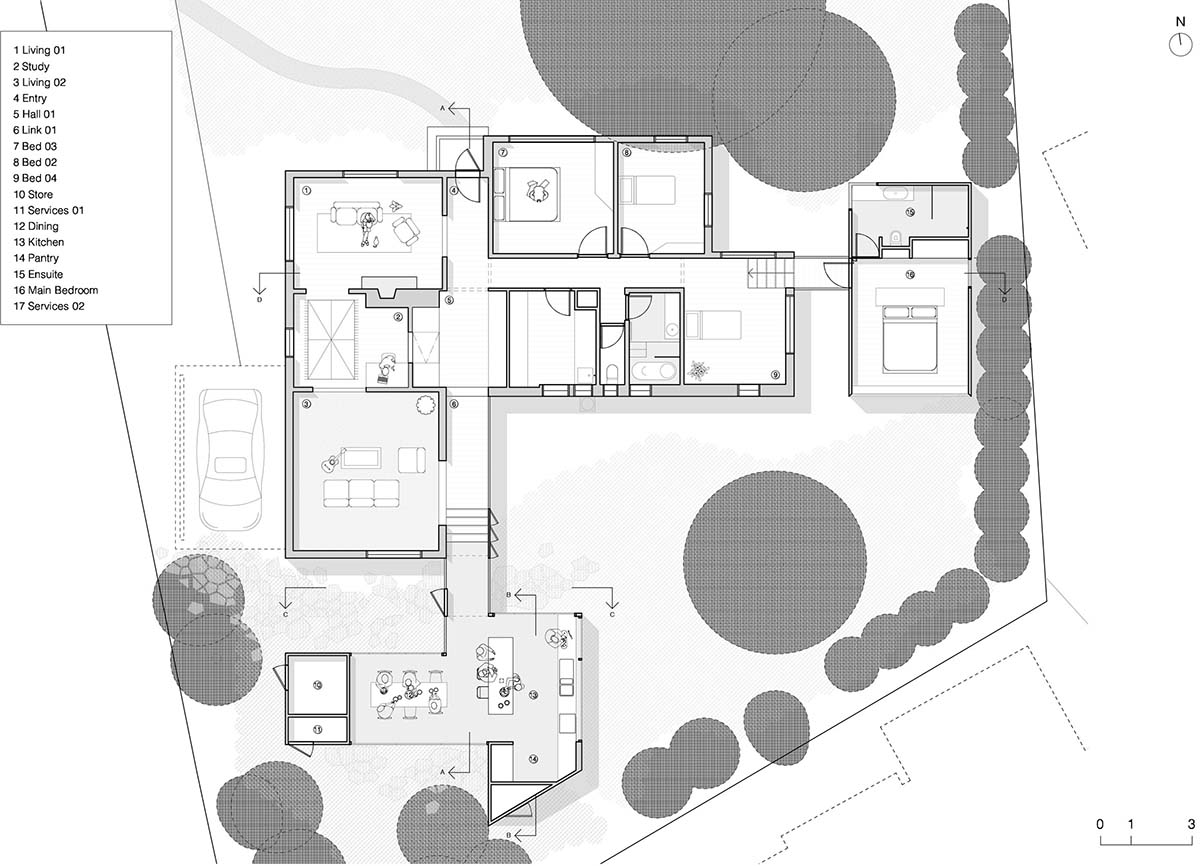
Floor plan
Austin Maynard Architects also designed these pavilions by considering Canberra's climatic conditions which draws sustainability effort throughout the project. Canberra has more defined and extreme seasonal climes than other Australian cities. It’s a lot colder in winter here, so there was a lot of emphasis on insulation, thermal mass and thermally broken windows.
Throughout the colder months the sun streams in through the north facing window, heating the concrete slab which continues to warm well into the night.
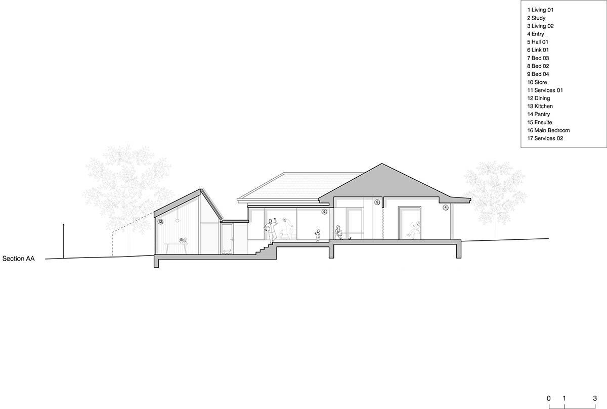
The large garden increases the permeability of the site and also radically reduces heat sink in the area. Passive solar principals are maximised by the design. All new work aims to maximise available daylight and optimise passive solar gain in winter, while ensuring that summer sun does not hit the glass.
All windows are double-glazed. With active management of shade and passive ventilation, demands on mechanical heating and cooling are drastically reduced. A large water tank has been buried within the garden. All roof water is captured and reused to flush toilets and water the garden. Where possible Austin Maynard Architects have sourced local trades, materials and fittings.
The real sustainability of Empire comes from saving and working with the original build. Knocking down and replacing with an 8 star building will never be as sustainable as retaining and re-using.

Austin Maynard Architects previously completed an existing terraced home with corrugated steel pavilion in Melbourne, Australia.
Project facts
Project team: Andrew Maynard, Mark Austin, Ray Dinh
House area: 233m2
Total site area: 941m2
Completion date: January 2019
Builder: Preferred Builders
Engineer: Ken Murtagh
Landscape Architects: Bush Projects
All images © Derek Swalwell
