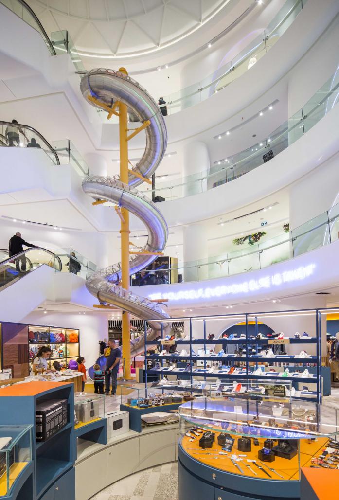
It is expected that commercial spaces such as shopping centers and airports should be constantly full of life. For this reason, those kind of spaces need zones that can easily be modified, transformed, dismantled, and installed. Instead of having simply thematic or decorative changes, we wanted to make a space that could transform and renew itself like a flexible, surprising, living organism, and this became the Wepublic project in Istanbul’s Akmerkez Mall. We create fun of the labyrinth system in the interior of the store with thinking it like a passage that we could not get out of. With this emotion occurs spontaneously and other functions with radical changes or small touches. Project space is compressed between shops and columns with eliminating spatial values and differences as in the case of similar shopping malls has turned into a recovered surprising space. We tried to destroy the usual rhythm and order with various curvilinear forms and to create the continuity and movement of the nodes through sequential detection. The natural, simple, color of fiber glass columns was specifically chosen to opposite bright colors and forms in other areas of the mall. We aimed to surprise the standard column arrangement which is repetitive, monotonous, homogeneous and boring, by establishing amorphous bonds of between these columns. We tried to create an unexpected structure out of an unexpected point and destroy the boredom by changing the column layout with various methods. In fact on the one hand those structure elements point to the spaces secretly.
The main concept of the project is to transform a junk space into a kind of new space, to do an experimental field study while conducting a workshop. This project is actually a large-scaled mockup. The project lies between art and architecture which is directly/indirectly influenced by some artists.
We created two entry points for Wepublic from two main corners, bringing users directly into the heart of the store and distributing them from the 17 meters high atrium. Despite the inevitable x-ray device that infested every entry, we made it possible to draw people’s attention to the entrance door, which is intriguing and inviting when viewed from the outside. The Atrium is a hang-out area from top to bottom or vice versa and of course, an intermediate, permeable area that also connects the paths of circulations.
In fact, the community needs outside of the designed space that modern investors ignore after modernism. It is the same for urban plans and large scale shopping malls. Because of this requirement, we have transformed the gray area into a public zone in a commercial building. The atrium, located in a mall with in a mall, is a surprise area in the structure within a structure. As an alternative to the definition of a typical shopping mall, it is a space fiction that creates its own definition, dancing between architecture and art.
The space organization of the sales areas was carried out by Universal Studio and HMKM Groups, and the construction was done by Yoo Mimarlık.
2015
2016
GAD


