The Urban Planning for ‘Plaça de lEsglésia’ in Granollers intends to regain the role of this square within the old part of town.
Our plot is the key factor for the consolidation of this centrality, due to it occupies the space that gives continuity to Barcelona Street and connects with ‘Plaça de la Porxada’.
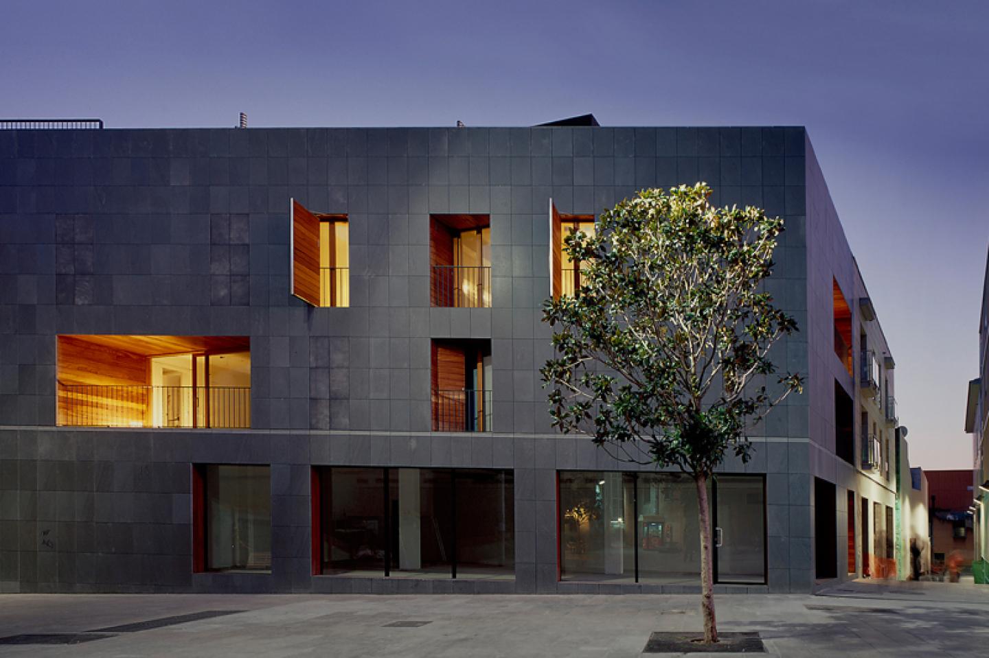
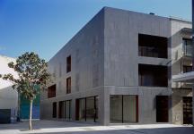
The three facades of the building become a single skin that, thank to the continuous use of the stone even in the shutters, unifies the volume and consolidates the characteristic predominance of the massive-wall facades in the old quarter.
Basalt stone has been used due to the fact that because of its porosity and texture constantly changes in colour and reflection according to the different degrees of humidity.
Besides, print inscriptions and ornamental recessed caps remind us of a tattoo that reinforces the perception of skin and gives a personal and human touch to the building. The changing rhythm of the shutters that appear and disappear, as they are open or closed, project on the façade the interior life of the dwellings. The entire building captures the passage of time and transmits an alive and organic atmosphere.
The exterior coating of the shutters consists of VIROC panels made up of cement and wood fibres which have similar colour and texture as the basalt stone of the façade though it is a much lighter material and withstands the impacts by opening or closing the shutters.
When the shutter is closed it keeps flush with the external stone coating and visually disappears in the modulation of the ventilated façade. In the inside, the shutters are wood-panelled and, once open, evolve from their anonymous presence towards singularity.
The only exceptions of this dark and massive uniform treatment will be the large windows of the business premises on the ground floor and the great wooden cavity terraces that emphasize inside out the interior layout and give relief and volume to the building.
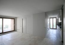
The dwelling typologies are based on the L shaped continuity between the living and the kitchen so as to create a space that goes through the building and connects both façades by piercing them in an explicit way. Besides, this strategy allows every dwelling to have a visual connection with the square and the church.
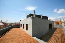
The layout of the upper floor dwelling is reversed so as the living room, the dining and the kitchen could be related to the perimeter terrace from where to enjoy the views over the old part of town.
2005
2008
H ARQUITECTES - David Lorente, Josep Ricart, Xavier Ros, Roger Tudó
Favorited 1 times
