All substances in nature,from tangible mountains and rivers to our own existence, are shaped by light. The visual contrast of light and shadow only represents a singular physical perception. However, as time changes and the surrounding environment and site evolves, light gains multifaceted contextual expressions. Although it is invisible, light delineates the clear contours of objects, and also harbors a certain boundless spiritual power within the crisscrossing of geometric lines.
Tectonic, always begins with the exploration of specific functions, then giving rise to the spirit of site. These elements interweave to shape a three-dimensional, experiential space. Upon entering, the combination of transparent glass door and natural travertine-made handle highlights the theme of virtual and real, heavy and light, natural and contemporary. Transitioning from the outdoor public area to indoors, the ambiance gradually evolves into a soothing and tranquil state. The entire surface of the glass separates inside and outside area, but also visually connects them together.
The walls on either sides of the entrance slope and converge from bottom to top, crafting a serene and profound canyon imagery,capitalizing on the spatial height. The summit mimics “a strip of skylight”, creating a gentle texture on facade. After dozens of steps, the vision suddenly become wide open, with the undulating spatial rhythm presented a multi-dimensional site experience. Simultaneously, the light strip embedded in the ground serve as the spatial axis, establishing a symmetrical visual aesthetic and guide visitors along it, commencing a prologue of light.
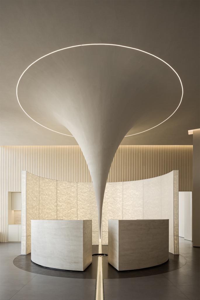
As a natural phenomenon, gravity has the power to alter the state of space and time, guiding objects closer to its source. In the center of the reception hall, the celling appears to be drawn, pulled and stretched by the force of gravity, a metaphor of the brand’s attractiveness through space, then the abstract concepts are manifested in tangible forms. The reception desk, adorned with imitation travertine texture, is placed at a calculated distance on both sides, allowing the gravitational device to be fully displayed before the eyes. Together with the “screen” behind, forming a focal point of spatial energy.
The visual journey follows the walking path, transitioning from the proximity reception desk to the mid-height “wall”, extending further to the undulating facade in the background. These organic forms progress between elevations, creating a vivid and distinct visual experience with diverse structural layers. The arc-shaped “screen” , crafted from DuPont paper and embedded with warm lighting, emanates a subtle glow, while its delicate texture resembles silk, fostering a distinctive humanistic ambiance within the space.
Considering the position of structural columns, the walls in north and south directions are smoothed and leveled. Western style cabinets are installed in area with sufficient depth to store various equipment, serving as a functional complement to meet daily needs. The southwest corner is designated as a resting area for waiting, communication and relaxation. The back wall echoes the arc-shaped design concept, softening the sharp angles while complementing the distinctive combination of low-rise furniture harmoniously.
The layout is a community composed of different spatial blocks that can communicate with each other. The three-sided daylighting environment dictates the arrangement of functional area. The optimal urban landscape on the north side serves as the main reception area. Then a secondary axis is introduced perpendicular to the entrance axis, forms an internal passage, connecting functional spaces. Symmetrical curved glass walls not only define space, enhance daylighting, create rhythm, but also establish a contrast between virtual and real with the solid walls.
Walking to the back area, the spatial layout features a sensible arrangement with upper and lower tiers, expanding usable area for internal office spaces. In order to solve the variation in actual floor height, a cylinder is integrated within the channel, creating the concept of “ channel within the channel” while maintaining the facade’s integrity toward the public area. A top opening is reserved, fostering connectivity and interaction between the second floor and the downstairs.
Based on the hierarchical design strategy, the visual tension-led formal language transitions to a serene and comfortable spatial expression. The auxiliary spaces integrate both functional needs and aesthetic interests. The white blinds aligned with the facade's color can regulate light. Between the opening and closing, fostering a harmonious coordination between the natural materials, the tactile comfort of fabrics, and several green plants. This creates another tone for the space – simple, elegant, and evoking a sense of tranquility.
Opposite to the primary viewpoint, a suspended acrylic triangular cone device becomes a terminal vista of the passage. This cone, mirrored on the ceiling, not only reflects the distant cityscape but also transforms into a radiant starburst. As night descends, bathed in subtle lighting, it appears to float in the air, shining brightly. This is also an embodiment of Destiny Wedding’s brand vision: For couples, the upcoming wedding marks the romantic highlight moment of their lives. Light, beyond its material properties, also symbolizes new hope.
2023
2023
Project Name:Destiny Wedding office
Location:Ningbo, Zhenjiang
Project Area:550m²
Completion Time:2023-11-8
Design Company: GODOT DESIGN
Chief Designer:Huang Qin
Photographer:Sheng Hui
Written by: Off-words / Venus


