People often choose corbels late, after the beams are sized and the trim is ordered. By then, the decision feels small, so people grab whatever looks nice in a catalog photo and more or less fits the overall house style. But choosing carved corbels is easier to get wrong than it seems, and the mistakes are noticeable even from across the room. Nearly all of them trace back to proportion, style, or how the piece harmonizes with everything around it.
Too big, too small, too deep
A corbel has to read as part of whatever it supports. Put, say, a 5-inch bracket under a 10-inch beam, and it looks like a toothpick holding up a log. On the other hand, a 14-inch one under a slim mantel shelf crowds the shelf and eats the surrounding wall. Projection matters too: a deep corbel under a shallow ledge looks top-heavy from the side.
First measure the object the corbels will support: a beam, a shelf, or a cornice. Then choose corbels whose width and overhang fit comfortably into the overall proportions. For clarity, you can tape a life-size paper cutout of the bracket to the wall with painter’s tape. It costs nothing, but it prevents most arguments.
Fancy carving on the wrong house
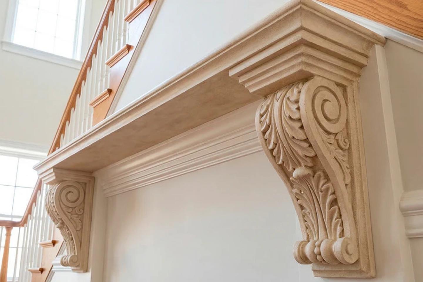
Of course, eclectic facades are trendy now, and designers are conspiratorially suggesting that we step outside the rules. But it’s still not worth getting carried away with the incompatible combinations: sometimes it goes against common sense. A heavy acanthus leaf looks right on a traditional entrance, but on a minimalist modern facade with flat-panel doors, it just looks ridiculous. Ornament can also backfire on small corbels, where intricate detailing turns into visual noise past ten feet.
Match the carving to your existing trim. If the crown molding is plain, a simple scroll or a restrained profile fits better. In rooms that already have a lot going on, quieter corbels give the eye somewhere to rest.
Colors and textures that conflict with each other
Wood-look and stone-look finishes are popular, but don’t blindly follow trends. On their own, such corbels can look chic and luxurious, but when attached to a wall, they’ll only confuse if you don’t carefully consider the combinations.
A golden oak corbel beside walnut-toned beams reads as a mistake, rather than a deliberate contrast. The same thing happens with limestone finish next to brown brick.
Use the existing finishes in the room as a starting point: the beam stain, the door, the fireplace stone. Then hold a corbel material sample against it in daylight and under evening lighting, because the two can look quite different. As you can see, samples are essential here, so look for companies that offer this service (for example, Royal Foam US and Decorative Architectural Products). If this isn’t mentioned on their website, don’t hesitate to ask.
Crooked rhythm: spacing and symmetry
Corbels are one of the elements that create rhythm on a facade. Hasty mistakes and errors in this regard are particularly noticeable. Three spaced evenly under a ledge look balanced. But if two are placed at the same distance and the third shorter, it will appear as though the design was planned and reworked literally on the fly.
Doorways are another classic trap. Corbels on both sides of the opening should sit at the same height and the same distance from the frame, and line up with the cornice above. The eye checks pairs, so an inch difference stands out more than you would expect.
To avoid such mistakes, lay out the corbels' placement on a drawing, mark the centerlines, and measure from a fixed reference point, such as the doorway or the ceiling line.
Don't ask a decorative corbel to hold anything up
This mistake is more critical than the others. Here, many people are misled by new-generation materials and technologies that create lightweight yet durable architectural elements capable of withstanding outdoor use.
For example, decorative corbels from Royal Foam US are made of EPS with a protective polyurea shell. They look very sturdy, and the coating is designed to handle harsh weather, making them suitable for porches and exterior entries.
However, even these “indestructible” elements are still purely decorative. They should not carry a beam, a balcony, a heavy mantel, or any load the building relies on.
Where a spot needs a real support, the load-bearing element is installed first, and the corbel is added next to it as trim. It’s important to discuss these details in advance.
Order only after checking dimensions and samples
Photos in the catalog can flatten scale—especially if they’re taken at an angle for aesthetic appeal and dramatic effect. A corbel that looks compact on screen may turn out to be three inches deeper than expected once it’s on the wall. Therefore, before ordering, be sure to compare the height, width, and projection with the project drawings. Request a finish sample and examine it under the room’s actual lighting. Do it early, while changes are still easy to make.
2026
2026
Product type: decorative carved architectural corbels
Material: EPS (Expanded Polystyrene)
Protective coating: polyurea protective shell
Dimensions: height, width, depth/projection
Customization: custom sizes and carving profiles
Finish wood-look, stone-look, painted, or textured finishes
Application: interior and exterior decorative applications
Weather resistance: protective coating designed for outdoor exposure
Load-bearing capacity: decorative only; not designed to support structural loads
Installation: mounted as decorative architectural elements
Placement: requires accurate spacing, alignment and symmetry
Ben Jackson
Decorative Architectural Products