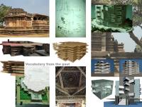
People’s Precinct at Warangal, Andhra Pradesh, India.
The entire building complex has its roots from the great building traditions. Interpreted to address modern day concerns, with all focus on climate, eco-friendliness, energy-conscious designs that would have made our fore-fathers proud.
The basic shell is evolved from rotating a square, which in the rich kakatiya traditions gave the temple gopurams and ethereal, floating feel.
Each of the squares measures 110’x110’ to give a floor area in the whereabouts of 11,000 sft. Arriving at this size of a floor plate gave the comfort of addressing the requirements of most of the end users from business establishments to software facilities, to offices to boutique hotel spaces to restaurants, showrooms and anchor shops.
The lower two floors have been conceived as mall-spaces with an abundance of shopping facilities, along with ample parking both for short-term and long term requirements.
However the entire shopping precinct has been planned as a pedestrian space “ a people’s place”. This is to remove the anomaly of similar shopping and commercial facilities functioning with the absence of adequate spillover and breathing spaces for the people.
In design, this has been achieved, by having a continuous platform or precinct both at ground and first floor levels.
Spaces have also been included for a variety of informal spaces so as to give the people’s place a truly informal all-inclusive character.
1. Interpreting the detail.
The locking of stones is a sharp style of the kakatiyas for the stability of the structure offering semi-seamless joints. This has been used in the slabs which are rotated to give the feel of interlocking between the structures.
2. Rotating the floor planes.
The most celebrated geometry, that of the rotated square resulting in cantilevered vertices in the exterior, resulting in multiple shadows. Apart from the aesthetics, the rotation of the planes results in a structure that results in almost 50% less exposure to direct sun’s rays and thereby reducing net heat gain. The exterior form thus is multi-faceted and employs numerous faces resulting in equal aesthetic appeal on all sides of the building.
3. Pattern generation.
The elevation patterns and those that appear in the two-dimensional plan are thus arrived from a constant rotation keeping the internal viscera of the structure and that of the plan intact. This enables ease in construction and service provision.
4. Scale of the built form - Psychological Responses.
As we go higher the need to embrace the ground becomes felt more both from the exterior and from the interior. The concepts involved allow the structure to scale down the overall height and relate well to the surroundings. This has primarily been achieved by employing a huge plinth which is characteristic of the traditional styles of the region. The plinth itself is converted into a utilitarian precinct allowing for better crowd flow and to achieve ease of pedestrian movement.
This plinth further expresses itself by way of its horizontal nature and bringing down the building at the lower level to a comfortable human scale.
5. The structural grid.
Given the need for vast uninterrupted spans the structural grid employed is of post-tensioned slabs which are flat plates and with a clear span of 30’0”x30’0” {10m.x10m. spans}. These flat plates effortlessly swing out and form balconies and garden terraces at different levels.
To make the structure more cost-effective, all the service cores have been effectively arranged to employ the service cores as structural pylons/ members.
All parts of the structure have thus a multi-utility character within them.
6. Material Responses.
The pink colour stone very well employed in some of the best structures of the regional tradition became a natural choice, given the smooth appeal of the material and given the fact that the architectural image intended to b
2007
2007

