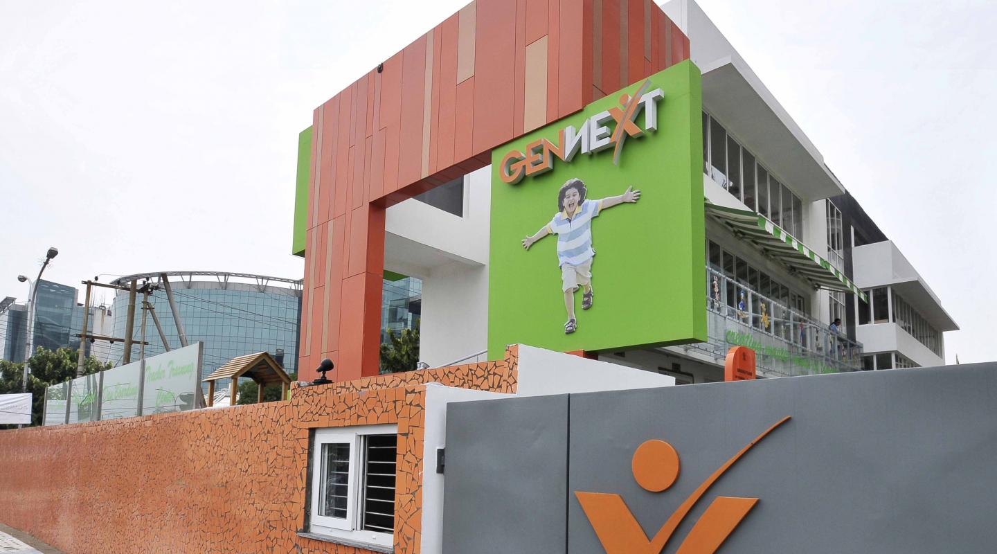
‘A home away from home for tiny tots’; this was the brief for the new school campus at Noida, Sector 62. It was a linear corner plot measuring 50m by 19.2m. Flanked by high-rise apartments on the north and west side, the site was framed by roads on the eastern and southern side.
2009
2010
Gen next is a well-known preschool brand acknowledged for its ‘walk the talk’ philosophy. They follow a simple principle, ‘if you want children to be innovative and enthusiastic; you have to provide them with a stimulating and inspiring environment!’
As the name of the school itself suggested, the design had to cater for the next generation. The brief demanded an inspiring and ultra-modern preschool where the spatial design would reflect international standards and energize kids into learning while playing.
Space and Time were huge constraints and the site location amidst a dense locality, proved to be a challenge. The timeframes for design and construction were extremely tight and within 9 months, the construction process was finished.
The school’s signature entrance comprises of a centrally pivoted steel gate, which opens a 180 degrees. The building has been planned at five levels consisting of basement, ground, and three floors. A multipurpose hall and space for administration are housed in the basement. A sunken landscaped courtyard allows one to access the hall from the ground level and comprises of a podium, which helps the space to double up as an interesting, external teaching area. The ground floor consists of a daycare center for kids below 3 years, and a variety of play spaces.
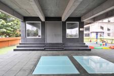
The entire rear side of the building is on stilts, thus, creating a huge semi-open space for a range of assorted activities. The public axis to the rear side of the building is cordoned off for security purposes. Space utilization has been given high priority with value-added facilities like a water screen (placed at the rear setback), a mini golf course (placed in the south setback)-and a green terrace in the front half of the roof.
The floors above house the class rooms that are accessed through a ramp located near the entrance, or the central core which comprises of a staircase, lifts and washrooms. Most of the classrooms open to the north side and hence, get constant glare-free light.
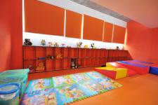
The color scheme for the building’s interior and exterior is inspired from the corporate logo of the school, which is orange and green. These colors have been extensively used on the façade, interiors and even furniture, adding a personal touch to the design!
As the south and eastern facades get maximum visibility, they have been thoughtfully designed using these hues. The front façade boldly showcases the school’s name amongst juxtaposing surfaces that are clad in aluco bond. It is interesting to know that each of these panels were sourced from a different vendor to get an vivid collage of shades of orange that gave a character to the front elevation of the institute. The play of color symbolizes the variety of children that the school teaches. The Southern elevation is randomly sprinkled with 1m x1m windows that are clad with orange and green aluco bond panels. These windows are boxed and reduce the harmful effects of southern light, not to mention give the façade a fun, childlike feel. The core and third floor of the building is clad with black Kadappa which looks like a huge mass coming out of the white building.
Noted for its fun and user sensitive design, this project made most of the design team want to head back to preschool!
Principal Architect: Mr. Sourabh Gupta,
Design Team: Mr. Murli Dharan, Ms. Aditi, Shivdutt Sharma
