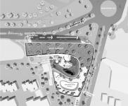
Although Kish Island is currently a developing region, it can be observed as two main zones; one of which is based on former developments of the Island in previous years, and the other is the currently developing parts. The project is located at the threshold of the developing zone and the former developed zone. This role facilitates it to collaborate with the two zones and also work effectively with future developments.
The transportation system of this project consists of two parallel set of streets which are connected to each other by another perpendicular set. The site is located by the main structural road that makes it easily accessible and visible from this main road. Additionally, being located on the junction of a linking street and the main road of the city may also carry an important character for the project. There are three iconic points in the master plan of Kish. The project is a multi-functional 23-floor tower, which is indented to play the iconic role of the zone and the city as well. Based on these three reasons this project intends to be an iconic design of the future Kish .
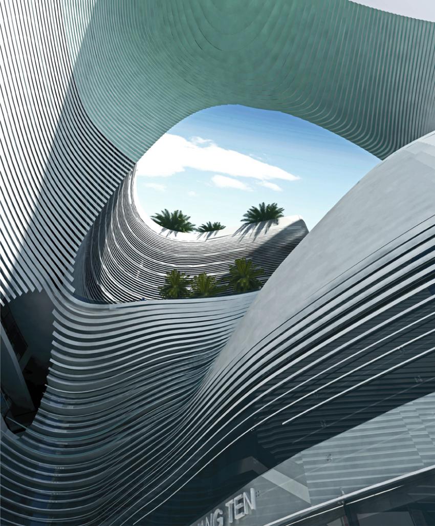
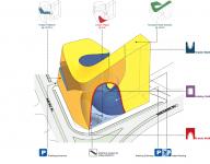
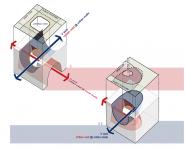
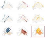
The project has potential to act as an iconic building of the Kish Island due to its functional program and location in the city. To create the basic design we took two different actions; 1) To have an urban-scale effect and achieve a remarkable urban void, we designed a floating U-shape form on higher elevation. 2) To create an impact on the urban surrounding of the project, we formed another U-shape form starting from the ground level. The intersection of the voids of these two forms creates an internal void that links the two forms as well as the forms to the urban environment. On the next step, we blocked both voids on one side to save more sellable area and keep the privacy of the whole project.
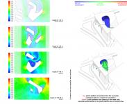
The main technique for designing the form was subtraction. Initially, we assumed the building as a tapered extrusion of site margin that sets back as it rises up to make a reasonable distance from the neighboring buildings. In the second step we subtracted the voids of the previously mentioned U-shape forms from this basic extrusion. As a result we grew a diagrammatic form that has attained the permitted area, according to basic documents. The final form has two different themes that later inspired us in designing the facades. The first one is the exposing face of the project that is a geometric smooth layer. The second theme on the inside is the internal void that contains the public platforms. To compose the final façade, we obtained a uniform mesh that grows from the outer layer in to the inner one. We considered an overlaying skin on the mesh that transforms in color, fabrication, openings, pattern and so forth based on the dual theme of the final form. These transformations and other design issues such as solar accessibility, desirable shading, ventilation, need for the view (in Hotel) and being exposed (for retails) lead us to the final presented facade.
2010
Commercial - Office & Hotel Complex Kish Punctum
Concept Design l fall - 2010
Client : Iran Darya Kish Co.
Consultant : HOOBA Design Group
Architect : Hooman Balazadeh
Project Manager : Shahram Seifikaar
Design Team :
Designer in Chief : Hessamedin Fana Design Assistants : Noushin Atrvash Mahan Shirazi Nina Bazeghi
Environmental Analyser : Motahareh Khazaei
