Benetton devoted itself in dressing people.
Women, men and kids.
To dress people with colorful clothes.
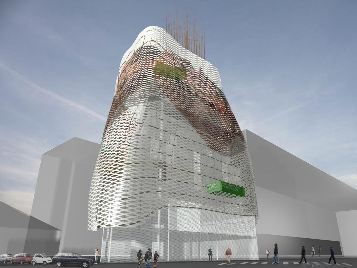
We would like to imagine Benetton to dress its own building.
And not only that, we would like Benetton to change the clothes if its building.
So we thought a strategy for Benetton to resemble as much as possible with its own products.
The building Pret a Porter is a structure conceived as it could be a human body, with a particular shape and the chance to change its own image and appearance and, every time, its own image.
The building is conceived as a functional place where to work and live, changing the way to be perceived, from the outside and the outside.
The whole building, a glass and steel construction, is wrapped by a light steel structure supporting different “clothes”, or, better, façade surfaces, able to change the image of the building according to their nature.
The lines of the architecture design an organic and even sensual shape that reminds the forms of the human body.
These surfaces will obviously allow the view from the outside of the building, according to the pattern of the surfaces, than is anyway conceived as a “fabric” pattern.
In this way the building will be a ever changing structure. According with what the fashion of the moment is or to what a special city event will require.
This project wants to be a piece of contemporary architecture as should be.
The materials used in the project, beside the glass and steel for the “body” of the building, are light materials, such us plastics, printed and cut with different colors and shapes.
The project is anyway following all the requirements as id shown in the drawings and the technical informations reported in the drawings.
Surface is important, and it is what we are following.. and not without a meaning, as Friedrich Nietzsche suggested.
2009
Gianluca Milesi, Michiko Yamada, Michela Schirinzi, Alessia Longoni


