Deli Gateway Taj, from the Taj group of hotels, at Kochi is an up market establishment set in the heart of the city. Their clientele comprise of the globe-trotting tourists, jet-setting businessmen and the cream of the city folk, who are exposed to and well aware of the latest trends, fashions and moods.
What did the client want?
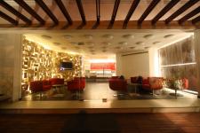
The Gateway Taj, Kochi wanted a coffee shop that reflects “today”, that would appeal to the trendy young crowd. The 800 sft had to have casual seating, service counter and a feel of a lounge. It had to appeal to the hotel guests as well as the locals. The café had to meet the standards of a globe trotter, while evoking the flavors of Kochi. It had to be lively yet relaxing.
What did we offer?
The idea of a café being primarily a transit space was the basic premise around which the
design evolved. The design reflects the local references. The site is located opposite the
Kochi port. The primary colour scheme has been restricted to the shades of brown. However, red being the Tajs corporate colour, it was incorporated in the primary board and furniture.
The broad range of materials put to use in the design have been specifically chosen for their evocative qualities. The key design elements thats holding the space together are the
metropolis installation, saucer lights, the rusty wall, incandescent lighting and the Kochi-New York installation.
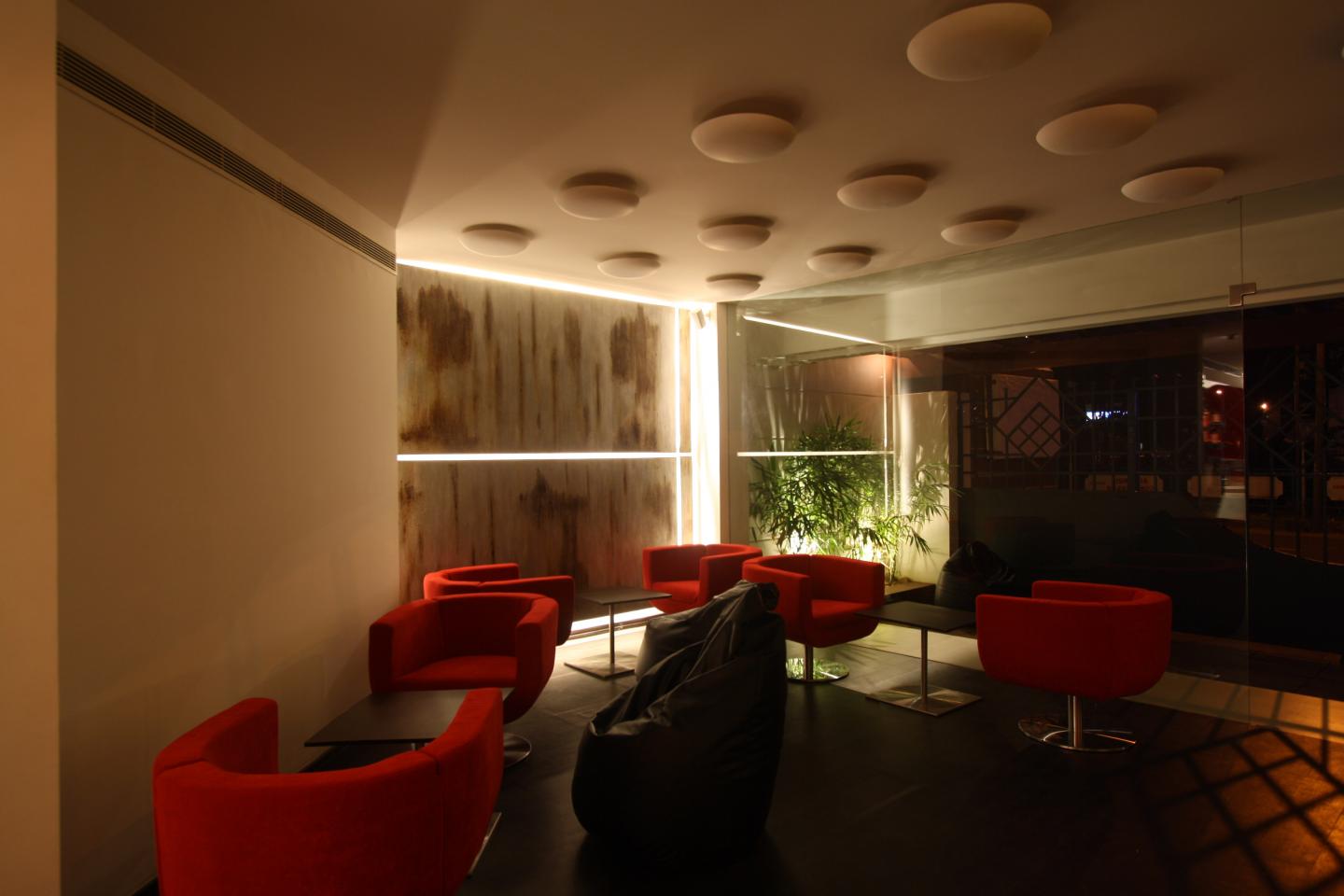
The RUST metal wall: the port of call
As metropolis resonates with the air travelers view of the city, so the rusty wall
celebrates the seafarer and the booming Kochi port, which is visible from the
Taj Gateway. Kochites have long been familiar with the sight of large, weather-beaten
vessels that call on the Kochi port for supplies and maintenance.
Most of them have also passed very close to these huge vessels while
commuting between the surrounding islands. The rusty steel sheet on the wall
suggests the same feeling of being too close to these giants.
The FILAMENT LIGHT: nostalgia
Today CFL and LED lights are phasing out the yellow bulb that all of us grew up
with. To many of us, the humble incandescent light brings memories of home
and ways of living that are being outmoded. This installation adds a touch of
nostalgia, a sweet longing while acknowledging the changing preferences.
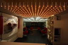
Keeping energy costs in mind, the 361 lights glow with a bare minimum intensity
so that only the filament glows.
An outdoor sitting area of about 200 sft has been provided in the front of
the cafe. The glass wall in the front affords an easy view of the café to the
passer by. It is also a good way to enjoy the famous monsoon season of
Kerala. Red, the Gateway Taj corporate colour adds life to the space.
The seating is casual and very flexible. Bean bags and movable swivel
chairs can be rearranged according to the customers needs. The eye catching
red bar stool has been provided for those who wait for take-away
orders to be filled.
The METROPOLIS by night: for the traveler
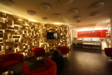
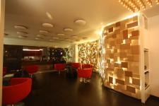
One entire wall of the Deli at Gateway is covered with mild steel sheets in staggered over seven levels, painted in seven different shades of color. These sheets brilliantly cover the lights and lend an interesting character to the seating area. The amount of space covered by this installation makes it a noteworthy feat. To a traveler, it immediately calls to mind the view from an airplane, a city by night, viewed from far far above. To another, the warm tones of the milky coffee colour lend a soothing feel. Even when not lit, the varying hues of the warm colour add depth and coziness to the space.
KOCHI – NEW YORK : the expanding metropolis
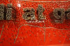
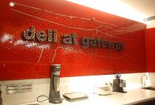
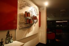
Why New York? It is the established melting pot of the world. The Queen of the Arabian Sea, Kochi, is well on its way to becoming a mega city. The two cities are represented in the abstract. The Deli at Gateway sign, on a red background, that is the corporate colour of the Taj; stands out of the map of Kochi, showing the harbor and the main roads. The city map of New York with its grid layout transforms into the bread stand. The city of kochi- the area around the Gateway hotel has been mapped and extruded as metal
components of varying heights to form the name of the café. Similarly the city of New York has been mapped and extruded to morph into a bread stand. The New York city has a grid iron layout which results in a more orderly arrangement of buildings. A total number of 5000 (approx.) M.S chrome plated components have been used to achieve this.
The SAUCER LIGHT: a tribute
The mundane, utilitarian vat used to mix cement and aggregates at construction sites usually leaves the scene with the construction workers. As a tribute to all those who labour to build the edifices of our cities, they were given a permanent place and put to innovative use at the Deli at Gateway. A coat of paint (same as the one used on the walls) and viola! The homely little vessel turned into chic light fixtures. While it serves as mood lighting, it also dresses up the otherwise unexciting ceiling.
2008
2009
1) The metropolis wall; lighting fixture, wall texture; traveler, transit
2) The map of KOCHI and NEWYORK; used to display the logo; cityscape and as bread stand.
3) The saucer light; mood lighting; local construction vessel, laborer
4) The rust wall; lighting; evoking the Kochi shipyard
5) The 361 lights steel & bulb fixture; lighting; nostalgia, home
Fahed Majeed
Sonali Motta
Rajesh Manjapra
Vijeesh
Sibi
TKM students
