Crafting a high-end, distinctive office space for a client engaged in manufacturing non-avionic components for the airline industry, The requirement was to create an engaging office for two principals, the team of 8-10 people, a clean room and a meeting room in an area of about 1100 sq.ft. The site occupies an unusually angular corner in an otherwise nondescript mixed use commercial development. There were no wet areas, the space was divided and there was minimal daylight from a dark curved glass towards one edge of the space. The glass did however, admit a lot of heat due to its southern aspect and there was no possibility of upgrading the glass for better insulation. The challenge lay in infusing positive and dynamic energy into a deeply compromised shell. The space had to convey image of an organisation and the program it had to perform
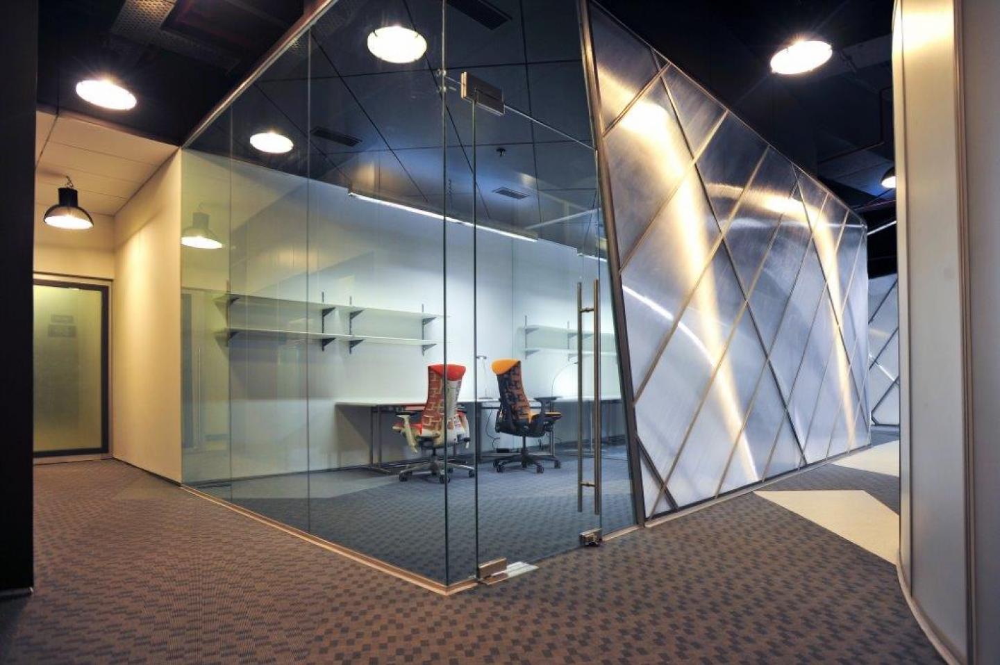
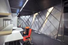
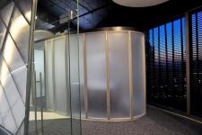
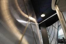
The first intervention was to open up the area by removing the dividing partitions to get a sense of the available space and make it look larger and brighter. A dark grey wall interfaces between the common public area and the space, relieved only by a broad glass door into which the signage is integrated. The internal layout was then planned around the central idea of a non-orthogonal geometry to create more visual depth. As one enters, two dynamic walls of multiwall polycarbonate sheet create a complex field of view, where ceilings descend into walls and fold, twist and bend. Supported on a diagrid metal frame, these undulating walls create the parti – a sinous, snaking central space that is flanked by work areas with varying degrees of enclosure. The floor, although static in its horizontality, is composed entirely of distorted triangles in muted shades that further animate the space. A curvilinear free form meeting room was planned at the glass periphery, creating a visual focus for the space, while at the same time, limiting the heat gain into the rest of the office since the meeting room would be used only sparingly. Wrapped in a double layer of acrylic, this represents the culmination of all lines of sight, finally resting on a static object.
The high ceiling was primarily left exposed and painted a dark grey to disappear behind the floating pendant lamps that are scattered through the office. These concentrate light on the polycarbonate walls, the light shimmering as it reflects and refracts through the cross grained double layers. The ethereal nature of light through a screen is a fundamental design ethos of our studio and this is further elaborated in the design of the translucent dark screen toward the curved glass. The dark grey colour mutes the intense glare and further controls the heat gain into the office. Although the air-conditioning was provided by the building, two ungainly air handling units needed to be accommodate in the area. The trapdoors have been planned as huge animated sliding sections in order to make them disappear.
While light draws attention to the glass, these units are placed together at the far corner right at the entrance of the office, being darker and virtually disappear behind two floating ovoids of intense white which are suspended to further animate the ceiling enable movement of the eye, so that the space doesn’t appear static.
An oddly-shaped meeting room with a further, strange-shaped table inspired by the section of an aircraft wing is conceived at the heart of the office. All furniture has been designed by Architecture Discipline, in a format that is highly visually engineered with crisp, well-detailed workstations. The space was conceived primarily with the intent of augmenting natural Light and enhancing views through Technique & Technology; therefore atypical, Herman miller ergo-positive chairs are used. Colour has also been appended to the space by means of these chairs and by highlighting the bottom exposed edges. Two such varieties, the Sayl (for the employees) and the Embody (for senior staff) have been used. The Sayl is primarily inserted as an architectural element, with a mesh at its back. While experimenting with inexpensive finishes and in an attempt to not overdo the materials, a dramatic palette is achieved by manipulating regular enamel paint to benefit an expensive and easy-to-maintain finish.
2013
2013
Structural : N/A
Mechanical: Architecture Discipline
Electrical: Architecture Discipline
Civil: N/A
Landscape: N/A
HVAC: System Aircon
Plumbing: N/A
PMC: Architecture Discipline
Façade: N/A
Engineering
Akshat Bhatt, Nikhil Auluck
