ANALYSIS
Where there is water, there is life. Thats why being beside water has always been the prior choice of the civilizations throughout history. Kızılırmak (Red River) is one of these water lines which have been a home for different civilizations of different cultures for hundreds of years.
They say that Anatolia is the land where God has wandered and Kızılırmak is the longest river in Turkey, which takes its source from these very lands wandering through Anatolia until it meets with the sea. This water source alone brings life to 8 different cities of the country, along its journey from Sivas to Samsun. But every water source causes a gap in the piece of land it passes through. This way, Kızılırmak has also acted as a strong threshold throughout history. It has shaped the western frontier of Hatti (the main land of the Hittites) and it has also been a frontier in between Asia Minor and the rest of Asia back in classical times just like it defines the borders of two strong civilizations: Lydians and Persians.
The gaps caused by the water sources, damage the continuity of the two river shores. This damage of continuity is what makes the water source become a threshold. Different scales of these thresholds make different effects on the local public life.
When we take a look at the different examples, we can easily realize that the less the width of the river is, the easier it gets to pass through. This way the opposite shore effect is decreased making the riverside a two way living public space. The 15m wide St.Antonio Riverwalk and 20m wide Eskişehir Porsuk River are good examples regarding this fact. When the river width increases, the threshold effect gets stronger causing the other side become an opposite shore of its own. Due to this increasing distance in between the shores, it gets really hard to provide a continuity of public space. Thats why the river, as in 150m wide Adana Seyhan River or 110m wide Sivas Esenyurt Bridge, becomes an obstacle to pass immediately, instead of a place to spend time on.
This way, the river that passes though the project area -Kızılırmak-, has a very critical distance regarding the recreational future plans on the 600 hectares of land along the riverside.
COASTAL CONTINUITY
To summarize the Analysis, the bridge which will be designed along this critical distance should prevent the possible damage to the planned recreational public usage of Kızılırmak shores. It should be designed as an alternative public space for the locals instead of a connection in between the two sides.
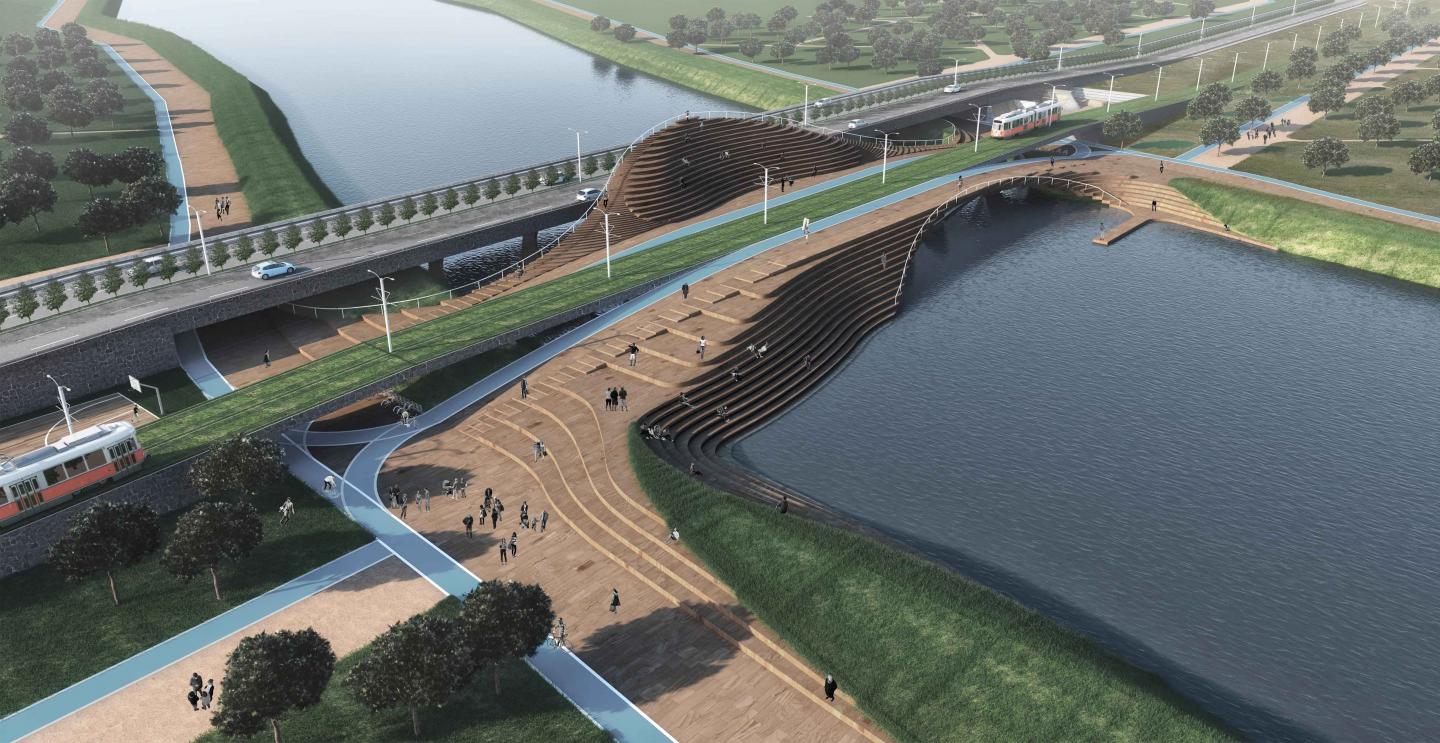
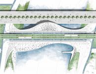
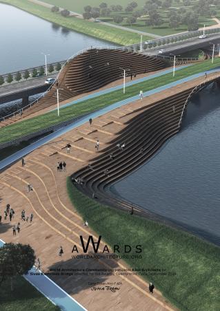
The proposed bridge design is not a separate landmark, but a unique extension of the recreational formations and the coastal walkways. So its starting points, ending points and borders are all vague. Its oval organic lines are a result of natural human movement making the bridge inviting and inclusive at both sides. This vagueness makes the bridge a place with a before and an after. The thought of designing the bridge as an extension does not only apply to its plastic form, but also to its functional effect on the area. So the 100m width of the river makes it necessary to design an alternative public space that allows different functions to take place on the bridge.
The separation of the slow, tranquil pedestrian movement and the fast vehicle movement is considered necessary to begin with. While the 21m wide vehicle highway makes its way to the opposite shore, the part of the bridge which serves to the pedestrians and the bicyclers, widens, shrinks, descends and rises back forming different kinds of structural forms and public usage.
The bridges tend to be dictative due to their nature. Because they aim to reach a specific spot, they usually are one directional at the same level. While thinking about it, we felt the need of breaking this natural dictative need as much as we could.
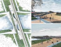
We are slowly going up to the bridge as a pedestrian so it becomes almost impossible to perceive the destination at first glance. So we have the ability to observe the surroundings from different levels. When at the very top level of the bridge (+4,50), we are suddenly facing a different world and this world allows us to experience 3 different things at the same time: walking on water, touching the water (steps) and observing the river view from a spot which can be observed from no other spot along the riverside (open air amphitheater). With this layout, the possible monotonous, boring life of bridge nature is broken.
HISTORICAL CONTINUITY
In todays world, the reason that the landmarks of most of the cities are opera houses, religious buildings and bridges is the lack of the proposed programs which tend to form spaces. This feature causes an unpreventable iconization reflex in some building types although they are not considered to be rare in their own areas. Along Kızılırmak river, there happens to exist many bridges built in different times, but in similar structural techniques. We can list 25m wide Handere Bridge (1200), Kesik Bridge (1292), Sahruh Bridge (1480) and Boğaz Bridge (1526) among these iconic bridges. These bridges tend to invalidate any move of being the new landmark of the city with the history they already have.
The proposed bridge design, as well as not trying to compete with this history, is situated close to the water surface, forming its own calm existence. Its structurally modest, but also in an attitude, not afraid to display itself. Its structure is a synthesis of the local and the modern, forming a visual bond with the arched structure of the former bridges on the same river. As all the bridges reflect the technological opportunities of their own times, this bridge too is linked to the series of historical bridges defining its own place throughout the citys history. The structure which carries the open air amphitheater, touches the water in an axis of 15m. By designing the bridge structure this way, the historical continuity is provided and a modest way of not sticking out with the structure is ensured.
2016
Lebriz Atan
Sacit Arda Karaatlı
Sivas Kızılırmak Bridge by Sacit Arda Karaatlı in Turkey won the WA Award Cycle 23. Please find below the WA Award poster for this project.
Downloaded 88 times.
