SUMMA, one of Turkey’s major international construction companies, purchased the practically derelict structure at the end of 2012, taking a decision to move further nearer towards the central CBD in Levent at the Seyrantepe junction of the ring road. Strangely although it is very near the CBD, this location currently has a no new building ban, pending a wider urban plan for the region, there fore SUMMA’s only choice was to make earthquake proofing additions to the building along with “maintenance” improvements which are allowed under the regulations. This meant that for all intents and purposes we were allowed to think of this as a new building but with a predestined structural grid and floor-to-floor heights.
The client initially drew from ideas by a few architects organizing in effect an informal limited competition, where Avci Architects approach was selected as the one which best represented SUMMA’s vision of itself. It was clear from the out set that due to its “terraced” location the project would be focused around a façade design. The building is also the most significant block on approach from the Maslak route in to the central CBD. Clearly due to the terracing the issue of “Front”, “Back” and “Side” become critical, and its most significant and important aspect towards the North facing this noisy approach road becomes the most important element of the design.
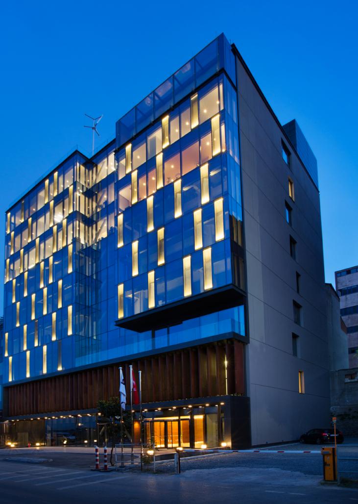
From an environmental point of view the north façade would require no shading for solar control, and there fore a totally transparent glass façade would be possible. Interestingly the brief included a two-floor car-parking requirement using mechanical stack car systems on both the entrance level and the first floor, these floors having the higher ceiling heights that also allow for this to happen. The floors need to remain open to the atmosphere, allowing natural air-flow, but obviously our approach was to differentiate this in the composition without making it look like a car-park. Thus the main entrance to the offices and the car park are placed at opposite ends, with a small café/shop unit in the middle to enliven the streetscape in front of the building. The main car park level is distinguished by a layering of large scale louvers of corten steel, backed by a finer grain of anthracite coloured open aluminum vertical louvers which provide a “veil” like back drop to the cars beyond. A thick metal clad line which begins as a roof canopy / gateway wraps around the corten steel to encapsulate this gesture, forming a clear “base” to the composition. This element then becomes a terrace to the office level on the second floor.
However difficult it is to think only of a front façade of a building, this notion was given depth by and avoids being simply a thin skin by projecting to the furthest point that the existing building provides on the top floor. The skin is further articulated by pushing back the section picked out by the triangulated earthquake-strengthening bay in a recess that follows through to the 2nd floor terrace. The broad composition of the façade then becomes increasingly complex and interesting as we push the offices out again to their extreme above this terrace. A more obvious move to add to this complexity comes from the inside at the top part of the offices by differentiating the office of the CEO with a top glazed conservatory that brings light deeper in to the space at this point. There fore what appeared to be an exercise in the manipulation of a thin skin becomes a more three dimensional game of composition that begins to give substance to the building, an un expected out come given where we began. It is worth taking a look at this point to the original existing building to appreciate this.
What has been driven by commercial and town-planning concerns has subsequently also satisfied our need to give a sustainable edge to this project. Building on “brown” sites instead of on green fields, and not only that but straightforwardly recycling a building that looked more than defunct is no mean feat in Istanbul.
On all other facades a more modest skin is applied with an articulated render finish on insulation to bring the building up to energy standards. Eventually the adjacent neighbouring buildings are likely to be built up to cover these end facades, although this will only happen when the construction ban is lifted. In the mean while the objective is to bring these facades to a level of acceptability that is both economic and aesthetically satisfying.
The brief for the building was to place the headquarters of SUMMA on the top three floors, allowing for a degree of flexible expansion down the floors towards the ground as the company expands. Driven by the founder of the company the lettable floors on levels 3 and 5 are sandwiched by an art gallery / workshop space which will be ran on the basis of an art space open for display of up and coming artists and a place of debate and discussion for Turkey’s fledgling art scene. All of these functions are accessed from a common ground level lobby, which is clad in American walnut on the walls and Serpeggiante grey marble on the floors. The geometries of the lobby are a surprising shift from the rectilinear composition of the façade. The black dynamic form of the Corian reception desk element engaging with the undulating dark timber walls of the space is lit by similarly undulating strips of reflected light from the ceiling. SUMMA gives a clear message to the outside world: modern, dynamic, edgy but nevertheless natural.
Office levels are a series of shared cellular open plan spaces and directors offices, which are arranged to the north. The darker core is utilized for reception areas and meeting rooms. The selected range of furniture from Nurus, ‘U Too’ is offset against glass interior walls with natural walnut timber wall paneling and anthracite gray glazing elements. A strong objective in the interiors was to avoid placing a flat dropped suspended ceiling through out the spaces, and to maximize the given ceiling heights. As a result the ceiling heights in each space is separately maximized and lighting sources are provided from indirect LED strips concealed within the ceilings while specific task lighting is provided by suspended LED strip lights.
The façade of the building is given an interesting inflection by the enforced addition of triangulated steel tubular load transfer steel sections through the central column bay in the façade section of the building. This provides an interesting counter point to the some times excessively enlarged earthquake strengthened concrete columns, which are often encased as circular when they are free standing and part of an open space. The curtain walling solution is as minimal as possible in its conception, with large glass panels spanning the full height of each floor, while avoiding dark spandrel panels. Each potential cellular space is provided with an operable window the full height of the space, and which opens inwards to allow fresh air in to the space when required. These full height openings are protected from the outside with vertical strips of stainless steel mesh, with LED lighting recessed within to further highlight these points at night-time. This gives the building its final signature, which at night comes fully in to life, adding this section of the Maslak to Seyrantepe axis a curious inflexion which makes the SUMMA HQ stand out as a unique edifice in the Istanbul skyline.
2014
2014
Client: SUMMA Head Office
Architectural Office: AVCI Architects
Project Type: Architectue / Interiors - Workplace
Project Location: Syrantepe / Istanbul
Design Team: Selçuk Avcı,Büşra Al
Architectural Supervision: Selçuk Avcı, Deniz Nar, Özge Öztürk
Project Start Date: 2013
Project End Date: 2014
Construction Start Date: 2013
Construction End Date: 2014
Building Plot Area: 830 m2
Total Construction Area: 6,480 m²


.jpg)
.jpg)