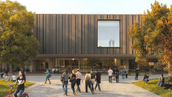
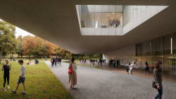
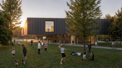
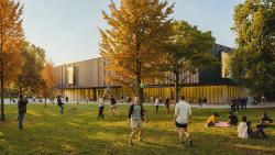
In order to satisfy the brief’s requirement of having a single open exhibition space, we opted to create a low profile horizontal building raised off the ground level, a distinct object yet fused with the landscape. This strategy not only resolves programmatic issues but contextually allows the building to camouflage itself within the park trees. The ground floor is understood as an extension of the park, where the floating volume allows for park activity and public functions of the museum to blend with each other. Additionally, the project is inspired by two Bauhaus elements. The volume is based on a floating table located in the Staff Room of the Engineering School and the roof is an interpretation of a Herbert Bayer’s Bauhaus-Alisstellung poster of 1923.
As a free floating prism anchored to the ground by a long glass base, the project is an investigation in horizontal space. Horizontal space is seen as the space that occupies park, an extension of green and vegetated space, and the museum galleries, an extension of exhibit space. The definition of horizontal, parallel to the ground, defines the project at its essence. The ground being the park space and the parallel being exhibit space. Continuity is established between the building and its context to create a cohesive experience for the subject where connectivity and openness characterize the space.
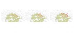
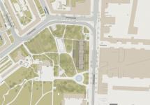
Contextually, the project addresses the park at the level of siting, program, and materiality. The ground floor level bar structure runs parallel to the eastern edge so as to relate to the Kavallierstraße on one side and on the other to create an outdoor covered terrace that addresses the park as a whole. This strategy programmatically activates the street. Two entrances, one to the Foyer and the other to the café, provide access through the otherwise solid bar. In terms of pedestrian routes the proposal maintains the two existing routes that traverse the site, only slightly modifying one of the routes but maintaining its directionality and connectivity. Additionally, the Main Entrance is located at the midpoint of Springbrunnen Fountain and the northern part of the site, coinciding with an edge of the Sports Field and the route that leads to the parking.
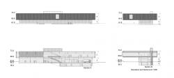
Hidden within the existing trees, the building respects their height limit. The building stands at 11.5 m ( 73.3m) off the park level. Existing trees have been moved to different parts of the site covering up open space and placed strategically at times so as to allow visuals of the building. The building ends up being covered by trees and revealed at special moments. The ODF Memorial is relocated on axis with Antoinettenstrße.
Strategic openings anchor the building to the site and reveal important views of the context at the same time it orients the subject within space. To the north we reveal trees in order to consciously remind the subject of the surrounding park. To the east and west the windows align with major pedestrian routes as the Ratsgasse and a major entry route to the museum. To the south the museum opens up to Springbrunnen Fountain.
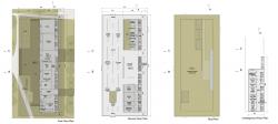
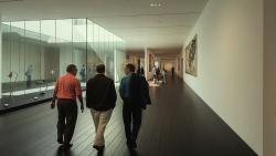
The base organizes the public functions of the museum in a linear fashion so as to allow the Foyer, Workshops, and Event Space to become one single space. These also communicate to the shop and cafeteria. The second floor contains the exhibition galleries, administration and part of the logistics program. The underground level contains the restrooms and the remaining logistics program. By adjusting movable partitions, the main gallery area can function as a single open space as well as a subdivided interior space, allowing for a variety of spatial conditions and flexibility in layout design. The roof is a combination of vegetated spaces and terraces that could be used for special outdoor exhibition events.
The ground floor is placed 1.5 meters ( 60.3 M) below the park level ( 61.8 M) to compress the ground floor as much as possible and highlight the free floating characteristics of the upper volume. The Event Space, Workshop, Foyer, Shop and Café open up to the covered terrace, activating it with diverse public functions. Additionally, an atrium which penetrates the exhibition galleries brings in light to this space at the same time it communicates vertically the two levels. An additional atrium in the second floor becomes a patio for the administration offices. A skylight tops off the monumental staircase to bring in light to the lower level Foyer.
The outer skin of the raised volume is composed of lightweight concrete panels striated to add texture to the rather long surfaces. The vertical pattern is composed of three basic dimensions that ascend in dimension and are repeated all throughout the surface. The concrete volume dematerializes by functioning as a backdrop surface to register the tree’s shadows.
2015
2015
Competition
Office One Architecture Toro Arquitectos

