As Delhi continues to expands as a metropolis, the organic settlements that once dotted the surrounding landscape are gradually being subsumed into the city. Existing linkages to suburban nodes are also strengthening as traffic volumes increase and the city’s hugely successful mass transit system spreads into the erstwhile hinterland. This evolving fabric of the city is creating a complex confluence of building typologies, as pioneering entrepreneurs seek out the elusive combination of large flexible spaces and lucrative capital investments. Located just off the main arterial connection to Gurgaon, the DCA office simultaneously inhabits a setting shaped by a plethora of influences, the strongest of which is the dichotomy of adaptive reuse within an old structure and the local context of an indigenous settlement.
Designed as a studio space for an architecture and interior design firm within an existing warehouse structure, the main challenge was to retain as much of the original structure as possible, while retrofitting the interior to meet the stringent parameters laid out in the design brief created by the partners. The space was to be day lit as far as possible and needed to provide a naturally ventilated and flexible work space for a growing team of design professionals. Additionally, the studio needed to foster a high level of interaction between the two verticals within the company, the studio and the projects team. Conceived as a box within a box, the office space provides engaging spaces for both private and communal use, fostering a sense of creative continuity, allowing spaces for brainstorming and focussed work alike.
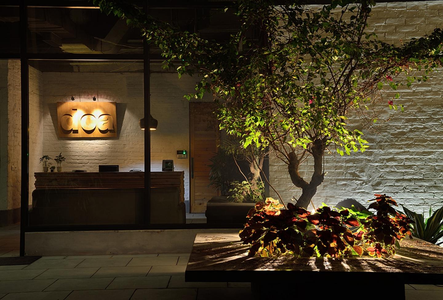
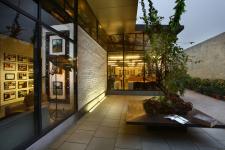
Approached from the exterior, the building unfolds in a series of planned and unplanned architectonic gestures. The front facade is virtually transparent to the eye, the emphasis being on traversing a circumambulatory path around a mostly glazed pavilion. As one rounds the corner, an intimate courtyard reveals itself to be carved out from within the rectilinear volume. Minimally adorned with a steel planter bench, one involuntarily pauses to take in the unrestricted views through the studio and into the reception, transposed against a white brick wall set within a glazed envelope delineated only by the thin members of the dark frame. Arough hewn stone wall on the right has been raised to the same height as the building, creating the appearance of a walled in court in the spirit of Luis Barragan, removing distractions and allowing contemplation of the sky and conversations with the passing clouds.
Upon entering, a stark reception area divides the space into two parts- the common interaction zone and the studio itself which is the bulk of the work space. The interaction zone is designed as a large hall with two glass and wooden boxes that are used for meetings with clients and vendors; the large remaining space serves as a multipurpose hall which is used for more hands-on design activities and engagement such as demonstrations, mock ups, internal team meetings and trainings that happen regularly in the studio. This space also acts as a lunch room and a resource center. Between the two zones and strategically situated next to the entrance is a visually engaging pantry space. On the other side of the reception, a cavernous studio space reveals itself. Four glass boxes within the studio enclose cabins for the partners and the finance and projects heads. These crisp glass cubes create transparency between the individual rooms and the larger work space, while affording the senior management their required privacy. To allow for privacy and a quiet environment, the accounts department is segregated from the studio.
The raw, industrial appearance inherited as a part of the old structure is further enhanced here with the use of raw wood, rough unpolished kota stone and unfinished steel in the pantry and toilets with a basic lacquering/waxing to seal off the untreated surfaces. The ceiling insulation was a critical to maintaining a comfortable working environment, and was tackled at the outset to ensure that the air-conditioning system was more efficient and did not unnecessarily waste electricity. In line with the industrial aesthetic, the un-plastered walls are simply painted upon, the concrete floor is retained and the services remain exposed across the ceilings. The finishing and joinery of the materials and details is maintained as natural and minimalistic. Rubber wood is used for the work desk partitions, tables, and glass supported ceilings in cabins. A carpenter’s work table, commonly known as an “adda”, has been ingeniously re-purposed as a conference table, it’s original form retained for holding open discussions in the library.
Working within a small budget and in an attempt to make no design compromises, the space has been successfully transformed from an old storage unit to a fully functional work space. A combination of old and new furniture, along with elegantly detailed new lighting aids in creating a befitting ambience. The executed design successfully employs a complex layering of spatial hierarchies that caters to the flexibility essential for a growing design services firm.
2012
2012
Typology : Design Studio
Name of Project : Studio for Group DCA
Location : Sultanpur, New Delhi
Address : 344, M. G. Road, Sultanpur, New Delhi - 110030
Tel No : 011 26802444
Email : [email protected]
URL : www.groupdca.in
Principal Architect : Amit Aurora
Design Team : Amit Aurora, Anupama Kumar
Site Area (sq ft & sq m): 11,000 sft
Built-Up Area (sq ft & sq m): 5000 sft
Start Date : June 2012
Completion Date : August 2012
CONSULTANTS
Furniture : DCA Architects
Lighting : DCA Architects
Electrical : Design Matrix
PRODUCTS / VENDORS
Lighting : LSI Systems (I) Pvt. Ltd. / Vizion Lights Pvt. Ltd.
Air Conditioning : Weather Comfort Engineers Pvt. Ltd.
CONTRACTORS
Structural : DCA Workshop
Amit Aurora, Rahul Bansal, Anupama Kumar


