Client Brief:
The hospital approached us with a brief to refurbish the Waiting Lounge and a few consultation rooms in the already existing old block of their premises. The idea was to replenish the soul of the space and provide solace to the anxiously anticipating patients by removing the good old metal benches (that were seemingly cold and aching) and ideating a new splash to the canvas that would be more ergonomically comfortable as well as visually enticing. The waiting hours in a crowded hospital can be very onerous and mentally taxing, especially for the older generation and hence the owners wanted the overall experience for them to be a very gratifying one. Also, the demand for the consultation rooms was addressed to be very user friendly by prioritizing the patients and taking care of their needs.
Concept Note:
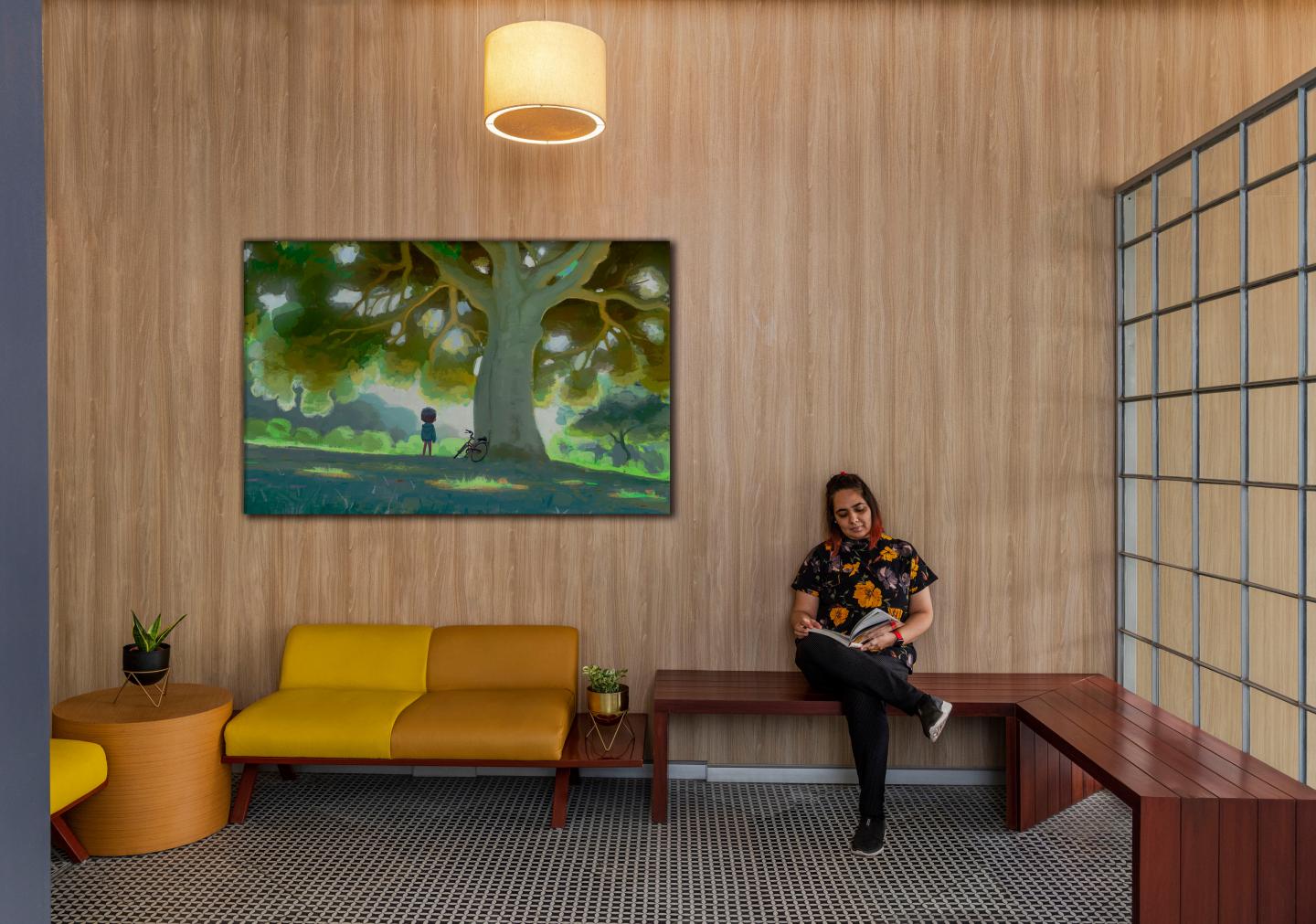
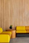
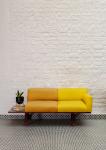
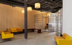
As one starts to renovate this space, one realizes that the existing palette is monochromatic/beige but is extremely well daylit and that acts as a plus as it instantly uplifts your mood. There is an instantaneous thought to add a dash of an invigorating colour that would illuminate the space as well as bring psychological respite to the users who would relish and savor it. The furniture design is clean and minimalistic but has some unique elements added to soften it and create a sense of harmony and visual calm along with being an eye-catching feature in design. A sparing shade of yellow, being the prime luminous colour inspiration (radiant yellow adds ecstasy and optimism) has been intermingled with mahogany and beige, in proportions that would neither be too harsh/jarring on the eye, nor would it undermine the intent used for.
“Yellow is a power color because, when you think about it, what's more powerful than sunlight?" Eiseman said.
Exuding joy while energizing the space, it would be an impetus to the elation that the people would experience while relishing this space that would be an absolute antithesis of their previously acclimatized experience of a sea of gloomy steel chairs in hospitals with very flat uninviting colour palettes.
The consultation chambers also go through an overhaul in terms of the layout, having a rounded triangular conference table for a cozy discussion with the patients that also blends in the yellow scheme of things.
2021
2022
Client: Dr. Saurabh Choudhry
Design Team: Shweta Kaw, Naushaba, Rochi
Photography: Suryan/Dang


