Inspired by the original status of space, Sò Studio recently launched the LOOKNOW Xintiandi flagship store. Through the storyline of "House Now", Sò Studio conveys the narrative of the space and the immersive experience to create a strong identity of the contemporary design style. The key design components "Live Artwork" and "Resident In" combine with the unique cultural quality of Xintiandi provides a special shopping experience for the customers.
The new flagship store of LOOKNOW locates in Xintiandi phaseⅡ, which locates on Madang Road Shanghai. The store facade is decorated with ginger color and simple geometric composition to emphasize the overall visual effect and enhance the brand identity to create a new landmark for urban girls.
By holistically planning the space, Sò Studio re-organized the store into three parts, the window exhibition area, major display area, and accessories area. LOOKNOW, as a global designer assemble store, requires flexibility to be able to display different brands and products, as well as holds different events and changes the scene accordingly at any time.
The yellow frame installed in the window exhibition area is the "Space Object". The frame looks like a box transported from elsewhere is an important aspect of "Live Artwork" that Sò Studio emphasized. The yellow frame, which has the same color as the facade, is not only a visual connection but also to separate the different zones. It is a visual focal point and a connector of the whole space, to create a smooth and seamless transition going from one zone or style to the next.
The "Space Object" installed in the window exhibition area transforms the front area of the store into a flexible space, providing the possibility of future collaboration with other brands and artists for pop-ups, installation displays, and media shows. While keeping the original function of the store, it helps to attract more attention and keep the freshness of the store and brand.
The major display area includes two parts, "Live Artwork" and "Resident In".
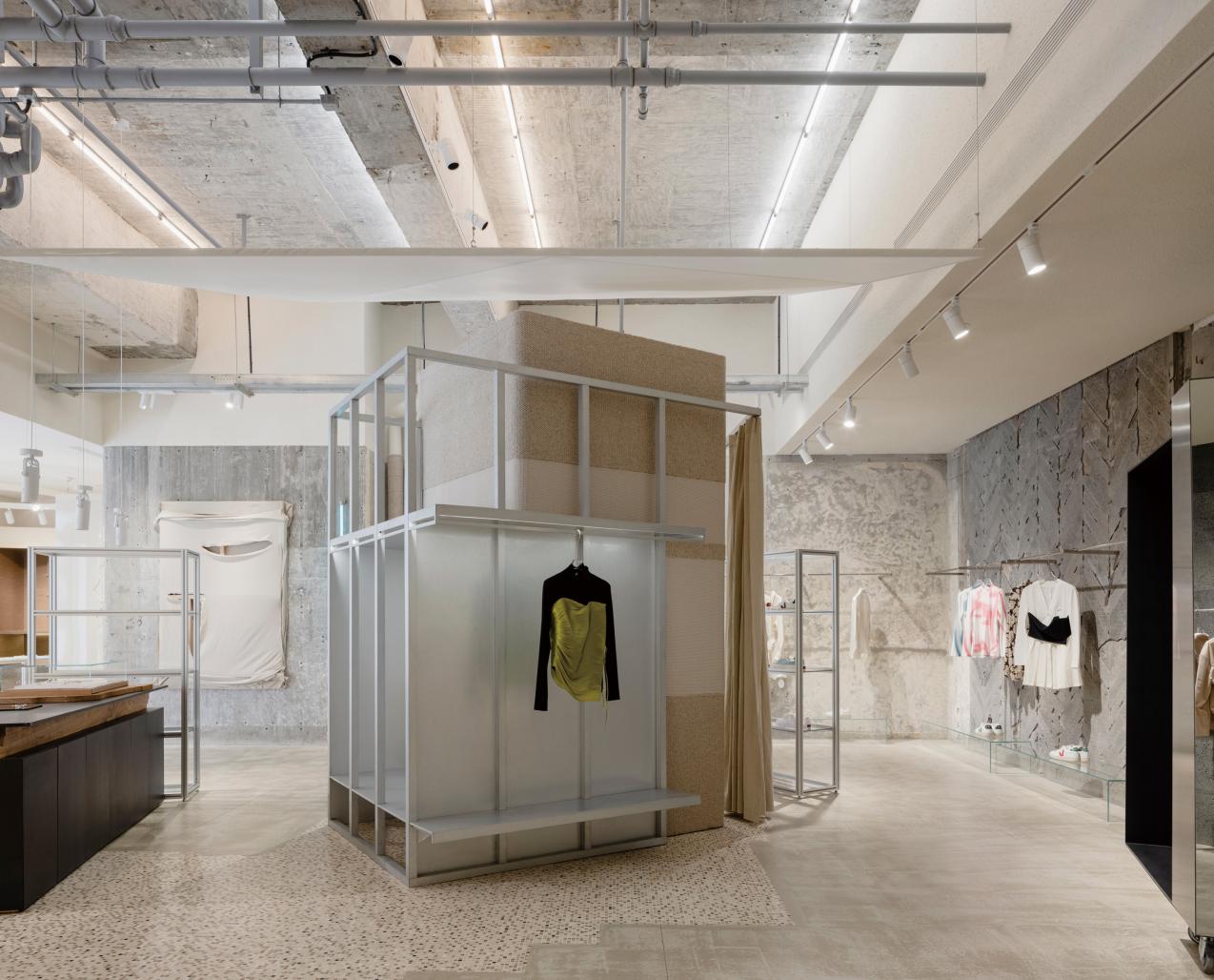
"Live Artwork" is a concept of open space to mimic the status of an artist’s studio. From the start point of the reception, space is transforming from a sense of modern and artificial into the original and rough space texture. For example, the fabric artwork on the wall created by the designer on site has added an aesthetics sense to the store, at the same time, it is also a representative of an "Aesthetics Object".
As the biggest structure in the store, the fitting room is located in the center of the display area. The fabric hanging upon the fitting room helps to visually separate the space and soften the light. The fitting room centered design units the fitting, displaying, and lounge function together. Meanwhile, the circulation is spread out around this space.
Antique doors kept from the old house and the random rocks picked from the quarry are serving both aesthetic and functional purposes. By retaining the historical traces, Sò Studio creates new trace belonging to the present. This kind of retaining and creation is not only the continuation of the space story but also the record of the ongoing creation.
"Resident in" is a privative concept to recreate the conditions of where the artist lives, likes a living room. Wood texture, warm yellow color, and low color temperature lighting are used at the store to generate a relatively private and deluxe atmosphere. The setting of sofa, carpet, and clothes-like racks expresses the story and immersion emphasized by Sò Studio. Although it is not meant to be lived in, it presents what a lived-in space looks like.
The designers intentionally painted the walls in blue unevenly to create a peeling or crackling appearance. The restrained and tuned-down choices of color give a sense of comfort and privacy to the space.
Accessories area is using the same ginger color as the store facade. The abnormal and exaggerated display cabinets are placed here. A standing lamp that looks like a launch pad, customer carpet, and the mottled treatment on the cabinet tells the story of "on purpose" creation.
Exposed brick walls and structural steel and traces of the decorations that were put in place by previous owners are kept in place. Abandoned pipes were rearranged and turned into racks for handbags. Retaining and repurposing the existing conditions and introducing new elements form the "on-going" design concept of the store.
Sò Studio intentionally blurs the boundary between used and new by re-purposing used materials in new designs to create a style that is unique to LOOKNOW. The space, then, becomes a vessel for stories that the used materials carried with them. But the old stories are told in creative ways that incidentally match the overall cultural quality of Xintiandi.
2020
2021
Gross Built Area: 240 square meters
Design team: Sò Studio
Design director: Yifan Wu, Mengjie Liu
Space designer: Louis Lee, Para Fang
Lighting designer: OUI DESIGN
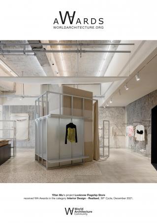
LOOKNOW Flagship Store by Yifan Wu in China won the WA Award Cycle 39. Please find below the WA Award poster for this project.

Downloaded 0 times.


