The blurring of interior and exterior boundaries
——Shanghai Baoye Centre Interior Design
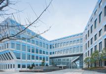
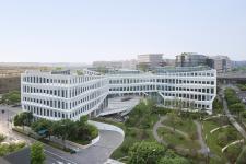
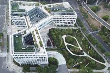
Shanghai Baoye Center is the headquarters building of the Baoye Group in Shanghai and is part of the phase-two urban development scheme for the new Central Business District in Hongqiao, a rapidly developing piece of western Shanghai. The location of the project puts it at the center of the car, train, and airplane transportation. It is in fact the last building one sees before entering the busy Hongqiao High-Speed Rail Terminal from the south by bullet train, granting the project a significant urban presence. The architecture and interior design of Shanghai Baoye Center are both designed by LYCS Architecture. The interior design shares its architectural clue, which penetrates both its content and context, interweaves with its spatial logic. The inherent beauty of architecture is deliberately planted in its interior space as one of the most significant interior elements.
The challenge of the design is to deal with several pairs of opposing issues at the same time: 1. Demonstration and iconicity. 2. Efficient office and humanistic care. 3. Cultural heritage and modern innovation. 4. Restoring the beauty of space and shaping the interior atmosphere. Taking these challenges into consideration, design continues the features of architecture, taking nature, technology, construction and humanistic care as four subjects, setting four atmosphere themes in different functional areas according to the section.
Indoor courtyard full of sunshine and vitality
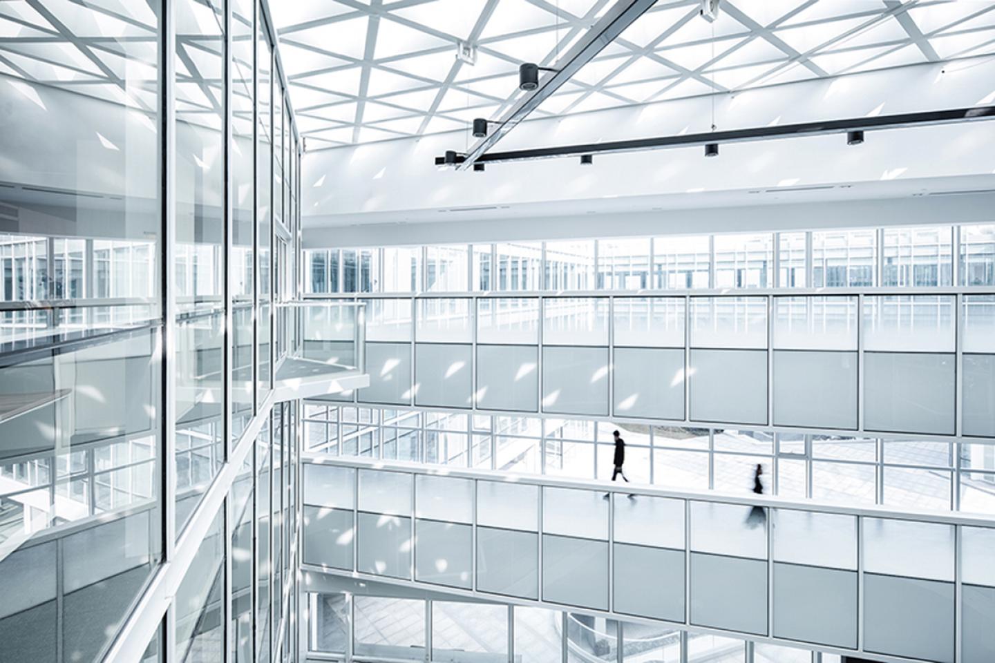
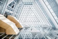
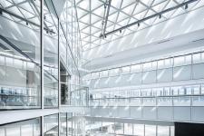
The entrance lobby is designed to create an indoor courtyard full of sunshine and vitality. Five "alleys" around the atrium divide a large space into six spatial units. The building's GRC windows serve as the end, which brings the outdoor landscape into the interior space.
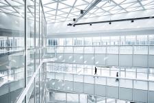
The use of transparent glass and glass terrace, green plants on both sides of the atrium and sunlight from the top of the triangular grid, which together create a vibrant outdoor feeling in the interior. Therefore, the outdoor and indoor boundaries were merged, and interior design was also incorporated into the architectural beauty.
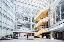
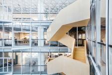
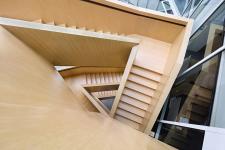
At the end of the atrium, there is a sculptural wooden stair that connects the 1st floor to 4th floor. As the key to traffic flow, the wooden stair activates all spaces and becomes an independent unique space where people enjoy walking. Everyone from 1st floor to 4th floor will pass through each office area, thus artificially creating opportunities for communication. Through the exchange of information between each other rapidly, employees can inspire more creativity.
Comunicational Hub of Technology Charm
The 1st floor is the exhibition hall and meeting rooms. "Baoye's architectural world view" as the entrance of the exhibition hall makes the interface between reception and display naturally bridge. The exhibition hall space highlights the Baoye Group's culture with a combination of technology and humanities, integrated industry and traditional forms.
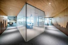
Different spaces have their own main colors. Functional spaces and public corridors are modern dark gray, while the private corridors are surrounded by wooden materials to create a warm surrounded feeling.
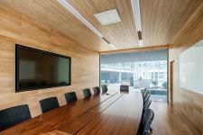
The meeting rooms use electric glass as divisions. When the glass is energized, it is in a transparent state. In the de-energized state, it has a gray and opaque effect. This ensures daylight and visual unity, but also provides users with great convenience.
Open Office Space of Construction and Industry Beauty
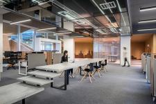
Design of the offices from 1st floor to 4th floor is based on the sense of construction and industrialism. The skyline of Shanghai is used as the design element. At the same time, the industrial design makes the office space reflect the characteristics of the leading enterprises in the construction industry.
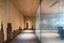
The wall of public corridor in the meeting area is composed of two different colors of wood veneers to form the abstract Shanghai city skyline, which is scattered at different heights. This two-material splicing method is also used in the leisure stair. It is the dislocation of wooden floors and cement self-leveling, which creates a site for reading, relaxation and activities for employees.
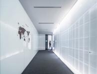
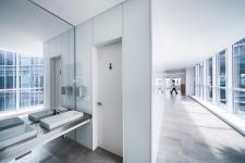
The space of public corridor of is bright with white as the main tone. The white painted glass is on one side. On the other side, the facade is printed on the surface. When the light is turned on, the facade lines are clearly displayed, creating a futuristic space.
Open offices and corridor hide the necessary pipelines in the ceilings. The lower space is set to be a coffee break area.
In order to reflect the construction process of building, the material of ceiling was made of black glass and internal lighting. Pipeline layout was mapped onto the black glass to form a translucent surface.
The area on both sides with high space and close to the light is used as an open office area, so that the original architectural layout is reasonably used. Interior space is a good representation of the theme without sacrificing the original intention of building. The material of the ceiling on the south open office uses experimental light-transmitting concrete to combine industrial materials and light.
Humanistic Care for Staff
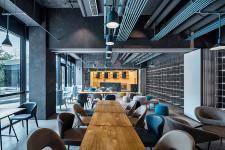
B1 is a more private space and is built as a home for employees with humane care. Here is a collection of catering, rest, entertainment, culture, fitness and other functions, around the two daylight courtyard to meet the staff's working and living basic needs. The multi-functional café, a place for employees to relax, is a main area. It is positioned as a young, flexible space. In addition to the café, a collection of salons, classrooms, and party are also included.
The entire café is divided into three parts. The outermost space is "variety of coffee". A large space is divided into two openable areas by a partition. The partition is opened for café and closed for class and discussion. The entire top surface and the pipeline were exposed to a dark gray color. The well-designed tubes, alignments, and chandelier were sprayed blue and suspended below the other lines. The side walls are framed and displayed using stainless steel frames combined with landscape plants.
The middle of the café is the bar counter and deck area. Concrete wrapped bar counter meal space, while interior of the bar is a wooden surface. Deck area is surrounded by warm wood. Leisure area along the window is equipped with movable furniture. The innermost area is the "Variety of Feelings" area. This is a very flexible space for employees to use. The side of the wall is equipped with a movable screen and the opposite side is a step and a graffiti wall. On the other side is staff sleeping compartment. This is a warm and exclusive area for employee activities, discussions, and lunch breaks.
The design of the restaurant integrates Wu Yue culture, the birthplace of the company, into the design language. In addition, the company’s construction culture is reflected in materials that use natural textures and restore the employees' frequent contact at work. Collages of Shaoxing's residential rooftops are tiled in wood with two different colors. The cultural charm behind the abstract picture can be felt through the public walkway walls.
The staff restaurant adopts a bare top approach in order to ensure the height of space and flexibility of use. A ceiling is set around the perimeter to solve the problem of the pipeline. The space is divided into two parts: the outer ring is close to the outside, and the feeling of outdoor extension to the interior is created by the green brick paving, while the inner circle is limited by the triangular custom lighting to the dining area.
The function hall is based on the large space of the building. One wall is set with white painted glass and a projection surface, and the other three planes and the center are set by a rotatable and translatable partition. According to the use of behavior can be divided into different spatial states: when the partitions are all open, there is an open column-free large space to facilitate the activities and meetings of all employees; when the partitions are all closed, the space is divided into four small spaces that can be used independently. The soft rubber pad between the partitions is designed to enhance the sound insulation after space separation, while the multi-function hall chair is movable and foldable to facilitate switching during different uses.
Architecture and interior design of Shanghai Baoye Center is a milestone project for LYCS Architecture. On the basis of the architectural design concept, the culture of Baoye Group is fully understood. Nature, technology, construction and humanistic care are taken as four main purposes. It is truly human-oriented and gives each floor a different spatial theme while being continuous in space. The blending of functions and feelings makes the office no longer rigid, but becomes to a space full of humanistic care, inspiring communication and ideological collisions. The integration of architecture and interiors complement each other here.
Project name: Shanghai Baoye Center Interior
Location: Shanghai Hongqiao CBD, China
Size: 27,394 sqm
Project Period: Design 2012-2016, Competition 2017 (Architecture), 2018(Interior)
Interior Design: LYCS Architecture
Architecture Design: LYCS Architecture(Leading Architect), ZJ Baoye Architecture Design and Research Institute(Architect of Record)
Decoration Design: LYCS Architecture
Curtain Wall Consultant: Shanghai Macfarlane and Sinobau Structure Consultation Co.,Ltd
Curtain Wall Enterprise: ZJ Baoye Curtain Wall Decoration Co., Ltd.(Constrution Design)
Electromechanical Consultant: LYCS Architecture(Hydropower Design), Shanghai Credy Intelligent Technology Co., Ltd. (Weak Current), Shanghai Linxiang Environmental Protection Co., Ltd. (Air-conditioning)
Lighting Consultant: Shanghai Hanyuan Lighting Design Engineering Co., Ltd.
VI Consultant: Inbetween Creative Design
Images: WU Qingshan(interior), He Lian(interior), Su Shengliang(Architecture)
2016
2018
Project name: Shanghai Baoye Center Interior
Location: Shanghai Hongqiao CBD, China
Size: 27,394 sqm
Project Period: Design 2012-2016, Competition 2017 (Architecture), 2018(Interior)
Interior Design: LYCS Architecture
Architecture Design: LYCS Architecture(Leading Architect), ZJ Baoye Architecture Design and Research Institute(Architect of Record)
Decoration Design: LYCS Architecture
Curtain Wall Consultant: Shanghai Macfarlane and Sinobau Structure Consultation Co.,Ltd
Curtain Wall Enterprise: ZJ Baoye Curtain Wall Decoration Co., Ltd.(Constrution Design)
Electromechanical Consultant: LYCS Architecture(Hydropower Design), Shanghai Credy Intelligent Technology Co., Ltd. (Weak Current), Shanghai Linxiang Environmental Protection Co., Ltd. (Air-conditioning)
Lighting Consultant: Shanghai Hanyuan Lighting Design Engineering Co., Ltd.
VI Consultant: Inbetween Creative Design
Images: WU Qingshan(interior), He Lian(interior), Su Shengliang(Architecture)
LYCS Architecture
