There's a stage in life when children grow up and leave the nest. This was the case for a couple in their 60s who decided to revitalize and renew their home after all their children had left. They sought to refresh the design, bring in light and joy - making the house enjoyable for visiting children and grandchildren.
The house, purchased by the couple thirty years ago and serving their family, was built like most old houses - with clear separation between public spaces, many walls, and inadequate light. The main goal was to provide the couple with a bright, spacious home that suited their daily needs but also served as a place to accommodate their extended family.
For the renovation work, they turned to interior designer Keren Gans, whom the homeowners discovered through social media and fell in love with her unique style. The couple wanted to create a home with a warm, fun, optimistic atmosphere full of hope. The result surpassed all imagination, thanks to Gans's precise planning and extensive use of different types of wood.
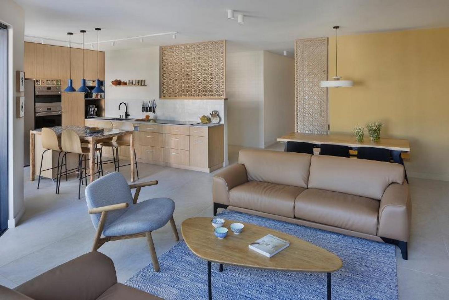
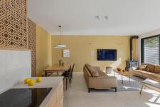
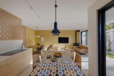
Firstly, the communal space underwent a transformation. It was crucial for the couple to reorganize the communal area to make it spacious and well-lit, add storage spaces, and create a spacious dining area for the whole family. The keys to the living room were enlarged and expanded to their maximum to create a brighter space and connect the interior to the outside garden, which also includes a dining area and a small kitchenette, serving as an additional option for hosting the extended family.
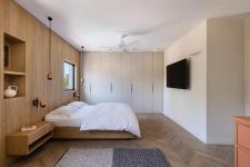
The entire communal space, entirely paved with large gray porcelain granite tiles, was adorned by Gans with shades of brown and cream wood elements, creating a familial and warm look with touches of mustard and blue that added a lot of joy and character. The wooden element begins at the entrance to the apartment, where Gans chose to frame the door and entrance wall with oak frames, providing height and space. The central space is also surrounded by light wood elements designed specifically for the couple, allowing light to enter and create a dominant design as they open 180 degrees.
"The couple dreamed for years of having a fireplace and leather sofas in the living room - two 'heavy' elements that they wanted to incorporate intelligently to maintain a light, bright, and airy look. Therefore, the other furniture and elements in the living room are light and minimalist in design - an oak and iron drop-shaped table, jute fabric, and to complement the look, we opted for a rug in subtle shades of gray and blue, which resonate with the Moroccan tiles in the kitchen."
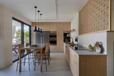
The small and old dining nook was replaced by a large dining area where the entire family could gather. Here too, the motif of wood returns, and the couple chose an oak wood dining corner with metal legs that extends along a length of 3.3 meters, complemented by a wooden bench and black chairs.
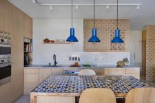
Additionally, the designer chose to remove the dividing wall between the kitchen and the communal area, creating a sense of a spacious, large, and well-lit kitchen. The wall separating the kitchen area and the extensive worktop was complemented by a low wall, completed by Gans's signature wooden elements, allowing the kitchen to expand without darkening it. The kitchen fronts are made of light-colored veneer wood, providing a backdrop for the Moroccan mosaic tiles that the homeowners wanted to integrate into the kitchen. Moreover, a central island was placed in the kitchen, serving both as additional storage and a place for daily seating and dining. Ceramic lamps, handmade in shades of blue, complement the warm and romantic look of the space, combining wood, brass, and rose gold.
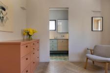
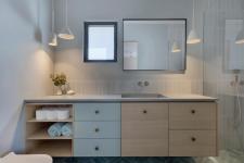
In stark contrast to the light and tranquil communal space and bedroom, designed in light and calm tones, the bathrooms in the house are colorful and vibrant. The floor of the couple's bathroom is covered with colorful porcelain granite tiles. The space itself is spacious, combining pastel shades with oak veneer. Gans chose not to cover all the bathroom walls but only in the "wet" areas to maintain a minimalist appearance. The vanity is exceptionally large, containing plenty of storage space and featuring a concrete surface with an integral sink.
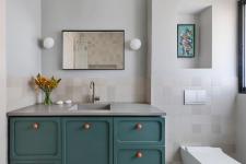
The central bathroom is dedicated to the grandchildren and is designed in a youthful and cheerful style, with bold colors and rounded lines, creating a pleasant atmosphere. The vanity cabinet is painted in a smoky dark green color with orange handles. Here too, the surface is made of concrete, with an integral sink. To complete the look, the designer chose bright tiles for covering the walls and floor, avoiding overwhelming strong colors in the bathroom space.
Thus, the couple's home underwent a complete transformation, including breaking down walls, enlarging key areas, improving home ventilation and introducing as much light as possible, and of course - realizing their dream.
2022
2023
Size: 180 sqm 150 sqm yard
Interior Design: Keren Gans
