Ramat Aviv Gimel neighborhood in Tel Aviv, is characterized by new construction alongside old buildings. In recent years, the urban landscape has changed as each of those old buildings has added a balcony to each apartment. This is a charming project in the northern neighborhood of Tel Aviv, the last among the group of buildings where a balcony was added to each apartment. The couple, in their 50s, bankers, has been living in the apartment for years, along with their military daughter. They decided to take advantage of the refreshing addition to make a significant change in the apartment, finally adapting it to their new needs. For the renovation, they chose designer Dorit Weinbren, who knows the neighborhood well and has decades of experience in renovating apartments in Ramat Aviv Gimmel.
According to Weinbren, "During the process, the renovation grew and became significant and substantial. All the planning changed to adapt the apartment to the family's current needs, residing in the apartment for many years."
Weinbren further explains, "There was a very special process here. He likes dark and she likes light. This created a project where I delicately moved between light and dark, in order to give both of them their space. There is a play between light and dark here; dark flooring, light furniture, black bathtubs, light flooring, dark kitchen, and so on."
Upon entering the apartment, we encounter a dominant cabinet with plated handles and unique carving, a motif that continues to be seen in various spaces of the apartment. The cabinet, as described by Weinbren, contains ample storage, electrical products, papers, pull-out drawers for letters and newspapers, essentially a cabinet that maintains a lot of order.
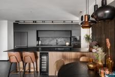
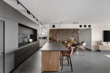
To the left of the entrance, the kitchen is located, featuring a large island measuring 4.5 meters in length, surrounded by bar stools for daily seating and entertaining, as well as a workspace. Its lower part serves as storage, including a wine refrigerator facing towards the living room, and a uniquely processed porcelain granite surface. The kitchen itself features a pocket unit, called BOX in professional language, with a built-in sink and overhead lighting. The wall adjacent to the kitchen extends with practical storage facing its direction. The wall is clad in grooved wood with unique processing and painting, harmonizing with the grooved texture of the island's lower part.
The kitchen's design balances between black and plated elements, seen in the lighting fixtures above the island, bar stool legs, and dining table base. A secret passage leads to the service balcony, through a zero-line door located to the left of the built-in unit.
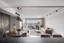
The family previously had a large but impractical dining area that even blocked access to the previous island. Now, Weinbren chose a compact, round dining corner that cleverly serves the small family and can be expanded during large dinners, featuring a unique design.
Weinbren further explains, "To avoid cornices, I chose jets, similar to black balls, whose purpose is to 'throw' air into the living room while maintaining a clean and minimalist design.
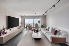
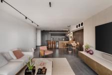
Bright seating arrangements, a light wool rug, providing beautiful contrast to the dark flooring, were chosen for the living room. A TV wall is covered in intricately patterned and delicate terrazzo tiles. An "emerging" sideboard from the wall, also clad in terrazzo tiles with a plated front, designed by Weinbren. Magnetic lighting travels across the walls using lighting strips coming directly from the kitchen to the living room.
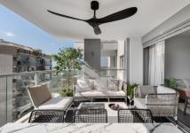
Investment in the balcony is also noticeable. At its center is a fire table that serves as a wonderful backdrop for sunsets, alongside seating areas with refreshing lemon trees and a refined dining table. Here too, the play between dark and light continues, with light furniture against dark flooring, integrating with the living room flooring.
The master suite includes a bathroom and a walk-in closet. Both feature an interesting and intriguing glass front in the form of semi-opaque, plated-colored stripes. Herringbone parquet adds a soft and stylish atmosphere to the master bedroom. Nevertheless, it's a clean and minimalist room, with trendy lighting strips that, like in the living room, start from the closet and travel to the end of the room as a single unit.
The shower's frosted glass creates a dramatic appearance. The walls are covered in detailed panels. A sink unit, in a single piece, with a rugged processing of marble and surfaces, and decorative lighting fixtures on one side of the cabinet that resemble bells.
The child's room is minimalist and clean, with light furniture, zero-line doors, like the rest of the doors in the house, and flat lighting with square cylinders and small cubes descending on the wall.
2023
2023
.
Dorit Weinbren - interior design and planning

