The Value of Space and the Success of Strategy - Different Industrial Architecture
Industrial architecture is first and foremost industrial architecture. Factory buildings are often associated with words such as "huge", "noisy", "ugly", and "dirty". How to shape a distinctive factory area on the basis of unchanged cost? The Qidong new factory area, which is tailored for ECHOLAC luggage, has made some explorations in this regard.
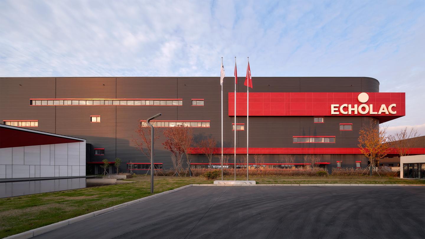
The second factory area of ECHOLAC located in Qidong, Jiangsu Province was completed this time. The factory area is divided into two major parts: production and office. The production area is a 20000 square meter light steel factory with a height of 20 meters; the office area is a single story concrete building of 5000 square meters, with significant differences in volume and form between the two. How to lift it out of the surrounding factory buildings? The key to solving the problem is through the combination of colors and local innovation.
Horizontal extension: the expansion of space
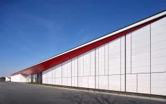
The office area connects several large functional blocks together through several courtyards, which can extend the length of the building to 130 meters. However, there is still a proportional imbalance with the huge volume of the factory workshop. Therefore, the "red roof" structure of the office area was extended outward, incorporating the outdoor basketball court and elongating the building proportion.
The charm of color: low-cost aesthetic enhancement
A standardized production workshop, due to its functionality and efficiency, inevitably leads to a clumsy, monotonous, and rough facade. However, through the combination of color matching and lighting windows, this huge volume presents its characteristics. The small arc-shaped chamfer at the corner of the building plays a crucial role in balancing weight.
Choose white for the small office area to make it stand out. The tall production workshop uses dark gray to make it "hidden" behind and become a prominent "red" background. The entire factory area is adorned with the iconic red color of Coca Cola, blending "deep" and "light" together. The 2.2 meter high wall is innovatively made of red perforated aluminum panels, making it a part of the building.
Strategy: Effectiveness and Economics
How to achieve high quality with low cost? The answer is to use money on the cutting edge. The rich texture of the stone curtain wall is reflected on the main entrance display surface, and local efforts are made to enhance the overall atmosphere of the factory area. However, in other parts of the street facade, pedestrians can only observe from a distance through the wall. In this design, a curved painted wall is used, which presents a sense of order and rhythm that can be perceived even from a distance.
Courtyard Placement: Super "Core"
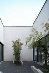
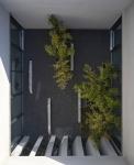
The six distinct courtyards elevate the spatial quality of the factory area to a high level, connecting many public, semi-private, and private functional spaces, introducing sunshine and breeze, and bridging the slightly negative spatial atmosphere of industrial buildings on a large scale. The rare spatial experience and fun in the factory area also come from this.
Conclusion:
The fundamental purpose of architecture is to solve problems, and it is all based on an interesting architectural practice in industrial architecture: to reinterpret factories through architecture without increasing costs. A beautiful working environment, harmonious architectural relationships, interesting spatial experiences, and a building image that reflects corporate culture, these architectural techniques are like the experiences of culinary skills turning cheap ingredients into Michelin.
2019
2023
Gross Built Area: 25365m²
Three materials used in the project:
1. Glass
2. Perforated aluminum plate
3. Corrugated color steel plate
Chief Architect: LING Kege, LI Lian
Design Team: LI Lian, JIANG Andong, WANG Yunan, WANG Longlong, ZHU Mengdi, ZOU Tianchen
Clients: ECHOLAC (CONWOOD INTERNATIONAL)
Construction drawing design (company name): Qidong Architectural Design Institute
Landscape Design (Company Name): Chongqing Daye Landscape
Photo credits: ZY Architecture Photography
