At the beginning of 2020, Longting Restaurant, a mixed-cuisine restaurant at the Rong Hui International Building, opened its doors simultaneously with Feichi, a company with offices at the same location. Both the restaurant and the Feichi office space were developed by the building’s owners, with WIT Fangxia Design commissioned to design a restaurant space spanning two underground floors.
Interview with the Longting Restaurant’s Proprietor
Q: What were your first expectations of the restaurant design?
A: The first phase of the project was positioned and defined as “business use”. In undertaking this office building project, we found that it was difficult to find a suitable restaurant between Beijing’s West Second Ring Road and West Fourth Ring Road that suitably met the need for business receptions and family gatherings. There was a big gap between the quality of commercial centers in Haidian’s BeiXiaGuan area, and those to be found in East Beijing. Therefore, our goal was to create a comfortable dining space that empowers the Ronghui Building itself to support the requirements of its occupants – primarily involved in the financial technology industry, and to offer an ideal dining option to related staff. At the same time, it should be a preferred option for such dining spaces in West Beijing.
Q: What difficulties did the project face at the time?
A: The difficulties in this project were quite straightforward. When first encountered, however, everyone thinks them rather difficult to solve.
First of all, originally about 60% of the operating area of the restaurant was located on the B2 floor. Our design solution made a sunken plaza in the atrium directly leading to that level. Also, the rooms on that floor have no natural lighting, so preventing that factor from affecting guests’ dining experience was one of the primary difficulties.
Secondly, there are many structural columns throughout the space. How to artfully incorporate these columns into the layout demanded innovative design.
Thirdly, we wanted to create as much effective operating area as possible in the space. Making optimal use of the irregular spaces while maintaining a comfortable environment for guests, including the need for private rooms, was another challenge .
The fourth difficulty lay in enabling larger dining scenarios such as banquets and annual meetings, and to coordinate the conflicting demands for large spaces as well as private rooms.
The fifth was the interplay of interior and exterior, such as making good use of the sunken plaza’s natural lighting, and allowing it access to adjacent private rooms without wasting its natural advantages.
The last difficulty was presented by the chaotic pipelines left from the last project and its complicated theme. We didn’t want the infrastructure investment wasted, so how to utilize the original pipelines in the design was also a problem.
After the design was completed, we felt we had basically achieved our goals, at an optimal balance of space and cost. Everyone agrees that that the ambience is not that of an underground room, but of a softly-lit, comfortable space.
Q: What was the operational result after the design was completed?
A: The design and implementation have brought a positive boost to our follow-up operations. During the three-year epidemic period, our operating results were relatively good, compared with similar restaurants in our area. Further to the epidemic’s restrictions being lifted, our evening business hours are basically at full capacity.
Q: How do diners rate this restaurant?
A: New demand drivers for contemporary restaurants has supplanted the previous business model. Compared with the logic a few years ago of dining out in order to dress up and enjoy a nice meal, people's needs have become more social. Guests need to dine at a specific time and in an atmosphere that deepens and enriches their relationships. So in addition to cuisine, the demand for quality space and design has reached an unprecedented height.
The first reaction of the guests who came to Longting is to its air of comfort, the ease of integrating into the environment. Although we won’t harp on how exquisite the design is, we can boast that the space serves people’s needs, so bestowing comfort is the priority – providing culinary comfort, physical comfort, psychological comfort, visual comfort, with the help of several components enabled by the design. Our famous restaurant management team partners, Longting, told us that our restaurant is the best one in their chain in terms of design sense, so much so that it has helped them improve their operations, which is proof that they are quite satisfied.
Q: Has the restaurant had an impact on the building complex itself?
A: This restaurant meets the area’s need for high-end dining, and solves the daily needs of our customers. Many of the office managers here have adopted Longting as their daily business reception location, the telltale sign of one plus one adding up to more than two. I find this particularly encouraging.
Challenge - A Paradox of Nature and Space
An approximately 2,500 square meter seating area is divided into an open dining area on the first floor and 20 private rooms on the B2 level, and a kitchen area on the B1 level.
This layout presented several design challenges –creating a delightful and relaxingly natural environment in a business-oriented office building; 80% of the dining space located on sub-ground floors, where natural light is extremely scarce; the 500 square meters of the first floor contains 7 different open-air cuisine stations - properly unifying them without blurring their individual characteristics and attractiveness posed a design challenge.
Solution- Architectural Form Synthesis
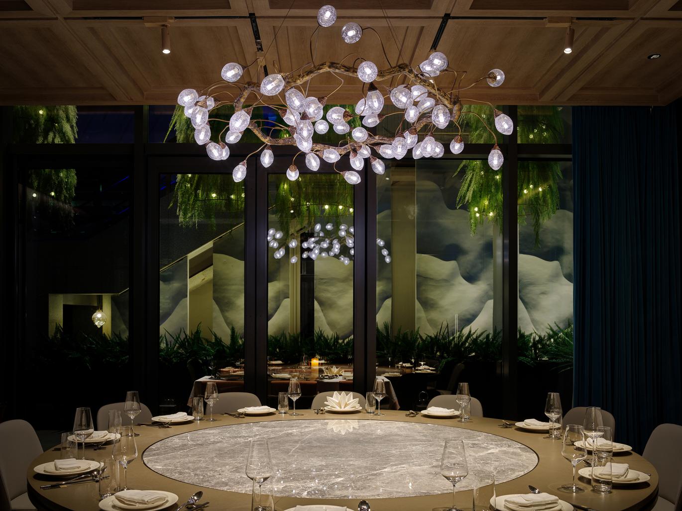
Incorporating the outdoor atrium into this design was undoubtedly the best decision for both designers and investors. The design of the atrium space employs digital technology to simulate an ever-flowing waterfall and pool, with an outdoor “waterscape” made of concrete. Copper ducklings afloat add to the scene, a tableau conveyed through the window view of the restaurant. Beijing’s arid environment intensifies the appeal of water bodies, while its dry and cold northern winters are not conducive to the construction of outdoor water features. The design employs pristine natural imagery, such as trees and animals, to create a spiritual sense of nature, transforming the original rational architectural form. The heavy traditional materials are lightened, and the ubiquitous tension of the city is relaxed, so that people can enjoy this evocation of nature to the fullest.
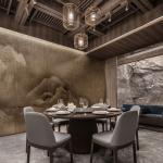
A similar recreation of nature is manifested in each private room. The earthiness of mountains and rocks, regardless of the techniques and media which convey it, replaces the dispiriting urban feeling of an office building.
The underground space’s design ingeniously obfuscates the floor concept. Most guests fail to notice the private room located on the second basement floor, drawn instead to the overall space design, an indoor vale of sumptuous greenery illuminated by an artificial skylight. Through color temperature selection, and artful choices of light and shade, the design renders an interior simulation of diurnal time, real for all relevant intents and purposes.
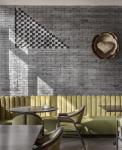
In the open seating area on the first floor, each island uses a different color to denote its dishes——Guangzhou silk cotton red for Cantonese-style roast meat; cherry blossom pink for teppanyaki; jasmine green for Jiangnan cold dishes; gold to mark Peking Duck, and more. The bold use of color endows the dining area with a subtle air of the dramatic, and presents the chef as an actor on the stage, greatly enhancing the dining experience, the highly saturated RGB color artfully employed to stimulate appetite and emotion.
Discussion on the value of restaurant hospitality
Since Longting Restaurant and the Feichi offices share the sunken plaza and the outdoor atrium, they form a micro community, unfolding into an active and open urban milieu. On the one hand, the restaurant serves as support for extra-professional affairs such as lunch meetings, providing urban white-collar workers with high quality dining options superior to self-contained restaurants, undoubtedly of great benefit in terms of convenience, efficiency, and the vitality of the environs.
On the other hand, in order to simulate nature, the design uses both digital and traditional methods to provide a realistic sense of nature in a commercial office building setting. That sense of nature soothes, so people can eat and work in a relaxed manner, enjoying a natural setting while embracing the city and all it offers.
2023
2023
Owner Information: Longting Boyue
Project area: 3500㎡
Project Location: Ronghui International Building, Xie Street Gaoliang Bridge, Haidian District, Beijing, China
Interior Design: WIT Design & Research
Lighting Design: PRO Lighting Consultant
Design team: Zhenhua Luo, Gongpu Zhao, Yanli Zhang, Qianxuan Niu, Rui Tao, Lin Yang, Changxin Tian, Wenyi Chen
Illustration Design: Bo Dan
Project photography: 1000-Degree Vision, Fei Gao
Copywriting planning: NARJEELING
Project planning: Le Brand Strategy agency


