A steeply sloping land, a green area to be preserved and a view that is so beautiful explains why our city is called Belo Horizonte.
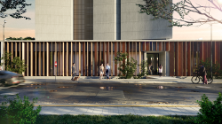
A new building can change an entire neighborhood. Each city has a different land use and occupation law. We are in Belo Horizonte and for just over 3 years the city has had an instrument called ACTIVE FAÇADE, which promotes a visual connection from the inside out and the outside in. It can be a store, an office, a gym, a café, anything that doesn't include the common areas of the condominium. Thus, the government encourages developers to use the ground floor for this purpose and, on the other hand, the area will not be computed in the occupancy coefficient.
This instrument transforms previously empty streets into places with people walking day and night. As a result, we have safer, livelier and more attractive neighborhoods.
But the city is full of hills. Our land is located in the Santa Lúcia neighborhood, a high point in the city and has a steep slope, like a cliff going downhill. And the back view is even more beautiful than the front view.
So how to connect this pedestrian to our façade? Adding mandatory distance and permeability, we are 7 meters away from pedestrians and with a 3 meter height difference.
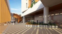
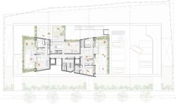
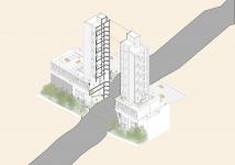
To make an active façade, the solution was to create a walkway over gardens where pedestrians can enter the building and reach a square where they will have access to 4 commercial spaces, those that will be responsible for activating our façade. In addition to commerce, the square will be a lookout point to see the city. From there it will be possible to enjoy a breathtaking sunset and understand why the city is called Belo Horizonte.
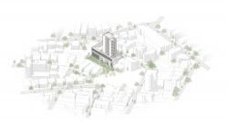
There are 4 plots that result in a front of 50 meters where a horizontal box was implanted in the pedestrian scale. The tower has 3 units per floor, and every two floors has 4 units, as two of them are lofts and 2 are studios. This proposal results in completely different ambiences, allowing the future resident to make more traditional or more innovative choices in terms of occupying the spaces.
The parking spaces occupy one floor below the ground floor and for the nine meters of difference in level below the garage, we proposed studios, lofts and duplexes. There are 04 units that resemble the houses in the neighborhood, with their green backyards.
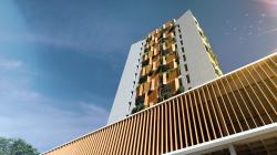
On facades with high insolation, the use of brises was proposed to improve the thermal comfort of the internal space. These architectural elements are spaced approximately 60 cm away from the façade, providing shading and also excellent air circulation. On these 60 cm projections, planters were designed that will be present on the facades between the metallic brises.
The development is in a neighborhood that has been changing its occupation from single-family residential to multi-family vertical structures. In this scenario, buildings are still vertical islands in the landscape and therefore require special care in their plastic volume so that they do not become an obstacle to our beautiful horizon.
2022
Area: 4123,15 m²
Designed: 2022-2023
Location: Belo Horizonte, MG - Brasil
Number of floors: 17
Number of housing units: 14
Number of non-housing units: 17
Ulisses Mikhail Jardim Itokawa, Raquel Propódis, Giovanna Cotta, Luiza Menicucci and Gisele Borges.

