The clients, a Tel-Aviv couple in their 40s, work centrally and commute to work by foot or public transport. Their two children, 12 and 14, were born, raised, and educated in the same neighborhood, and enjoy spending much time in the local park nearby. The search for a new property that would meet the family’s needs took a long time. They eventually purchased a new apartment in a renovated building, as part of a Tama 38 plan, four buildings away from the apartment they were living in at the time.
Today, from a new balcony that overlooks Tel Aviv’s urban skyline, the family knows they made the right decision, and as a result, they can enjoy quick and easy access to a myriad of urban amenities offered by a Metropolis - such as a local grocery store and gym located at street level - an homage to trade floors that characterize the buildings in the city’s high-streets, as well as a vibrant green-lung local park, and easy access to public transport.
The new apartment was planned and designed by Studio Dulu. "There is no difference in the level of finishing, the potential, and the real estate value, between this apartment and apartments in adjacent buildings”, explains Studio Dulu’s Adi Klein. “It's just that the owners appreciated the opportunity of living in the heart of the city, with all that it offers. This was our starting point in the planning process”.
Interior planning
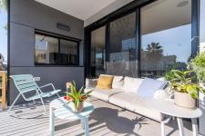
The symmetrical square-shaped apartment extends across half of the building level. The designers at Studio Dulu partitioned the space into functions requested by the owners according to the program outline. The location of the master bedroom was obvious: “The parents' unit was planned next to a long and narrow balcony that was built as an extension to the north facade of the property”, explains Klein. “We designed a small floating counter that fits the dimensions of the balcony where the couple enjoys spending time in the evenings overlooking the neighborhood and nearby park”.
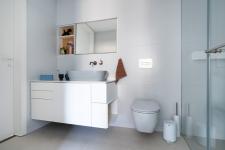
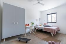
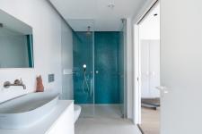
The eldest son is a computer buff who expressed his desire for privacy. As such, the designers planned his bedroom in the corner safe room, as furthest away as possible from the entrance and family living space. The adjacent bathroom completes the living unit, providing maximum privacy. In the remaining space (just under 50% of the apartment), the designers planned the family living room, kitchen, and the 12-year-old daughter’s bedroom. The designers created a carpentry “chest” that envelops the daughter’s bedroom and adjacent bathroom. One side of it creates a small hallway at the entrance to the property across from which floating shelves were fitted. A functional entrance cupboard was designed next to it, which conceals electrical and comms infrastructure. The designers decided not to carve out a space for separate guest toilets, and as such, on the long side of the chest that faces the lounge, they designed another door to the bathroom. The door is embedded into the wall, as does the door that leads to the daughter’s bedroom.
The washer and dryer are located in a niche next to the window with a concealed area for laundry.
The Master Bedroom
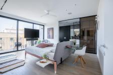
The bedroom was planned as if it was a stylish room in a boutique hotel, as the designers wanted to create a haven that would allow the couple to switch off from the day-to-day, recharge, and enjoy the aesthetic experience. The bed was positioned in the center of the room across from glass doors overlooking the Tel-Aviv view. Its design, a mattress on a thin metal frame with two shelves attached to it, creates the illusion that it is suspended in the air. A work corner was positioned at the back of the bed and includes a light glass table that contributes to the airy feel. The majority of the furniture in the property is free-standing in order to emphasize the sense of space and enable circular movement.
Sliding glass partitions separate the bedroom and the bathroom and are suspended by a concealed ceiling rail creating a clean and minimalist look. The mechanism allows easy opening and closing of the partition, creating a modular bedroom environment.
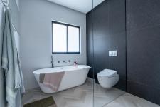
The bathroom was planned in a unique way. A floating cupboard, fitted with two sinks and two glass mirrors that hang from the ceiling by a metal fixture, faces the bedroom. The unit reflects the interior of the room and conceals a spacious walk-in shower behind it. A permanent glass partition separates the shower, the toilet, and the bath. A free-standing bath was positioned under the window to continue the overall design theme and fishbone-patterned tiles blend beautifully with the bedroom parquet.
The Family Space
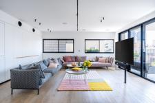
The designers sought to create the sense of a suspended apartment floating above the city, and as such, chose free-standing furniture pieces. The lounge includes two sofas that are positioned across from the balcony and the TV was erected on a rotating pole so that it could be watched from the balcony as well. The decision was made in order to avoid having to position the living room furniture around a television wall.
This concept repeats itself in the kitchen design, which in this apartment proves that a kitchen doesn't have to be planned around a wall of floor-to-ceiling cabinets. Instead, the kitchen includes three sides, two of which are free-standing tall cabinets and an island. Wood was chosen for the facades of the lower cabinets In order to balance the industrial feel created by the tall metal cabinets.
The Studio Dulu designers chose unique materials that influenced the color scheme chosen for the apartment. Special textured parquet that was oxidized for an antique look, was used for the floors that exude a sense of warmth and intimacy. Warm-toned iron and glass were chosen, influencing the carpentry and colors throughout the property: a white base leaning towards browns combined with pink touches that appear in the library, wardrobe partitions, and master bedroom.
The surfaces in the bathrooms are made of Corean and stone-like Dekton was chosen for the kitchen. The original ceiling height of 290cm allowed the designers to lower the wall by 10cm with plaster ceilings in which lighting fixtures were embedded. The light strips along the entire apartment alongside the furniture layout, mark the pathways in the space. In order to balance and blend softness with a more industrial feel, four sandy-colored metal lamps were fitted above the island. These correspond well with the overall color scheme of the space.
2022
2022
Property: 170 sqm 20 sqm balcony
Planning and design: Studio Dulu

