Love at First Sight
A successful blend of old and new, along with some unconventional and bold ideas from the Studio Dulu design team, bring this unique house in Tel Aviv to life. Find out why the tenants fell in love with this house at first sight
When you step foot in this two-story property, it's easy to understand why the owners fell in love with it so quickly. “In our first meeting, the clients enthusiastically shared with us that it took them no more than two minutes to decide they were going to buy the property”, says the design team at Studio Dulu, responsible for the project planning and design. “Their enthusiasm was contagious. As soon as you enter the property there is this magical feeling of an olden Tel Aviv. The blend of all the elements around the house along with its unique story, create something very unusual that we wanted to preserve”.
According to the design team, as soon as they started this six-month-long project, they understood that they would need to bridge the gap between old and new. “The original house was partitioned into many dark rooms, so we decided to change the floorplan and open up the ground level into one large open space that opened up to the garden as much as possible”, The team continues. “While working on the new plans, we decided to preserve elements from the old property and create a connection and continuity between them and the new elements. In addition, we redesigned the small garden, which overlooks a quiet street, and made it more central, connecting it to the lounge and family corner, whilst the large garden was redesigned as an extension of the kitchen and dining corner”.
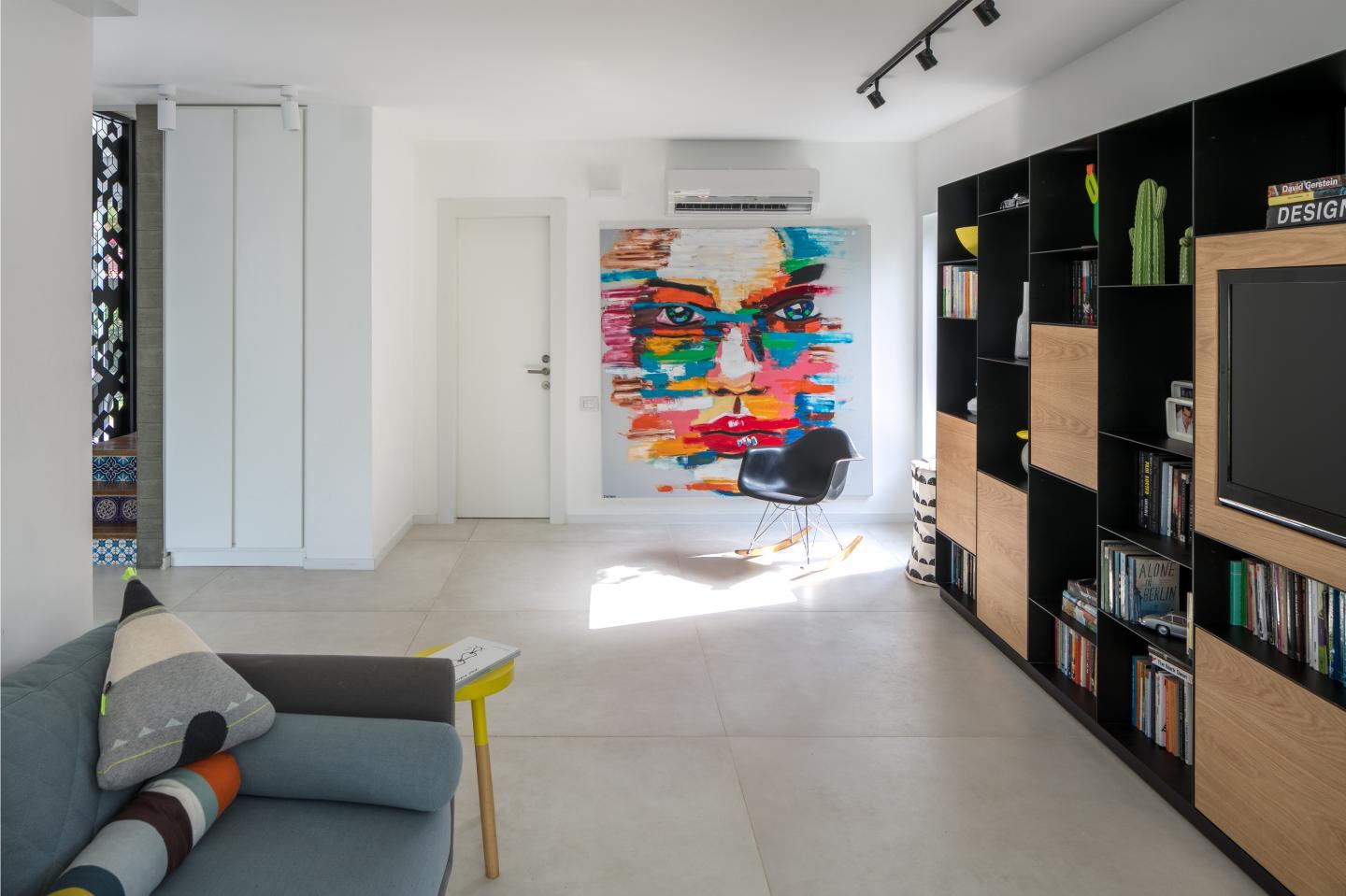
The ground-level open space includes a lounge, a family corner, a kitchen, and a dining area. The entrance to the property was fitted with a cupboard that frames the entrance and conceals a door to the pantry. Large concrete-like tiles were chosen for the floors, creating a continuous sense of space. Two decorative pillars symbolize the link between old and new - these are structural pillars that could not be removed - instead, one was painted white, and the other was coated in a concrete-like cladding that corresponds with the staircase wall. The lounge and family corner were positioned on the other side of the entrance cupboard, which was used as a partition with niches for decorative items. A brown leather couch with colorful textured cushions was placed next to it. The TV was placed across from the couch on a wall that partitions the lounge from an intimate family corner with a modular library abundant in open and closed storage solutions.
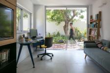
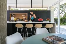
An exit to the small garden was fitted next to the library. The lush green garden, with a fountain in its center, has turned into an integral part of the family corner and adds a sense of openness to the space. The open kitchen is located to the left of the entrance and enjoys natural daylight thanks to a long window, preserved from the original planning. The kitchen is made of wooden black cabinets with a white Corian island in the center.
A staircase leads to the top level where the design theme continues. The original staircase was preserved and renewed with a unique light iron partition that partly conceals it from the central space, whilst simultaneously creating a sense of spaciousness. The black iron partition is designed in delicate lines that do not overwhelm the space.
"We preserved the sloping ceilings and the top level’s parquet as much as we could, with the view of preserving the home’s historic story and adapting it to the needs and preferences of the owners”, says Adi Fershtman, one of the team’s designers. “We decided to tear down a plaster wall that was originally used as a banister. We also preserved the children’s bedrooms, but the joint bathroom underwent a significant renovation”, he adds.
The master bedroom was also designed as an open space, partitioned into a sleeping area and a bathroom area with the use of a double-sided cupboard that creates a sense of space. The cupboard is used for clothes on the one side and storage of bed linen and toiletries on the other. A partly frosted glass shower screen was fitted for extra privacy.
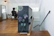
The pièce de résistance on the second level is a large library that was positioned in the central space next to the family corner and home office corner. “A secondary family corner was originally located in this space, but with time the space needed to be better utilized”, explains Fershtman. “In parallel, the owners felt that they didn't have sufficient storage on the second level, and that was the starting point of the second-level renovation. The clients approached us with the request to solve the insufficient storage issue, however, we didn't want to change the second floor’s unique DNA, nor did we want to compromise the privacy of the bedrooms. As a result, we had to identify a solution that would allow for optimal storage whilst maintaining an understated passage to the rooms that would look like an integral part of the property. After some brainstorming with the clients, we decided to create a linear cupboard that would run along the entire level, but wouldn't overwhelm the space”, Fershtman adds.
Since the floor-to-ceiling cupboard runs along the entire wall, with the doors to the bedrooms interlaced in between, the design team masterfully created light wood-paneled screens to conceal each of the doors for better privacy and create a better flow in the space. Different-sized niches were designed throughout the cupboard creating a joyful play on depths, for the family’s various storage and display items. The design team's concept was to minimize visual clutter and to create a homogenous flow between the ground and top level, and as such, the decision to build this cupboard was considered a creative idea with added value.
“Two decorative niches were incorporated into the wall and can be utilized by the adjacent home office corner. The cupboard colors match the parquet that was preserved during the renovation, and light pigment colors were used alongside powder pink, with touches of brown and beige against a backdrop of understated black frames, which blend in harmoniously”, summarizes the designer.
2022
2022
Property: 200 sqm
Tenants: a couple three children
Landscape design: Carcom
Interior architecture: Studio Dulu


