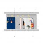
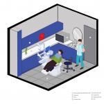
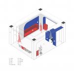
The combination of colors fosters habitability, growth and inner emotions in humans. The work that we have put as the main pillar in the initial encounter with this project, taking into account the prioritization of the user in this space, a persistent and at the same time static characteristic will be formed, a feature that cannot be seen in the previous state and use of the space. was not
A commercial unit with an area of 58 square meters in a 5-story building, which is typical for a doctor's building, has two rooms and a living room with bathroom facilities and a small kitchen. One of our most important challenges was the obstacles of the inner shell of the space, which was formed with 40 x 40 columns and similar dimensions in the design of such uses with a therapeutic category, apart from the fact that specialized equipment should be created, circulation according to the use. And it is very important to consider other users who are often between the ages of 15 and 25 in this project.
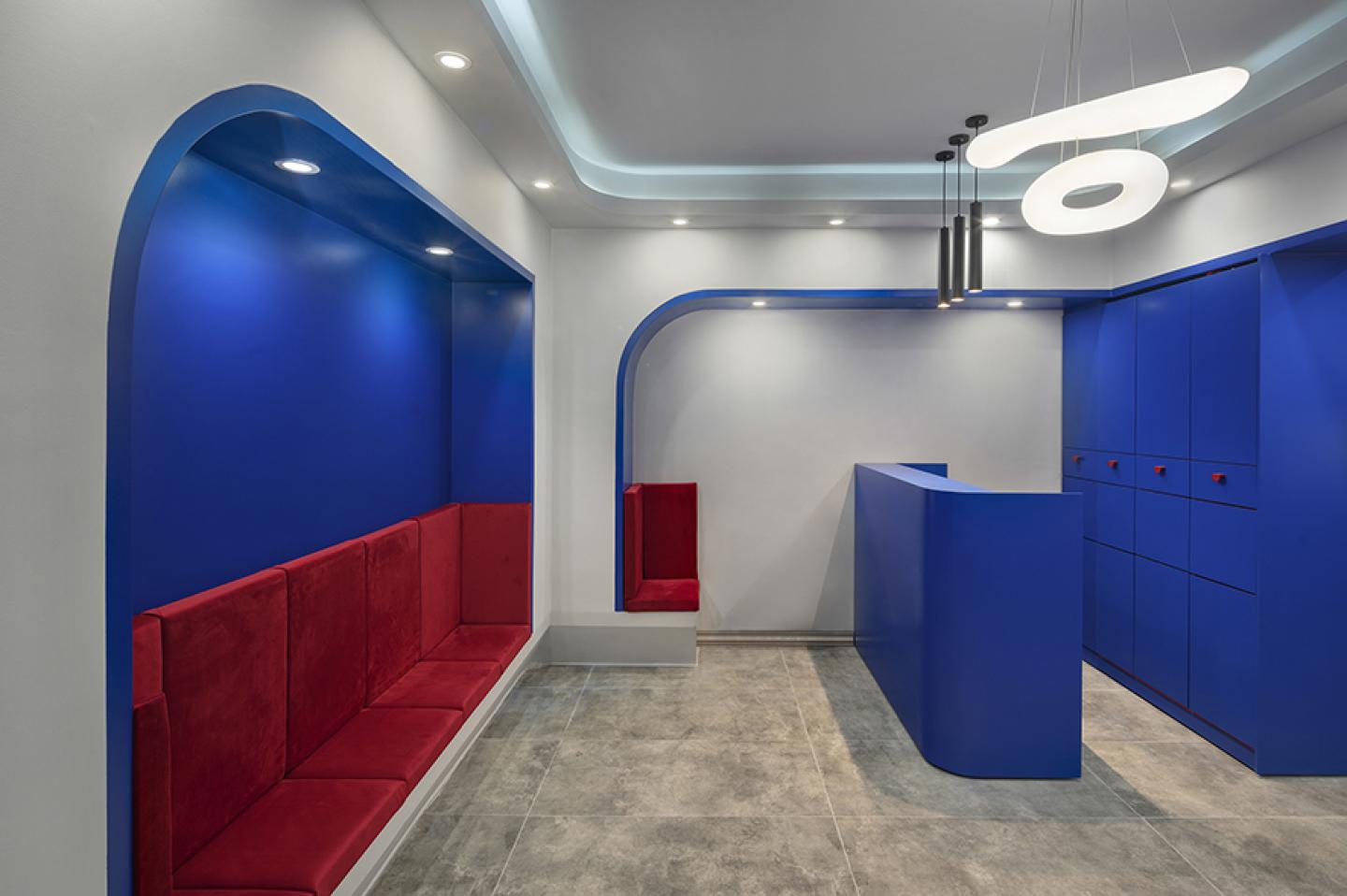
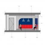
We divided the living space into three parts, two parts for visitors and one part for reception and reception desk. . According to the form and the basic furniture, a functional form shell that includes the pillars and the column and built in the sitting space was designed along with some single chairs in the space that gives the users the right to choose to sit in a separate space.
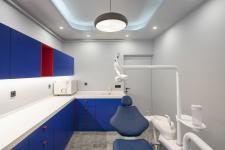
The doors of the rooms were chosen and implemented without form to maintain integrity. One of the rooms was the master, which was turned into a doctor's examination room by installing Vionite dental equipment along with the work space. The other room formed the main treatment space with the addition of dental equipment and units and having more closets.
The energetic color palette of the design includes blue and red colors along with the neutral combination of gray with the appropriate amount of brightness spread in all spaces. The color palette was used according to the level of brightness and according to the application of each color to bring us to the desired characteristics. The gray walls with the blue skin on them, along with the seating points and the part of the form marked with red, not only make the living space dynamic, but with this companionship in the form, it also refers to the static. The play of colors in the rooms. It was extended and covered all the furniture. To put the user in a different treatment environment than what he had experienced.
2021
2021
Built Area: 85Sqm
Architect & Contractor: Ronak Roshan
Presentation :Mahazar Poulab Saeed haghdoust
Photo:Deedstudio
Site manager: Amirreza Barimani
Logo: Ahmad Momennia
Location: Rasht,Golsar
Client :Dr.Javidi
Date: 2021
Type: Dental office
Javidi Dental office by Ronak Roshan in Iran won the WA Award Cycle 43. Please find below the WA Award poster for this project.

Downloaded 0 times.
