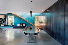
It is no secret that colors affect the human soul in many ways. Colors have the power to change our mood, increase our energy levels and contribute to a better state of mind and improved interpersonal interactions. And so, this home, which originally boasted 50 shades of white, was brought to life by Architect Adi Aronov with the use of an exciting color scheme.
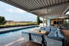
The property, originally dominated by shades of white, went through a complete overhaul planned and designed by Arch. Aronov. The surrounding regional views that embrace the property in all their glory and are visible through sliding glass doors, were given center stage, to which the impressive monumental structure (planned by architect Marc Topilsky) serves as a gateway.
The owners, who were impressed with a steel and concrete NYC loft-style apartment designed by Arch. Aronov for their friends, approached the architect. They had one request: to turn the original property into a cheerful living experience. “One can liken this renovation to an artist creating an artwork on a blank canvas, a complete ‘Tabula rasa’”, explains the Arch. “When I first arrived at this massive property, it was entirely white with some very light touches of oak. An impressive and elegant look, and yet there were numerous planning dilemmas that needed to be addressed. The owners, a lovely couple who have a good understanding of design, and I brainstormed for a few weeks in order to precisely define their design preferences and ensure all their needs would be met. In order to strike the perfect balance, we used the services of a feng-shui consultant, who helped us identify the right color scheme for the property”, she adds.
The renovation lasted seven months. “I used countless sketches”, recalls the architect. “Each wall received full attention and had its own detailed sketches. We used 3D images to really drill down into each and every detail, such as the dark and bold wall in the staircase that was created by a company specializing in concrete art pieces. The company’s designers put together several sketches and examples of artistic textured concrete that resembles brown steel. In order to achieve the desired outcome, we ran through no less than five tests during which we combined acid and concrete in different ratios, until we reached the precise result we were aiming for”, she explains.
The bold colors start from the front door and run through the entire property. The entrance door’s facade is made of black steel and the interior is a dark gray cladding. The door is entirely frameless and in line with the wall, creating a slick and elegant homogeneous look.
A green patio welcomes guests upon entry with a cozy family area located to its left.
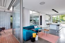
The open space has a good flow to it and its various areas blend in harmony, such as the blue sofa in the family area that ‘overspills’ slightly into the kitchen area, allowing for optimal interaction between the family members at any given point.
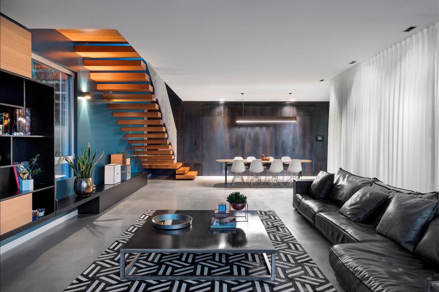
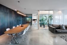
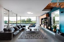
The kitchen did not undergo extended changes, with the exception of adding black backsplashes and light fittings. In contrast, the dining area went through a dramatic change where the boundaries between the private and the communal were stretched: the powerful dark wall surrounding the area conceals hidden doors opened with the touch of a button, giving the place a dynamic and somewhat mysterious vibe. The blue staircase wall serves as a conceptual extension of the dark wall, its blue shade corresponding with the skies that can be seen through the glass doors, as well as with the shade of the lounge library and the light banister color. The dining corner blends in the space effortlessly and the brass dining table legs set a contrast to the weathered concrete wall, without overpowering the space.
The children’s bedrooms on the top level continue the display of joyful colors along with unique furniture items. A fine example is, the four-year-old son, who prior to the renovation refused to sleep alone in his white room and can now enjoy a playful room that is home to a car-shaped bed, a shelf unit abundant in books, games and toys, and a bright yellow wall that corresponds with the shade of the surrounding fields.
2021
2022
Owners: A couple two children
Built property: 400 sqm
Planning and design: Arch. Adi Aronov
