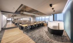
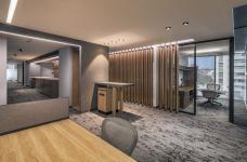
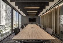
In this project the requirements for the five business units, distributed in 10 levels, were approached avoiding making each one completely different, achieving a balance between the open spaces, the collaborative ones and the services. Key points were defined in each floor, always in the same spot, and only the appropriate adjustments for the closed spaces used for meetings, collaboration and reserved offices were done.
The project was developed in Torre III of Down Town Santa Fe complex occupying a 12,550 sq m area distributed among 10 floors, that have irregular shape with diagonal ledges that frame the exterior views, like the one towards the La Mexicana park in the south or the one to Avenue Santa Fe in the west.
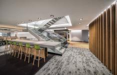
Until a few years ago, it was common to place the services (such as printing, beverages or recycling stations, etc.) close to the working stations, today we are going the other way. In our experience it is vital for people to stand up from their desks and walk inside the office, promoting interaction among the users. To make this goal it was necessary to add an important structural challenge to the project: perforating 8 post-tensioned slabs reinforcing them with steel beams in order to develop the stairs that intercommunicate the different levels, and business units, to prevent the use of the elevator.
Another one of the clients’ requirements was that the project had to follow Daimler´s global image, but it also had to use materials or details that refer to the country where it is located. In order to achieve this, we focused in the combination of materials such as stainless steel and glass that we contrasted with a rough and porous finish stone such as flamed granite, attaining accents in the steps and the grand tables for the casual meetings.
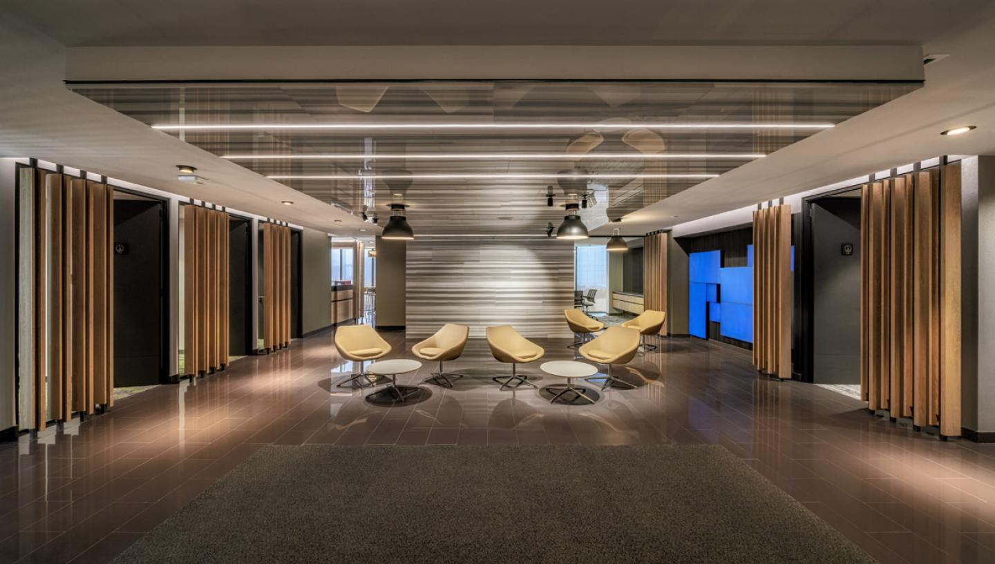
The finishes selection is neutral for the walls, plafonds and floors; the general areas are covered with carpet in grey shades with a pattern resembling wood´s lichen and has discrete color accents. For the main circulation an oak color vinyl floor was selected and for the beverages stations a bright black ceramic.
The uniformity of the five business units was reached with a neutral color and finishes palette and some color accents; something we defined as: gray suit with a white shirt -that fits everyone and may be highlighted with a tie, a pair of socks and shoes that bring a touch of distinction to whom is wearing them, procuring variety without losing Daimler´s identity.
The plafonds were done with drywall painted in light and dark grey allowing the level changes, lighting details and acoustic panels suspended from the ceiling, to stand out. The black aluminum partitions go together with the oak color tablets lattice, recalling a percussion instrument.
Matte finish walls, in different warm and cold shades of gray, emphasize the ones covered with vinyl wall coverings with moderate geometric patterns -in different colors and metallic gloss- and with neutral fabrics with acoustic properties for the meeting rooms. For the ending walls on the entrances of every floor different colors of automotive paint, in matte and glossy finishes, were used to guide users so they can easily identify the floor they are in.
For the services level, shared among the business units and where visitors are received, Striato marble in polished finish was incorporated to the finish’s palette, as well as artisanal black clay and vinyl tapestries with more texture and more saturated colors. In this floor is where the concession coffee shop, the auditorium, games room, dining room, terrace, medical assistance and general services are located.
It is important to mention that lighting, air conditioning, multimedia and the whole project´s infrastructure are fully automated in order to create a more comfortable space for all the users as well as for being responsible with the environment.
The ideal furniture selection was another one of the most relevant tasks, because it had to fully reflect the design requirements of the project. It has more than 15 different collaborative spaces in each floor, in addition to the flexibility asked by the client. For these reasons they were selected of different brands and after intense work sessions with the design team we accomplished the perfect blend of plastic laminates for the work surfaces, paint for the metallic structures, wood veneers and fabrics for the upholstery, and at the same time this combination is consistent with the finishes palette alternatives to dress each one of the business units.
2020
2020
Category: Corporate
Year: 2020
Products and services: Furniture: Knoll, Herman Miller, Steelcase, Geiger, Intersthul, Haworth, Allermuir, Vitra, Allsteel y Global
Construction: GAYA
Area: 12,550 s qm
Photography: Héctor Armando Herrera
Project: USOarquitectura
Team: Gabriel Salazar / Fernando Castañón
Erika Aguirre, Francisco Ortiz, Julia Belmar
