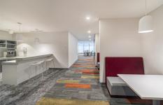
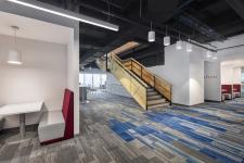
The project was developed in two Corporativo Miyana´s full floors, for an international company of hygiene, health and home products. Seizing the fusion of two companies that were in two different locations, the client decided to join the teams in a new corporate under a single brand of products.
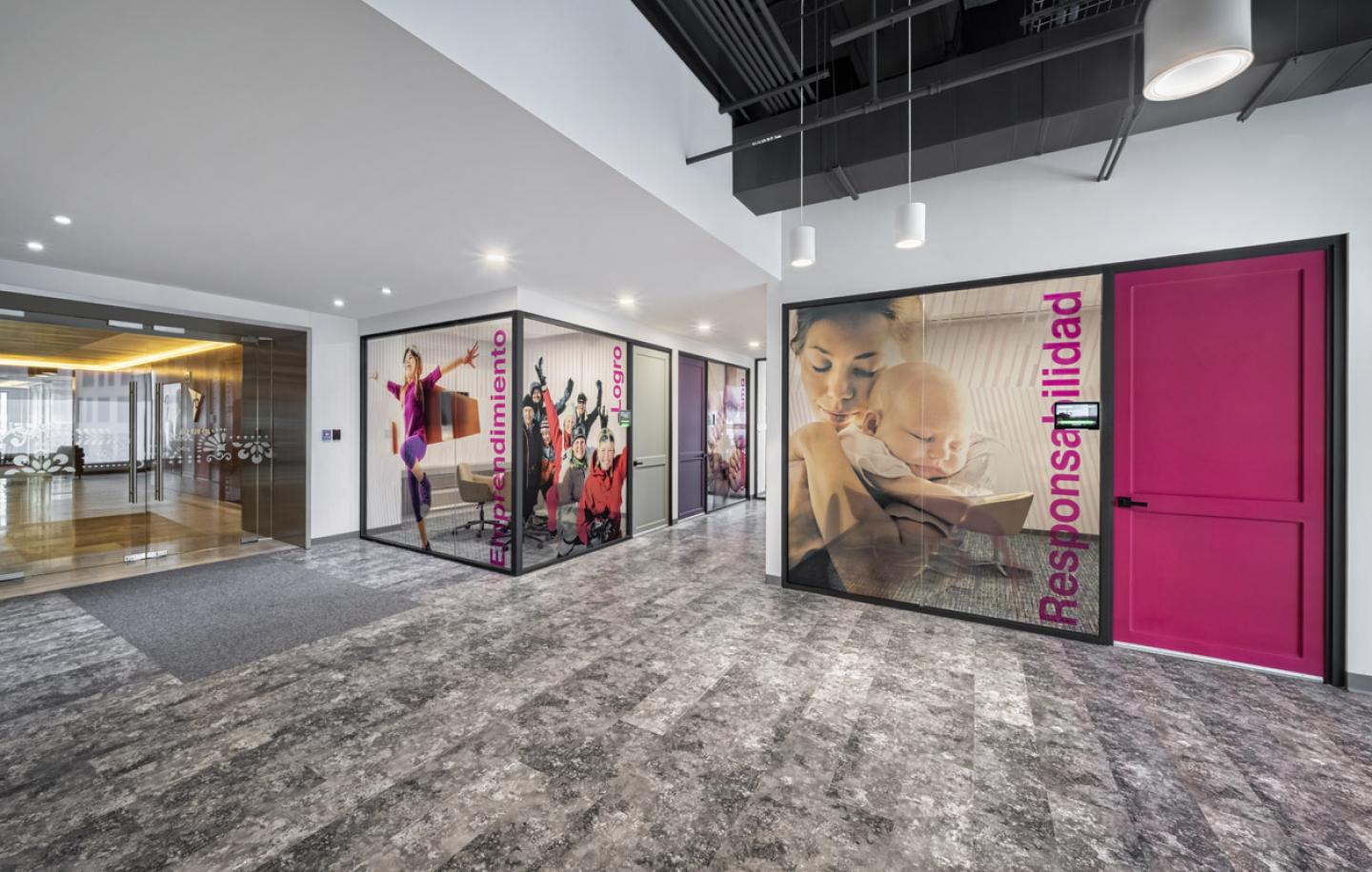
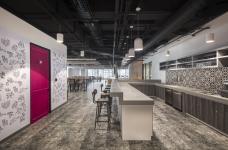
The main challenge was working hand in hand with the design team of the company located in London, following the international guidelines, as well as the standards and requirements to each office in the world. Also, the project in Mexico was looking to implement a local culture element. The use of color in the form of a saturated palette in harmony with the furniture and branding was the recipe for a comprehensive design. Color doors with classic moldings and fittings make the user feel at home.
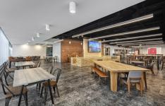
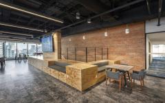
Part of the programme required a space for a grand town hall, intended for the company´s communication events that also works as cafeteria and coworking. With local furniture, the use of natural look materials -pine wood, iron works and bricks- were reached a space where 200 people gather every day.
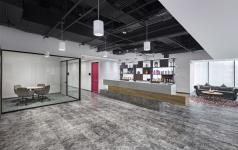
A staircase joined with a podium, through platforms with benches, on an apparent brick wall, communicates the two levels towards the public assembly area. Each floor separates two business units and its different brands, a single reception welcomes the visitors designed by 3 blocks of different materials: concrete, wood and stone. All the constructed spaces are located at the center of the floor towards the services core, providing plenty of daylight at the perimeter and bench style working stations with no fixed places assigned.
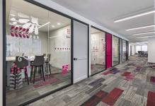
The corridors and offices layout are not orthogonal, but with a light angle that allows to play with different perspectives when walking through the corridors. Graphics inspired in the traditional day of the dead cut-out paper were designed for privacy in the managers offices. The product´s branding, people and a wall with “alebrijes”, that may be painted by everyone who enjoys the cafeteria, are examples of the visual elements enriching the spaces.
2019
2019
Category: Corporate
Year: 2019
Status: Completed
Products and services: Furniture: Steelcase / Haworth by Papsa
Carpet and Vinyl floor: Interface
Ilumination: H T
Branding: Jorge Cejudo (Cejas)
Construction: atxk
Area: 4,600 s qm
Photographs: Héctor Armando Herrera
Project: USOarquitectura
Team: Fernando Castañón / Gabriel Salazar
Regina Hartasanchez
Francisco Ortíz
