Straight Out of a Magazine
An understated rustic feel, colonial and industrial touches, stone and greige color schemes, solid wood, and jute ornaments - all come together to create a breathtaking living experience for this family of six. Take a peek into this house we would all be happy to live in
We all dream of a house that looks like it just featured on the cover of ELLE DÉCOR. For this family, a couple in their fifties and their four children, this dream came true. After years of living in a standard property in the wife’s home village, the couple purchased a plot of land in a new neighborhood that overlooks a wild and breathtaking view. The couple hired the services of Sara and Nirit Frenkel, owners of Frenkel Architecture & Interior Design, who specialize in the planning of luxury villas and estates. The overarching aim was to finetune the family’s needs and create a rustic and understated property that would serve all its residents for the years to come.
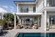
"The property structure is not fancy or overly sophisticated”, says Nirit Frenkel. “Brick cladding covers the ground level facade, giving it a solid feel of being rooted in the ground. The top level was smoothly rendered in a similar shade in order to lighten the visual load of the property. We chose to work with a greige palette and natural colors that are easy on the eye and add warmth to the property”. The roof is tiled, in true rustic style, and provides shade for the balconies surrounding the property. Wooden elements such as shutters, wooden beams and wash-dyed solid wood pergolas complete the design concept.
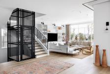
An access road leads to the front of the property, with two neighboring properties located on either side. As such, the main windows and doors were designed to overlook the rear of the property to maximize the undisturbed and breathtaking view of the surrounding hills and forests. The size of the plot and the glorious view can be seen from the entrance hall immediately upon entry. The entrance hall was fitted with an elevator shaft and a surrounding staircase that separates the living room from the kitchen/dining area to create a cozier and more intimate entertaining experience.
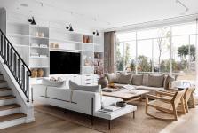
“A variety of styles harmoniously blend together throughout the property: mixed elements such as a light metal elevator shaft, a colonial-industrial piece, encircled by a classically designed stairwell fitted with oak treads and an iron banister custom made by a welding artist”, says Nirit.
The ground floor is fitted throughout with white oak parquet. In order to emphasize the breathtaking view in the cleanest way possible, off-white Belgian profiles were chosen for the windows. “We intentionally chose understated furniture and carpentry pieces for the lounge so that these could serve as a neutral setting for any design style or concept the owners might wish to incorporate down the line”, explains Nirit. “It can be done easily by refreshing the accessories and textiles”. The woody tones, as well as the gray and linen, work together well to achieve this. The woven jute rug serves as a quiet setting for the light furniture and compliments the wooden elements throughout the ground level such as the parquet and the treads.
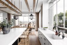
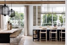
The dining area and kitchen were designed as one space: “We took this area of the property in an entirely different direction: less rustic, more industrial-brasserie”, states Nirit. “This comes across in the dark shades of the kitchen units, touches of brass, wooden work tops and rattan seats. We chose to add solid wood beams along the kitchen ceiling to add depth and dimension to the space”. The brick wall, which adds to the brasserie style vibe, is made of a combination of colorful bricks that act as a reference to various dominant elements in the space. The space is home to some interesting and unusual pieces such as white and brass storage units and a brass and cylinder glass hanging shelf fitted above the island, which completes the picturesque cafe feel. Dominant metal and netting light fixtures were fitted above the dining area and correspond with the elevator in view.
The ground level also includes a cozy family corner, defined by thin Belgian profile doors that reduce noise but allow eye contact with anyone else on the level. This is the family’s go-to-place to snuggle up and watch a movie. Guest toilets were fitted on the same level and contain a classic cupboard made of oak legs and a gray granite surface as well as a red rug, which adds a pop of color and livens up the space.
The basement includes two spacious and well-equipped living units that were designed for the couple’s two older children. The top level includes the master bedroom, two bedrooms for the younger children and a utility room. The wooden beams that were visible in the kitchen reappear in the corridor, this time in white, and decorative-glass double doors lead to the master bedroom. The tile roof in the bedroom was exposed to allow for sufficient headroom and add a touch of rustic warmth.
The walk-in wardrobe was designed as an integral part of the sleeping area. The central console table, fitted with a hidden pop-up TV, is used for storage as well as visual partitioning between the sleeping area and the wardrobe, whilst simultaneously giving the space a light and airy feel.
Greige brick cladding covers the wall behind the bed, two dominant woven light fixtures hang from the ceiling and brown, gray, and terracotta stools add warmth to the room.
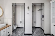
The master en-suite was partitioned into several sub-spaces. The main space includes two sinks fitted on either side of a wooden make-up counter. Across from the sinks is a large storage unit used for towels and toiletries. The toilet and walk-in shower were designed as two separate intimate cubicles similar to those in boutique hotels.
The younger childrens’ bedrooms include all that growing teenagers need: large double beds, study corners, and cozy lounging areas, all in soft greige and linen colors. Ocean inspired light fixtures, made of withered steel and mother of pearl, hang gracefully from the ceiling in the center of each of the rooms.
A casual lounging area in pinks, teals and peach was designed outdoors under the pergola. In its center are dominant resin and ivory tables, which are surrounded by woven furniture. The entertaining area includes a barbeque and a seated bar that overlooks the swimming pool.
2022
2022
Property: 500 sqm (basement: 140 sqm, ground floor: 200 sqm, top floor: 160 sqm).
Plot: 600 sqm
Photograph – itay benit
Planning and design: Sara and Nirit Frenkel

