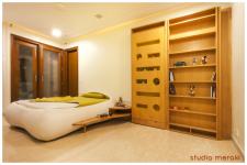
Clients' Brief : The client brief for the overhaul of this particular kids bedroom was a very simple yet an enormously challenging one as the intent was to make him use his room in the first place as it had been abandoned by him due to his complete disinterest in it in the current scenario thereby making his daily schedule haywire resulting in him using different spaces at different time intervals in the house to sleep, study, read, paint and do all his activities scattered all around instead of one consolidated personalized space that he could take pleasure in and connect to emotionally as well.
Design Concept : Since the kid has a tremendous passion for cars, the car shaped artwork on the wall designed in tandem with the study table has a dual purpose of an aesthetic element contributing to the fascination and excitement of the child as well as a purely functional purpose of being used as a support to his daily learning activities by having spaces for white board, writing, storage, pencil stand, lighting etc., thereby involving and engaging his mind more into the whole process instead of the daily mundane task of sitting at a study table that most kids normally don’t get thrilled to do. Also, the car lights at night are more stirring for him that draw him more towards his new room (thereby encouraging him to sleep alone as a daily practice) which has been the intent and demand of the client since the very beginning. Hence, the whole assembly becomes much more fun for him and engrosses him to an extreme level thereby adding value to his life and studies. The study table and low height zip bed with curved side tables have been specifically designed with no sharp edges and corners adding to the softness of the room and catering to his taste as well.
Also, there is an element of childishness and surprise wherein one of the bookshelves acts like a murphy door and opens into a covered balcony space (unused till now) that will be converted into a secret hide out space for him to read or paint alone adding to his enthrallment and also using the space in a more creative way rather than just acting as a storage dumpyard as it was being used currently.
The colour scheme of green and yellow coupled along with soft wooden textures seem appropriate adding to the warmth as well as bringing happiness in the whole aura of the existing room with green being the favourite colour of the child as well.
One of the walls has been chosen to add a caricature graphitti of a family portrait chosen by the client which adds to the dynamism of the space and hence seals off the room for the kid on a more personal note that he can cherish forever.
2017
2018
Client : Mr. Harak Banthia
Furniture & Artwork : Timbregrain, Oystra
Photography : Visuary
Shweta Kaw, Kavi Sumi


