Anatolia Tiles is a Canadian Company who import seramic tiles they got produced in Europe and Turkey and sell them in Canadian market.
Recently they decided to sell their products in the U.S. market as well, especially in southern part of U.S.A.As a reult of their strategical plans they decided to build a logistic center in Aliağa –İzmir/TURKEY as direct sea transport from south of Turkey to Southern U.S.A came out to be much cheaper than TIR transport .
The company has 10 similar logistic buildings in Canada, thus they are used to working with architects and they were in the expectation of a similar design approach in their new building as in their existing buildings.
While producing solutions in the operational side, we made use of the clients referances in Canada as well.
Whereas on the office spaces the client had new requirements. Their priority was a spacious, joyfull and high quality work space.
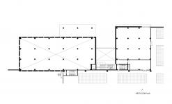
Another important demand was the 800 sqm showroom part with a 8 m ceiling height where design alternatives were to be studied.
In this part they asked for showrooms and meeting and guest rooms, a lounge and also needed a space which they can use as a residence during their visits to Turkey.
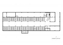
We solved all these functions on the top floor. A private roof garden fort he residence part, gym and rooms with the comfort of a hotel room. On the other part they had private offices spaces where they can host their guests and they can also share the roof garden with the guests.
Big meeting rooms and a showroom are situated on the ground floor.A majestic staircase at the 3 storey high entrance hall welcomes the visitors.
On the 1st floor a cafe/restaurant serves to the Office part with its open terraces.
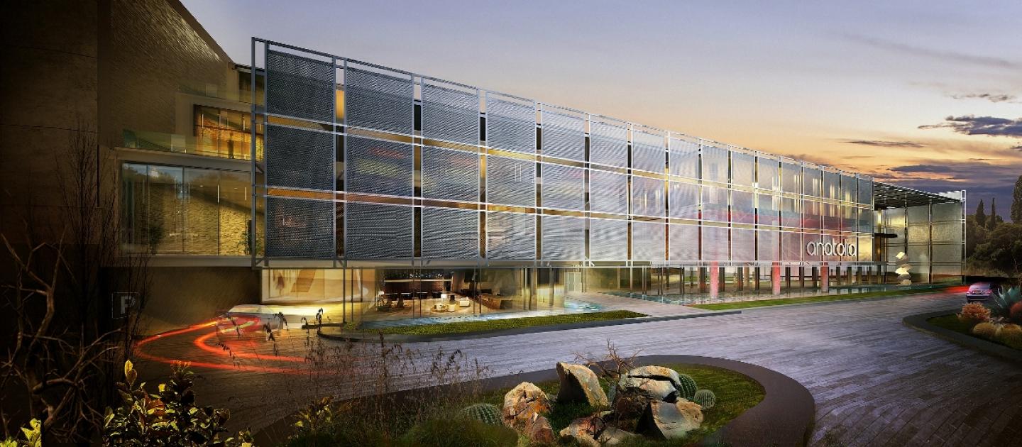
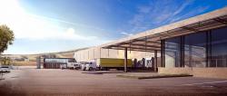
A tranparent facade was a requirement of the client both for operational ease and comfort, but a an appropriate solution suitable with the hot climate of the region was to be designed.
This led us to place the building in a refreshing and cooling water activitiy which brought the visual and the functional solution together. The dynamic architecture which is created by solids and voids, protrusions and recesssions derived from functional needs on different floors also serves as part of the solution.
To take all this dynamism under a mild and kind order and diciplin we tried to create a linear and slender architecture to in the overall geometry of the building. The translucent material of mesh on a steel frame on the overall facade provied not only this unity but a protection for the building from the movement of the sun on the horizontal and vertical planes .
At the courtyard which makes the entrance of the buildin and where the protruding office part forms a deep overhang, this architectural element lets the facade flow to by creating certain visual perspectives and spatial sensations.
A full glass facade was avoided at the showroom space which has a high ceeling , instead the 3 m high blind wall with light slots surrounding the showroom scaled down the space into human scale and provided the sense of boundary between the exterior and the interior.
The light slots on this blind wall helps keep the magestic effect of the high ceeling while reducing the scale down to human.
With with all these effects , the water meeting the curtaining mesh and the art objects a pleasant ambiance in the sense of an art gallery was attained both at the interior and the exterior space.
Terraces beneath this mesh frame, met the statical needs and served as smoking balconies for employees
At the operational part of the building prefabricated heat insulation panels were used.
At the 75 m long facade of panels, deep cervasses were formed at junctions to help the dance of light-shade to be felt.This helped to break the monotonity of a continuous facade. The same effect is used as a reminder in the form of light slots at the office facade.
At the operational part of the building a technical building includng Office, restaurant and technical spaces for blue collar workers was organised. A canopy designed with the same mesh frame used on the facade was used as an architectural element connecting the two blocks and at the same time to serve as a sunshade for satff vehicles.
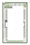
Incoming and outgoing cargoes operations were seperated and placed on two long facades and large Truck roads were provided on both sides for comfortable truck maneuver.
At the narrow facade on the Office side, a calm work space away from all this hectic operation was aimed to be created by a good lanscape design. But the staff can still check the operations visually from the protruding structure at the office side.
2016
Project Type: Architectural - Interiors / Function: Office - Industrial / Project: Anatolia Tile Stone & Inc. Building / Task: Architectural design and projects + Control / Project Area: 6250 sqm / Project Place: Izmir - Turkey / Project Start Date: January 2016 / Project Completion Date: October 2017 / Construction Date: Ongoing
Zafer Karoğlu, Yıldırım Gigi, Zeycan Gökçe Abay, Dilara Bozkale, Ayşe Pek, Pınar Kömürcü
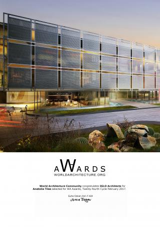
Anatolia Tiles by IGLO Architects in Turkey won the WA Award Cycle 24. Please find below the WA Award poster for this project.
Downloaded 122 times.
Favorited 1 times
