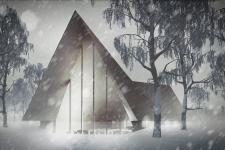
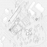
The footprint of the existing church is allowed to remain as a memory, it is respected. The new building must empower the site while maintaining a balance with the memory of the old church. The result is a new landmark to empower Ylivieska. All superfluous, wilful concerns are discarded and the design is the result of a process of distillation. Only that which is absolutely necessary remains. The addition is a simple yet powerful form that through small, but particular manipulation creates the new church. The building sits in harmony with the natural surroundings, an ephemeral intervention. The new building is a sleeve, a funnel.
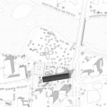
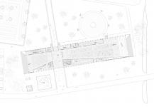
Plan.
The simple compression and relaxation of the plan arrangement allows the program to be solved in a simple yet elegant way. The long form is divided three times – entrance, public hall and church. The entrance bisects the volume on axis to the old entrance and this move creates a subtle cruciform shape which doesn't discriminate between religious and secular but makes them equivalent. Conceptually the building begins as a simple sleeved tube with a single long wide space flanked by two narrow bars. By one simple shift a compression is created at the entrance point. This pinching allows the main served spaces through the centre of the house to be notionally divided although still visually connected. It also makes a more generous composition of servant/backup spaces as the building contracts and expands to accommodate the various elements of program. The building is at its heart a flexible space where both the parish and church hall can merge into a single space to accommodate events of different sizes and intensities.
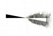
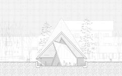
Section.
Following the same logic as the plan solution a single shift or manipulation defines the hierarchy of space. Defined in section the primary building elements are a pit and a roof. A shallow depression is made in the ground defining both the footprint of the new church but also the primacy of the old church which sits higher on ground level. Visitors drop down a ramp to enter underneath the low point of the roof and can turn left or right into the church hall and public hall respectively. These spaces expand both horizontally and vertically as one moves towards the open ends of the tube.
2017
0000
Structure.
The buildings structure is extremely simple but through small shifts allows a complexity to develop. A series of roof trusses placed at regular intervals expand and contract defining both the internal spaces within and the building’s exterior appearance. These trusses sit on top of a rigid base formed from the backup spaces running along the length of the building on each side. Again, the design decisions are the same, a linear division between spaces and a simple process of compression.
Form.
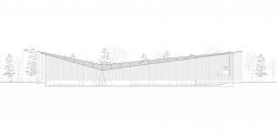
The main exterior form is defined by the tension created between the upper roof element and the carved ground below. The roof is raised slightly revealing a narrow band of windows along the long sides beneath the eaves which creates a distinct line of light contrasting the darkness over the horizon. The roof and this narrow slit of glass become the main facades. The gable ends are completely open to the east and west allowing both views out but also a view through the hole length of the house. The separated bell tower stands alone as a sign of the modern church. It is a lighthouse signifying modernity and independence. The original bells from the old church are reused with the familiar sound of the call to prayer being the continuity between new and old.
Materiality.
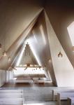
The choice of materials is simple but coherent echoing the clarity of the rest of the project. The exterior materiality is primarily the roof cladding which is of black/green copper. Laid like shingles, these metallic scales give a strong textural quality to the exterior of the building while also echoing the craft and tactility of the original church. Internally the space is timber clad creating a warm inviting atmosphere for visitors. The spaces are pure and unadorned, the ornament is created through the architecture. The bell tower inverts this order with glass on top and copper covering the base.
Light.
The delicate play of light in the main spaces is a result of the combination of openings and their symbolic character. The west gable relates to the public room and offers generous light and views over the church garden. The east gable end behind the altar is conceived as a filter which creates a spectrum of diffuse light which is divine in character. The roof openings to the south reveal the thickness of the walls while simultaneously allowing the changing light of the day/night cycle to be perceivable in the main church space.
Ori Merom, Jarlath Cantwell, Kuba Kolec, Pej Gombert, Beatriz de Una Bóveda

