The White Space
Between stimulus and response there is a space. In that space is our power to choose our response. In our response lies our growth and our freedom. - Viktor E. Frankl
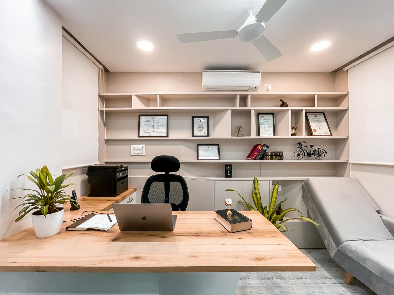
We were commissioned to design the corporate office of leading CA , CS & Tax consultant firm “Lahamge“ in Ahmednagar, India. Our client wanted to retain the idea of collaboration in a very small office or corporal environment, while also incorporating such requirements of privacy and hierarchy in a corporate office discipline. While designing, the key concerns were to create a balance between collaborative and private zones.
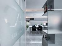
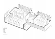
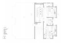
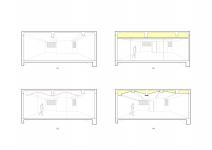
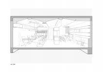
The space given to us was around 750sqft in an old building, it was intended to create several areas that could meet the needs of the company, three offices, work area, pantry, etc. Being an office based on finance and numbers, the design development was based on an idea of exchange of knowledge of its employees and still looking for new solutions, it was thought as a functional rectilinear working space, organized around a long table to encourage collaboration and yet have notional private work station and discussion area at the same time.
The whole area of the project was an integral part of a single space leading to the option for segmentation to be made through the placement of glass panels. In addition to allowing the creation of more reserved work spaces, natural light which only enters through windows, fills the entire space. Another important aspect while designing was the play of volumes, rather than approaching ‘one size fits all’ solution, we adopted a customized fit for tables that would address their work activity which also promotes a sense of wellbeing for their employees. We questioned the general trend of open environments and therefore opted for a hybrid workspace, a mix of individual and collaborative space that would lead to increased productivity.
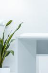
According to Merriam-Webster, white is “free from color.” White reflects and scatters all the visible wavelengths of light. As a designer, white space is how every project starts. It’s the blank slate. It’s an untitled artifact. It’s the promise of things to come. While the project does not make a loud stylistic statement, it serves as the perfect setting for its users. White offers a sense of peace and calm, hope and comfort. It creates a sense of order and efficiency. No one aspect of the interior space stands out, however, they all come together as a seamless harmony. Finally, the office space above, serves it’s purpose in bringing together people to work in focus environment.
Tres Atelier
2020
2021
Gross Built Area (m2/ ft2): 750 ft2
Project location: Ahmednagar, India
Program: 3 Cabins, 2 Workspace, Pantry, Toilet, Storage
Social Media Accounts: Instagram : tres_atelier_ Facebook : Tres Atelier
Photo Credits: Indrajit Patil
Video link: Vimeo - https://vimeo.com/531158893 Youtube - https://youtu.be/Y_KRl2stfbA
Design/ Site coordination : Suchit Mutha
Design/ Site coordination : Mandar Khele
Design/ Site coordination : Kaushal L. Tatiya
