THE CRACK
Design Factory
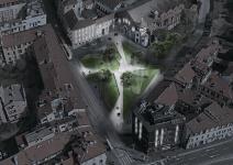
Milan is one of the most desirable places for young people who get inspired by Italian culture and want to develop their skills especially in the field of Fashion, Design and Architecture. The site of the Design Factory, piazza Sant'Eustorgio, is situated in Navigli district, full of cultural events and a lot of landmarks - the Basilica of Sant'Eustorgio.
In the past it was important place where people gathered before religious and social events. Nowadays it has similar function, part of it is a green area for recreation or a transit zone.
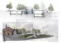
Proceeding of the needs of the visitors, the aim of the project is to preserve the green area and the silhouette of the old architecture. Therefore the new building is designed to be semi-underground which forms different kind of spaces – underground/above ground, indoor/outdoor.
Reference: As main symbol of Italians cities are the piazzas, the beating heart of every town. Different in characteristics as big/small, intimate/dramatic, old/new, they all have something in common - their civic and symbolic importance, they’re the physical and spiritual center /marked by monument or fountain/ for the surrounding buildings and intersections of streets.
Morphology: The tiny ramps and stairs going through the site, following the diagonals, splits the area into four parts. These parts are the lifted corners in which are placed indoor spaces, playing the role of the buildings surrounding the square. Last but not least, the piazza is formed in the center between the indoor spaces, where the ramps and stairs cross each other and Saint Peter of Verona Monument is placed in the middle.
From more abstract point of view morphology could be treated as a crack in the earth. The powerful energy of the place fissures the earth and underneath is revealed the core – a place of liveliness and emotions, a world of art. That feeling is strengthened by additional effects of lights along the cracks which reminds of lava going through them.
Sun analysis and planting: In regard to the morphology, tinier “cracks” are designed for contributing natural upper lightening. The existing trees are placed in that cracks, inserting nature in the interior spaces.
Functions:
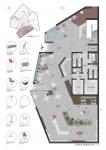
Functions of the building are separated in the four parts connected in between: workshop spaces and commercial spaces with exhibition halls. On the main level ±0.00 are situated reception, cafe, bookshop, exhibition rooms for temporary and permanent exhibitions; workshop rooms for Fashion, Design and Photography; storages; WC rooms; elevator and staircase which leads to level -3.30 where are situated storages and machine room.
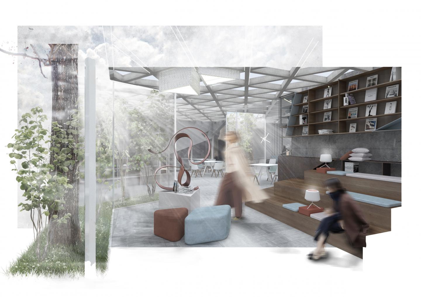
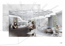
Interior: As mentioned above the concept of the project is inspired by a crack which resonate in smaller ones. These inside gardens contribute for the natural lightning in the interior and the upper light is preferable for exhibition rooms. The existing trees situated in the gardens implement the connection between people and nature.
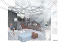
Main concept of interior is inspired by the function of the building – Design factory – “producing art”. “Factory” is a place where something is produced, an industrial building – industrial style which is characterized by rough natural materials, concrete, neutral colors, metal, beams. “Design” in the interior is characterized by colorful accents like designer furniture – poufs, lamps, armchairs etc.
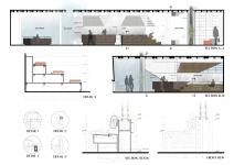
Material: As mention above the materials used for the interior are characterized by the industrial style: flooring – concrete tiles, walls – rough concrete and neutral colors, metal white grid and metal sheet for bar covering.
Warmth is implemented by wooden amphitheatre stairs, tables, chairs as well as colorful furniture in brick-red and light blue.
Exhibition rooms for temporary and permanent expositions are connected in between by a corridor and in the same time are separated by the inner garden which contributes for see-through effect between two spaces.
Workshop rooms for Design, Photography and Fashion are connected in between by corridor for better communication between 3 categories of art. They are separated as well by inner garden which is used for partition of spaces but allows visual connection between the rooms.
Bookshop, café and reception are one open-space which allows free circulation in the public space. An amphitheatre stairs are situated across the inner garden and provide a peaceful atmosphere for reading or recreation.
2020
2020
- "Tinier cracks" contribute for natural upper lightning in the interior and existing trees are place inside and connect people with nature
- Triangle raster of ribbed slab corresponds to the facade raster and exterior elements /water mirrors, benches/
- Material like concrete, metal, neutral colors contrast to colorful accents - designer furniture and warm wood implemented in stairs, tables, chairs.
Katerina Rangelova
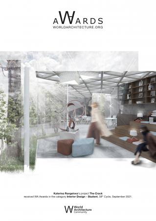
THE CRACK by Katerina Rangelova in Italy won the WA Award Cycle 38. Please find below the WA Award poster for this project.
Downloaded 0 times.
Favorited 4 times
