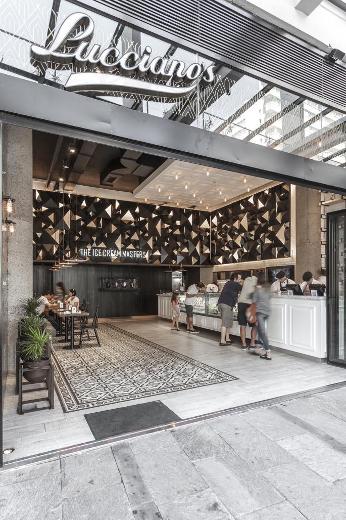
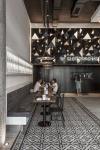
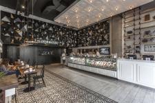
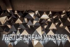
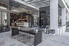
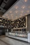
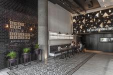
The initial pursuit of the brand was to draw away from the preconception of the traditional ice cream shop and relate to somewhat unconventional aesthetics for this type of stores. Therefore, to bring the product and brand together with different forms of art was the path chosen as designers. Through the election of materials, lighting, equipment and some semi-sculptural elements, we were able to incorporate into the ice cream shop attributes that convey the comfort of domestic living and reminiscences of an art gallery.
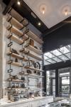
Through the development of different constructive elements - the hammered treatment of the columns that exacerbates the characteristics of concrete; the verticality of the black wood siding; the elaborate piece of iron and glass that serves both as centerpiece and railing of the upper level- the goal is to enhance the spatial qualities of the store an put the focus of attention on its double height.
The construction of a topographic art piece was in part a decision associated with the idea of gastronomic product with relevance in the artistic concept. Its location was decisive for its protagonism.
The balance of old / contemporary, monochromatic / colorful, flat / textured, generates an interesting aesthetic eclecticism that at all times gives way to promote the product in question: frozen creams.
2016
2016
Location:
Libertador y Corrientes – Olivos, Buenos Aires, Argentina
Program:
Ice cream & bar
Surface area: 100 sqm
Project:
Hitzig Militello Arquitectos - www.estudiohma.com
Ferro & Asociados (Mar del Plata)
Construction management:
Ferro & Asociados (Mar del Plata)
Promoter:
Private
Photography:
Federico Kulekdjian
