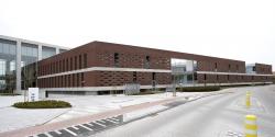
In the late 1990s, Telenet built its headquarters on the site of a disused army barracks just outside the ring road around Mechelen. Telenet’s banal office volumes failed to fill the gap in the urban fabric. Their prominent presence disrupted the neighbourhood. Less than a decade later, the telecom company organized a design contest for the expansion of their offices and technical spaces. POLO Architects won with a design that remedied the scale violation and eased the transition between the various elements in the complex urban environment.
RECOGNIZABLE ANCHORS
While the other submissions generally doubled the office buildings, producing a series of four buildings linked by a central circulation corridor, the winning design proposed raising a single office building no more than two storeys high, but much larger in total. To avoid wasting scarce, precious space on a car park, parking spaces are available both under the elevated building and on the roof. Another advantage is that the view of the employees, visitors and local residents is not spoiled by a vast expanse of parked vehicles.
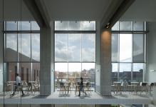
The atrium, with robustly spaced doorways and a roof lantern, is the building’s backbone and nerve centre. It provides access to the office floors and the car parks, and connects the existing office buildings. The atrium serves as a circulation area, foyer and conference room, and forms the vestibule to the offices. Its stairs, landings and hidden sitting areas facilitate informal contacts, chance encounters, brainstorming sessions and consultations.
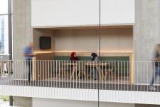
Cut-away sections and terraced patios draw daylight deep into the massive volume. Each of the patios has its own character. They are the recognizable anchors around which the company’s various departments can be clustered and structured. The set-up ensures an extremely flexible office environment. As departments or services grow or shrink, they can easily regroup around their epicentres.
MODEST PRESENCE
Along Caputsteenstraat, a perforated brick wall has been erected in front of the building like a screen. It gives the people living in terraced houses an increased sense of privacy. The neighbours used to feel like the tenants of the glass buildings were eyeing them all day, but the glances are now fleeting and more introverted.
The building is a modest presence that can mediate between the many different scales. The gesture of the wall restores the right proportions to the difficult urban context. The wall evokes the vanished barracks wall and – mirroring the prison wall just down the street – restores significance to the metropolitan functions in the area.
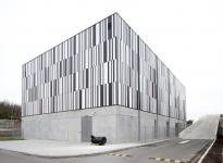
The new server facility lies beside the office building, set back from the street. The facade panels, which have to be closed, follow a random ‘binary’ pattern of black-and-white lines. The autonomous, abstract, near-iconic object is a counterweight to the ‘modest presence’. It is the very embodiment of the Telenet soul.
photography - © Toon Grobet, Steven Massart
2005
2007
Modulo Architects (architecture)
Dirk Vandekerkhove Landschapsarchitecten (landscape architecture)


